Couple Renovates to Spend More Time in the Kitchen
http://decor-ideas.org 06/08/2015 04:14 Decor Ideas
These homeowners, one retired and one now working just part time, was spending more time at home — and in the kitchen. But it was kind of hard to enjoy their kitchen, as they hadn’t renovated it in 35 years. Dated and dark, their kitchen was ripe for a remodel.
Interior designer Naomi Stein of Design Manifest, a family-run design-build firm in Pennsylvania, learned how her clients liked to work in the kitchen, what they needed to have handy and which styles they liked. She helped transformed the modest space into an open and light room, paying careful attention to the smallest of details to keep things balanced and special.
Photos by Courtney Apple
Kitchen at a Glance
Who lives here: A couple spending more time at home
Location: Havertown, Pennsylvania
Size: About 126½ square feet (12 square meters); 8 feet, 7 inches by 14 feet, 8 inches
When it comes to design, homeowners who wait 35 years to renovate a kitchen can be the most intrepid. “These clients were so wonderful to work with — they said they wanted it to be ‘a portfolio kitchen,’ and they just went for it,” Stein says. Their home is rather traditional, while their own style is more transitional, and they like to collect art.
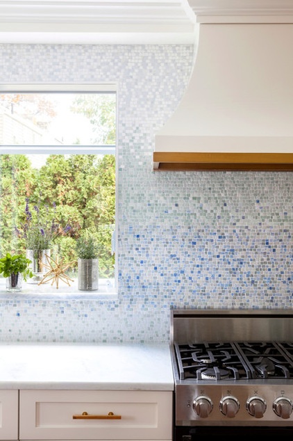
A stunning handmade mosaic tile backsplash artfully adds color to the room while maintaining the light feeling, and doesn’t compete with the artwork in the dining room. Within the gradient pattern, most of the blue and green hues show up in the middle, then it gets whiter toward the ceiling. “There are more tiles per square inch, which gives it more visual height,” the designer says.
The counters are topped with Aquias Blue quartzite, which has veins in blues that pick up on the colors in the mosaic tile. “They are soul mates,” Stein says of the pair. “Quartzite is a wonderful material, because it’s natural and has all of the veining and tones of marble, but it’s much stronger.”
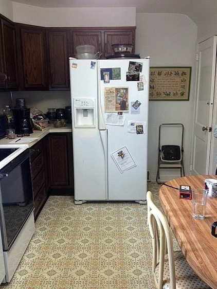
BEFORE: The room was closed in and closed off, the appliances were old, and the linoleum flooring and laminate countertops were dated. The most dramatic part of the transformation was the removal of the wall (right) between the kitchen and the dining room.
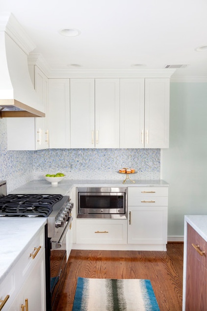
AFTER: Stein created functional zones within the layout. Here she changed the refrigerator’s placement to open up space for a snack area separate from the main prep area (the countertop and cabinets above the microwave). Small appliances, like the coffeemaker and toaster, will sit atop this counter. All of the dishes and cutlery are stored in the cabinets of the snack zone, while closer to the range, there is plenty of room in cabinets with roll-out shelves for pots and pans.
Tip: “Customizing is really important in a small kitchen,” Stein says. You can take the cabinets as high as you want to go and make the most of every inch. You can add pullout drawers and can even add a few extra inches where needed. For example, these clients have oversized plates and chargers, so she made those cabinets deeper than standard size.
Backsplash: Metamorphosis, New Ravenna; wall paint: Dewy, Sherwin-Williams; cabinet paint: Snowfall White, Benjamin Moore; cabinet hardware: Lewis Dolin Decorative Hardware Bar Pull collection; range: 30-inch 3 series self-cleaning dual-fuel, Viking; dishwasher: 24-inch panel-ready, Bosch; drawer microwave: GE; counters: Aquias Blue quartzite, AAA Hellenic Marble
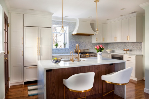
Taking down the wall between the dining room and the kitchen really opened up the space, but they lost a lot of wall space for cabinets and appliances. Stein packed the island with the sink; lots of counter space, including dining space for two; a dishwasher; storage space; and recycling and trash bins.
The cabinets on the far left serve as the pantry, complete with pullout shelves. To the right of it is a panel-front refrigerator. Note the way Stein planned the placement of the pulls on the pantry and refrigerator to work together; this keeps the eye from having to jump around and maintains a pleasing balance. This is another detail that was made possible by designing custom cabinets.
There are three work areas for cooking: the island, and to the right and left of the range.
Bowls: Le Souk Aqua Fish, Lamps Plus; cabinets: custom, Christiana Cabinetry
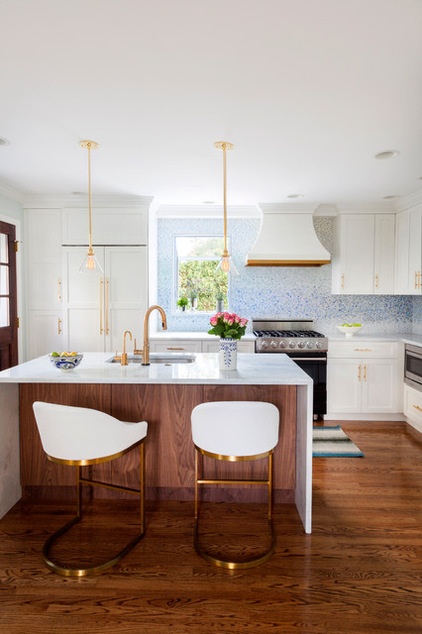
“Because this arrangement is not symmetrical, we had to give it balance,” Stein says. One way she did this was via careful placement. For example, there are 6 inches between the refrigerator and the window and 6 more from the window to the vent hood. She designed the vent hood, and the carpenters at Christiana Cabinetry crafted it. A soffit anchors the hood to the surrounding cabinets.
When it comes to mixing metals, Stein recommends a two-thirds, one-third rule. Warm polished brass is the dominant finish. “I didn’t want the stainless to overwhelm the room,” she says. She kept the stainless steel items like the range and the microwave at the same level, so that they don’t make the eye jump around. Conversely, the brass extends from floor to ceiling via the stools, hardware, faucets and pendant lights.
The counter stools originally came in stainless steel. Stein had them powder coated to match the rest of the brass finishes.
Otus stool, custom powder-coated to look like brass: Wayfair; pendant lights: Satellite 1 with polished brass finish and glass shades, Schoolhouse Electric & Supply; refrigerator: Sub-Zero with custom panels by Christiana Cabinetry
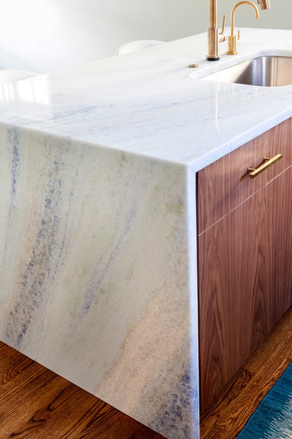
The homeowners wanted to keep things light, but they love natural materials, like walnut. “I knew the island was a spot that could be warmer and richer,” Stein says. “We wrapped it with a waterfall counter to keep it light.” The designer carefully specified which pieces would be used down the sides and across the countertop — notice the continuous flow of the vein pattern in the quartzite.
The island cabinets contrast the other cabinets; while the wall cabinets are Shaker style, the island cabinets are slab style. The veneers have been carefully book-matched so that the grain flows nicely from drawers to doors. They have an ultramatte finish.
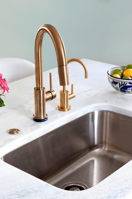
Polished brass faucets curve above an undermounted stainless steel sink.
Sink: Blanco B441024 Stellar Undermount, Ferguson; main faucet: Trinsic, Delta Faucets; water filter faucet: Newport Brass, Ferguson
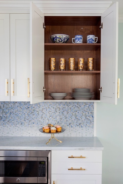
The walnut extends to the inside of the cabinets and drawers.
Cake stand: Lamps Plus
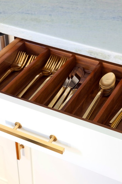
When she was done, Stein gave the clients she was so fond of this flatware, which coordinates with the other metal in their new “portfolio-worthy” kitchen.
Gold flatware: West Elm
Design-build team: Naomi Stein and Andrew Stein of Design Manifest
Cabinetmaker: Christiana Cabinetry
More:
Homeowner’s Workbook: How to Remodel Your Kitchen
Your Guide to 15 Popular Kitchen Countertop Materials
Related Articles Recommended


