My Houzz: Personal Touches Keep Things Fun in a Historic Vancouver Home
http://decor-ideas.org 06/08/2015 02:54 Decor Ideas
“A reno project that went on for years didn’t appeal to me,” says first-time homeowner Jessica Schmid. “However, something that would take a few months to renovate did.” Jessica and her husband, Kevin, found an 1898 heritage home in Strathcona, Vancouver’s oldest neighborhood, that was a rare piece of the city’s history. The house was in good shape, but it needed some upgrades. The scope of this project was therefore perfect for them. Jessica, an operations manager with an engineering firm, led the renovation process, tapping into her project management skills to delegate the design work.
Houzz at a Glance
Who lives here: Kevin and Jessica Schmid, chihuahua Lucy, pug Sullivan and cats Gibson and Hunter
Location: Strathcona area of Vancouver
Size: 1,500 square feet (139 square meters); 3 bedrooms, 2 bathrooms
Year built: 1898
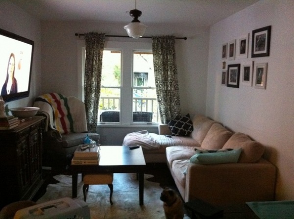
BEFORE: The house was last renovated by previous owners in 1987. The main floor had a plain appearance and was screaming for a makeover.
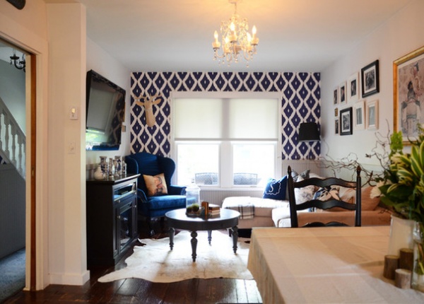
AFTER: “This floor has a more traditional vibe, but I kept it fun by throwing in elements such as the bold wallpaper, the cowhide rug, sassy pillows from various Etsy sellers, saturated colors and unique artwork,” says Jessica. The sectional is a favorite lounge zone for the couple’s two dogs, and is a practical choice. “I would absolutely love to have an aubergine upholstered sofa in the living room. However, with four pets, this is unrealistic,” she says. “Any couch or sofa we have has to be replaced every few years and has to be durable and easily cleaned. I have to balance function with desire.”
Floor lamp: Ikea; sofa: The Brick; coffee table: Isala, Ikea, painted in Pencil Point by Behr; terrarium: oversized glass jar from HomeSense; terrarium kit: Twig Terrariums; chandelier: vintage; decorative deer head: The Cross Decor & Design
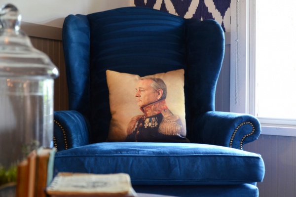
“When I choose furnishings for my home, I choose them for the space rather than choose the space for the item. I try to get a sense of the room, the perspective of view from other rooms and how the room will be used,” says Jessica. “I just kind of know what a room needs to feel right for myself.” She describes her style as a mix of traditional, modern rustic and eclectic. “I love adding one piece that doesn’t belong, saturated colors and restoring historical elements,” she says
Chair: Ethan Allen with custom reupholstery; Bill Murray pillow: Replaceface
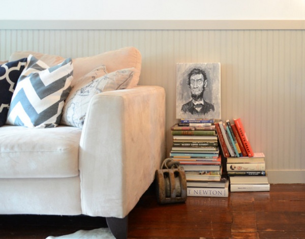
Kevin, an art director in the mobile gaming industry, painted the Abraham Lincoln artwork resting on some stacked books. ”Some nights we have drinking and painting nights with our friends. That’s just one of the casualties from that night,” he says. “Just for good times, you play some music — there will be six or eight of us, and we’ll just draw or paint or whatever.”
Wall paint: Painter’s White, Behr; wainscoting paint: Chinchilla White, CIL; vintage ship’s pulley: Vancouver Flea Market
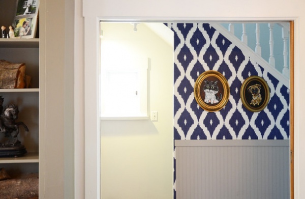
The corridor features pet portraits, painted by Kevin as a gift for Jessica. Kevin framed the paintings in ornate oval frames found on eBay.
Graphic wallpaper creates an accent wall on the stairwell. “Because the main floor does not have enough natural light, I chose not to wallpaper all of the walls — I think this would have looked dark and busy. Instead we did three feature walls,” says Jessica. “I really love this wallpaper, but I get tired of things fast, so my guess is that I will replace it in five years or so.”
Wallpaper: Kelly’s Ikat by Kelly Hoppen for Graham & Brown, Lowe’s Canada
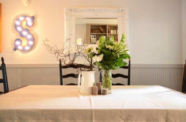
The couple added beadboard wainscoting in the dining room, living room and hallway.
Table: Urban Barn; Francesca dining chairs: Pier 1 Imports; mirror: The Cross Decor & Design; tablecloth and pitcher: HomeSense; letter “S” wall art: Etsy; flowers: Whole Foods
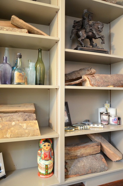
The house came with built-in cabinets in the dining room. Jessica uses cut firewood as a decorative accent, along with other collections and keepsakes.
Horse figurines and sculptures like this one are seen throughout. Jessica owns a horse that resides in a barn only a 12-minute drive away. While Jessica enjoys dressage, the competitive equestrian sport, Kevin is less enthralled with the theme. “Horses just scare me. They’re just large animals that I’m afraid of,” he says with a laugh.
Horse sculpture: Maynards
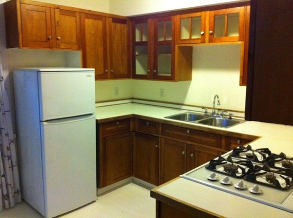
BEFORE: The appliances in the existing kitchen were rearranged to accommodate a dishwasher.
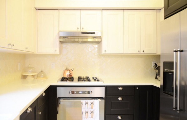
AFTER: Everything was replaced in their kitchen renovation. The couple hired Modus Enterprises, a company that specializes in Ikea kitchen installations. The new backsplash tiles have a unique handcrafted appearance, contrasting nicely with the new Ikea cabinets. “I spent hours upon hours searching for the perfect backsplash,” says Jessica. “I wanted something that would stand out but not be so trendy that it would be out of date in a few years.”
Backsplash tiles: Tuileries, Walker Zanger; cabinets, appliances and quartz countertop: Ikea; Equine Markings dish towel: Anthropologie
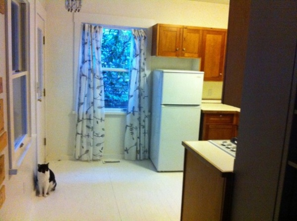
BEFORE: Seen here is one of their cats pausing in the original kitchen, which had underutilized space in front of the window.
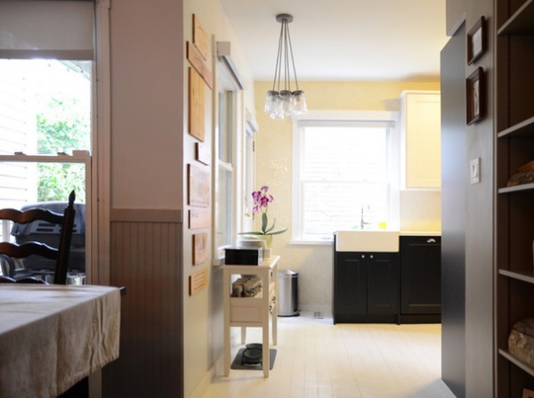
AFTER: The only configuration that allowed for a dishwasher involved installing the sink in front of the window. Now they can enjoy sunlight and views when washing their pots and pans. A small sideboard is used to store vintage dishware.
Sideboard: Pier 1 Imports; lighting: Exeter 5-Jar Pendant, Pottery Barn
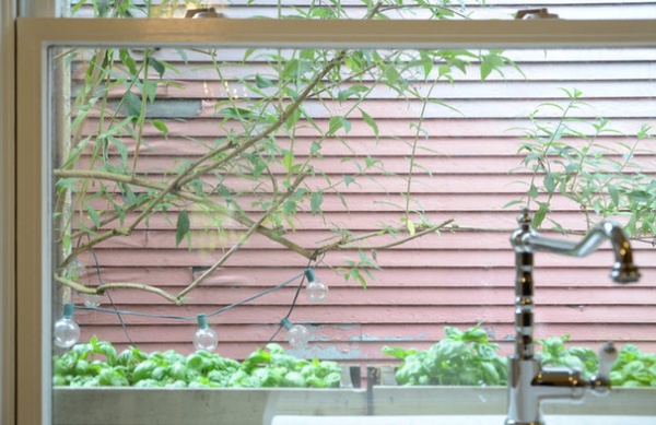
The couple grows basil outside their kitchen window in flower boxes. The textured wall of a neighboring heritage home serves as a colorful backdrop.
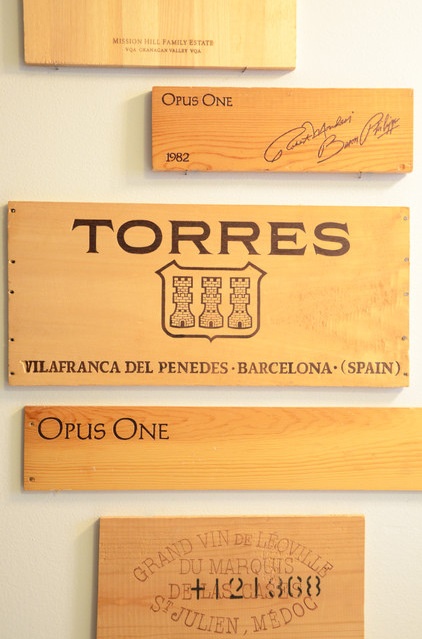
Inspired by an article that she had seen years ago, Jessica used a collection of wooden wine boxes to decorate a kitchen wall. “We have a friend who collects wine — some of those crates he has lugged around with him for over 25 years,” she says. “When he saw I was collecting old wine crates, he gave me some really cool ones, like the 1982 Opus.”
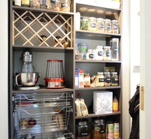
Because the house had almost no storage, the couple had to get creative. A small room near the kitchen was transformed into a pantry.
Pantry shelving: custom, Arbutus Furniture & Closets
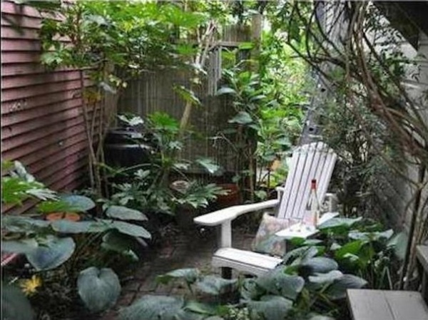
BEFORE: The kitchen leads out to a compact garden. When the couple moved in, this space was lush and green but difficult to use. “When it came to the landscaping, the front and back gardens were overgrown and looked neglected,” says Jessica.
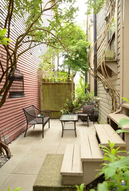
AFTER: Jessica and Kevin worked with De Haas Landscape Design to transform their outdoor area into a more usable oasis. The result is a lovely patio, with sun shining through the branches of the climbing jasmine vine and butterfly bush.
Outdoor furniture and birdcage: Walmart
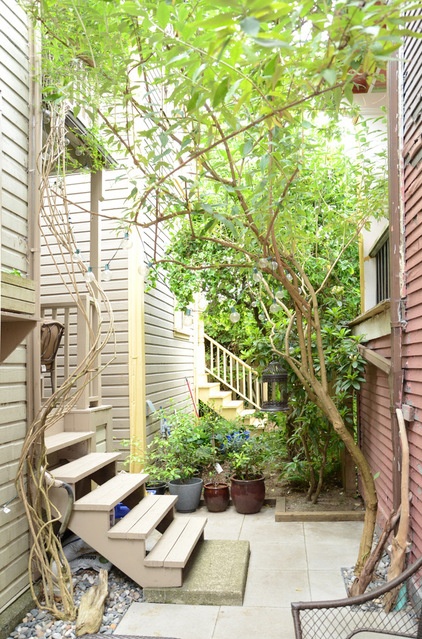
The space is now usable and easy to maintain. A large butterfly bush acts as a leafy canopy over the patio. “In the summer it gets all these purple flowers all over it. It’s beautiful,” says Jessica.
Globe string lights: Pottery Barn
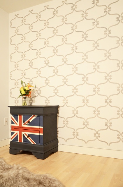
Jessica also refurbishes furniture through her small business, called Little Chihuahua Design. She revamped this vintage dresser with new paint.
She also hand painted this eye-catching stencil pattern on the guest bedroom wall. “It was definitely a pain, and it took me probably a couple of weekends just to do it, just because it was so finicky,” she says.
Wall stencil: Etsy; wall paint: Painter’s White, Behr; stencil paint: Neutral Gray Value 5 acrylic, Liquitex
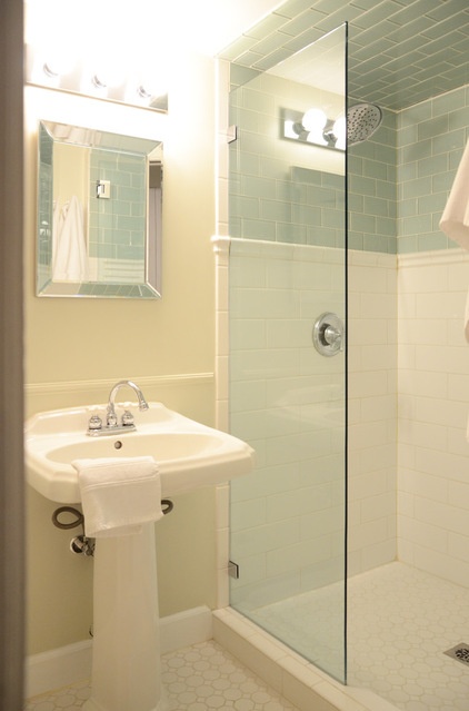
The basement bathroom was gutted, retiled and recompiled. Having a shower in your basement is not ideal, Jessica says. “But with these old homes, you just have to have patience with the weird layouts.”
Wall and floor tile: Daltile; glass shower enclosure: custom
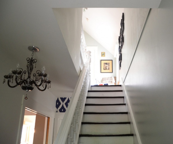
The floors and stair treads are well worn as a reminder of the many occupants who must have passed through this house over the decades. These stairs were given a fresh coat of paint.
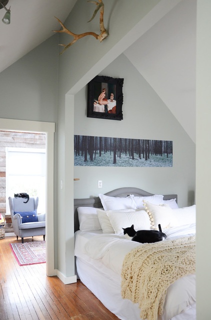
The upper floor features vaulted ceilings with ample daylight. The couple takes advantage of the wall space by hanging art both low and high.
Headboard: Joss & Main; bedding: HomeSense and Ikea; pillows: West Elm and Ikea
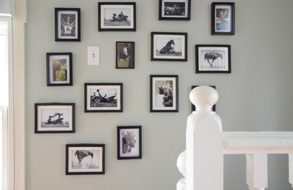
Framed images of past horses and pets create a gallery wall next to the stairs. “Some of those pictures of the horses are of my grandma’s cousin, who was a traveling stunt rider. His name was Montana Steve, and his horse was called Flicker,” says Jessica. “He was actually from Saskatchewan, but when my dad asked him why he called himself Montana Steve, he said it’s because the rodeo tours were in the U.S., and Americans do not want to watch Saskatchewan Steve! He’s still alive and in his 90s.”
Wall paint: Gray Wisp, Benjamin Moore; frames: Michaels
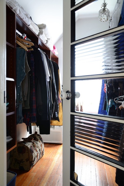
A small room, with access off of the master bedroom, was formerly used as a nursery. Jessica says, “The walk-in closet was originally counted as the fourth bedroom, and was intended to be a nursery in the original floor plan. It is a tiny room and works perfectly as the walk-in.” The couple transformed this space into a custom closet, filled with daylight and plenty of space to organize their belongings.
Custom closet millwork: Arbutus Furniture & Closets
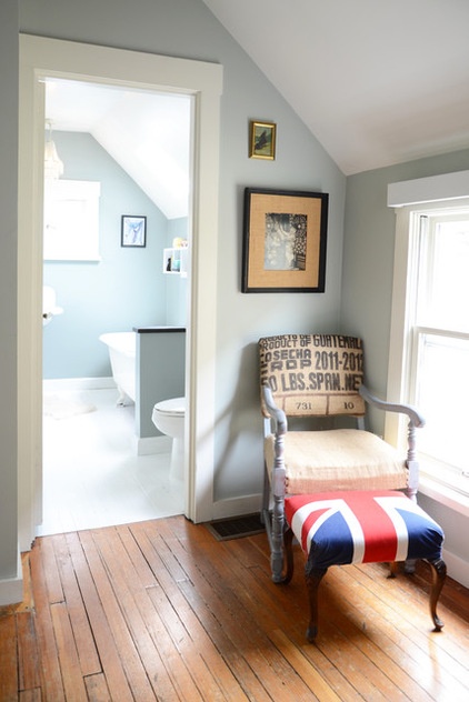
“My favorite feature of the house is the old fir floors,” says Jessica. “They feel so warm and so inviting. There are not too many homes in Vancouver left from the 1800s, so I cherish their originality and the stories they tell.“
Chair: reupholstered by local artisan; footstool: Little Chihuahua Design
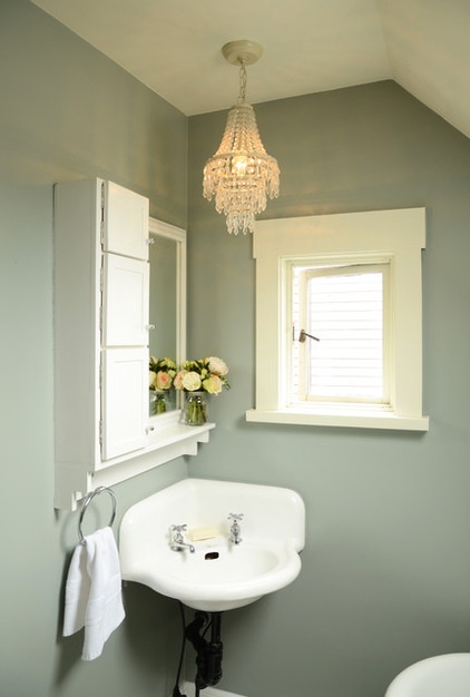
The main bathroom needed only some light updates. The toilet had to be replaced, and some existing vinyl floor tiles were stripped. The rest was in good shape.
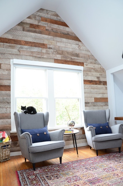
This upstairs space is Kevin’s office and a room he calls his man cave. The couple worked with Vancouver Reclaimed to install a floor-to-ceiling reclaimed-wood accent wall. The couple was given a few options for color, and they decided to do a mix. “That’s actually an old barn on our wall,” Jessica says. The wood planks have a hand-sawn texture and were only lightly sanded to remove splinters. The wood helps to accentuate the height of the room and brings visual warmth to the space.
Strandmon armchairs and Lövbacken side table: Ikea
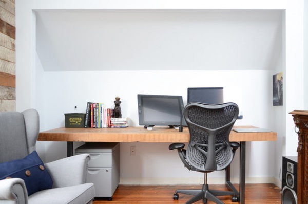
Wood from the same barn was used to fabricate an 8-foot-long worktable for Kevin, custom built to accommodate his computer monitors.
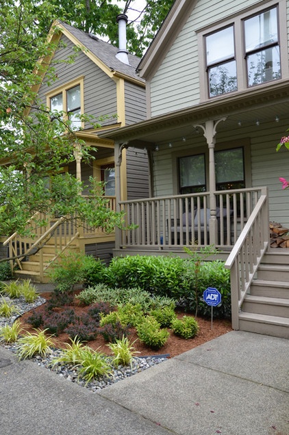
The house was originally built as part of a six-unit rental housing block (their house is on the right). Four of the six houses remain, and two were rebuilt in 1987 to match the existing buildings. The couple worked with De Haas Landscape Design for new landscaping in the front yard that would require little maintenance, with no grass to mow. A sculptural arrangement of chopped and cured firewood is stacked on the porch, giving the house a rustic cabin feel.
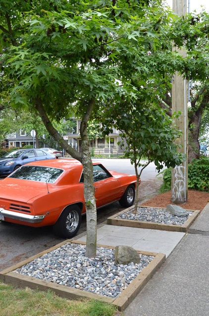
Here’s the lawn-free sidewalk treatment, featuring river rocks and large concrete pavers, with Kevin’s orange 1969 Firebird.
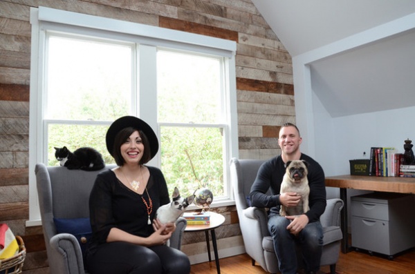
“I adore everything about the house and the design choices we made,” says Jessica, pictured here with their chihuahua, Lucy. Hunter the cat is perched behind her, and Kevin is with Sullivan the pug. “It feels warm, and it feels like home. I’m proud of what we achieved and feel like we helped preserve a little part of history.”
See more photos of this home
My Houzz is a series in which we visit and photograph creative, personality-filled homes and the people who inhabit them. Share your home with us and see more projects.
Browse more homes by style:
Small Homes | Colorful Homes | Eclectic Homes | Modern Homes | Contemporary Homes | Midcentury Homes | Ranch Homes | Traditional Homes | Barn Homes | Townhouses | Apartments | Lofts | Vacation Homes
Related Articles Recommended


