Kitchen of the Week: Bamboo Cabinets Hide Impressive Storage
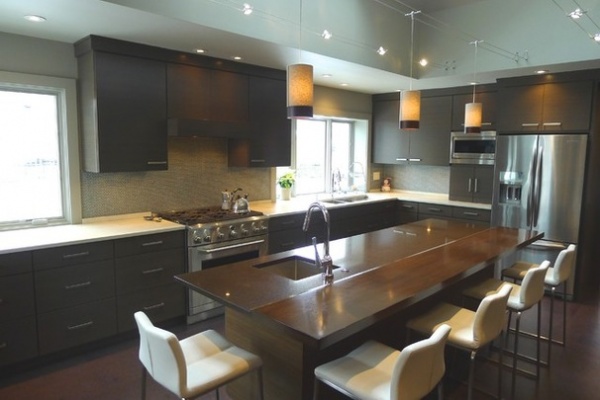
The most remarkable thing about this Indiana kitchen is what you don’t see. The serene and subtle exterior of the elegant bamboo cabinetry masks an explosion of colors and shapes inside, the teeming life of an energetic kitchen.
Interior designer Susan Brook’s clients are a couple with children who, she says, are “passionate about cooking, coffee, entertaining” and cooking together as a family — particularly on the weekend. In the original, somewhat chopped-up kitchen space, “the counters were full; they were spilling over,” Brook says. This family’s goal was to create a family- and guest-friendly space that was organized “to the last inch,” she says. “So much so, that when the kitchen was installed, the homeowners knew where everything was going to be placed.”
Kitchen at a Glance
Location: Indiana
Who lives here: A couple with children
Size: 344 square feet (31.9 square meters)
Designer: Susan Brook of Susan Brook Interiors
The tone is set for the kitchen’s discipline and order by its neutral color scheme and the solid ranks of custom bamboo-faced three-drawer base cabinets that march around the kitchen’s perimeter and the cook’s side of the central island. The uniform look of the base cabinets, whose bamboo fronts have a visible horizontal grain, creates a continuous visual flow around the space.
“I’m a fan of having that movement when you look around the kitchen,” says Brook, who favors drawers over doors. “Even under the sink, you have a consistent play on the line of the cabinetry as well as the movement the bamboo brings.”
Brook chose bamboo for several reasons. “It is a wood that is renewable, and that appealed to my clients.” Moreover, she says, “I wanted to bring something to the table that was completely different, not just a typical paneled door.”
Perimeter counter: Starlight, ColorQuartz; main sink: Precision 16 R10, Blanco; island sink: Precision R10 Bar, Blanco; Axor faucets: Hansgrohe; wall and trim paint: Lockport Gray HC-105, Benjamin Moore; dual-fuel range, island oven and hood: GE Monogram; dishwasher: Bosch; refrigerator: KitchenAid
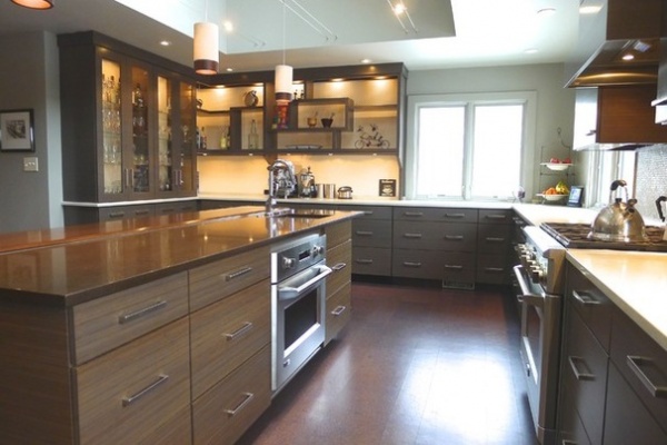
“If a kitchen isn’t functional, then it’s not a good kitchen,” Brook says, adding that it’s the “depth of details” that makes the difference. “Every single drawer — we knew what was going in them before the kitchen was installed,” she says. After cataloguing all her clients’ kitchen goods, Brook began organizing, creating specialized stations within the space, such as a “coffee and cocktail corner” and areas set up for food and breakfast prep.
“You want everything you need within reach of that particular station,” the designer says. “We don’t want them needing to walk to the other end of the kitchen.”
Flooring: 6- by 24-inch and 12- by 24-inch cork planks, Capri Cork
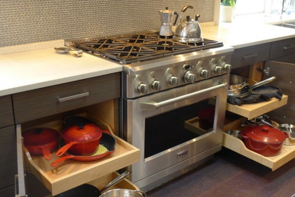
What appear to be three-drawer base cabinets on either side of the stove are, in reality, shallow top drawers and panel doors below that open to reveal pullout shelving conveniently holding the pots and pans.
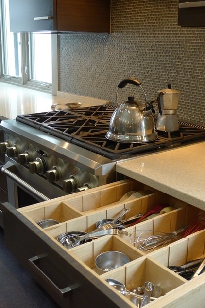
In the picture at left, the shallow drawer next to the stove contains cooking tools, beautifully organized with a wood inset storage system whose “cubbies” can be expanded or contracted as needed simply by moving the vertical wood dividers into precut grooves.
Backsplash tile: Belle Mare in Arica, Chapter 1 Suite Glass collection, Jeffrey Court
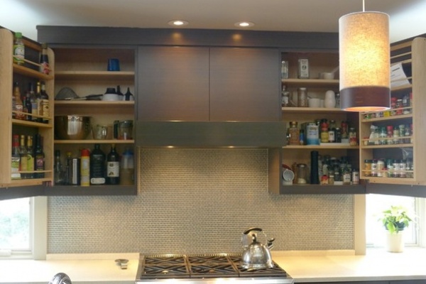
The upper cabinets surrounding the hood, with additional rack storage in the doors, hold the items a cook needs to have at hand while cooking: oils, vinegars, condiments, sauces, spices.
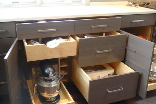
The three-drawer facades might appear uniform, but Brook was able to incorporate a variety of storage elements behind them. Seen above, she used real and simulated drawers that have front-panel doors in the baking area, in one instance to accommodate the height of the stand mixer.
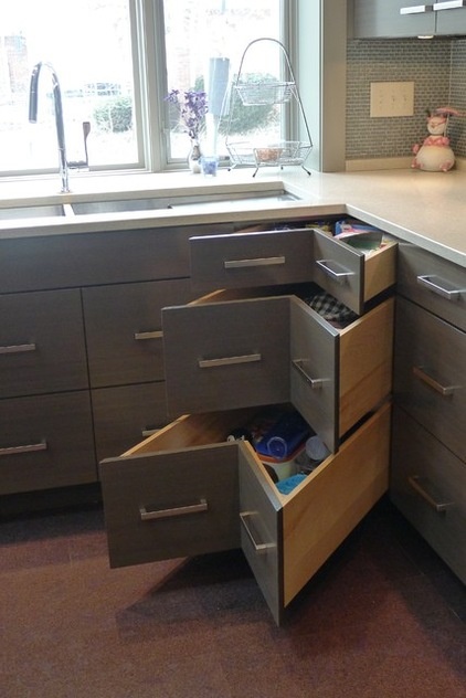
Not even corners were allowed to disrupt the visual flow of the cabinet drawers. In the two cabinet corners of the room, Brook joined adjacent drawer-front panels, which pull out to reveal deep drawers. Though angled, they offer considerable storage space.
The corner by the sink, seen at left, has three independent drawers. At the far corner of the kitchen, Brook maintained the three-drawer look but created only two pullouts — a shallow undercounter drawer and one double-height drawer to house tall pots.
Cabinet hardware: Italian Designs Classico in matte chrome, Schaub and Company
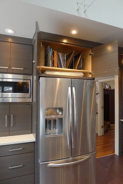
Brook likes to take advantage of a refrigerator’s 28-inch depth to create a storage space for baking trays and large serving platters, seen at left. More storage is available above the microwave, and an appliance garage housing the family’s Vitamix blender is tucked below in the breakfast prep area.
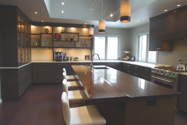
Above, the walnut counter, while visually blending almost seamlessly with the island’s ColorQuartz prep counter, demarcates the guest area from the cook’s space. Brook was sensitive to the fact that the homeowners like to have guests in the kitchen but that serious cooking would be going on, requiring some measure of separation.
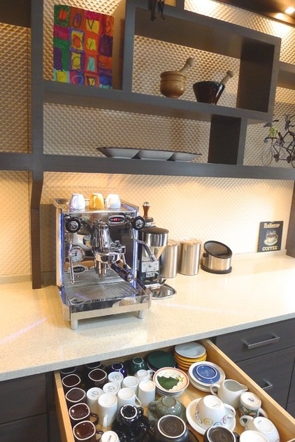
The homeowners are devoted coffee drinkers, so an organized coffee bar area with an espresso cup drawer and a coffee grounds waste disposal was essential. The “floating” shelf system, also in bamboo, is meant to be a deliberate break with the kitchen’s strong linear look. “It needed to have a strength in design,” Brook says, “so when you walked into the kitchen, you had that grabbing your attention.”
Textured wall paneling: Cantena in Antique White, Soelberg Industries
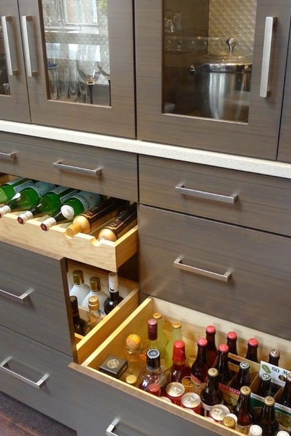
To the left of the coffee bar, guests can help themselves to glasses from the glass-front upper cabinets, then browse through the drink drawers for water, soda, beer and liquor.
Island prep counter: Coffee Bean, ColorQuartz; pendant lights: Topo in Heather Gray, Tech Lighting; undercounter refrigerator: Jenn-Air
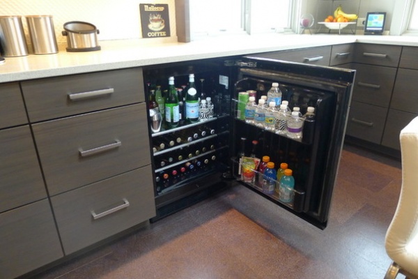
Cold drinks are found in the undercounter refrigerator just around the corner.
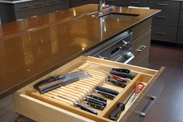
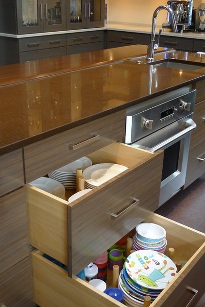
The island is the prep station, housing (among other things) a sink, rollout trash can, cutting boards and a dedicated knife drawer, seen above. “I try to live in that kitchen before it’s built — where do I want to reach for my cutting board and knives? Where is my trash bin?” Brook says.
Underneath the knife drawer and across from the dishwasher, two drawers store the daily plates (seen at left). “It’s much easier to put them in a drawer than in an upper cabinet,” Brook says. For these drawers she used an easy-to-install pegboard and dowel organizer, readily available in kitchen stores and online. Its movable dowels can be adjusted to separate and corral the plate stacks.
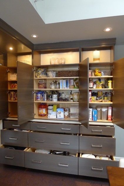
“We knew we needed a big run of pantry space,” Brook says. The pantry, with its nine drawers and 12 shelves, houses the dry goods and less frequently used appliances and gadgets, with illuminated display space at the top to lighten the look. Brook kept the depth shallow, 12 to 15 inches, to prevent things from getting lost in the space.
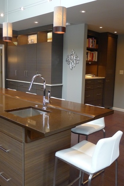
Brook stole space from the adjoining family room to create a combined charging station, message center and cookbook library, as well as a tall broom closet, all fashioned from the same bamboo.
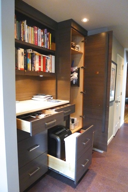
With more than 30 drawers and shelving units, everything indeed now has its place, and there is more than enough space for everything. “The question from the homeowners was always, “Do we have enough storage?” Brook says. “On my final visit, I did spot empty drawers, so that is a good sign.”
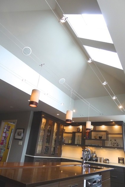
The palette and materials could have gone dark and muddy without Brook’s installation of a rectangular light well, punctuated by skylights set into the hip roof. The light well echoes the shape of the island and softly illuminates the central space, adding air and space and a good deal of drama. Track lighting adds to the task wattage, and pendants add subtle style.
K-Hello Kable lights: Tech Lighting
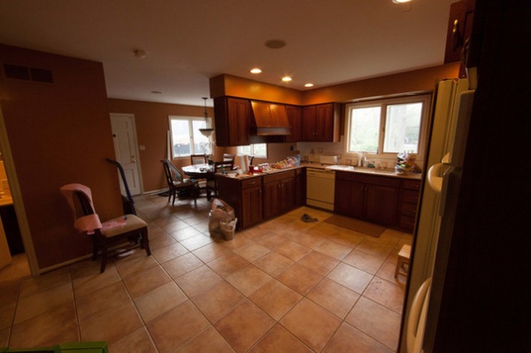
BEFORE: The original kitchen was “chopped in space, and not very well lit with either natural or artificial light,” Brook says. Once she and the homeowners had their plan in place, she took the kitchen down to the studs, opened up the ceiling with the rectangular light well and track lighting, added the sizable central island and created the desk and broom closet using space from the family room. The kitchen size expanded from 220 square feet (20.4 square meters) to 344 square feet (31.9 square meters). “From floor to ceiling, wall to wall,” Brook says, “everything was put back new.”
More:
Browse more Kitchens of the Week
See the most popular kitchen storage ideas on Houzz


