Houzz Tour: Newlywed Couple Find Their Style
http://decor-ideas.org 06/06/2015 02:13 Decor Ideas
Contractor Erik Byron Broms had been on his own in this contemporary ranch house before his bride, Chris, moved in. Though the place was in fantastic shape, the couple wanted to transform it from his bachelor pad into a home that includes her preferences too. Interior designer Julie Nordby helped them find a style that combines the industrial, farmhouse and vintage touches they are both drawn to. The result is a home that reflects them as a couple.
Photos by David Papazian Photography
Houzz at a Glance
Who lives here: Erik and Chris Broms, who had the home renovated as newlyweds
Location: Portland, Oregon
Size: 2 bedrooms, 2 bathrooms; 2,000 square feet (186 square meters)
Designer: Julie Nordby of Nordby Design Studio, Architecture & Interiors
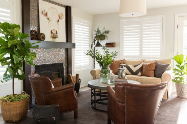
Erik had completed the remodeling himself years ago. While some of the home was dark or certain things had become a bit dated, he had created a home with great bones, and plenty of the elements were keepers. In the living room, the lively mosaic tile fireplace surround stayed. Nordby had the existing wood around it stained darker for contrast, emphasizing the fireplace as a focal point.
She also added hardwood floors throughout the entire home, ripping up wall-to-wall carpeting in some of the rooms. She then gave the existing and new oak boards a matching updated gray stain. Lighter walls, plantation blinds, an interior transom and frosted glass interior doors used throughout the house have brought much more brightness into the home.
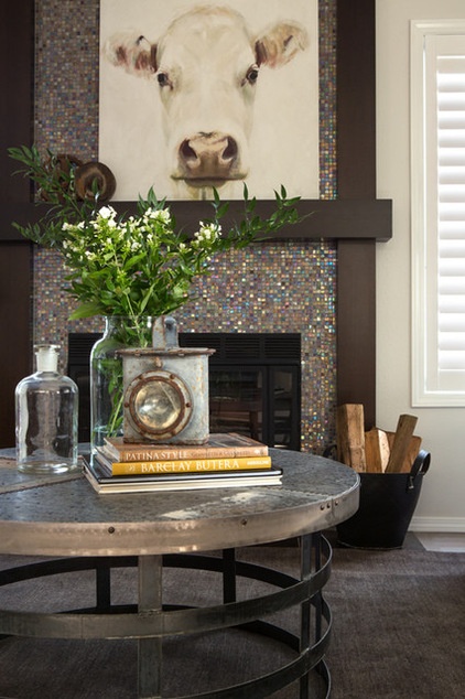
The furnishings are a mix of industrial and vintage pieces, with some hints of simple farmhouse style. The couple already had the sofa and chairs; new accessories and color transformed the room’s style. The couple fell in love with the cow painting, by then-local artist Leah Anderson, at Nordby’s shop, Piper Louie. “This painting really started the inspiration of industrial-meets-farmhouse going,” the designer says.
She helped them track down and curate unique vintage items, like the railroad lantern seen on the zinc-topped coffee table here and the motorcycle bag in the previous photo, which they use to store magazines. Fiddle leaf fig trees add life to the room. Nordby helped the couple find unique planters; the galvanized bucket is a Turkish olive basket.
Floor lamp: Pottery Barn; most accessories: Piper Louie
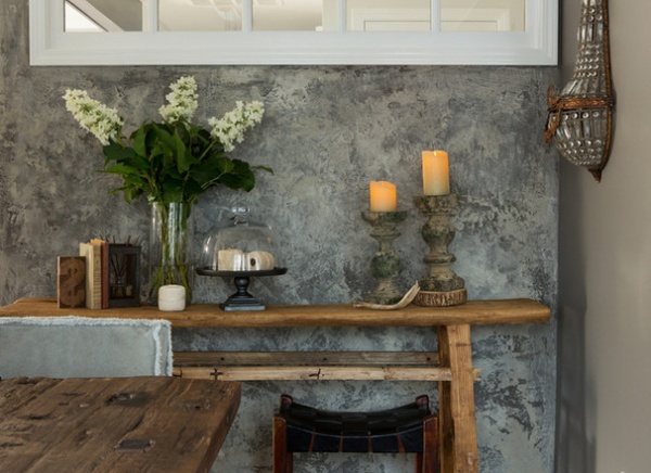
The homeowners had admired a concrete-like wall in a local store and tracked down Robert McAnulty, the artist who made it. He created this concrete-limestone accent wall in the dining room.
Nordby added this transom window over the console; it lets the area share the natural light with a dark hallway.
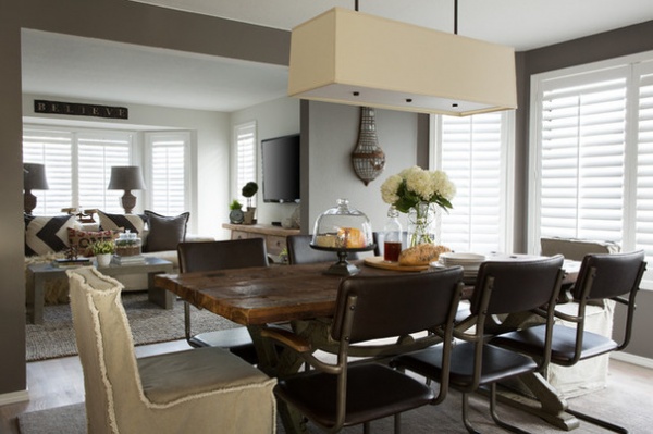
Many of the items in the dining room are salvaged or vintage. The crisp, contemporary light fixture was already here and did not need replacing. The dining tabletop was crafted from hundred-year-old wood from a dismantled dock. The French-regency-style sconces were salvaged in Egypt. They still have their original old, unsafe wiring, so they are not used as electric sconces, but they do function by reflecting the light. Nordby used shimmer throughout the remodel.
To the left you can catch a glimpse through to the comfortable family room, which is the main TV-watching space. Nordby stuck with solids and large-scale patterns on most of the fabrics, for a consistent, unfussy look.
Table: custom, via Piper Louie; end chairs: 4 Hands, via Piper Louie; side chairs: Cost Plus World Market
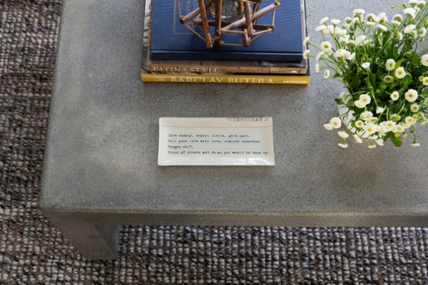
The couple’s existing solid concrete coffee table clued Nordby in to their love for industrial design.
Rug: Pottery Barn
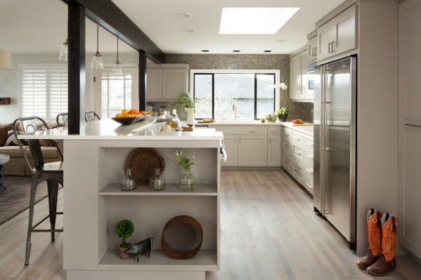
The kitchen had great bones and needed only some cosmetic changes. Nordby darkened the beam and the posts for contrast, lightened up the cabinetry, put in quartz countertops and added new hardware. She also brought in new glass pendant lights, new accessories and Tolix counter stools, which add an industrial touch.
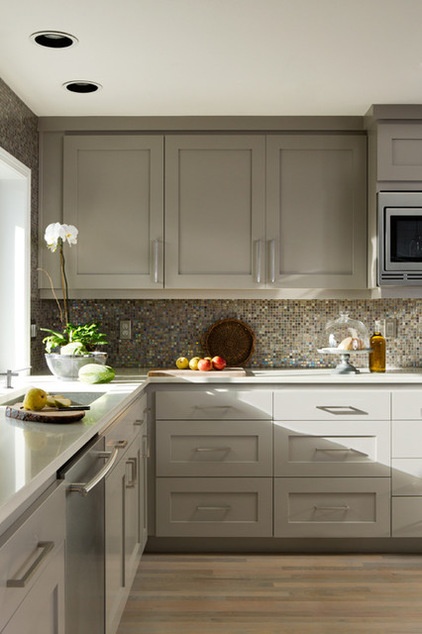
The existing mosaic backsplash already brought the shimmer to the kitchen. The simple Shaker-style cabinets bring in some farmhouse style.
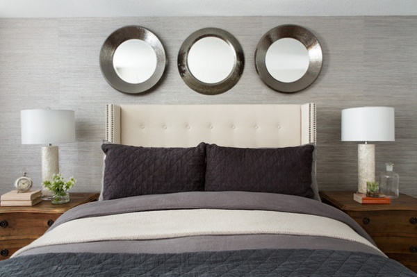
“The master bedroom is a mix of luxe and rustic,” Nordby says. She balanced a rougher wood finish on the nightstands with the shimmer of capiz shell lamps. The headboard wall is adorned in metallic grass cloth, while the headboard is upholstered in a simple linen.
Wallpaper: Golf Shore T41120 in Grey, Thibaut; bedding: Restoration Hardware; mirrors, headboard and nightstands: Piper Louie
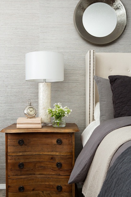
The linen headboard’s antique bronze nailheads pick up on the trio of hammered metal mirror frames overhead.
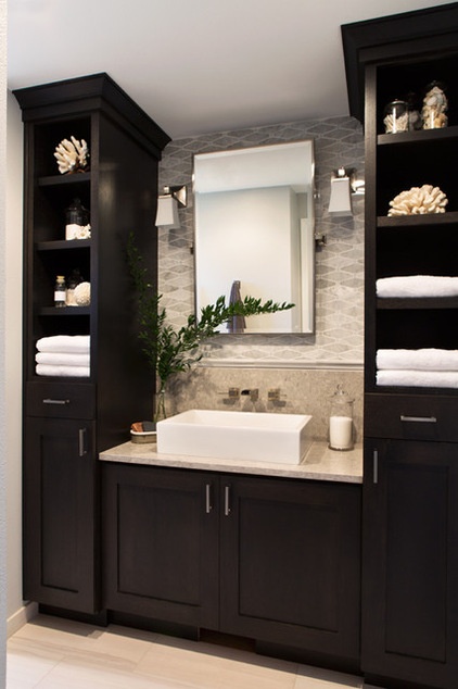
While the home now truly feels more like theirs, the couple opted for separate bathrooms. Nordby swapped the laundry room with the hall bathroom, because the laundry room had a window and the drab bathroom did not. She outfitted the modestly sized room to serve as Chris’ bathroom.
She gave it a hotel-like feel by adding a Carrara marble backsplash, quartz countertops that resemble limestone, and brushed-nickel faucets and hardware. She then surrounded the sink with symmetrical towers for lots of extra storage.
The former bachelor pad is now lighter, brighter and feels like home to Erik and Chris as a couple. “Now the home reflects both of them together,” Nordby says.
Browse more homes by style:
Small Homes | Colorful Homes | Eclectic Homes | Modern Homes | Contemporary Homes | Midcentury Homes | Ranch Homes | Traditional Homes | Barn Homes | Townhouses | Apartments | Lofts | Vacation Homes
Related Articles Recommended


