Room of the Day: A Cheerful Family-Friendly Suite for Guests
http://decor-ideas.org 06/05/2015 16:08 Decor Ideas
With her second child on the way, interior designer Kelly Rogers knew that the emergency overflow guest room on the third floor of her home would have to become the main guest room, and it was in desperate need of a makeover. “Having friends stay up here was kind of embarrassing for me, since I’m a professional decorator,” she says. The very dated guest suite in her Victorian-era home had been designed for a teenage boy living out his Greg Brady attic bedroom dreams years ago. It was full of unattractive, bulky built-ins, and the floor was covered with an old black carpet. Determined to give her guests a joyful and relaxing experience, she transformed the space into a family-friendly suite with cozy cottage style.
Photos by Eric Roth Photography
Room at a Glance
What happens here: Playing, reading, sleeping and sometimes just squeezing in as many kiddos as possible
Location: Waban, Massachusetts
Size: About 400 square feet (37 square meters)
Designer: Kelly Rogers of Kelly Rogers Interiors
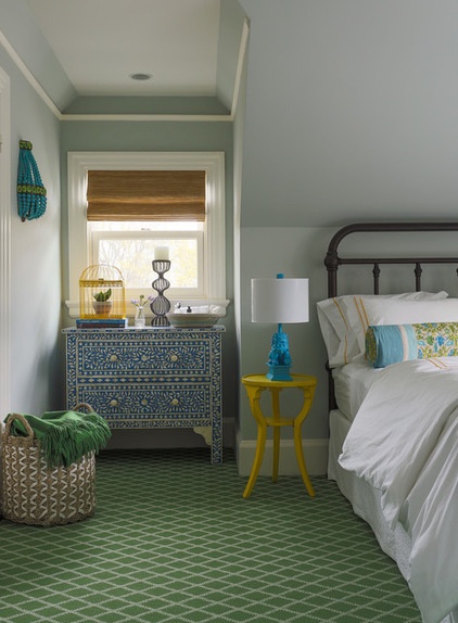
The design began with a vivid green trellis-patterned rug. “The rug really feels like you’re outdoors on grass,” Rogers says. “I wanted to keep that garden-cottage feeling, but I also wanted to make sure the bedroom was peaceful, restful and calm.” She toned down the bright hue with white bedding and a very light blue paint on the walls. The light wall paint also blurs the divisions between the ceiling and the angled eaves, which could have looked awkward and distracting if painted the wrong hue.
Rogers preferred to find pieces that fit into the room’s quirky nooks and crannies rather than build anything in. The blue bone inlay chest was just right. It was also a great fit for the global style the designer overlaid on the cottage look. “It gives a room a more collected international look, like you’ve brought things home from trips,” she says.
Ceiling paint: Sebring White, Benjamin Moore; wall paint: Cool Breeze, Benjamin Moore; bone inlay chest: Butler Specialty; yellow table: via One Kings Lane; window shades: Horizons; rug: via Williston Weaves
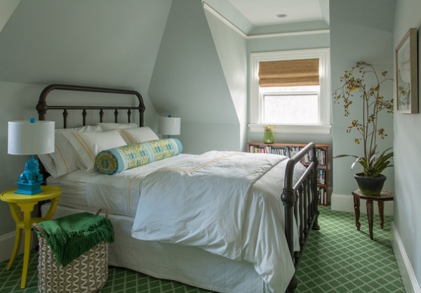
“I always like to nod to a home’s age and style,” Rogers says. Her home was built in 1896, and a bed like this one would have been a common sight in a Victorian home.
The designer is a big believer in mixing things up. The bed and bedding are Pottery Barn scores, while the custom bolster pillow is covered in a luxe fabric by Manuel Canovas.
Tip: One accent pillow can be plenty. “Sometimes just one great patterned pillow is all you need to make a bed look custom and unique,” she says. It’s also a way to bring in just a small dash of an expensive fabric where it will really count.
The new window treatments are cordless for child safety, and their wood slats add another layer of natural texture. The large orchid does as well — or at least, it looks like it’s natural (it’s faux). When no one is staying up here, Rogers estimates she comes up only about once a week and needed it to be low maintenance. The other two plants are succulents that are pretty difficult to kill.
A bookshelf that Rogers has had for years is a perfect fit for the other niche. “I love to have a little lending library for guests,” she says. “This is such a good space for reading — they have something to read when they are here, and they can take it with them when they go.”
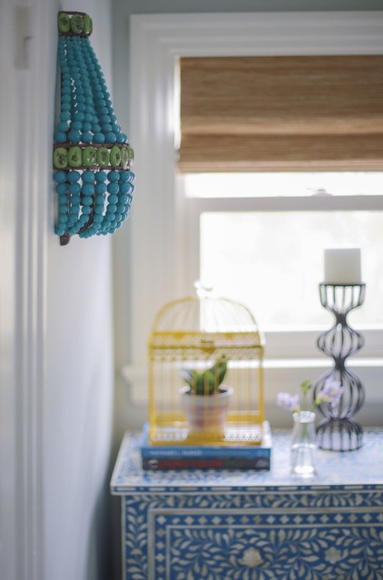
Because of the slanted ceilings and the layout, the room didn’t have much wall space for artwork. “I knew that the lighting would have to serve as my artwork,” Rogers says. She choose striking pieces, like this beaded sconce from Currey & Company, and a pair of sculptural mini foo dog lamps by Barbara Cosgrove in bright turquoise.
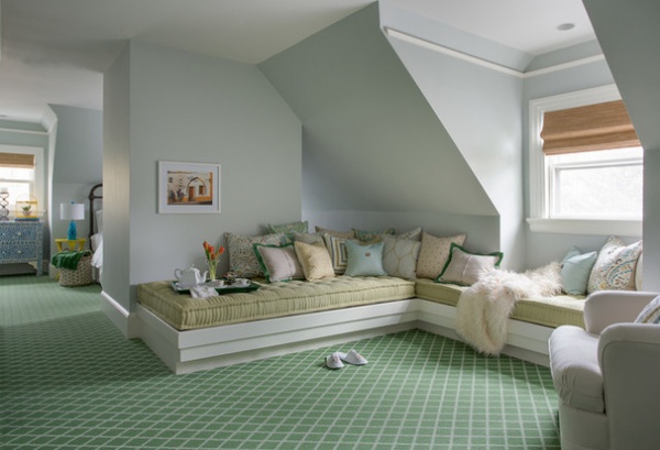
The adjacent sitting area makes the space extra appealing for visiting families with young children. Rogers had a bunch of awkward built-ins (a desk, cabinets and bookshelves) ripped out to keep the floor space open for playing or setting out playpens and blow-up mattresses.
She did keep one existing built-in element — the seating. She spruced up the daybed bases with white paint and replaced the cushions with French-mattress-style ones. “They are extra thick and very soft,” she says. The daybeds can serve as sleep spaces when entire families come stay in the suite.
The photograph, taken in Portugal, adds to the overlay of global style and was taken by the photographer who shot these interior photos, Eric Roth.
Throw pillows: Eastern Accents; photograph: Eric Roth
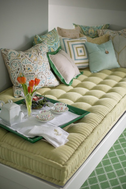
Because she went custom with the French-mattress cushions, Rogers wanted to keep the budget for the pillows in check, especially because she needed so many of them. So she ordered ready-made pillows from Eastern Accents, looking for an assortment of patterns in her color scheme.
Tip: Look for special details on ready-made pillows for a custom look. “I looked for things like decorative buttons, mitered trim and exposed zippers on ready-made pillows; these details make them look like they are custom,” she says.
An embarrassment no more, the suite is a private, family-friendly and cheerful spot for Rogers’ frequent house guests.
See more Rooms of the Day
Related Articles Recommended


