Take a Shortcut to Style by Choosing a One-Color Scheme
http://decor-ideas.org 06/02/2015 02:13 Decor Ideas
It’s a simple technique interior designers often use to give a room a sense of cohesion: Stick to one color but vary the tone and texture. While some people feel confident combining brights and prints or adding an accent shade, others find the layering of wall color, accessories, soft furnishings and other belongings more than a little daunting. If you’re a fan of fuss-free design, take a shortcut to style with these tips for decorating with tonal shades.
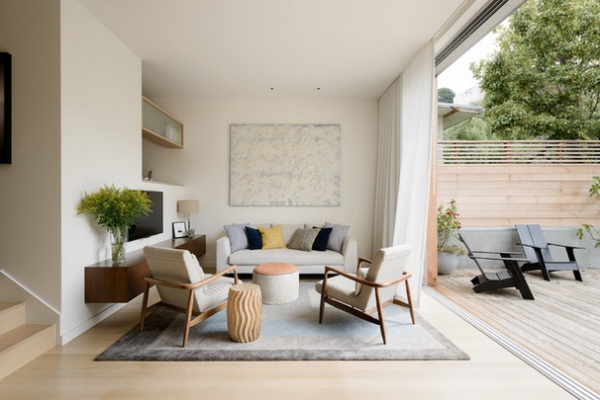
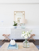
Try shades of subtle stone. Beige gets a bad rap for being boring, but a warm off-white is the ultimate base neutral for schemes where brilliant white feels too stark. With the same soft stone color used for walls, artwork, rug, sofa and chairs, this living room design feels effortlessly stylish. The colored pillows and pouf provide a subtle accent against a backdrop of beautiful beige.
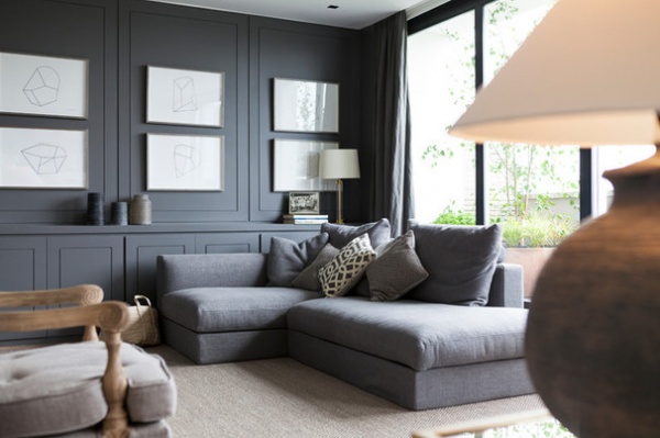
Go over to the dark side. If you prefer your interiors with a moodier hue, try combining rich blue-grays. This corner sofa is positively begging to be lounged upon in an elegant living space that will work just as well after dark, when shady gray colors appear luxe and rich. Darker-toned woodwork and coordinating linen curtains enhance the monochrome layered look.
Learn how to layer tones of gray for depth and harmony
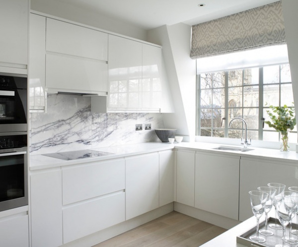
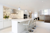
Bring in light with white. For those longing to brighten up their kitchen, white makes for a classic, cool look — but just one type of white could look austere. This cooking space has light-bouncing glossy cabinets combined with pale stone countertops for a sleek look that feels as fresh as a daisy. Recessed cabinet handles maintain the clean lines, while pale engineered oak flooring adds warmth.
For a hint of color, the dove-gray window frames and patterned blind take their lead from the veining on the marble backsplash.
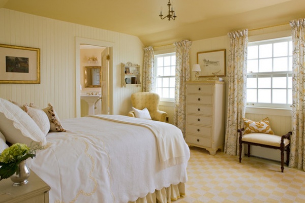
Add shine with sherbet shades. Not everyone’s cup of tea, but if lemon yellow is your happy color, why not go to town with it? Take this sunshine shade from floor to ceiling, making sure you inject lots of touchable fabrics, a few patterns and some paler tones to break up the lines.
In this bright bedroom, white bedding and a plain quilt dial down the sherbet shades (just a little).
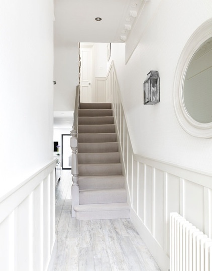
Add depth and detail. When sticking to a palette of similar colors — here, barely-there grays and whites — it’s important to add interesting textures and finishes. This handsome hallway features painted paneling in a slightly deeper hue than the one used on the upper part of the walls.
An eggshell finish is more washable than emulsion while having only a very soft sheen, making it a practical choice for this sort of hand-height woodwork.
Please Touch: Texture Makes Rooms Spring to Life
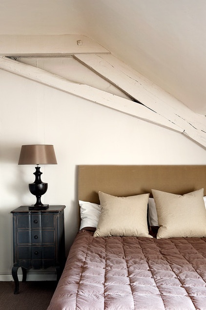
Bring back brown. Add rustic appeal to a simple scheme with underrated but oh-so-sumptuous shades of brown and taupe. In this French cottage, sludgy colors are used to stunning effect. Having the lampshade and bedspread match is key to the composition, meaning the tones of the headboard and pillows appear intentionally different.
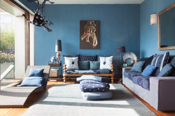
Layer luxe blues. One-color style needn’t mean sticking to a muted scheme. This lively living room has a Moroccan vibe, thanks to a host of fabulous fabrics. Various shades of blue linen — both patterned and plain — add warmth to the azure walls and pale blue rug. The wood floor and wooden sofa base inject an organic element.
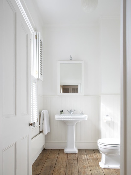
Soften with a chalky paint and wood. There are few things more pleasing (in interiors, anyway) than a pristine pale bathroom. It’s classic but contemporary, sophisticated but simple. Tongue and groove paneling is used here instead of tiles, meshing with the laid-back look of the wooden floorboards.
To soften the effect and avoid sterility in an all-white space like this one, choose a quality paint with a matte, chalky finish for a bathroom design that’s easy, chic and always in fashion.
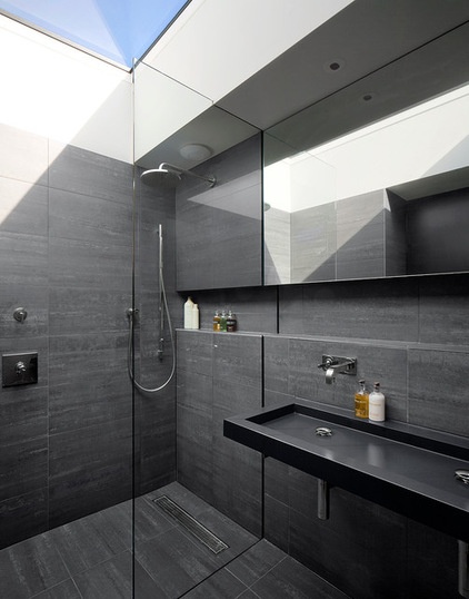
Create a soothing sanctuary. At the other end of the spectrum, an all-black bathroom with masses of tiling can also stake a claim to fuss-free design. This style works particularly well in two settings: either a room with lots of natural light, as here, or one with none.
It might seem counterintuitive to choose dark colors for a windowless bathroom, but it’s often more effective than picking pale shades, which look lackluster without natural light. Instead, embrace the dark and create a spa-like cocoon using tactile materials.
Bathed in Color: When to Use Black in the Bath
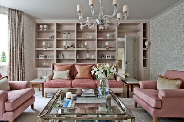
Think pink. A pink-heavy room might sound like a child’s Barbie-themed dream, but change the tone from bright to dusty, and pink suddenly makes an elegant entrance. Keep at least one area plain, as was done with the floor here; a pale gray rug forms the background for this bold suite and patterned wallpaper. Ramp up the rosy saturation even further with matching woodwork in a more muted tone.
More:
The Case for In-Between Colors
10 Ways to Make Your Neutral Palette Shine
Related Articles Recommended

