12 Genius Design Moves for Small Kitchens
Is your kitchen lovely and large, or is it on the smaller side? If it falls into the latter group, I can sympathize. I spent the better part of last year living in a studio apartment with a single-wall kitchen that was a measly 32 square feet (3 square meters). However, it wasn’t the shortage of square footage that was the problem, but rather that the cooking zone wasn’t the smartest, most efficient or space-savviest of kitchen designs. (For instance, it had no usable work area, as the sink and cooktop took up pretty much all of the countertop space.)
Since I was only renting the apartment, I couldn’t renovate the area, but that didn’t stop me from mentally writing a list of improvements I’d make if given the chance. Here are some of the design tricks I would have used to transform the spatially challenged kitchen into a cooking zone that was big on functionality, space-maximizing solutions and visual appeal, and that offered the illusion of spaciousness, too. Borrow these ideas when tackling your own cramped-kitchen makeover or, if you’ve successfully revamped a compact cooking zone for the better, share your must-try design moves in the Comments section.
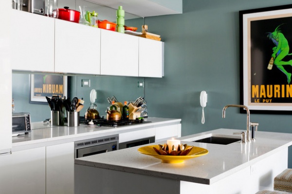
1. Add a mirrored backsplash. A strategically placed mirror works wonders when it comes to creating the illusion of spaciousness in a cramped room, as it will bounce light around and help visually elongate the walls. An easy way to introduce this reflective surface into a small kitchen is by way of a mirrored backsplash — a sneaky and extremely effective design trick used in this compact cooking zone.
See more of this kitchen
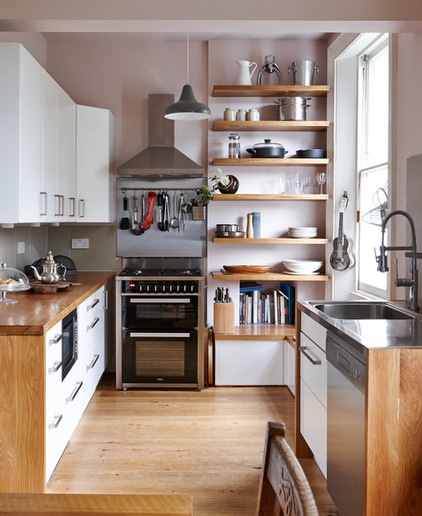
2. Be open to open shelving. While not everyone is a fan of open shelving, there’s no denying it’s a smart storage solution for rooms with a modest footprint. Not only do open shelves deliver an airy, open and bulk-free look — unlike cabinets with solid doors, which can look visually heavy in a small space — but they also ensure that kitchen essentials are easily accessible, too. Hanging storage, another functional and space-maximizing solution spotted in this cooking zone, achieves a similar effect.
If you’re eager to incorporate open shelving, just be mindful that the shelves will require a little extra upkeep to ensure that they and their contents remain dust free.
Style Your Open Kitchen Shelving Like a Pro
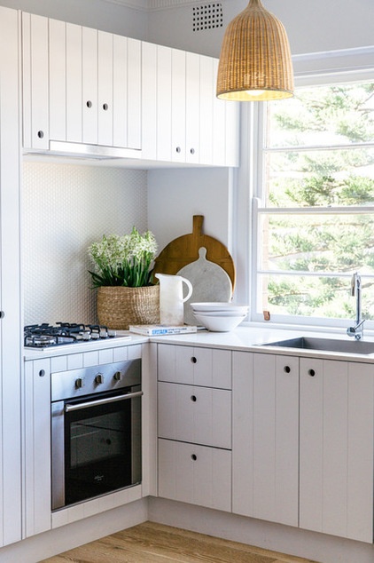
3. Opt for an all-white palette. Choosing an all-white color scheme will make your compact kitchen look light, airy and more spacious than it is in reality. If an all-white palette isn’t up your decorating alley, or you desire a scheme that offers more visual drama, opt for white walls or overhead cabinets, and try base cupboards made from wood or dressed in a dark, dramatic tone. Using white up top will enlarge the space visually, while the darker tone down below will anchor the room without making it feel closed in.
How to Keep Your White Kitchen White
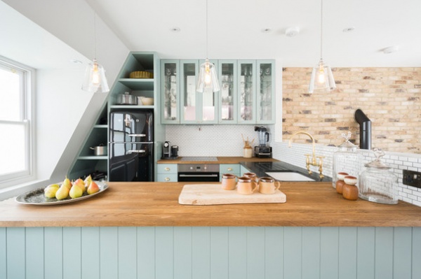
Alternatively, you might like to consider a soft neutral or pastel palette. Barely-there hues such as powder blue, mint, cream or dove gray are ideal for use in small spaces, as they add a hint of color and interest without being too overwhelming or heavy like bolder, more saturated tones, which can weigh down a compact room.
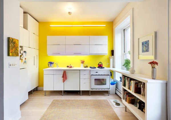
4. Fill your space with light. Flooding your room with natural light will go a long way toward making a small area look more spacious. However, if you’re restricted when it comes to window placement and size, the next best thing is to come up with a lighting plan that will brighten up and help visually enlarge your space, while transforming it into a more functional work zone, too.
This airy, cheerful kitchen is lucky enough to boast four different light sources: a generously sized window, which allows an abundance of natural light to filter into the room; a ceiling light that provides ambient lighting; a long wall-mounted fixture that illuminates the area from above and draws attention to the sunny feature wall that it’s affixed to; and undercabinet lights that ensure the countertop is well lit and showcase the suspended style of the overhead cabinets, which adds to the room’s sense of spaciousness.
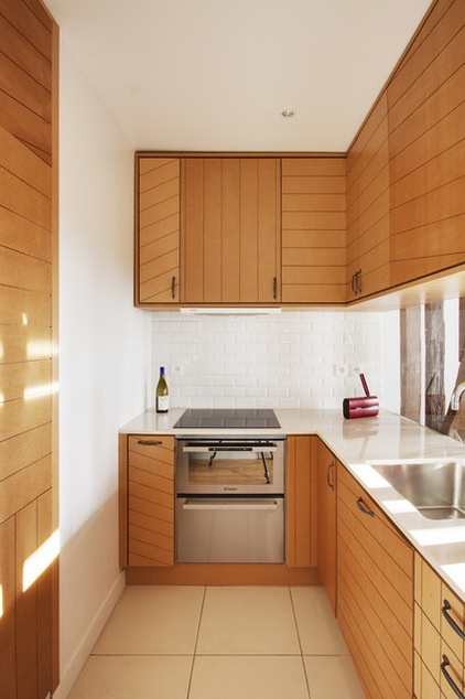
5. Create the illusion of space with horizontal and vertical lines. This striking kitchen is a study in how to enlarge a space visually by introducing vertical and horizontal lines. As you can see looking at the striped cupboard doors and panels in this compact cooking zone, vertical lines draw the eye upward and add height to a small room, while horizontal lines add depth and make narrow spaces appear wider and roomier.
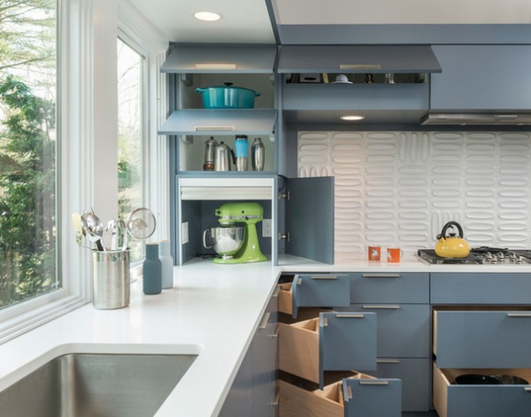
6. Incorporate space-savvy storage. A shortage in storage is a problem usually associated with small kitchens. However, this obstacle can be overcome by incorporating clever, space-maximizing storage solutions in your cooking zone — think corner drawers, appliance garages, pullout vertical pantries, drawer organizers and corner systems. Doing so will ensure that everything has a place to call home in your kitchen, cutting unnecessary clutter and visual bulk and making the area more effective to work in.
12 Great Ideas for Organization in the Kitchen
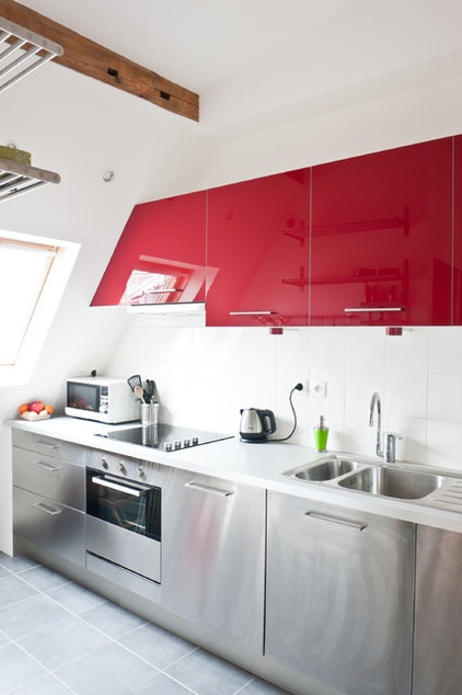
7. Go with glossy finishes. High-shine surfaces, such as stainless steel, two-pack polyurethane and ceramic tiles, will not only inject your kitchen with interest and sleek sophistication, but will amplify the natural and artificial light in the room, making the area appear more spacious.
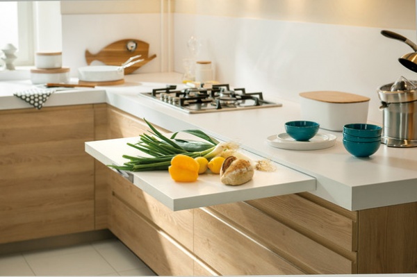
8. Choose a countertop that works double time. Since space is at a premium in small cooking areas, it’s important that every surface, material and design element earns its keep, even your kitchen countertop. While countertops have a practical purpose — as food prep surfaces and general workspace — they can also double as a space to stash kitchenware (such as the crafty pullout chopping board pictured here), which will help keep your counter and cupboards free of physical and visual clutter. Other space-saving, cleverly concealed countertop accessories you might like to consider include a built-in utensil holder, condiments organizer, knife block or bread box, each of which sits flush with the top of the counter.
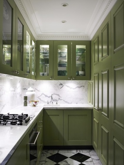
9. Choose glass-front doors. Like open shelving, glass-front cupboards trick the eye into thinking a compact kitchen is more generous in size, but with the benefit of keeping the contents of your cupboards free from dust and cooking splatter. Just remember to keep things nice and orderly inside for a clean, clutter-free look.
Another perk of decking out your cooking zone with glass cabinet doors is that you can easily see what items are stashed inside your cabinets and when you’re running low on pantry items, resulting in a more efficient space to work in.
8 Beautiful Ways to Work Glass Into Your Kitchen Cabinets
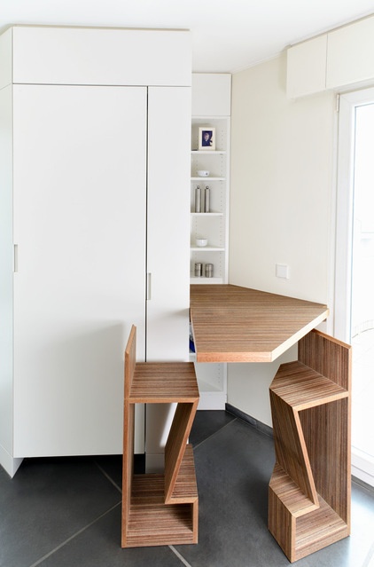
10. Fit in a cleverly concealed table for casual eats. Don’t have room for a breakfast bar or dining table in your kitchen? Take design cues from this crafty space and incorporate a foldable table that can be tucked out of sight when not in use. The geometric chairs slide into the nook below, so as to not take up precious floor space and to enhance the room’s clean, seamless look.
See more of this kitchen
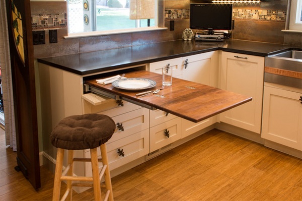
Another space-savvy solution is to equip your countertop with a pullout table, like the one shown above.
See more of this kitchen
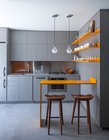
11. Stick with clean, slender lines. Resist the urge to decorate your compact kitchen with fussy design elements and decor that will crowd it and add unnecessary visual bulk. Instead, stick with features with clean, simple lines that are visually lightweight and don’t consume too much floor space.
This design trick takes shape in several ways in this small yet stylish kitchen. Note the slim breakfast bar, floating shelves and leggy bar stools; the use of finger pulls instead of bulky handles; and the simple industrial-style exposed bulbs, which draw the eye up to the ceiling, adding to the illusion of space.
See more of this kitchen
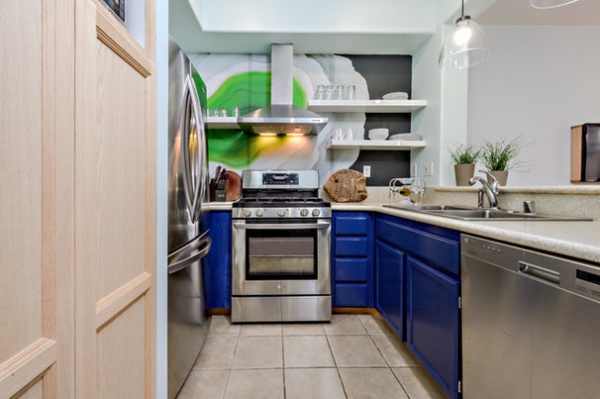
12. Master the art of distraction. A high-impact feature wall not only will inject visual drama into a compact kitchen, but will also add depth and draw the eye down the length of the room, making it appear longer and more open. This contemporary kitchen proves just how successful this design trick can be when done right.
See 20 fabulous feature wall ideas
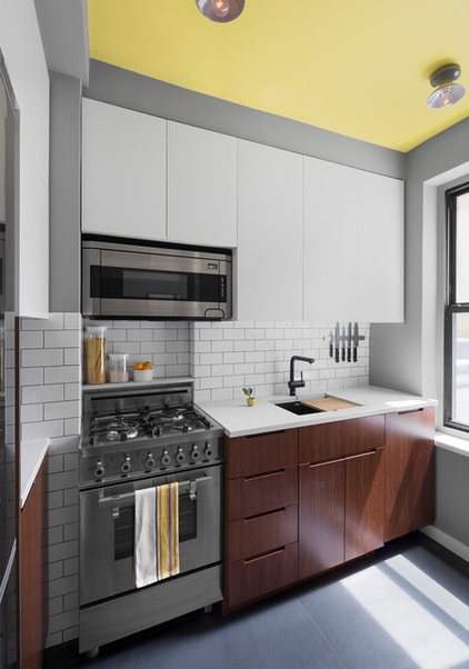
Likewise, a statement ceiling will also amplify the height of a kitchen that has diminutive dimensions, while doubling as a showstopping focal point. Take design cues from this compact cooking zone and paint your ceiling a bright hue (steer clear of moody colors, like black and dark gray, which will visually lower the roof and make the room appear more intimate). Alternatively, you might like to lift the look of your ceiling with wallpaper or a mirrored surface, or try a recessed ceiling with LED lighting.
14 Ceiling Treatments That Will Make You Want to Look Up
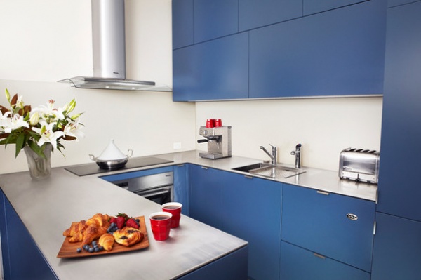
Tell us: Do you have any small-kitchen design ideas? Share them in the Comments.
More:
Personal Spaces: Small-Kitchen Designs
10 Big Space-Saving Ideas for Small Kitchens


