New This Week: 3 Amazing Kid Rooms That Will Make You Rethink Your Life
http://decor-ideas.org 05/30/2015 03:13 Decor Ideas
Ask an adult what special feature they’d want in their dream bedroom, and you’re likely to get a practical yet boring response. Ask a kid, on the other hand, and suddenly you find yourself imagining the possibility of waking up each morning and taking a water slide down to the breakfast table.
And that’s the realm in which the following kids’ spaces — gathered this week from the room photos uploaded by their respective designers — operate. OK, there’s no water slide, but indoor swings, swinging beds and even a pirate’s crow’s nest make a reality out of the fantastical possibilities that can only come straight from the mind of a child.
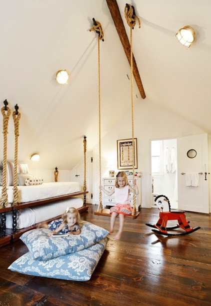
Designer: Elizabeth Georgantas of PEG Properties & Design (also the homeowner)
Size: About 700 square feet (65 square meters)
Location: Nantucket, Massachusetts
The vision: “We wanted it to be somewhat of a historical, Nantucket classic feel but updated, and have some more modern amenities and comfort to it,” says interior designer Georgantas, who designed the space for her two daughters. “There is an eclectic mixture of antiques and modern furniture throughout.”
Plan of attack: “I wanted to create a bedroom that was for more than just sleeping. I wanted something playful and inviting. My first plan of attack was to figure out how to maximize the space for sleeping arrangements. From there, once I designed the bunk beds, I chose fabrics, furnishings, paint etc.”
Why it works: “This room is unique because it has pitched ceilings, which is why we were able to get the hanging beds to be designed the way we did. The pitched ceilings allowed us to maximize the functionality of the space by pushing the beds to the outer walls and using the center of the room as a playspace.”
What wasn’t working: “I think the only thing that was difficult and didn’t work out well was the lack of storage space. Normally to increase storage we would utilize the space under the beds, but since we did trundles, storage was limited. In order to solve this, we ended up cutting into the bathroom space to accommodate a walk-in closet.”
Get in the Swing of Things With a Hanging Bed
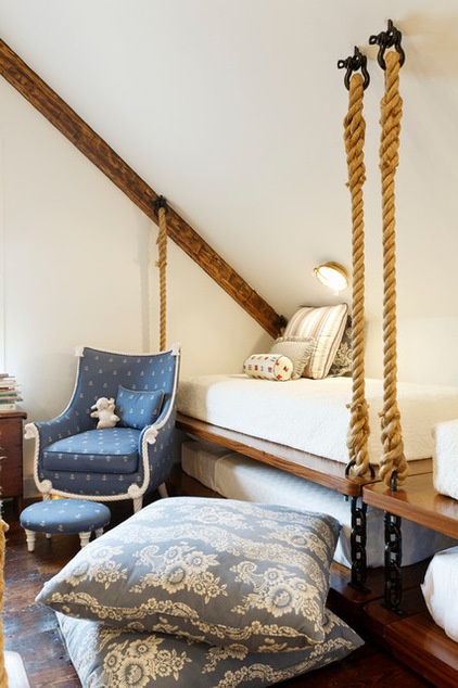
What goes on here: “The space is a classic bunk room designed to accommodate many people for sleeping, as well as a playspace for the kids.”
Designer secret: “I made a lot of throw pillows that could be used on the floor for lounging as well as on the beds. Varying the sizes to accommodate sleeping as well as lounging on the playroom floor was a key component to making this room feel cozy. The pitched roof also allowed for a swing, which adds a playful component.”
“Uh-oh” moment: “One challenge that we faced was how the peaked roof angled all the way to the floor. We had to figure out the minimum amount of space we could have above the beds without hitting your head when you sit up, but also leave room for the trundle beds to roll out and still have enough space to walk in between.”
Splurges and savings: “I used inexpensive tile so I could do a custom, more expensive vanity.”
Take-away: “I learned a new process to replicate the original plasterwork that would have been used 100 years ago. I was able to find someone to re-create the process.”
The nitty-gritty: Hanging beds: custom by Elizabeth Georgantas; coverlets (top bunks): Ralph Lauren Home; Euro pillows: Osborne & Little (fabric), Kravet (trimmings); neck roll pillow: Kravet (fabric), Berkley House (trimmings); large floor pillows: custom by Elizabeth Georgantas; dresser: vintage; rope chair fabric: Duralee; throw pillow on chair: Martain Group with Duralee fabric; artwork: vintage; rocking horse and trunk under window: Brimfield antiques market; Roman shade fabric: Schumacher
Team involved: Paul Curtis (architect); Elizabeth Georgantas (interior designer)
See more photos of this home
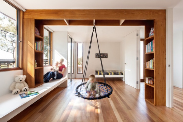
Designer: Lynnsay Prunotto of Lume Architecture
Location: Northeast Melbourne, Victoria, Australia
Size: About 250 square feet (23.2 square meters)
Homeowners’ request: “The homeowners — a couple with three young children — were looking to build a sustainable, practical home to a budget,” says designer Prunotto. “When we suggested opening up between the two boys’ bedrooms whilst the children were young, to create playspace, the owner said how nice it would be to hang an indoor swing between the two spaces for the boys to play on. Thus, we designed a shelving unit that extended up and overhead to create the necessary structure.”
Plan of attack: “This space is part of a whole new house designed by Lume Architecture for a Scandinavian-born couple that has chosen to settle with their young children in amongst the gum trees in northeast Melbourne. Rather than creating a bedroom for each of the two young boys, a single, flexible space was created that can easily be subdivided, at a later stage, into two rooms — with desks under the window and room divider shelving — if the children feel they need more privacy and independence as they grow older.”
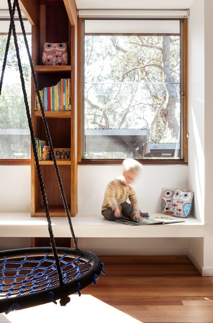
Why it works: “The idea of opening up between the two bedrooms for the young children has created another space within the home in which to experience life as a family. The design works really well within the context of a compact house, as it allows the bedrooms to become multifunctional by doubling up as a playroom. The beautiful natural light, natural timber flooring and walls painted in a soft white make it inviting, as does the lack of clutter. Having most furniture built in allows space for recreation — reading or indoor play — in the center of the room.”
What goes on here: “The children love to run around inside. Unusually, the parents have no objection. Thus, this room is part of a bigger running circuit that the kids take to before bedtime. It is also used for reading or looking at picture books, swinging and general play, as well as for sleeping in, of course.”
Designer secret: “Natural lighting from two directions makes this a light-filled room in the morning and during the day. A simple palette of neutral, low-sheen finishes provides a serene backdrop to life in all its color and glory. Taking windows and doors all the way up to the ceiling will make any room, even one with a relatively low ceiling, feel spacious. [Closets] with floor-to-ceiling sliding mirror doors extend the spaces and reflect the light.”
“Uh-oh” moment: “There was a moment during construction when we hesitated. I hadn’t designed a flexible space like this before and suggested to the owner that maybe the bookshelf–room divider should be left out. The owner looked so disappointed that we immediately resolved to make the shelving unit and window seat work.”
Splurges and savings: “This house was built to a tight budget, so inexpensive finishes were selected generally, whilst the splurge consisted of investing in good-quality products where it was important — for example, in windows with solid timber sections and easy-to-use opening mechanisms that should last a long time, and in fully tiling the bathrooms to make them easy to keep clean.”
The nitty-gritty: Flooring and bookshelf: Victorian ash, sanded and sealed by Anro Floorcare using Livos oils; wall and seat paint: Whisper White in low-sheen Aquanamel, Dulux; closets: Regency Wardrobes and Shower Screens; bed, swing and toys: supplied by homeowner
Team involved: Lynnsay Prunotto of Lume Architecture (architect); Marco Prunotto of Lume Projects (builder)
See more photos of this home
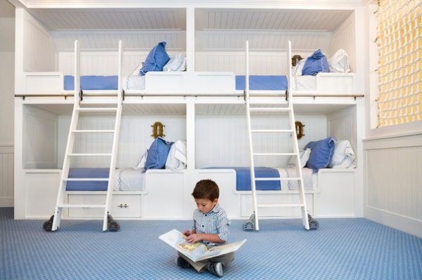
Builder: Charles Croom of Croom Construction Company
Location: Vero Beach, Florida
Size: About 450 square feet (41.8)
Homeowners’ request: “The homeowners requested [that] a fun, themed playroom be designed and built that was appropriate for the style of their waterfront location and their grandchildren,” says builder Croom.
What wasn’t working: “When the homeowners bought the house, the attic space was basically a large storage room that had lots of potential, including maximizing a fantastic waterfront view from the third story. The homeowners were willing to invest time and expense to make the room a functional space.”
What goes on here: “The nautical-themed room, complete with pirate crow’s nest and laser-cut tile made to resemble water, is perfect for the homeowners’ grandchildren and their friends. With four bunk beds, a half bath and toy storage area, it’s a child’s dream.”
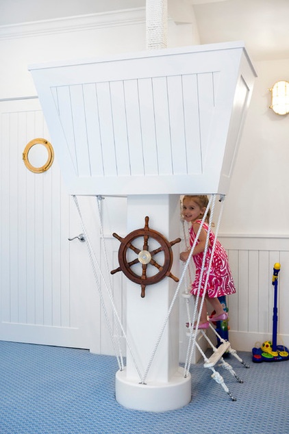
Who uses it: “The homeowners are from New York, and they have grown children and young grandchildren. They are very active — both play golf, tennis and enjoy kayaking on the Indian River lagoon. The kids’ playroom reflects the family’s outgoing, active lifestyle and personalities. During the Christmas holiday, the family experienced an African safari together.”
Designer secret: “During the discovery period, we realized the clients loved and appreciated antiques, so wherever possible, we selected antique design elements, such as the antique ship’s bell, roping and nautical lighting.”
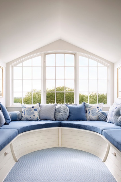
“Uh-oh” moment: “Since this third-floor space was basically a large attic–storage room, there were engineering challenges to overcome in order to protect the rest of the home during the renovation process. Adding a bathroom required roughing in all lines and rerouting existing utilities without disrupting plumbing throughout the rest of the house.
“The dormer room was also added to increase square footage and create the bow of the ship. In order to add the dormer, we had to crane in 20-foot structural beams over the top of the house, open up the roof and lower the beams in for construction. All this transpired without disrupting the use of the whole house throughout the project.”
Splurges and savings: “The homeowners spared no construction or interior design expense. It was more important to them that the themed design was authentic and the new additions not look like an afterthought. In other words, the room added impressive aesthetic appeal and functionality while also increasing the value of the home.”
The nitty-gritty: “Antique materials were used where appropriate. For example, the ship’s hull (the dormer window area) has a real ship’s bell on the wall from an old ship, and the rope hanging along the entrance area is authentic ship rope. Laser-cut glass tiles were used in the bath’s floor and shower walls to resemble the ocean. Nautical lighting was installed along each of the bunk beds.”
Team involved: Croom Construction Company (general contractor); Rob Atkins (architect); Maria Companion (interior designer)
See more photos of this home
Related Articles Recommended


