My Houzz: Simplicity and Serenity in a Vintage-Modern Remodel
http://decor-ideas.org 05/29/2015 02:13 Decor Ideas
When Ira Waxberg and Akiko Muratani began remodeling their 1914 Craftsman home, they sought to incorporate their simple, minimalist lifestyle — inspired by many years of living in Japan — into the new design of their home. “We wanted something unabashedly modern,” Waxberg says.
After visiting a nearby musician’s studio completed by Seattle’s Shed Architecture and Design, Waxberg knew he wanted to work with architect Thomas Schaer and his team. “There was no question I had the right people,” says Waxberg of his experience collaborating with Schaer, Shed project manager Alex Hale and contractor Lasting Nest. The result: a remodel that preserves Craftsman touches but has a distinctly modern and Japanese-inspired design.

Houzz at a Glance
Who lives here: Ira Waxberg, Akiko Muratani and their daughter, Sophie
Location: Magnolia neighborhood of Seattle
Size: 1,870 square feet (174 square meters); 3 bedrooms, 2 bathrooms
Year built: 1914
Designer: Shed Architecture and Design
“We trusted each other’s judgment,” says Hale of the early design connection between Shed and the homeowners. “It became obvious that we wanted to design something special and smart and take some risks.”
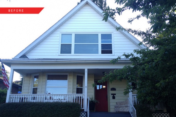
BEFORE: Waxberg and Muratani knew the 1914 Craftsman had potential when they found it hidden among the midcentury homes of Seattle’s Magnolia neighborhood. So did the team at Shed. “The exterior presence was simple and classic with limited updates, while the interior had been modified over time,” Hale says. “It was obvious [that] remodel work over the years had reduced the inherent charm that this house once had.” That left the couple and the design team free to give the home’s interior a new feel.
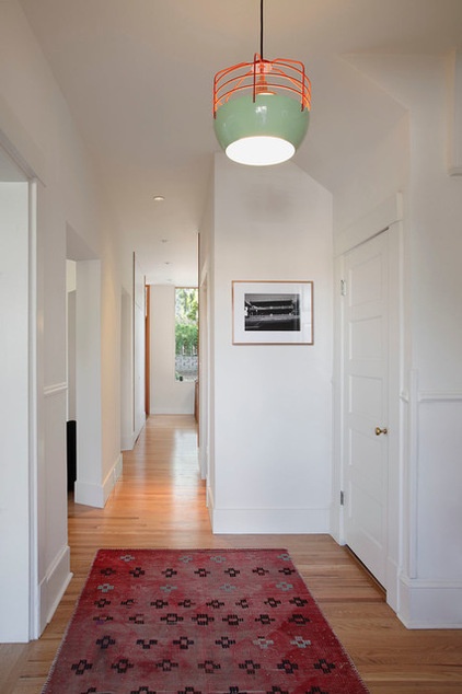
AFTER: The original plan of the home was typical of the period, a progression of small spaces separated by angled walls. With a few key revisions, Schaer and Hale created views straight through from the front door to the kitchen window and backyard without opening the space completely. “There is still some privacy and some mystery at that point, even though the circulation is very open,” Schaer says.
Wall paint: Atrium White, Benjamin Moore
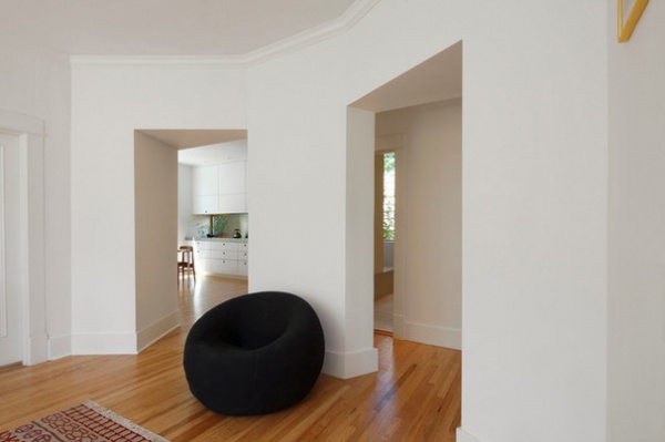
Large openings provide an open flow between living spaces, create views into the kitchen and allow light to penetrate and circulate through the space.
UP 1 lounge chair: B&B Italia
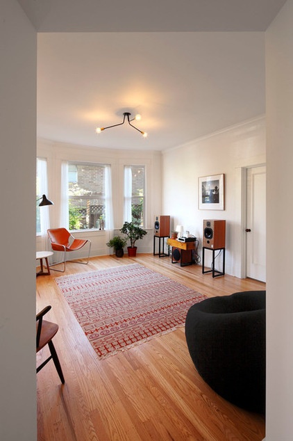
Waxberg, a software developer, studied design in college, and his interest in modern art and architecture influenced the decor.
Though sparsely furnished, both living spaces showcase a curated selection of furniture, objects and light fixtures. Installing new and unique light fixtures in old rooms played a major role in transforming the feeling of each room.
Ceiling light: onefortythree
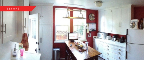
BEFORE: Waxberg says a missing appliance started the entire remodel. “You may find this hard to believe,” he says with a laugh, “but we didn’t realize the kitchen was missing a dishwasher until after we bought it.” With no place to add one in the existing layout, the family decided the house needed a bigger remodel than originally planned.
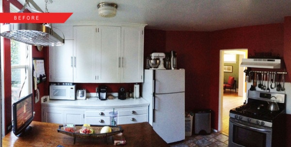
BEFORE: The couple began collaborating with Shed on a new layout for the back half of the house. “Other owners and designers may have decided to start from scratch instead of remodeling,” says Schaer, “but we see the project as sustainable in the sense of extending the life of a genuine and nice home while reworking only a fraction of the house.”
Schaer also credits contractor Lasting Nest with the initiative and drive to realize the remodel’s design. “They brought another critical level of care to the project,” he says.
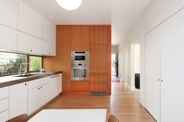
AFTER: Shed designed the kitchen to be the social heart of the house. Included in the new space is an informal dining area, a laundry closet and a traditional Japanese genkan nook for removing shoes at the backyard entry into the kitchen.
Though most of the materials in the kitchen are a modern departure from the rest of the home, the new oak flooring mimics the existing top-nailed thin-plank oak flooring found in the adjacent living spaces. The transition between old and new is nearly flawless.
Oven and microwave: Bertazzoni; refrigerator (concealed by vertical-grain fir cabinetry): Leibherr
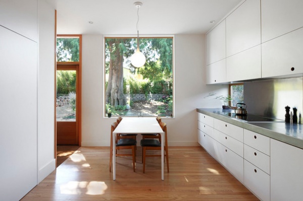
The new picture window above one end of the dining table has been placed to capture a view of the magnificent cedar tree in the backyard. It sets the modern tone of the new space with its lack of trim and extension to the underside of the ceiling.
Table: Arper Nuur; Castore pendant: Artemide
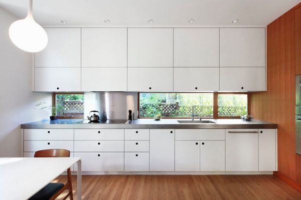
A long linear window bathes the countertop in natural light and lets in a glimpse of greenery. The stainless steel countertop and white laminate plywood cabinets were chosen for their clean look and durability.
Countertop and integral sink: Metal Masters Northwest; cabinetry: Salmon Bay Woodworks; cooktop and range hood: Bertazzoni; dishwasher: Miele
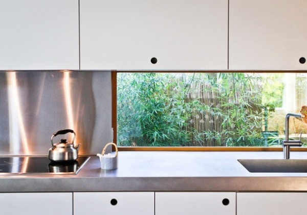
The homeowners elected to use simple round holes in the cabinetry in lieu of protruding hardware, complementing the minimalist aesthetic of the kitchen’s materials. “There are two kinds of people,” Waxberg says. “People who love the way we designed the hardware, and people who ask when it’s going to be installed.”
Livello stainless steel faucet: KWC
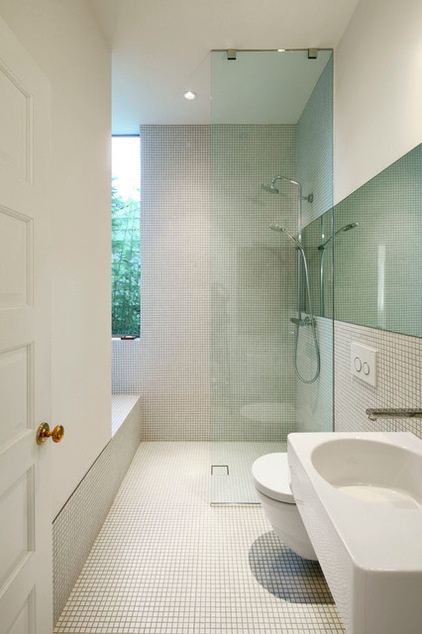
White ceramic mosaic tile stretches from floor to ceiling in the new guest powder room that was inserted off the hallway behind an original five-panel door.
Showerhead: Hansgrohe; toilet: Duravit; Sigma 20 Flush Panel: Geberit; ceramic tile (similar): 1-inch by 1-inch Keystones mosaic tile in Arctic White, Daltile
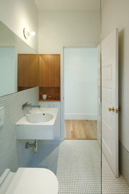
A wood medicine cabinet on the wall just inside the door adds a natural touch to the room and echos other wood trim and walls found throughout the home.
Sink: Duravit; sink faucet: Hansgrohe
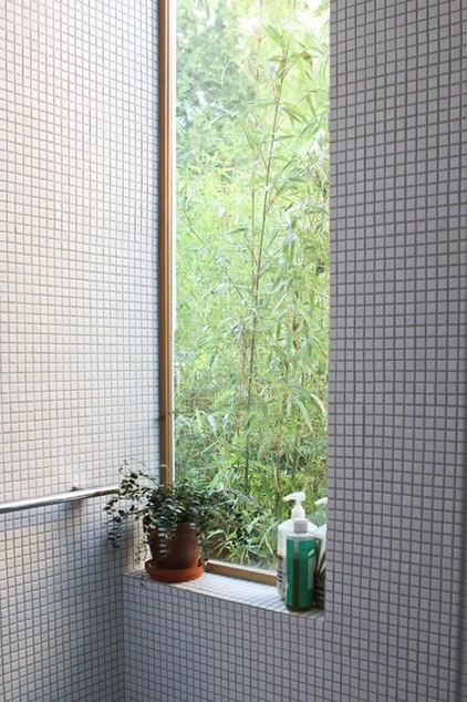
White mosaic tiles around a tall, narrow window frame a view into the side yard.
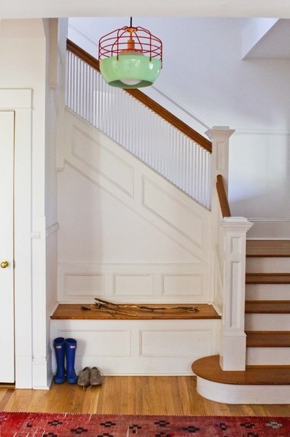
A bow and arrows made by daughter Sophie rest on the existing entryway bench, where visitors are politely asked to remove their shoes upon entering the home.
Bluff City Pendant: Roll & Hill
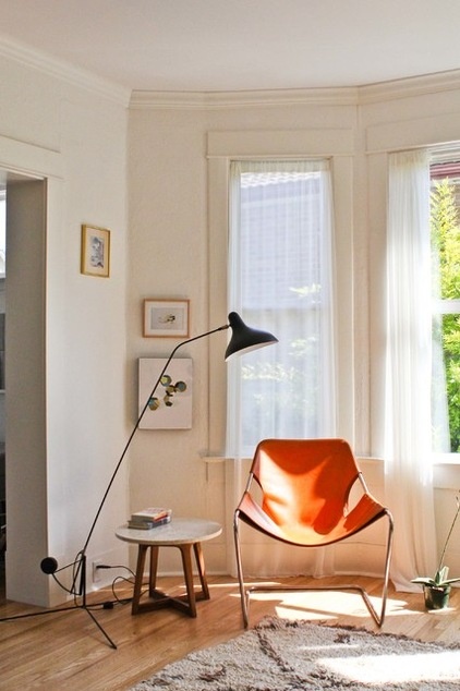
With the cost of the remodel exceeding their initial budget, Waxberg and Muratani purchased most of their furnishings secondhand from thrift shops or online.
Paulistano armchair: Design Within Reach; Mantis floor lamp: SCP; side table: Lane Company
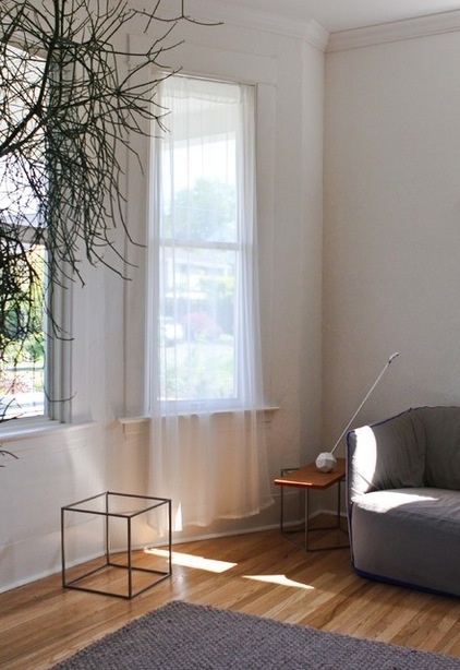
Minimalist sheer window coverings allow natural light to fill the house. The overall result is a bright yet calm space.
Thatch rug: Design Within Reach
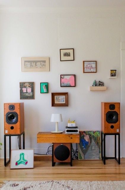
Artwork done by Waxberg, family members and friends hangs throughout the living areas and the hallway. The couple display pieces that are meaningful and eclectic.
Area rug: Beni Ourain, Maroc Tribal
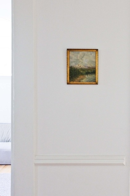
Original 1914 chair rails, ceiling trim and cased openings that were not affected by the remodel were retained and touched up. Waxberg and Muratani wanted to honor the home’s existing vintage details but, as Hale says, “sticking with the Craftsman aesthetic was not desired for the remodeled spaces.”
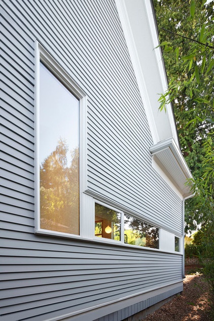
New contemporary windows are trimmed in Craftsman-style trim and beadboard to meld the home’s modern and vintage aesthetics.
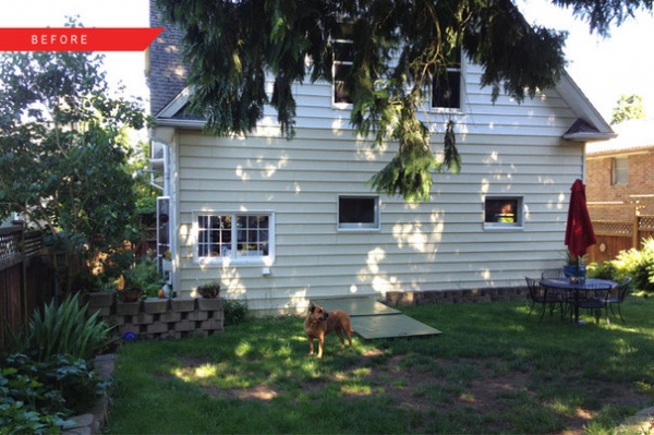
BEFORE: The remodel included the installation of new siding, insulation and an efficient heating system.
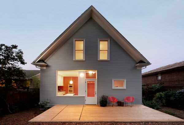
AFTER: Shed was able to avoid relocating the existing crawl space access hatch by ingeniously integrating it into a new wood deck. The large kitchen window and transparent back door open the home to the garden, creating a “third place” where the family can enjoy meals outdoors.
Solair chairs: Innit Designs

One of Sophie’s favorite parts of the remodel hangs from the backyard’s cedar tree: an extra-long swing installed as a favor by Lasting Nest. She’s pictured here hanging out with a friend.
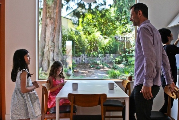
Sophie (left) and a neighborhood friend hang out during afternoon tea, with Heath Ceramic mugs on the table. While Waxberg (pictured with Muratani behind him), claims that Shed was responsible for the remodel’s success, Schaer insists that “this project would not have been the same with different clients. Ira and Akiko were a fundamental part of the design team.”
For the homeowners, the admiration is mutual. “We feel lucky to be here,” says Waxberg.
My Houzz is a series in which we visit and photograph creative, personality-filled homes and the people who inhabit them. Share your home with us and see more projects.
Browse more homes by style:
Small Homes | Colorful Homes | Eclectic Homes | Modern Homes | Contemporary Homes | Midcentury Homes | Ranch Homes | Traditional Homes | Barn Homes | Townhouses | Apartments | Lofts | Vacation Homes
Related Articles Recommended


