Houzz Tour: A Family-Friendly Home Keeps Its 1930s Charm
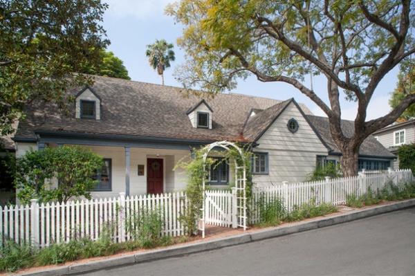
This Los Angeles house lured in its current homeowners from the curb. Both hail from New England and fell in love with the mature trees around the house before they even stepped inside. The 1930s architecture called to them as well. “I knew with two small kids we’d never be able to keep up a pristine modern look,” says homeowner Holly Kretschmar, who was attracted to the vintage home’s style. The architecture reminded both of them of the beachy, relaxed feeling of houses they’d stayed in on Cape Cod, Massachusetts, when they were growing up.
However, the house was far from move-in ready, with a warren of small rooms, strange hallways and a big box of a two-story 1970s addition. After a meeting with architect Jeff Troyer, the couple knew he was the one who understood their vision of updating the layout to something more open without losing the integrity of its authentic 1930s feel. The project’s potential grabbed Troyer right away as well. “I was so excited about this project from the very first meeting,” he says. Working closely with Kretschmar, he created a home that works in harmony with the family’s lifestyle while retaining the charms of the era in which it was built.
Photos by Lee Manning Photography
Houzz at a Glance
Who lives here: A couple and their 2 children
Location: Los Angeles
Size: 3,469 square feet (322 square meters); 5 bedrooms, 3½ baths
Year built: 1938
Having grown up in New England, both homeowners were drawn to the kinds of houses they enjoyed spending summers in on Cape Cod. But the real clincher with this charming property was the beautiful mature trees. “In the back we have a mature pear, an elm, a pittosporum and an avocado tree,” Kretschmar says. The large tree out front on the right is a jacaranda, which has lovely purple blooms.
Learn more about some of L.A.’s most iconic trees
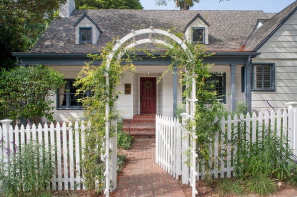
Once overrun with ivy, the front yard has been cleaned up, but some of its wild cottage charm has been kept. The couple worked with the landscape designers at Oakley Gardens, who specialize in drought-tolerant, sustainable, edible and native landscapes that attract wildlife.
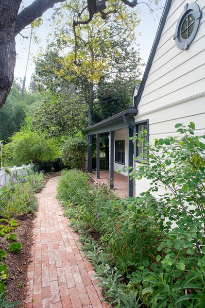
The fence, arch, brick pathways and plantings were all part of the landscape redesign.
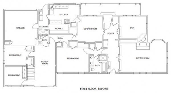
BEFORE: This is the first-floor plan before. To help orient you, the entry is at the top of the plan. As you can see, the rooms were chopped up and closed off, and hallways wasted a lot of space. “It was a warren of tiny, dark rooms and it was like navigating through a maze,” Troyer says. “There was a funky addition from the 1980s [left] that was just a big box. It wasn’t really integrated with the rest of the house.”
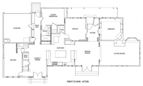
AFTER: In addition to eliminating hallways and creating wider openings between rooms for a more open feel, Troyer swapped the kitchen and dining room with the original master bedroom suite, so that there was an easy flow between the living room, dining room, kitchen and family room–playroom.
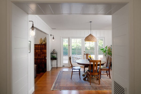
This is the view from the foyer to the dining room. This space along the back of the house used to be a hallway and a bathroom. Troyer mimicked the home’s original tongue and groove paneling and wrapped the 4-foot-deep opening between the foyer and the dining room in it. “The deep opening gives the opening more of a presence and helps the transition from the foyer to the dining room,” he says.
The dining room is open to the kitchen on the right, and to the living room on the left. While opening up and reconfiguring the layout, Troyer was careful to save and reuse light fixtures, doorknobs and other bits of the home to help it keep its original feel. They procured the oak floors from another old house. “It was painstaking process, but one of the homeowners was set on having floors like he’d had in the house where he grew up,” the architect says. “He loved all of the pocks and nicks, and we went through many stain and texture samples.”
“I love to find pieces that have been around longer than we have and that will be around long after we’re gone,” Kretschmar says. “Knowing it’s been made slowly and carefully with hard work gives a sense of humility.” She is willing to hunt for just the right piece for a space. She scored the classic oak claw-foot dining table base on the curb on trash day, then found the top at a thrift store.
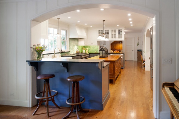
This is the view from the dining room into the kitchen. While the open feeling is more modern, the arched opening and paneling, furniture choices and small details, like the brackets under the countertop, keep the spirit of the 1938 architecture intact.
Being so involved in the design process let Kretschmar really define her approach to design. “I discovered that I have a philosophy about giving our home a sense of soul. In every room I tried to put something alive, something old and something handmade,” she says. “I like to see a plant or flowers in every room, as well as something that’s older than I am, and something that was crafted by hand, even if it’s a colorful doodle drawn by one of our boys.”
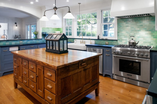
Kretschmar searched and searched for the right piece for the kitchen island, seeking something with warmth and character that would also fit the space. She finally found this antique school science lab table online and had it shipped from Ohio. “She found all of the furniture, and she has an amazing eye,” Troyer says. “She’s super organized and methodical, and has a knack for finding great pieces.”
“It’s the largest sight-unseen purchase I’ve ever made,” she says. “But oak and brass are the way to my heart; it was love at first sight.” Her kids love it too and have their own special drawers for their things. The surface displays another one of their favorite things, their snail terrarium. The way the home’s design would work for her children was always at the forefront of Kretschmar’s mind.
Tile: Heath Ceramics
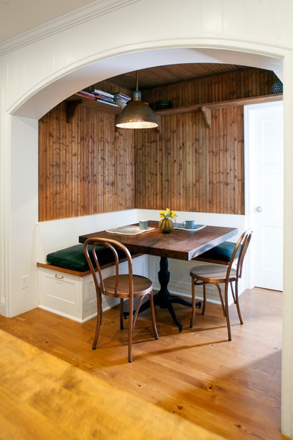
This built-in breakfast nook is just off the kitchen (that’s the island countertop you see in the bottom left corner). It used to be one of the hallways that they eliminated during the renovations. “We added stained beadboard to the cozy little nooks all over the house,” Troyer says. The beadboard is another great period touch. The banquette has storage built in underneath. The claro walnut table was made by the Offerman Woodshop collective.
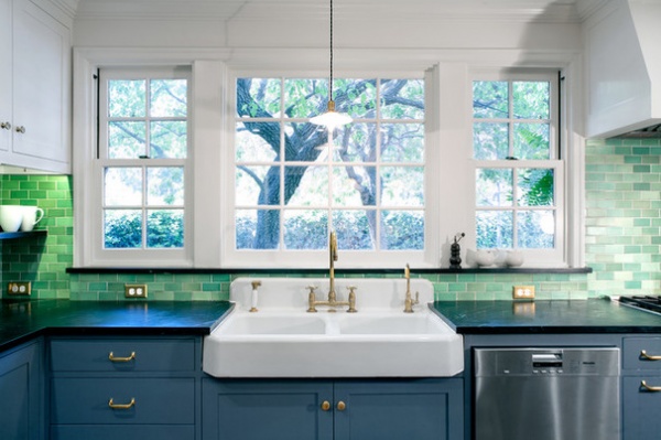
The kitchen sink is a salvage-yard find. “You’d never know by looking at it, but installing this sink was probably the most complicated part of the whole project,” Troyer says. “It had some strange angles, the bottom was unfinished, and old sinks aren’t as deep as today’s sinks and standard countertops.” In order to reconcile this, he bumped out the backsplash a few inches beneath the window. This not only met the challenge of setting the sink in the right spot relative to the cabinet and corresponding countertop depth, but also provided a nice little shelf along the windowsill.
The colorful handmade backsplash tile is by the iconic California company Heath Ceramics. The counters are soapstone, and the hardware is unlacquered brass; both are appropriate for a 1930s kitchen.
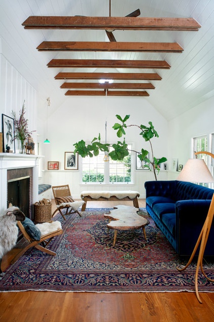
The living room is on the opposite side of the dining room from the kitchen. The grandfathered-in wood-burning fireplace is original, as is the paneling behind it. Because new wood-burning fireplaces are no longer allowed in the area, Troyer didn’t touch it. He nestled a cozy window seat just past the fireplace in front of a bay window. If you squint, you can see a trapeze bar; the couple’s sons use it for somersaults and play.
Troyer broke through the existing low ceiling to the attic, raising it into a vault, covering it in more tongue and groove paneling, and reusing the original joists. “We thought about painting the joists, but they had such a great aged patina, and they even had little notes the original framers had written on them intact,” he says.
“The living room has a barn-like feel. It seemed natural that we put a sheep in here,” Kretschmar says with a laugh. The live-edge coffee table is another eye-catching piece; it was designed by the Offerman Woodshop collective. She cannot praise these creative and talented craftspeople enough. “Their manager, Lee, is fantastic, and the whole crew are wonderfully passionate, talented people,” she says. “Our table is a work of art that we get to interact with every day — it’s not sitting behind glass on the wall. I know it will change over time, and I like thinking about how it will look when our kids are old enough to fight over who gets to take it to college.”
The steam-bent oak floor lamp is another piece that’s special to Kretschmar; her uncle made it.
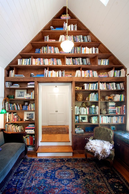
Before, this space was a library, but it had a much lower ceiling and only one bookshelf. Troyer vaulted the ceiling into the existing attic, covered it with tongue and groove boards that reflect the period, and added the alder bookshelves all the way up to the peak. The skylight on the right is one of the existing dormers on the front of the house.
“The library feels like such a luxury; it humbles me,” Kretschmar says. “Obviously there’s incredible value in books; we treasure them, we lugged them across the country, and we want to pass that appreciation for old-fashioned, printed stories along to our sons.”
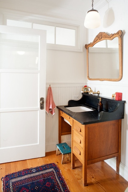
This powder room is adjacent to the kids’ art room. “We wanted it to be nice enough to serve as a powder room but not too fussy, where the kids could clean messy paintbrushes,” Kretschmar says.
The desk is an antique from the 1940s. “We were looking for antiques from the 1930s and 1940s as much as possible,” she says. Troyer topped the desk with soapstone left over from the kitchen countertops and converted it into a unique vanity. The curved sides are another nod to 1930s style.
Because the room does not have an exterior window, they replaced the top panel of the door with opaque glass and added a transom to let in more light. They salvaged the transom onsite; it used to be a sidelight adjacent to an exterior door.
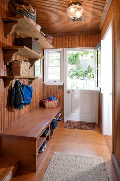
“This space used to be a gross old laundry room,” Troyer says. It now serves as a casual front entrance next to the garage. He was able to preserve the original door and window, and added a roomy bench, shelves and hooks to keep the busy family organized. The beadboard connects the entry to the other cozy nooks throughout the house.
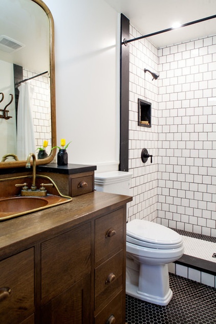
In the downstairs guest bath, the vintage copper sink dictated some of the design. Kretschmar believes the unique sink came from a train. Because it has three sides, Troyer had the vanity custom made to fit it, but he mimicked some of the style of the desk-turned-vanity in the powder room.
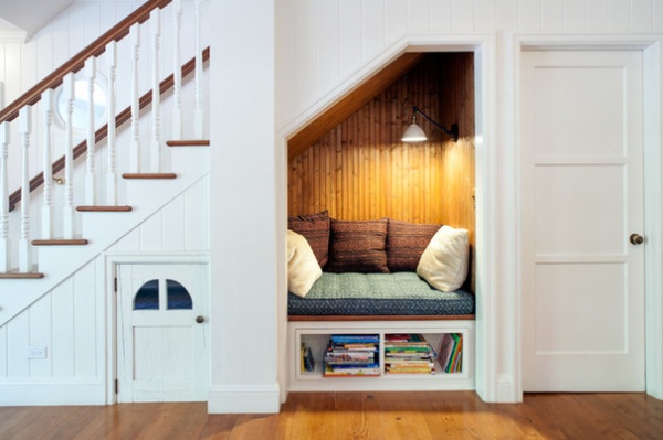
Another cozy niche takes advantage of space that’s often wasted — the area underneath the staircase. This space is in the kids’ playroom–art room (marked “family room” on the plan). The bookshelves underneath the reading nook pull out like a drawer to reveal more storage. The door to the left leads to a secret hideout for the kids. The door on the right leads to the powder room.
“I think all kids gravitate toward small spaces,” Kretschmar says. “We wanted some areas to invite play and balance the vaulted ceilings and larger scale of other rooms.”
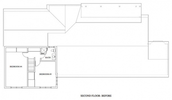
BEFORE: Now we’ll move upstairs. On the second-floor “before” plan, you can see the 1980s addition on the left side. A major part of the renovation was expanding the living space without changing the footprint of the house.
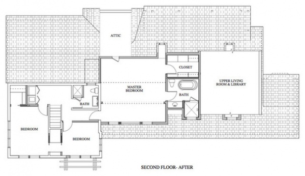
AFTER: After jumping through the city’s design review board’s hoops and working with the hillside ordinance that allowed for a maximum of 500 additional square feet of living space, Troyer took advantage of unused attic space and squeezed in an additional 499 square feet of living space upstairs.
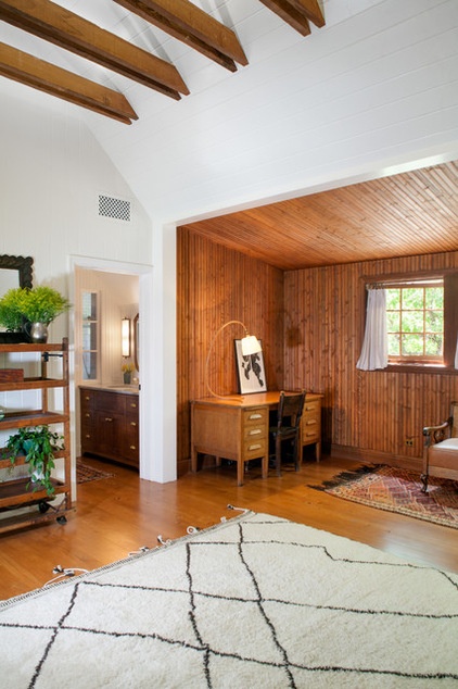
When the homeowners first visited the house, they had to climb up a ladder with flashlights to peek into this previously unfinished portion of the attic. “It was full of raw insulation and cobwebs and wasn’t structurally sound,” Kretschmar says. “It’s the space we transformed the most.”
Troyer carved a new master suite from an unfinished portion of the attic. He incorporated a cozy beadboard-covered area for reading, relaxing and getting a little work done. “The homeowners didn’t want or need a big master bathroom or closets. They preferred to use the space for a comfortable seating area,” he says.
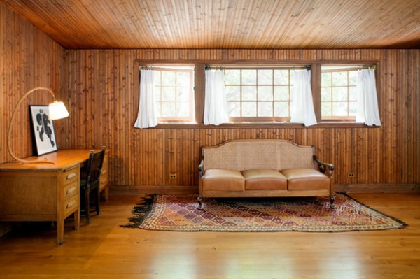
“I underestimated the powerful impact of the beadboard until it was installed. … I’m so glad Jeff focused on the walls,” Kretschmar says. “The beadboard adds so much character, depth and a sense of craftsmanship. It reminds us of houses on Cape Cod and keeps the room from feeling cavernous.”
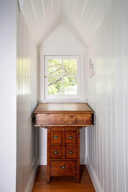
Downstairs we saw that Troyer used one of the front dormer windows as a skylight in the library. Upstairs this one provides a view out to the front yard from the master bedroom.
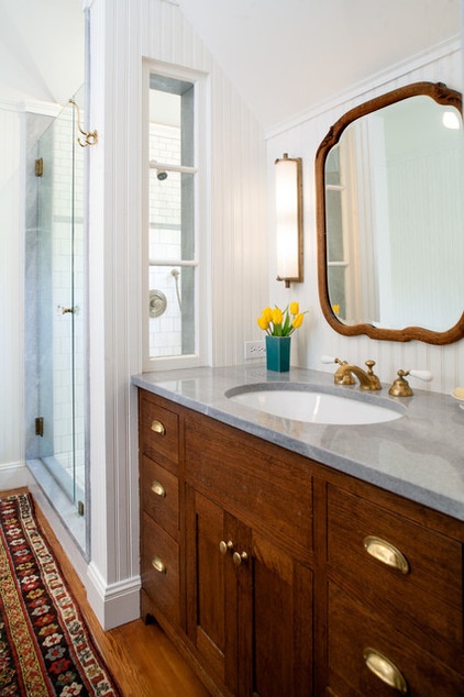
While the homeowners didn’t care to have a huge master bathroom, they did want to incorporate an antique tub and a separate shower. The tub is across from the shower stall, just out of view. A repurposed sidelight from downstairs shares light between the vanity and the shower stall. The countertop is gray limestone; the hardware and faucets are unlacquered brass.
One of Kretschmar’s favorite elements in this room is the knob on the shower door. “I couldn’t find shower door hardware that I liked. Most options were too modern looking for my aesthetic,” she says. As an alternative to what was available on the market, she used a vintage crystal doorknob. The contractor who oversaw the remodel, Nate Stockmeir, is also a creative craftsperson and an avid surfer. He drilled a hole in the glass and had the wetsuit-inspired idea to use neoprene to cushion the joint.
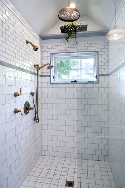
The gray limestone seen on the bathroom countertop makes an appearance on accents in the shower stall.
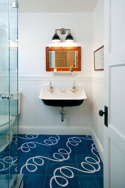
The boys’ bathroom has a playful hand-painted squiggle pattern on the floor tiles. It was a big splurge and another tricky part of the project, but the results are worth the effort. “You have to lay out every piece of a template before you order it in order to figure out exactly where all of the squiggles will go,” Troyer says. “You only get one chance to get it right!”
“This tile was a splurge, but I’m so glad we did it,” Kretschmar says. “The bathroom is visible from the top of the stairs, and everyone who sees it says, ‘Oh, that’s so fun!’ I like to think it pokes some fun at the more serious colonial elements of the house.”
The result of the collaboration between Troyer and the homeowners is that the family now enjoys a home that’s tailored to their casual modern lifestyle, yet it’s hard to tell that the house was ever renovated. “Everyone who comes into this house thinks that almost everything is original,” Troyer says.
Moroccan Popham tile: via Ann Sacks; sink: Kohler; light fixture: Schoolhouse Electric & Supply
Browse more homes by style:
Small Homes | Colorful Homes | Eclectic Homes | Modern Homes | Contemporary Homes | Midcentury Homes | Ranch Homes | Traditional Homes | Barn Homes | Townhouses | Apartments | Lofts | Vacation Homes


