Color of the Week: Mango
http://decor-ideas.org 05/25/2015 23:13 Decor Ideas
Nothing screams summer quite like the tropical fruits that will be at the peak of their flavor and availability in the coming months. Among my favorites are mangoes, and a big part of the draw for me is their pretty orange color, whether in a fruit salad or a blended drink. I’m taking a cue from nature’s summer bounty and finding ways to infuse homes with this vivid, fetching hue.
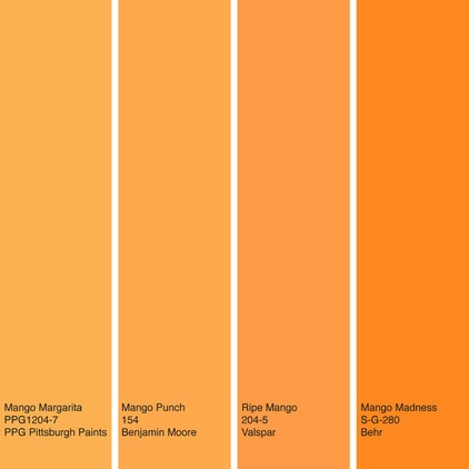
Unlike last week’s featured color, warm gray, this is no soft background neutral. These mango-inspired paint colors are striking, bold and impactful.
From left to right: Mango Margarita from PPG Pittsburgh Paints, Mango Punch from Benjamin Moore, Ripe Mango from Valspar and Mango Madness from Behr.
Note: Due to differences in how interiors are lit and photographed, as well as how computer monitors are calibrated, the colors you see in these swatches and photographs may differ slightly from the actual colors. It’s always a good idea to view actual paint swatches from the manufacturer, or better yet evaluate a large paint sample of the color you are considering, before finalizing your selection.
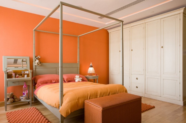
Now that’s an accent wall! If you go for one of the bolder mango paint colors, this is an excellent example of how to use the hue. I like to limit super intense colors to an accent wall, and in a bedroom the headboard wall is a good spot for the color. Typically a headboard and side tables, along with any art on the wall, will help soften the impact of the color, allowing you to get away with brighter hues.
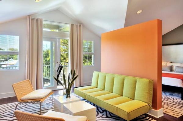
Here’s another bright mango accent wall, this one in a master bedroom seating area. No need to hang art here, because the accent wall acts as a colorful canvas. It also makes an excellent backdrop to the lemon-lime sofa. The remainder of the palette is fairly light and neutral, which keeps the space from feeling too visually busy.
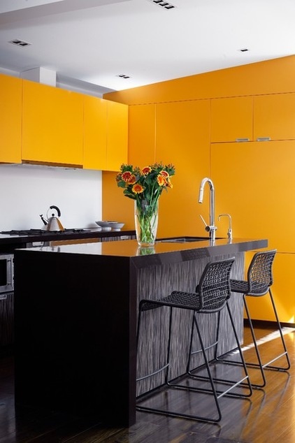
Yummy bold mango cabinetry brings vibrancy to this kitchen. If you plan to add a large chunk of bold color in a space, think about limiting the number of colors used. It can be a challenge to keep clutter to a minimum in a kitchen, and if you have a busy color palette, it can become visually chaotic with all that stuff competing with a bunch of bold colors.
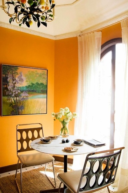
Warm colors are thought to stimulate our appetites, so warm mango hues are a terrific option for a breakfast nook or dining room.
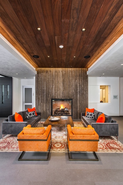
If all of the previous examples are a bit too colorful for you, think about using this bold color in only very small amounts to add a little zing to an otherwise neutral space. This gorgeous living room is clad mostly in neutral hues, but the small bits of bold oranges really warm it up and add some drama.
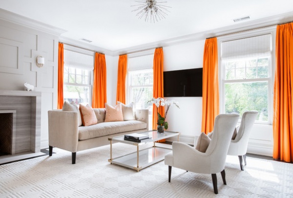
I love the use of bright orange in this otherwise monochromatic space. It really draws your eye up and around the room and plays up the windows nicely.
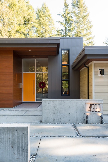
The more light-filled a space is, the brighter and bolder you can go with color. So bold colors are excellent for the exterior of homes, particularly for front doors. This door color is an excellent choice because it directs visitors to the entrance of the home with a happy hue.
More: Houzz Quiz: What Color Should Your Front Door Be?
Tell us: Are you mad for mango? How have you used this bold hue in your home?
Related Articles Recommended

