Houzz Tour: Pickle Factory Now an Energy-Wise Live-Work Space
Fine arts photographer and artist Jaime Alvarez was looking for a long-term home that could also function as his studio when he came across this three-story 1880s brick commercial building in Philadelphia’s Fishtown neighborhood. When Alvarez connected with architect Jeremy Avellino of Bright Common Architecture, who is dedicated to adaptive reuse and sustainable, energy-conserving design, he found his ecoconscious kindred spirit. “Jaime wanted to make a place that could be an example of a sustainable human environment,” Avellino says. “We did work in a way that allows the building to be near-zero energy for the next 100 years.”
Alvarez is already reaping the rewards, he says: In a space twice as large as his old 2,000-square-foot row house, his monthly heating bill is half as much — just over $200 in the coldest months. “Jeremy made me understand that, if you do it right, you will pay upfront,” Alvarez says, “but it will pay off in the end.”
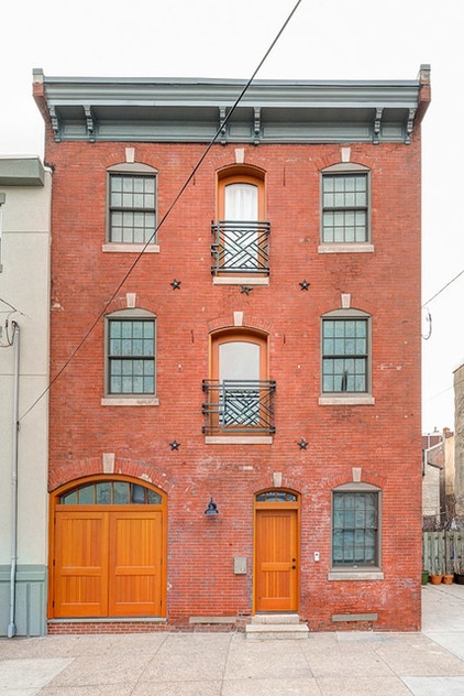
Room at a Glance
Who lives here: Fine-arts photographer-artist Jaime Alvarez; his longtime girlfriend, Leah Shepperd; and their dog, Seamus
Location: Philadelphia
Size: 4,921 square feet (451 square meters); 2 bedrooms, 3 baths and designed for 2 more bedrooms
Designer: Jeremy Avellino of Bright Common Architecture & Design
The pickle factory warehouse is a charmer, but it presented architect Avellino with numerous challenges: “bad insulation systems, terrible ductwork, lighting not done properly,” he says.
To work toward the goal of near-zero energy, he started by bringing in a third-party energy auditor, who performed a blower-door test to diagnose draftiness — a check that should be done, Avellino says, at the beginning, middle and end of construction. A drafty house will register 10 to 20 air changes per hour, or ACH50; current International Energy Conservation Code (IECC), which governs nationally, calls for 7 ACH50. The building initially scored 10 ACH50 — too drafty. Using a combination of spray foam and cellulose insulation, Avellino achieved an ACH50 of 1.97 — “the happiest day of my life,” he says.
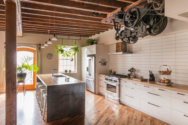
For Alvarez and girlfriend Leah Shepperd, who both love to cook, the second-floor open kitchen is their favorite space. The original 19th-century native hemlock beams, joists and rafters had been exposed and cleaned by the previous owner, who had installed the tongue in groove white oak flooring. Alvarez wanted to keep the design additions simple, choosing simple 4- by 16-inch white subway tiles and white cabinetry that allow the wood to stand out. Avellino added the counter island, capping the ends with hot-rolled steel plate for “a way cooler mottled effect,” he says.
Wall tile: stock glossy white subway tile, Bell Floor; cabinetry: Akurum, Ikea; light fixtures: Mercer, Schoolhouse Electric & Supply; island: wood and steel, fabricated by Kurt Schlenbaker, Wooden Box
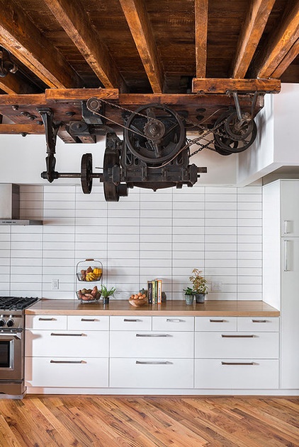
The imposing motor, which used to power the warehouse’s service elevator, was left in place as the focal point of the kitchen. “It’s a good conversation piece,” Alvarez says. “When you look at it long enough, you see all the ornate metal parts to it. It’s a beautiful piece of art from the industrial age.”
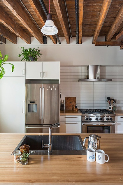
An important design philosophy for both Avellino and Alvarez was to reuse and repurpose materials whenever possible. For the island countertop, contractor Kurt Schlenbaker of Wooden Box used salvaged Douglas fir planks from an old bowling alley that Alvarez found on Craigslist. Avellino also prefers not to use upper cabinetry whenever possible, to avoid the type of visual clutter that would have detracted from the exposed-beam ceiling. Avellino installed only Energy Star appliances.
Refrigerator: Bosch 26FT70SNS; range: KitchenAid KDRU767VSS; range hood: KitchenAid KXW4436YSS; dishwasher: Bosch HX3AR75UC; vault island sink and Purist faucet: Kohler
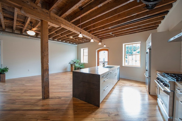
The kitchen and adjacent dining room, pictured after construction, are together an expansive, well-lit 10-foot-high space perfect for entertaining. The two double-pane Anderson windows — which are 3 feet, 8 inches wide and 5 feet, 8 inches tall — were put in in the 1990s, and Avellino added air sealing around them to buttress the insulation. The custom arched Douglas fir door, and its companions on the bottom and third floors, are new and feature low-e and argon double-pane construction. These arched facade openings, which were originally used to move product in and out of the warehouse, open inward for ventilation purposes only and are partially covered by shallow gridwork panel “balconies.”
Douglas fir doors: custom, Clingerman Doors
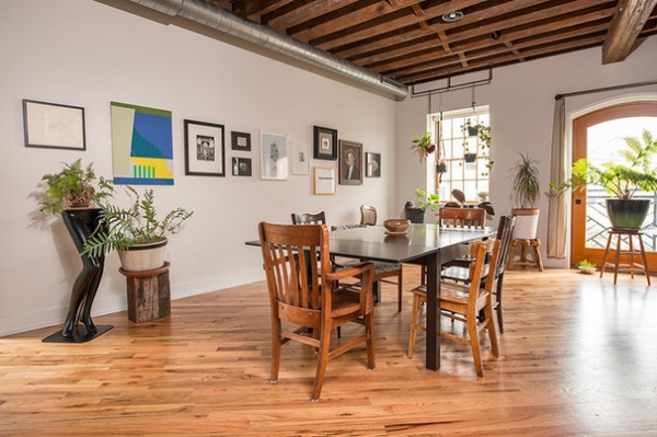
The dining area, now furnished, not only can host large parties, but also serves as a gallery for Alvarez’s photography and other artwork by his friends. The exposed ductwork piping adds another clean-lined design element.
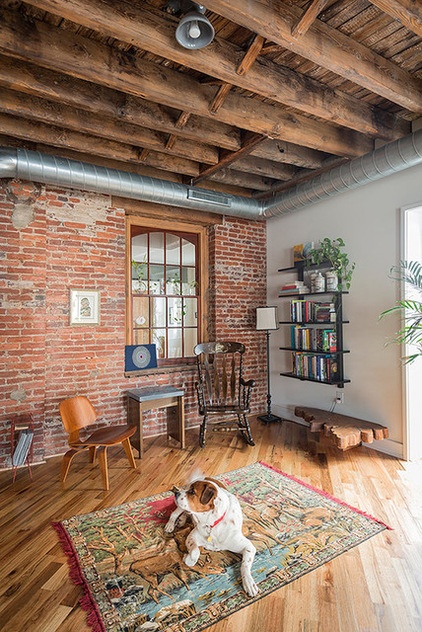
The brick wall with an existing window originally was part of the back of the building before an addition was put on during the early part of the last century that extended the warehouse to the back-lot line. Today only part of that back wall — on the second floor — remains standing, serving as an evocative backdrop to a cozy seating area, where dog Seamus is pictured, adjacent to the dining and kitchen areas. The window now gives a view to the stairwell and back corridor beyond. French doors at right lead to a powder-coated-aluminum balcony facing the side yard, an adjacent open space that Alvarez purchased.
French doors: Jeld-Wen
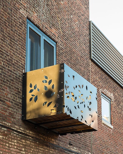
The powder-coated-aluminum Juliet balcony adds a leafy element to the old brick warehouse.
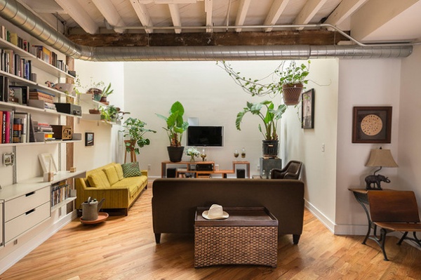
Since the warehouse occupies 100 percent of its lot size, sharing one wall with an adjacent row house, Avellino was limited in where he could install windows. No windows can be installed in a wall that directly abuts the property line, according to the International Building Code. That left the back of the house without any exterior openings.
Avellino solved the problem of how to light up rooms at the back of the house, such as the second-story living room, by installing a two-story light well that “catches morning light and throws it all through the building,” he says. The skylights, which are operable, also allow for natural, energy-free ventilation. Opening the exterior doors and the skylights “creates a stack effect like a chimney,” Avellino says. “The air flows in and goes right up through the light well. It’s just physics, no fan needed.”
Skylights: Velux
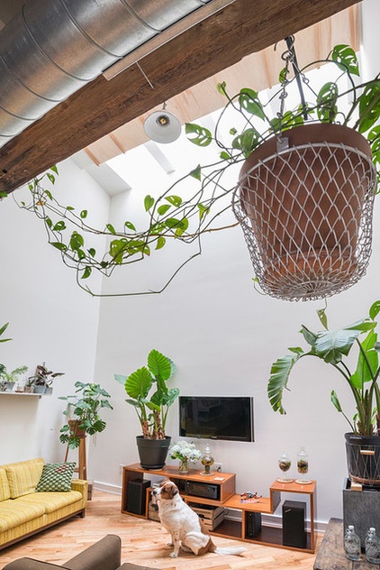
This view shows the two-story skylit light well that illuminates the back of the house.
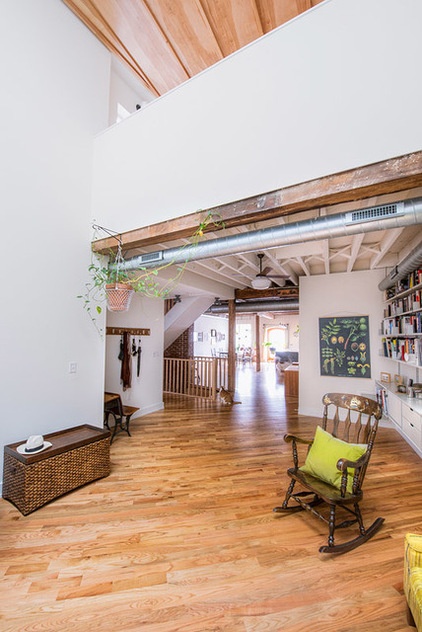
The view from the second-floor living room at the back of the house, to the kitchen and dining areas at the front, gives a sense of the building’s spaciousness.
The “big savings” in this project, Avellino says, “is creating a good insulating envelope and reducing the need for heat, staying away from fossil fuels and natural gas.” A critical component to any airtight building, however, is a mechanical ventilation system that serves as “the lungs of the house. If you insulate and air seal,” Avellino instructs, “you must ventilate.”
An energy recovery ventilation (ERV) system, which ran about $2,500, changes out the home’s entire volume of air multiple times per day, exchanging it for exterior air that is filtered and can be tempered to be hot or cool by the high-efficiency air-to-air heat pump when needed.
ERV system: Ultimate Air
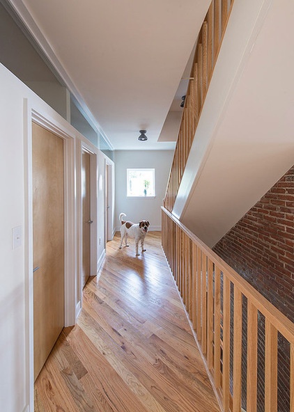
Seamus shows the way down the second-floor interior corridor, which is located in the early-20th-century addition that increased the size of the warehouse by about one-quarter, and abuts the rear property line. The side-yard window provides light, which filters into the corridor’s laundry room, bathroom and storage room via a series of fixed transom windows.
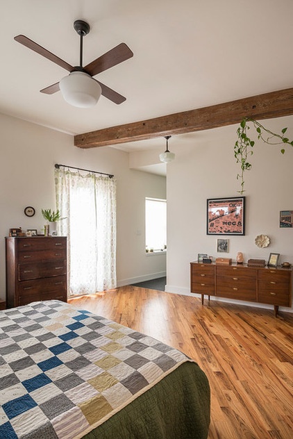
The third-floor master bedroom, which faces the street, has a southeastern orientation that enables its windows to catch early light and heat. “It gets really great sun in the morning,” Alvarez says. “We wake up naturally to the light.” A spacious but simple room, it boasts two large closets and abuts the master bath.
Schoolhouse ceiling fan: The Period Arts Fan Company
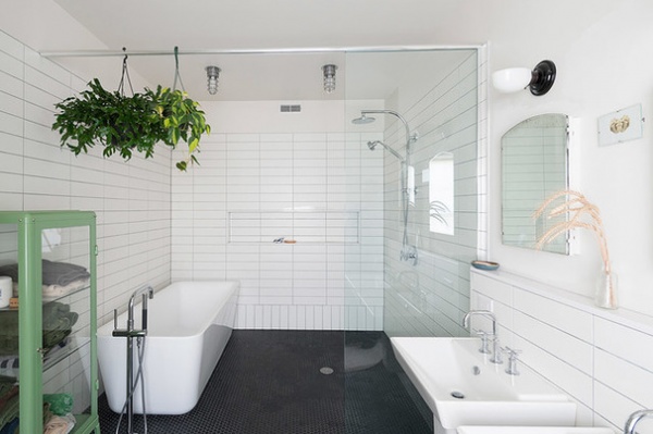
When it came to tilework, Alvarez, who likes to keep things simple, told Avellino to choose one tile for the wall and one for the floor, and use the two throughout the house as needed. The generously sized third-floor master bath incorporates the same inexpensive white 4-by-16 subway tile as the kitchen, and the bathrooms have the same floor tile, a 1-inch matte black hexagonal.
The master bath also features a novel approach to the tub-shower combination: The tub sits inside a 7-foot by 8-foot-4 glass-panel walk-in shower enclosure, which separates, Avellino says, the “wet uses and the dry uses” of sink and toilet. Combining the tub and shower in one area — about half the room — created more open space.
Wall tile: stock white subway tile, Bell Floor; floor tile: stock matte black hexagonal, Bell Floor; Emily soaking tub: Wyndham Collection; shower fixtures and Purist bathtub faucet set: Kohler
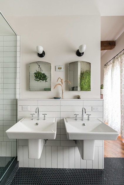
Both Alvarez and Shepperd wanted to reuse a lot of things. They combed local salvage stores such as ReStore and Philadelphia Salvage and came up with vanities for the other bathrooms and twin mirrors for the master. Note the subway tiles turned vertically here to create a baseboard.
Reve sinks and Purist faucets: Kohler; mirrors: ReStore; sconces: Martin, Schoolhouse Electric & Supply
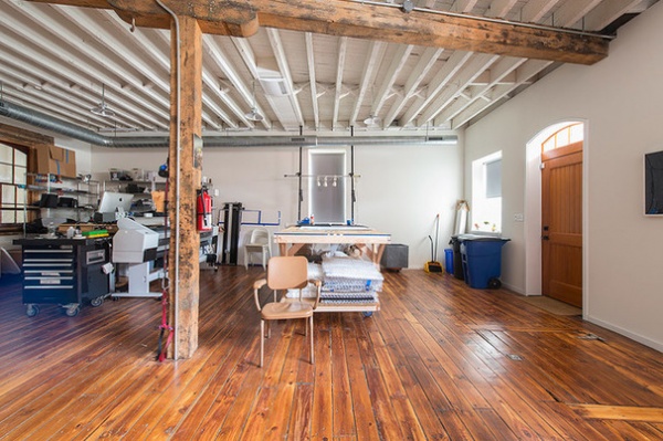
The 1,466-square-foot first floor is Alvarez’s work studio, divided into a clean space for photography and the messier fabrication space of the woodshop in back for his sculpture work. Double-wide carriage doors that open to the street, custom made of Douglas fir, are operable from the inside only and facilitate the transport of materials in and out.
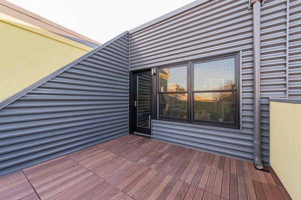
The roof had to be rebuilt entirely, which gave them the opportunity to add a third-floor deck. Avellino installed a Bison pedestal deck system of plastic supports topped with wood tiles that required no additional framing, and contrasted yellow stuccoed walls with corrugated metal siding. Also installed on the roof: Alvarez’s 4-kilowatt solar panel array from his previous house. The doorway leads to an office alcove and a flex space that will become bedrooms in the future.
Decking: massaranduba ribbed wood tile, Bison; door and window: Jeld-Wen
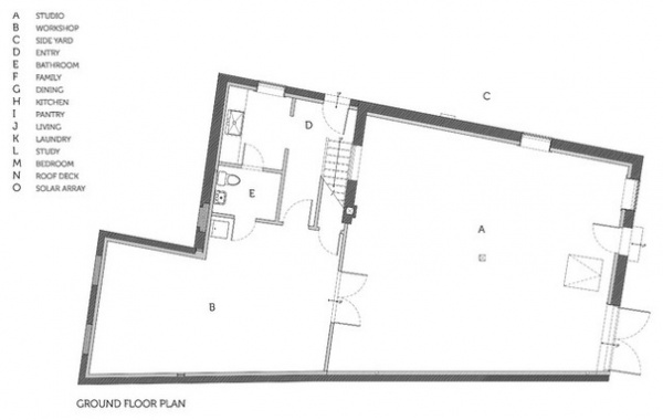
The ground-floor plan shows the simple division between Alvarez’s photography studio and woodshop.
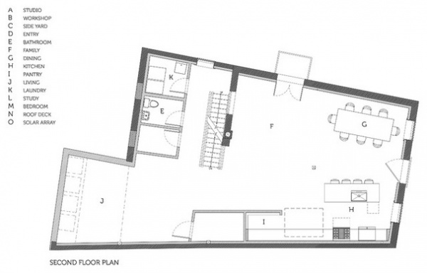
The open second-floor plan — which lays out the public rooms, the stairwell and service rooms, such as the laundry — shows windows on only the front and side, due to building codes that prohibit them when the building abuts a property line. Alvarez was able to put in French doors and a corridor window because he purchased the adjacent empty lot.
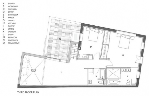
The third floor houses the two bedrooms and baths, and has access to the deck. Light pours into the space from the two-story light well.
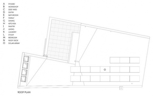
At roof level Avellino installed Alvarez’s 4-kilowatt solar panel array; the skylights are seen at left.
Contractor: Kurt Schlenbaker, Wooden Box
Browse more homes by style:
Small Homes | Colorful Homes | Eclectic Homes | Modern Homes | Contemporary Homes | Midcentury Homes | Ranch Homes | Traditional Homes | Barn Homes | Townhouses | Apartments | Lofts | Vacation Homes


