New This Week: 4 Casual Living Rooms Moonlighting as Formal Spaces
http://decor-ideas.org 05/23/2015 03:13 Decor Ideas
If you want a formal living space but don’t have room for one, things can get a bit tricky. How do you create a room that functions for everyday, casual use as well as for those special occasions? The following living rooms — gathered this week from the living room photos uploaded by their respective designers — nail the combination perfectly by focusing on durable yet elegant fabrics and upholstery, double-duty furniture and flexible traffic flow. By looking at these rooms, you’d never guess that small children roam freely through them. But in each case, they do.
Here, the designers share their plans of attack, “uh-oh” moments and more.
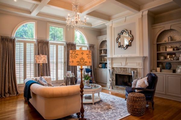
Designer: Jason Dunn of 2 Gays and a Design
Location: Marietta, Georgia
Size: 300 square feet (27.9 square meters)
Homeowners’ request: “Formality with function.”
Plan of attack: “We started with the awkward shape of the room,” Dunn says. “Knowing the transformation would be quite a challenge, starting with the basic idea of form, elegance and, most importantly, function was the key to the design. We knew we wanted balance to tie in the built-ins on each side of the fireplace, which would be our soon-to-be focal point. From there came the sofa, chairs, and then we finalized it all by updating the look of the built-ins, adding coffers, good lighting, draperies and accessories.”
Why it works: “Formal rooms in Georgia are typically standard. The fireplace is meant to be the focal point, but sometimes there are competing focal points — such as in this case. There is a wall of windows and a fireplace that compete for the focal attention. We softened each by adding texture to the windows with fabulous window treatments and added glamour to the fireplace by adding a fun quatrefoil mirror. Both of these approaches set the tone for the winning elegant feel of the room.”
What wasn’t working: “It was all about finding out how to keep this room formal enough without feeling like everything should be covered in plastic and kept out of. By finding a kid-friendly rug and fabric, the overall formal vibe of the room wasn’t compromised.”
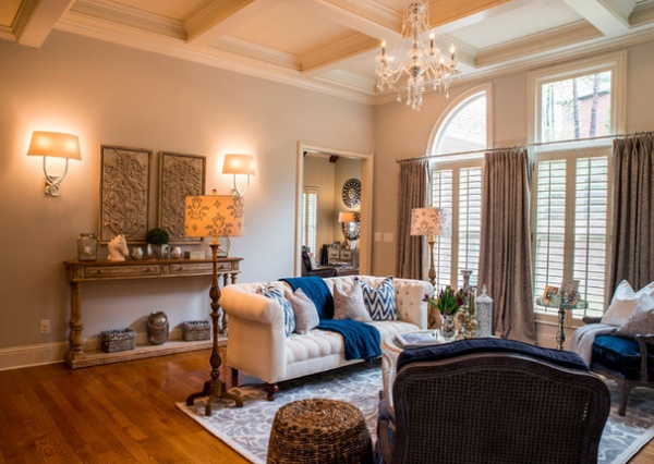
Who uses it: “This Marietta, Georgia, family of five is constantly on the go. The kids are all under the age of 6, and the parents are amazing, understanding and above all, patient parents. They knew they wanted a space that reflected their personalities, a place they could relax and feel comfortable and also be able to show it off, as it is one of the main feature rooms one sees when entering their wonderful home.”
Designer secret: “Most clients believe that big rooms need oversized furniture and room-sized area rugs to fill it out. Sometimes this idea works, but mostly, and in this case, we went the opposite route. Finding the center of the room is key for any designer to figure out where they begin. That center may not always be obvious, but by thinking outside of the box while still sticking with design fundamentals, any look can be achieved with form and function.”
“Uh-oh” moment: “Finding the right rug size was the biggest challenge for this room. We knew we couldn’t do a room-sized rug, since there are high-traffic areas that connect to other rooms of the house. Although it was outside of our comfort zone to go with a smaller rug, we knew it was ultimately the best decision to center the room around the fireplace while leaving generous pathways to the other high-traffic rooms.”
Splurges and savings: “We saved a lot on the rug to be able to splurge on the lush and elegant fabric for the drapes.”
Take-away: “That even a family with three kids with a hectic lifestyle can enjoy a fun, functional yet elegant formal room.”
See more photos of this house
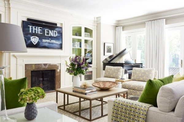
Designer: Anne Hepfer of Anne Hepfer Designs
Location: Toronto
Size: 21 by 21 feet (6.4 by 6.4 meters); about 450 square feet (41.8 square meters)
Homeowners’ request: “They are a young family of three with an incredibly cute and large dog,” Hepfer says. “They have a very active lifestyle. This is the room in the house that gets used the most, so comfort, durability and a modern vibe were very important.”
What wasn’t working: “There was concern that such a large space wouldn’t feel warm and welcoming. I think we effectively solved this challenge through the use of cozy fabrics, satisfying a craving for lush color, and layering interesting textures and objects. The custom upholstery is comfortable but tailored — no need to fluff. The oversized coffee table with wood top helps warm up the space and make it feel livable.”
Why it works: “This was the second home we designed for this particular client. There was a lot of trust and great synergy. We immediately thought that the Chuck Close photograph would be a perfect balance and provide contrast on the wall to the kitchen above a custom black shagreen Parsons table.
“This family room has three sets of French doors that open to a beautiful garden and two archways that lead to the kitchen and family dining area. The idea was to create a comfortable, casual, livable seating area. The fresh palette mimics the coming of spring in Toronto, bringing the outdoors inside. When the leaves on the trees start to bloom, they are a vibrant green hue, and then they turn darker as they mature. The taupe sofas mimic the color of bark when it is hit by the sun, as does the textural pattern of the rug. The mood is cozy with texture and alive with rich green color.”
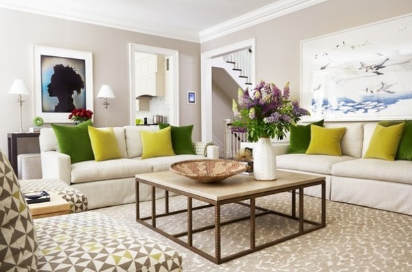
What goes on here: “This is the family room where they play games, play and listen to music, watch sporting events or movies, and entertain small or large groups of friends and family very casually.”
Designer secret: “The oversized coffee table as the center component helps ground the room. The cube ottomans under the Parsons console are perfect for pulling up as extra seating when needed.”
“Uh-oh” moment: “To make the layout work, we really needed to find the perfect coffee table. It needed to be large but not heavy, not too modern, not too traditional, and durable to stand up to the regular wear and tear of a family. As soon as we found it, everyone fell in love with it. It had the longest lead time of any piece in the room, but it was well worth the wait!”
The nitty-gritty: Sofas, slipper chairs and ottomans: Anne Hepfer Designs; sofa fabric: Lee Jofa; pillow fabric: Kravet; curtain fabric: Telio; slipper chair fabric: Billbrough; ottoman fabric: Osborne & Little; coffee table: Formations; table lamps (on console): Urban Electric; rug: Y&Co; wallpaper (backs of bookshelves): Phillip Jeffries
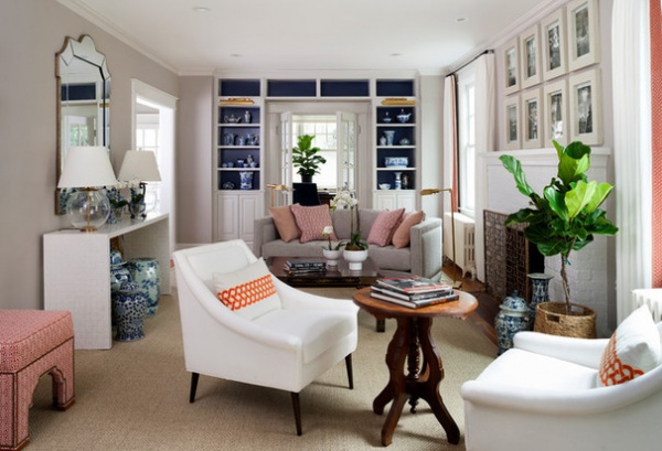
Designer: Breeze Giannasio of BGDB Interior Design
Location: Bethesda, Chevy Chase, Maryland
Size: 12 by 25 feet (3.6 by 7.6 meters); about 300 square feet (27.9 square meters)
Homeowners’ request: “The homeowners wanted to activate this previously unused and unloved space,” Giannasio says. “They also wanted it to feel adult but accessible and casual enough for everyday family use, [and] gracious and polished enough to feel special for guests.”
Plan of attack: “As with most projects, I started first with exploring the function of the space. How did the family want to use it? What did they hope a typical Sunday afternoon would look like, feel like, in the space? How about an ordinary Wednesday evening? This getting-to-know-you and getting keyed in to the client’s hopes and dreams is a critical part of the process, without which deriving design solutions is not possible or useful. Once those parameters are clearly understood, only then do we jump into space planning, designing built-ins, establishing a color palette and selecting furniture, lighting and final finishes — usually in that order.”
“We added built-in bookshelves on one side of the room to both give more architectural detail to the room as well as to add storage and needed shelving adjacent to the home office. In terms of setting the color palette, the homeowners had an Indonesian print from their early travels as a couple that had an inky navy backdrop and lively oranges, corals and golds used decoratively. They loved the piece, and [it] was the only time they had found bold colors that captivated them each equally. While I hadn’t done a room in coral and navy before, I took the challenge and love the results.”
Why it works: “The room’s dimensions are tricky. It’s a long and narrow room, and circulation must be left to navigate from one side of the house to the other. While not a main artery of the house, one does have to move through the space unencumbered. This eliminated larger couches or sectionals from the roster of seating candidates. The presence of the fireplace created an important axis, but it is too narrow a room to build everything around that elevation.
“If you imagine an apartment-sized couch and two lounge chairs grouped around the fire, the room would feel postage-stamp sized. So how to get the requisite amount of seating while maintaining an open feel? Having different zones of engagement felt like the perfect solution, and it matched the families’ needs and lifestyle.”
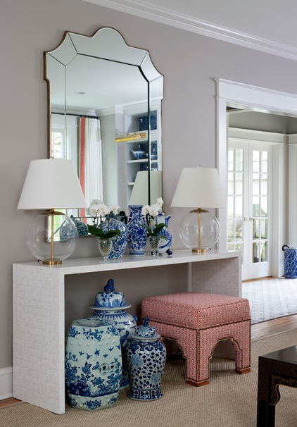
What wasn’t working: “Previously, this room was a dead space in the house. The family of four spent all of their time in the adjacent rooms: the home office, which you enter between the new bookshelves I designed, and the TV room, on the opposite side of the room. There were several factors contributing to its continued desuetude. The room had a lack of light and a lack of variety of light sources. Not only was it not inviting, but it was totally dark.
“The first thing I did was add lighting to the plan — overhead, bookshelf lighting, directional art lighting, floor lamps and table lamps — and remove the plantation shutters that kept out the little natural light that there was. Secondly, the furniture was statically arranged in front of the fireplace and only allowed for two people to comfortably lounge in the space. I created a multifunctional arrangement that created different zones of use so the family could occupy the room in a variety of ways at the same time.
“I considered it the ultimate success when I was told that on a recent weekend, the homeowners and their neighbors were visiting by the fire while the girls were running in and out of the den playing board games at the game table. Movable ottomans that can adjust to where the action is add versatility and flexibility to the room.”
Who uses it: “A professional, hardworking couple and their two tween daughters. They keep long work hours and wanted their home to be a refuge for quality family time.”
Designer secret: “Lighting is key to any room and was especially helpful here. In addition to adding the variety of lighting described above, adding an oversized mirror helped amplify the natural light and helped fortify the fireplace axis, helping to ground the room architecturally. The eye needs focal points and areas to rest and be delighted in a space. Without having the new bookshelves on one side of the room and the fireplace/mirror axis, the room would really feel long and narrow.”
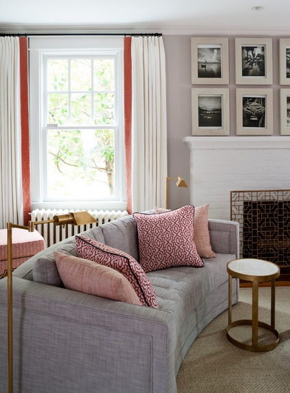
“Uh-oh” moment: “The couch is curved, which is lovely and makes it incredibly inviting and helps keep the space feeling open. It was a custom piece and in its stock size is meant to be closer to 80 inches long. By shrinking it down as we did to fit our space, it amplified the radius of the piece, which I wasn’t completely prepared for. When I first saw the piece, my heart dropped a bit, as I worried if having so rounded an inside edge was going to work. In fact, it works beautifully and everyone loves it.”
Splurges and savings: “Believe it or not, the frames above the fireplace are all from Ikea, and the artwork is from an old coffee table book of photography. I absolutely love those chunky frames, and it reads as an architectural unit with the fireplace. The game table was found in the couple’s basement and is a placeholder until a new piece is identified. It works, though. The high-low approach in fashion — pairing a T-shirt with designer jeans and great accessories — holds true in interior design as well. Ordinary sisal carpeting and Ikea frames hold their own when paired with gorgeous Henredon ottomans and a bevy of designer pieces both new and old.
The nitty-gritty: Ottoman, accent pillows and accent table: Henredon; rug: Carpet Palace (custom cut); lounge chair: Cobble Hill, ABC Carpet & Home; swing-arm floor lamp: Visual Comfort; fireplace screen and coffee table: Horchow; credenza: Mecox; drapery fabric and sofa: Kravet; drapes and hardware: Knightsbridge; table lamps: Circa Lighting
Team involved: Stacy Zarin Goldberg (photography); Russ Kahn, The Kahn-Struction Company (millworker for bookshelves)
See more of this home
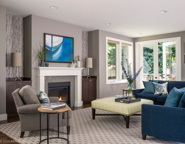
Designer: Tammara Stroud of Tammara Stroud Design
Location: Seattle
Size: 25 by 19 feet (7.6 by 5.7 meters); about 475 square feet (41.8 square meters)
Homeowners’ request: “This is the main living area, so function was a large focus,” Stroud says. “They have two small children, so it needed to be kid friendly in terms of safety and fabric durability. My clients loved blue and green tones, so that was an important part of the palette.”
Plan of attack: “I look at the space as a whole to create a complete palette where all the finishes work together. I always consider my clients’ desires for color, how the space will be used, storage, children/pets. I started with a gray palette for the overall theme and added blues and greens as the accents.”
Why it works: “The space is cozy and livable and at the same time has a sense of elegance. The anchor in the room is the painting I created based on the fabrics selected for the furniture. I think it pulls the space together.”
What wasn’t working: “The challenge was the overall size of the room and the number of entrances and doors in the space. The furniture had to float in the space to make it work.”
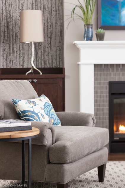
What goes on here: “My clients are young professionals with busy careers and two children under the age of 4. Since the space is the center of the home, it is Grand Central for most activities, with the exception of TV. This great room is the heart and soul of the home and provides a place that is cozy for the whole family to sit by the fire, read and play games.”
Designer secret: “I believe the painting brings the space together. Often I start with a client’s painting as inspiration for the space, but in this case I created the painting based on their love of nautical images and the fabrics I selected. It was a pleasure creating something unique for them that reflects their personalities.”
Team involved: Precision Cabinets/Loop Installations; Vargas Painting; Gibson Wallcoverings
Browse more recently featured rooms
Related Articles Recommended


