Houzz Tour: An Addition Connects a London Home With Its Garden
http://decor-ideas.org 05/23/2015 01:13 Decor Ideas
On a visit to the East London Design Show in 2012, designer Egon Walesch and his partner were immediately drawn to the style and ethos of architect Louise Sayarer of SASA Works, so they decided to team up with her to give their Edwardian home a fresh update. The project focused on the small lean-to at the back of the house. “We never really knew what to do with it,” Walesch says. “It wasn’t very well integrated into the rest of the house, and we always had the idea to make it a nicer space.” Working closely, Walesch and Sayarer have transformed the isolated lean-to into a cozy, bright and integral part of the home.
Photos by Alison Hammond Photography
Houzz at a Glance
Who lives here: Egon Walesch from Egon Walesch Interiors & Flowers, his partner and their Russian blue cat, Ivana
Location: Blackheath, southeast London
Original home built: 1903
Size: 3 bedrooms, 1 bathroom
Architect for the addition: Louise Sayarer, SASA Works
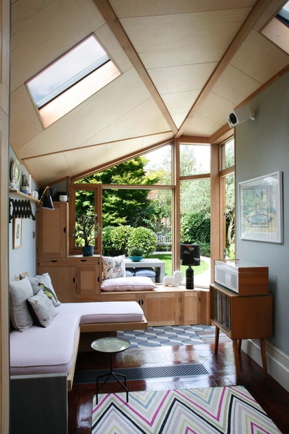
“We wanted to create an indoor space that immediately drew the attention to some of the features in the garden,” Sayarer says. She designed the split-level cabinets so they subtly lead the eye toward the door, and she also created the cozy daybed as a spot from which to view the garden in comfort.
Walls paint: Lamp Room Gray, Farrow & Ball; rug: Vanderhurd; tiles: Mosaic del Sur; cushions: St. Jude’s and Timorous Beasties
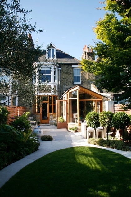
“We knocked down the back wall between the house and the lean-to,” Walesch says. “We also remodeled the garden quite a bit. We had to get rid of the decking and change the levels. I created an oval lawn and surrounded it with a concrete path, and we also made a courtyard area out by the extension.”
The unique shape of the roof was designed to provide texture and movement to the space, while also referencing the building’s original moldings. “There’s a lot of plasterwork in this style of house, and we wanted the new ceiling to be a modern gesture toward that,” Sayarer says. The wood frame, which was built in SASA Works’ workshop, is filled out with plywood panels. The roof was also kept intentionally low so as not disrupt the neighbors’ view.
The patio is laid with limestone, while the bricks connecting the addition to the house are reclaimed yellow London stock, designed to blend in with the rest of the building.
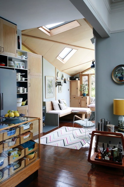
“The [project] was about light, and creating a better relationship with the back of the house,” Sayarer says. “We didn’t want the extension to look like this new thing that had been packed onto the building. We were looking for something more holistic.”
Sayarer added asymmetrical skylights that create multi-directional angles of light and a dynamic interaction between the light and the surfaces it hits.
A vintage record player and a Dieter Rams stereo (previous photo) infuse a touch of 1950s style, while a trench radiator in the floor, perpendicular to the daybed, and underfloor heating by the tiled area ensure the room stays toasty in the winter months.
The 1960s Danish home bar and the open-plan design is perfect for entertaining. “That was another reason for doing the extension, since I love cooking so much and enjoy having friends round,” Walesch says.
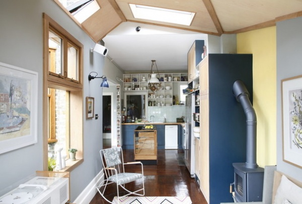
The addition of a wood-burning stove further ups the comfy feel. “We wanted a room that worked in all seasons, and having an open fire just makes it really, really cozy,” Walesch says.
A wire rocking chair by Ernest Race, reupholstered with fabric from St Jude’s, provides a comfortable sitting area without dominating the space.
To open up the kitchen a bit more and further link it to the addition, Sayarer created a combination of open and closed oak cupboards, picking out some of them in Farrow & Ball’s Hague Blue to enhance the connected feel.
The majority of the couple’s furniture, including in the addition, is oak. The rest of the house still has its original floorboards, so Sayarer found matching reclaimed boards for the addition from the Leaside Wood Recycling Project.
Race rocker chair: Nest; chair fabric: St Jude’s
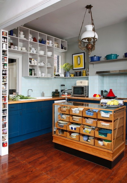
The kitchen island is a repurposed haberdashery cabinet, which was originally in a department store. “It was an eBay find, and amazing value,” Walesch says. “We had to get a cabinet-maker to cut it down as at first it was too large to comfortably fit in the kitchen. It’s great for storage, and it has a good work surface because we added [tempered] glass on the top.”
The delicate vintage lamp hanging over the island was a holiday find from France. “It came from a little antiques shop in a village in northern France. It’s an old gas lamp,” Walesch says.
Glass block clear tiles: Wickes
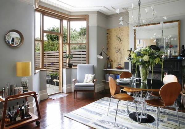
The dining room, which is connected to the kitchen and the added, is also flooded with natural light due to the generous bay window. Although the window is original, the frame was replaced with oak to match the addition.
Iconic midcentury designs are found throughout the house, such as the Noguchi Cyclone table and a vintage 1960s Danish armchair the couple found at a midcentury design show.
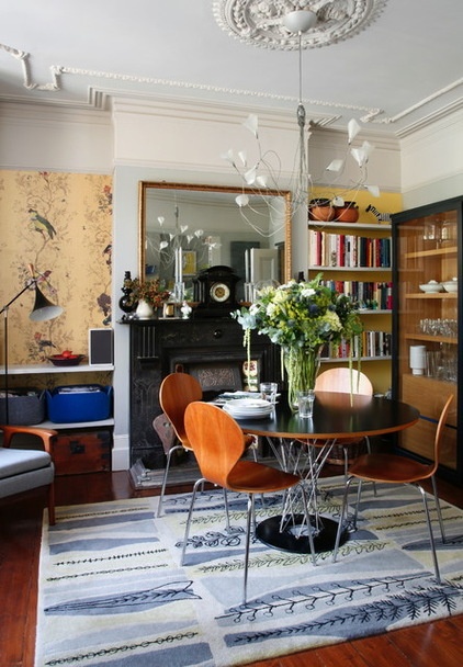
The intricate ceiling rose, fireplace and cornicing are all original Edwardian features, while a single panel of delicately detailed wallpaper hung in an alcove acts like a piece of art, adding further interest to the room.
Birds ’n’ Bees wallpaper Timorous Beasties; ceiling light: Heal’s
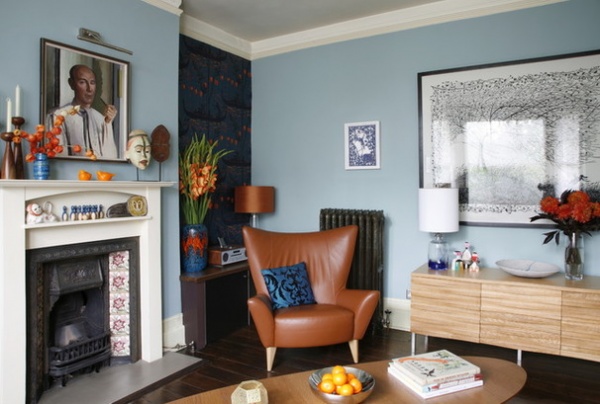
At the front of the house is the main living room, carefully curated with souvenirs from the owners’ travels. As in the dining room, a single strip of wallpaper provides an eye-catching accent, without dominating the space.
The surround of the original fireplace was given fresh coat of paint, and the cast-iron radiator was picked up in an antiques shop. The black-and-white print above the sideboard is by Rob Ryan.
Gondola wallpaper: Cole & Son; walls paint: Dix Blue, Farrow & Ball; Matador armchair, sideboard; both Content by Conran; coffee table Ikea
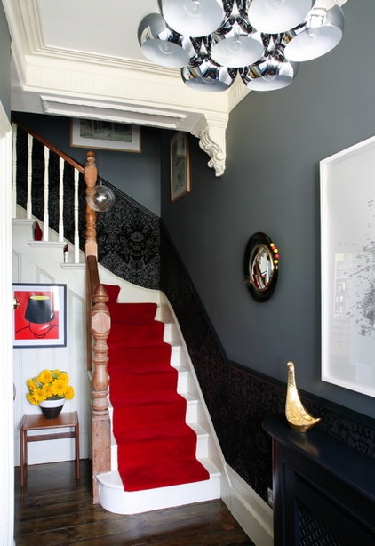
In the hallway that leads up to the first floor, Walesch chose a darker wall color and a bright red stair carpet to inject some color and atmosphere. “It’s quite dramatic,” he says. He also added an eye-catching wallpaper up to the chair rail, to mimic the flow of the stairs. “I didn’t want too much wallpaper, and it’s also frighteningly expensive,” he says with a laugh.
The banisters are plain wood, but the stairs have been painted white to provide contrast. “When we first moved in, almost every surface had been stripped. It was a bit too much really, like being in a log cabin. I love the texture of wood, but if you haven’t got too much of it, you notice it more,” Walesch says.
Visually striking details, such as the little 1950s atomic mirror, and the impressive Leitmotiv ceiling light, give the space a more contemporary update.
Devil damask flock wallpaper, Timorous Beasties; wall paint: Down Pipe, Farrow & Ball; carpet, John Lewis
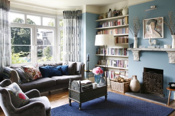
The upstairs sitting room was used as a refuge for the couple while the renovation was going on downstairs. “It’s still used for work, relaxing and reading, and we’ve got our books in here,” Walesch says. Floor-to-ceiling shelves create a library effect, while a beautiful vintage Indonesian dowry chest is put to use as a unique coffee table.
As the original fireplace was missing when the pair moved in, they created a simple opening. However, a classic fireplace is still referenced via the mantelpiece. “We got a piece of driftwood from the Thames, fished it out, cleaned it up, gave it a color wash and used that as a mantel,” Walesch says. Bespoke plaster casts hold it in place.
Sofa: John Lewis; curtains, Designers Guild
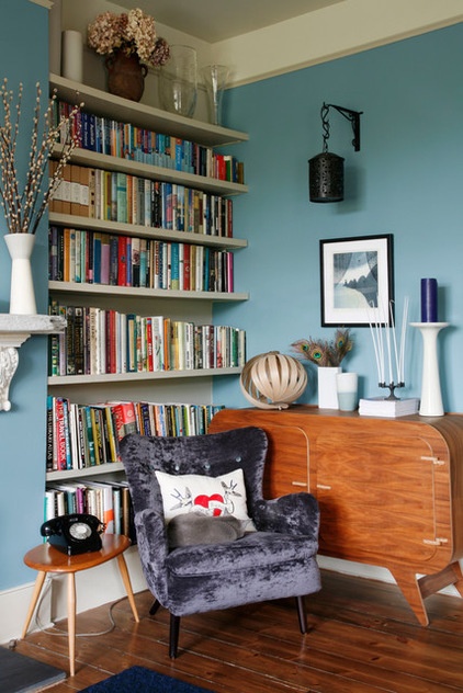
The couple’s midcentury-style sideboard was a bespoke creation from furniture makers Unto This Last, located in London’s Bethnal Green. An antique Moroccan lantern hanging above the sideboard adds an eclectic touch.
Ivana find the Ernest Race armchair the perfect spot for an afternoon snooze.
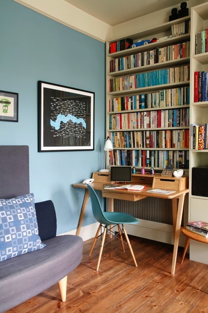
An Ercol desk and an Eames DSW chair are all that’s needed to create a stylish yet functional home office. The print on the wall is by Richard Wentworth, depicting an inverted view of east London.
Ercol desk: John Lewis; Eames chair: Utility
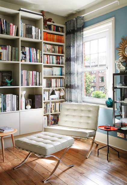
Making the most of the natural light flooding in through the window, a Barcelona chair and footstool are perfectly positioned to enjoy a spot of reading, while a task lamp provides extra light on darker days.
Barcelona chair: Nest
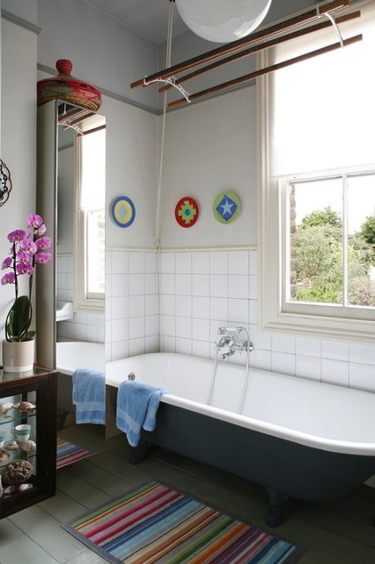
Walesch’s love of color continues in the bathroom. “I like having artwork in the bathroom, but you can’t have anything too delicate. So plates seemed like a good substitute,” he says. The cheery designs displayed on the wall were a souvenir from a trip to San Francisco.
The retractable vintage clothes airer above the bath is another quirky — and useful — addition.
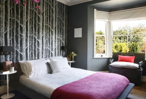
In the master bedroom, the striking Woods wallpaper by Cole & Son creates a moody and atmospheric feature wall. “I’ve always like the design. It’s very calming because of the trees,” Walesch says. Farrow & Ball’s Down Pipe is used on the other walls. “I really like that dark grey, it’s got depth to it.”
An antique monk’s bench with a fold-down back provides useful storage in the space underneath. Sited in front of the bay window, it was bought by the couple at an auction in Greenwich.
Bed, bedside tables; both BoConcept; wall lamps, Heal’s; throw: Habitat
Browse more homes by style:
Small Homes | Colorful Homes | Eclectic Homes | Modern Homes | Contemporary Homes | Midcentury Homes | Ranch Homes | Traditional Homes | Barn Homes | Townhouses | Apartments | Lofts | Vacation Homes
Related Articles Recommended


