Houzz Tour: A Playful Home Drawn Up by 8-Year-Old Twins
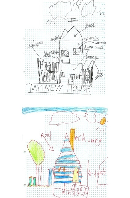
Out of the mouths of babes — or rather, from the drawing books of children — come the most ingenious ideas. Architect Andrew Maynard had spent a long afternoon with the owners of this engaging home, brainstorming possibilities for the renovation and addition that would create the family home they wanted. After hours of discussion, digression and going around in circles, they were no closer to finding the spark that would get the project underway. Maynard recalls the gloom of that first meeting: “We found ourselves deep down the rabbit hole,” he says. With a modest “There you go!” the couple’s 8-year-old twin boys presented the drawings they had been engrossed in while the grown-ups were buried in their serious business. No racing cars, spaceships or dinosaurs for these kids. There on paper was the concept that would anchor the imaginative tower home the family now enjoys.
Houzz at a Glance
Where: Alphington, a northeastern suburb of Melbourne, Australia
Who lives here: A couple and their twin boys
Size: 2,422 square feet (225 square meters) on a 5,382-square-foot (500-meter) lot; 3 bedrooms, 2 bathrooms
Architect: Andrew Maynard Architects
At some point during the evolution of a home, there is usually an “aha” moment. For Maynard this moment came quite out of left field. While lengthy discussions with the owners were taking place — which failed to advance their design project — the couple’s twin boys, with that uncomplicated way that kids see things, had been busy drawing the plan for their new home: a tower structure with windows, doors and rooms all in place, bathed in happy sunshine. As Maynard says, the simple artwork distilled a number of ideas that had been discussed that afternoon: “The boys had firmly pushed the boat off the shore, and we were on our way.”
Photos by Peter Bennetts
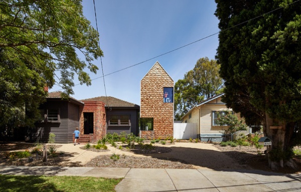
This picture shows how the twins’ fledgling ideas blossomed into an integral part of the final design: a tower that permeates a set of new structures and puts its quirky stamp on the home. The project involved the renovation of an original clapboard house and the construction of a series of buildings with angled rooflines, fitting together like a giant Meccano model. The tallest of these structures holds the twins’ studio, study and playroom.
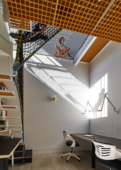
Step inside this tall tower and check out the study for these active and adventurous boys.
It has desks at floor level, and this child’s fantasy: a net that hangs above the boys’ desks.
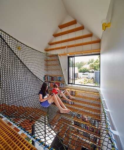
The net, reached from the ground floor by a set of steps, enables eager climbers like the twins and their friends to keep an eye on the street and backyard action. It also provides a comfortable and bouncy place in which to read, draw and dream. The safety netting is attached wall to wall and is strong enough to survive energetic 8-year-olds. The eye-catching tower connects to the original clapboard building by a short glass-enclosed link.
Maynard says, “This space pushes the idea of verticality, a theme that runs through the whole project. Internally, it is a wholly vertical shelf running from floor to ceiling.”
Safety net: Oxley Nets; steps: FRP (fiberglass reinforced plastic)
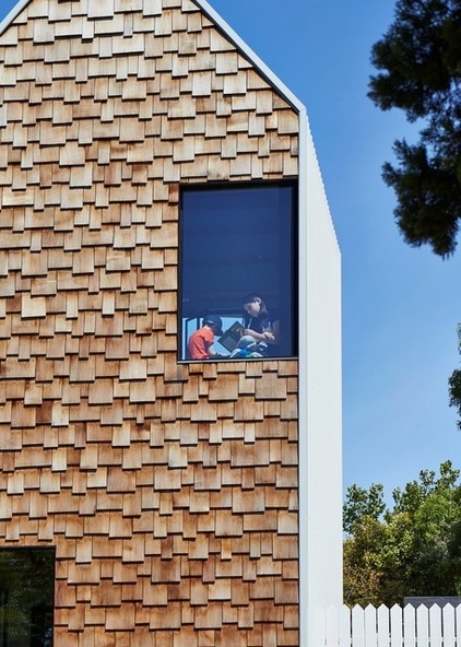
The studio makes a significant statement at the home’s roofline. Shingle siding, which covers many of the exterior walls of the new structures making up the home, is western redcedar and has been left untreated to weather naturally. The ribbed white cladding on the roofs and remaining walls cleanly defines the tower shapes and is treated for watertightness.
Longline 305 wall and roof cladding: Lysaght
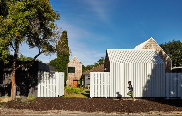
The house is between two thoroughfares: a leafy postwar suburban street to the front, and a rear one, shown here, which Maynard says feels like a country road. The suburban context is humble clapboard and brick abodes, and he felt that “a chunk of contemporary architecture would be an imposition.”
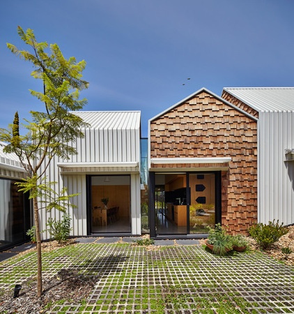
So how best to design a home to satisfy the family’s spatial, functional and aesthetic needs without overpowering the site and the streetscape? Maynard’s ingenious proposition was a series of small structures, echoing the pointed form of the boys’ sketches, each subtly different.
He describes the design aesthetic as “antimonolith” and says, “Externally the home looks small, as there is visual fragmentation in the separate buildings, rather than one bulky building. Internally, the house seems large — it defies logic in a way, like a Tardis!”
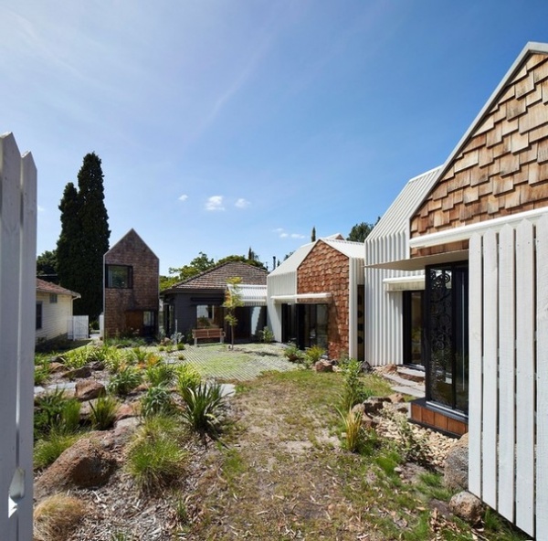
Says Maynard, who worked with project architect Mark Austin, “Tower House developed into more than just an extended house — it became a small village, with each building performing a different function, synchronized by the boys’ tower shapes and anchored by the original [clapboard] house.” This view from the rear lane illustrates the idea that carried the project through from beginning to end — an alliance of structures differentiated by the family’s diverse activities, Maynard’s “village” as home. The effect calls to mind the European concept of the extended-family farmhouse complex.
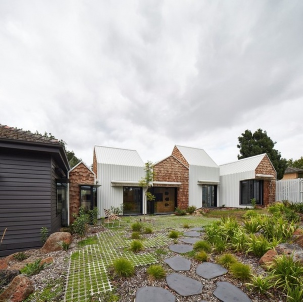
A fundamental approach to the project, sparked by the tall peaked towers in the twins’ sketches and emphasized by the vertically aligned ribbed siding, was to move away from longitudinally extended building forms. “Australia is wide and flat. As a result, our homes are often wide and flat. In contrast, this project explored the idea of creating a vertical home,” Maynard says.
The individual buildings differ in size and orientation, but a sense of cohesion is achieved by the materials used and how they cluster sociably around the outdoor area.
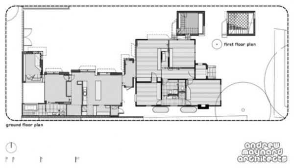
The floor plan shows the original house with bedrooms, bathroom and kids’ living space central on the site, linked on the left by a small tower to the family kitchen, dining and living areas, which in turn lead to the master suite and library. The boys’ study and playroom tower (top off-center) is reached from the original house through a glass-enclosed link leading off their living space. The square, top far right, shows the netted level of this tower.
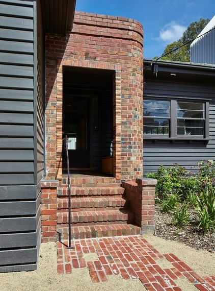
The clapboard dwelling on the site has retained its modest proportions and traditional brickwork front porch, but has been given a smart facelift, both inside and out. It contains a bedroom apiece for the boys, a bathroom and their indoor playing spaces. The house is entered through this modest porch.
Exterior paint: Intimacy NG44, Haymes
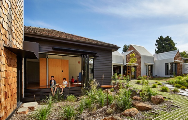
This view shows the rear of the original dwelling, and how the boys’ indoor playspace opens to the rear gardens through large folding doors. The gunmetal gray of the painted clapboards sets off the wood floors and hoop pine plywood cabinetry. The wall of the shingle-clad tower, with the boys’ magical netted studio, is visible on the left in the picture.
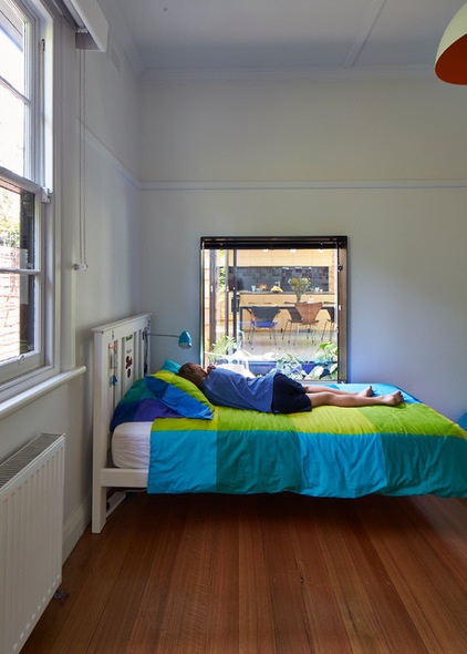
The twins’ bedrooms, in the original house, have visual and physical connections to the new extension buildings. These have been maintained by the strategic placement of windows and the way the structures fit together. The kitchen-dining-living area is in a separate building but connected to the original house by a small tower-shaped link. It can be seen, or screened off, from this boy’s bedroom. Check out the floor plan above to see how this works.
The floors are spotted gum, with a tung oil finish.
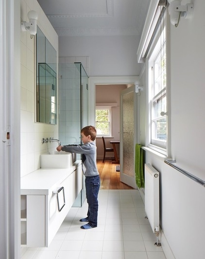
The twins’ all-white bathroom is sleek and practical and full of natural light. The heating in the original part of the house comes from hydronic panels, and the new extensions have in-floor hydronic coils.
Most modern domestic hydronic heating uses water as a heat-transfer medium. Water heated (and in some cases chilled as well, for cooling) in a gas-powered boiler is piped through the area to flat panels or underfloor coils, which give off heat.
Ceramica Vogue 200- by 200-centimeter Ghiaccio matte and glossy tiles: Classic Ceramics; Cube 500 above-counter vanity basin: Caroma; Gas sink fixtures: Rogerseller
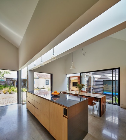
The kitchen sits in the hub of the house, taking in light and sunshine from wide steel-framed doors that open onto the gardens and the other structures of the “village.” The floors throughout the kitchen and living areas are polished concrete with exposed aggregate.
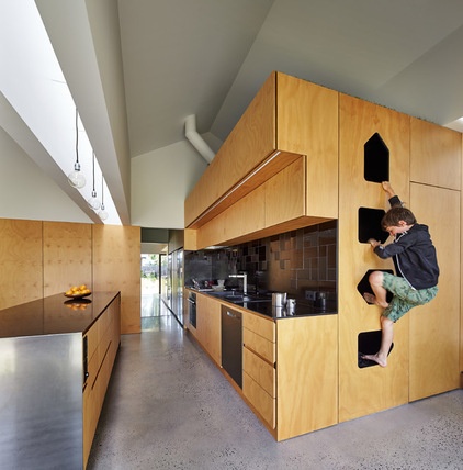
The twins appear to spend a lot of time above ground level. Climbing seems to be one of their favorite activities, and tower-shaped cutouts in the plywood walls of the kitchen encourage and support feats of mountaineering.
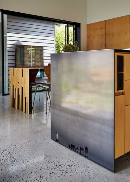
Towers have become a motif in the home: The cutouts at floor level on the island wall, resembling tiny tower-shaped mouse holes, are a profile of the house. The tower motif also appears in the woodwork at the entry porch of the existing house.
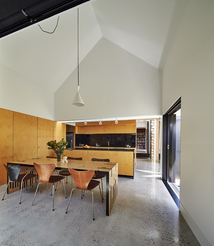
The ceiling of the kitchen and dining area follows the contours of the external structure, bringing the tower form and the vertical shapes that pervade the design to the interior, and giving a compact area space and openness.
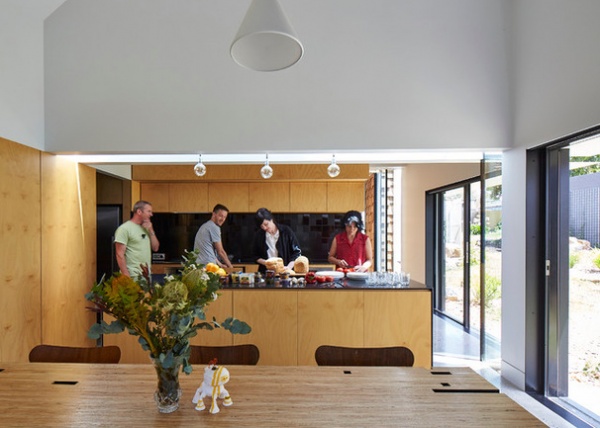
The expansive island counter, at almost 10 feet long and 26 feet wide, is a sociable meeting place. Meal preparation is often a communal activity when friends and neighbors visit.
The island countertop is black painted steel, waxed to a hard finish. The kitchen cabinetry is sealed hoop pine plywood.
Paint: Lexicon, Dulux
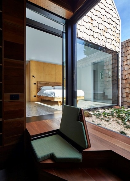
The master bedroom suite is in a separate tower structure, connected to the main living areas and the library by a glass-enclosed link. The house has his-and-her retreats. Hers is the serene wood-lined and book-filled library shown in the foreground, adjoining the master suite. “His is a sneaky spot in the roof space above the kitchen, lined with synthetic grass and furnished with a book and a banana chair,” Maynard says.
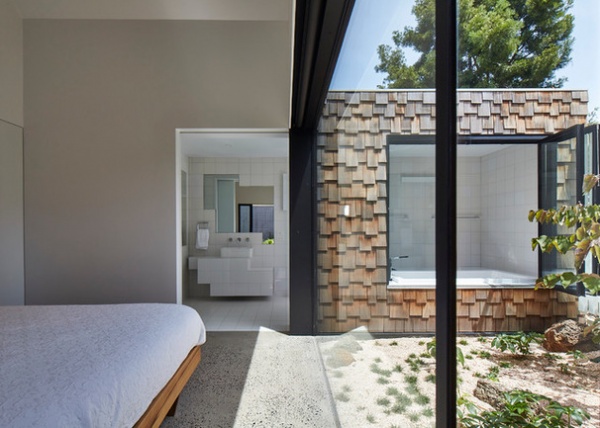
The master suite forms an angle enclosing part of the garden. The bedroom floor is polished concrete with exposed aggregate.
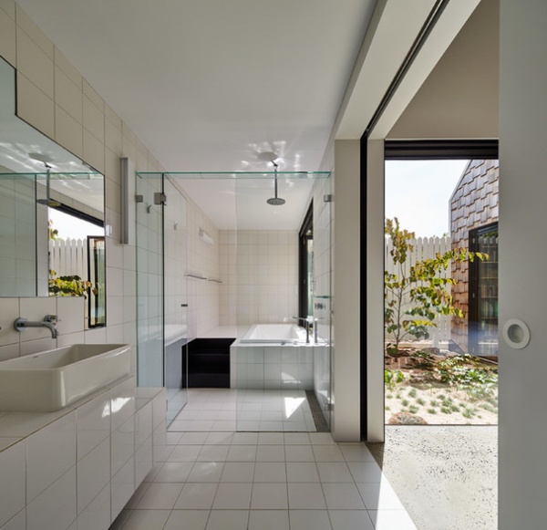
The master bath has the same pared-down simplicity and contemporary design as the boys’ bathroom, with similar tiles and fittings. A wide-hinged floor-to-ceiling tempered glass panel closes off the wet area, and oversize glass sliders maximize natural light. North-facing windows and doors have light- and heat-excluding blinds. The library can be glimpsed on the right.
Stylus Newbury Island 1800 bath: Caroma; Pol Summer rain shower: Sussex faucet; Ceramica Vogue 200- by 200-centimeter Ghiaccio matte and glossy tiles: Classic Ceramics
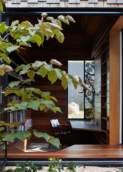
To satisfy the family’s enthusiasm for a series of functionally separate but integrated structures, Maynard created different moods within the complex with different colors and materials. The library, says Maynard, “is a place of thought and contemplation, in contrast to the playfulness of the boys’ study.” The serene room is lined with dark spotted gum and is slightly submerged so that “the desk is almost buried in the garden,” he says. Organic forms in jewel colors in a lead glass window, by Leigh Schellekens of Hampton & Bayside Leadlight, reflect the garden setting.
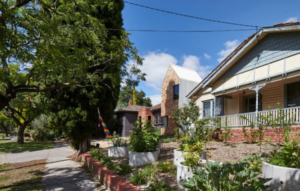
Maynard believes that “increasingly our houses are overly concerned with privacy, and we are turning our backs to our neighbors,” a view shared by the owners. Their vision was for a home where community, art and nature come together. The sincerity of this sentiment is amply illustrated in the front of the house and the neighboring property, which the couple also owns. The area has become a community vegetable garden — neighbors are invited to help themselves and do a little digging and weeding if the mood strikes. The high fences around the rest of the property can be closed off, but are often left wide open so neighbors can use the garden as a shortcut between the two streets.
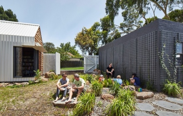
Community, art and nature are all wrapped up in this playful, flexible and easygoing but functional home. It’s both private and public, small yet spacious, traditional and contemporary. It enables solitary contemplation and sociable celebration, work and play. That its inspiration came from the lively minds of the family’s youngest members gives it an extra touch of magic.
The Tower House is shortlisted for the 2015 Australian Interior Design Awards, Residential Design category, announced May 15, 2015.
Browse more homes by style:
Small Homes | Colorful Homes | Eclectic Homes | Modern Homes | Contemporary Homes | Midcentury Homes | Ranch Homes | Traditional Homes | Barn Homes | Townhouses | Apartments | Lofts | Vacation Homes


