12 Decorating Scenarios When You Should Do Nothing at All
http://decor-ideas.org 05/21/2015 02:13 Decor Ideas
A lot of interior design is about finding beautiful items to fill a space. But a huge part is knowing when to stop. Negative space is often the element that goes forgotten in a home — and it’s easy to forget, since you can’t even see it. If you feel an obsessive need to overfill your home, here’s my advice for the areas where the best thing to add might just be nothing at all.
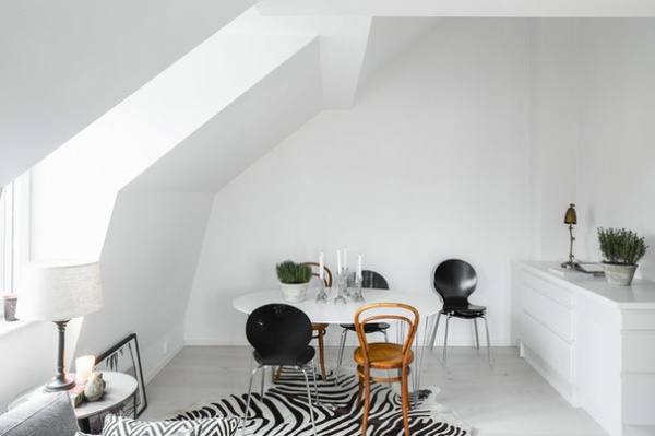
1. Awkward angles. Got an unusual bulkhead making your attic or basement space hard to fill? Then don’t fill it. Keep all the wall surfaces one color to de-emphasize the odd shapes, and let the eye fall on the objects in the room instead. Add some artistic interest to the floor instead with a fun rug so the room still feels decorated.
See expert advice on decorating an awkward nook
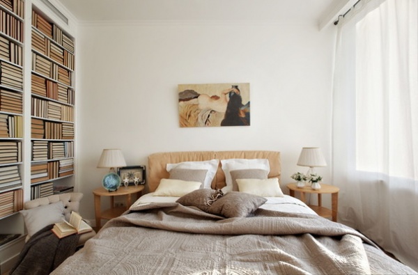
2. Beds. In a bedroom, filling in the space above the furniture (the bed in this case) is completely optional, and worrying about scale is hardly necessary. A small painting that leaves plenty of surrounding wall space creates a demure, dreamy look that is quiet and restful instead of empty.
See more bedroom decorating tips
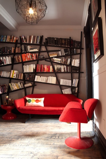
3. Pillows. When your wall is already bringing a lot to a look (whether through busy shelves, an expansive gallery of art or patterned paper), leaving your couch simple creates a nice negative counterpoint. Try using just one toss pillow (for the occasional midday nap) or skip the accessories altogether.
See more on getting your accent pillows right
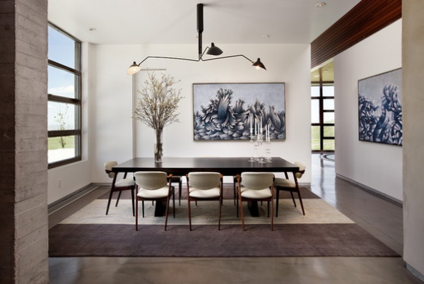
4. Flowers. Keep in mind when designing a space that accessories like fresh flowers can be a part of the scheme. In this space the nearly invisible door and dramatic painting could feel off balance alone, but the dramatic branch arrangement fills the negative space without anything needing to changed about the wall itself. Leaving negative space for such accents welcomes them into your home, so they become a beautiful part of your home instead of an afterthought.
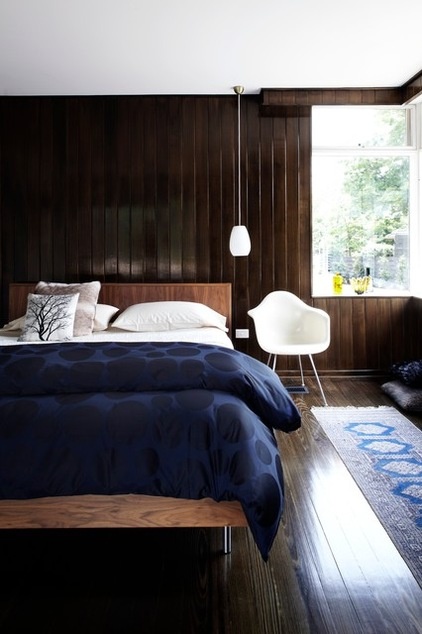
5. Walls with texture. If you have a beautiful wall treatment or texture in place, don’t feel the need to hang something to fill an empty space — it’s already filled. A layered look can be beautiful, but it’s far from required. Let the wall speak for itself, and it’ll tell a subtly beautiful story.
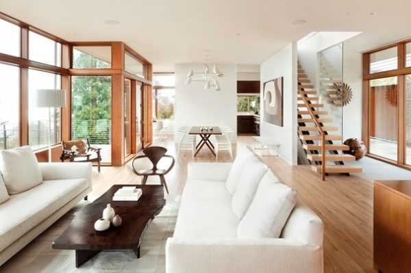
6. Walls and pendants. Sometimes a wall that feels empty when you stand in front of it (scratching your head wondering what to do) doesn’t feel so empty at all when viewed naturally from a distance. If a hanging fixture is already adding interest in the center of the room, you can leave the backdrop totally blank and let the light do all the talking.
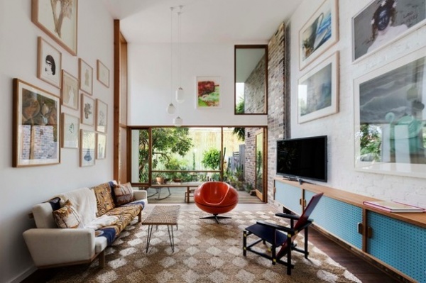
7. Walls with art. Hanging art is hardly a science — it’s an art in and of itself. That being said, it can be tricky to determine exactly how much space to fill, but luckily negative space has an interesting way of filling a wall on its own. If you don’t have enough pieces to dress a whole wall, or simply want to try a more asymmetrical approach, trust your eye and hang a piece where it looks right, even if that isn’t technically centered. It may take a few tries (you might want to use nail-free hooks until you settle on a spot), so test a few options and review them from a distance until one just feels right.
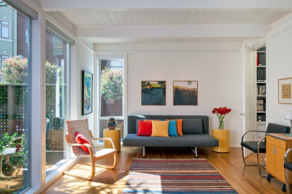
8. Coffee tables. If you already have side tables, you may not require a coffee table to put your drink on. With a bold rug, you may not need a table for visual reasons either. Removing the coffee table can open a space in a way that feels more relaxed, airy and playful (with less to bump your shins on). And besides, a simple side table or stool can easily be picked up and moved in a pinch.
See unusual coffee table ideas
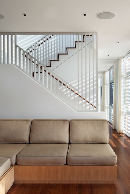
9. Staircases. That awkward angled space at the outside of a staircase? It can be a fun place to add shelving, a gallery wall or an asymmetrical arrangement. However, a plain wall works just as well. The stairs themselves are typically an interesting enough visual feature to draw the eye in, so don’t worry if a straight piece of furniture leaves a little negative space in between.
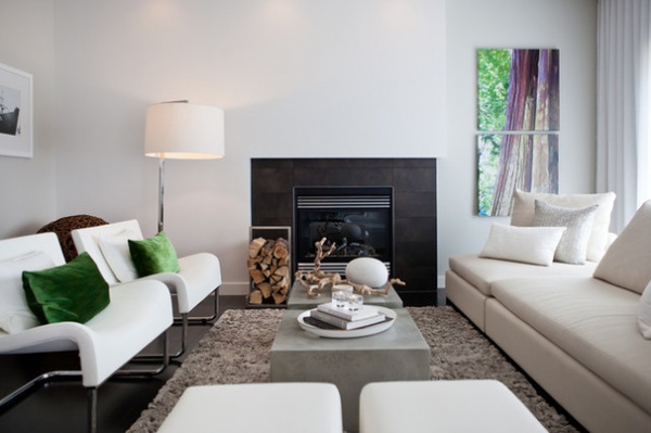
10. Fireplaces. While hanging a TV above the fireplace remains a popular look, pairing these two items can leave you with a ruined television (from the heat of the fireplace) and a ruined neck (from the viewing angle). A beautiful fireplace, especially in a dark color or rich stone, is a strong enough visual feature on its own that leaving the space above totally empty is often the best option.
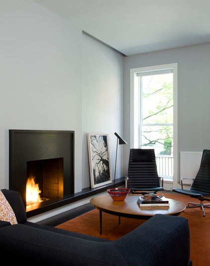
A beautiful window (or an eye-catching view) already filling the higher end of the wall is an especially strong visual feature too. Placing other items low (even leaning pieces against the wall instead of hanging them) lets the eye drift to the window and through to those great views that probably sold you on the house in the first place.
See how to remodel your fireplace
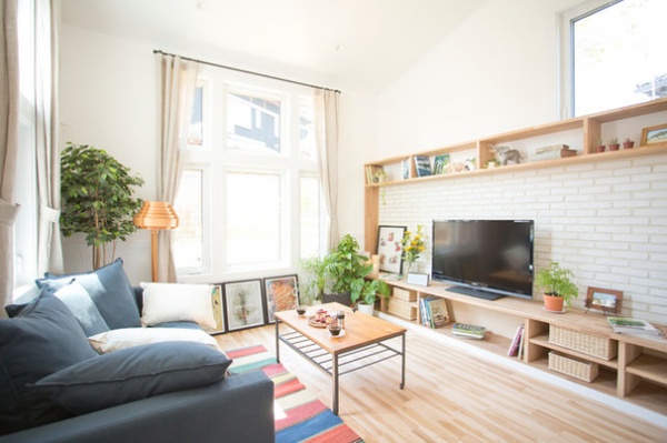
11. High ceilings. Struggling to fill a high or angled ceiling? Put away the ladder. When blended with the wall, a high ceiling like the one seen here won’t be the center of attention anyway, so simply leaving it blank is perfectly acceptable. Your gaze will naturally fall on objects at or below eye level, and your brain will easily ignore any empty space overhead.
See more on decorating rooms with high ceilings
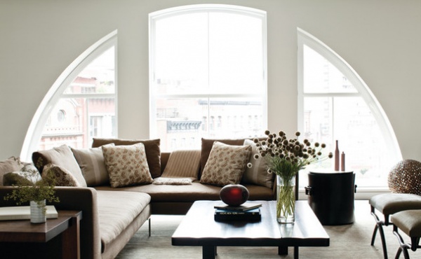
12. Windows. Speaking of windows, if you’ve got a great view — and nothing to hide — feel free to skip window treatments altogether and leave the windows undressed. If you don’t typically bother to close your living room curtains, you might not even need them at all.
See more on ditching the drapes to let your windows shine
More: How to Start a Decorating Project
Related Articles Recommended


