Houzz Tour: A Supersize Playhouse Among the Vineyards
http://decor-ideas.org 05/20/2015 22:13 Decor Ideas
In 2006 a semiretired couple moved into Hill House, their dream rural home on the Mornington Peninsula, southeast of Melbourne, Australia. Eight years later, determined to share their vineyard home with their family, they planned an addition to make room for current and future grandchildren — a supersize playhouse that is fun, functional and full of interesting features. Connected to the main house via a glass bridge, the new stand-alone pavilion provides them with the extra room they need to accommodate three or four generations at a time.
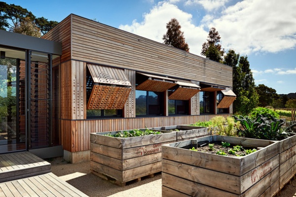
Photos by Emma Cross
Playhouse at a Glance
Who lives here: A semiretired couple and their golden retriever
Location: Merricks, Mornington Peninsula, Australia (southeast of Melbourne)
Size: 635 square feet (59 square meters); 2 multipurpose rooms, 1 bathroom
Architect: Mihaly Slocombe
The addition brings the total number of bedrooms in the house up to six, five of which can be zoned off from the main living spaces when not in use. This enables the couple to be flexible with the number of guests they accommodate, offers oodles of playtime space for the little ones and, most important, ensures that the couple feel at ease when the troops have left and it’s just them at home.
It was the existing vegetable garden to the right of the house, rather than the house itself, that inspired the addition’s structure and materials. The plan was to incorporate the garden’s neat rows, red gum (eucalyptus) railroad ties and batten fencing into the design. “We wanted to create a supersized folly that would belong first and foremost to its garden landscape,” says Warwick Mihaly, principal architect at Mihaly Slocombe.
Outside, the skin of the building is a reinterpretation of the canopy that surrounds a treehouse. “The timber was arranged to represent tree trunks, canopy and sky, while the patterns of dots routed into the timber were derived from a photo of our clients’ favorite pinot noir vines,” Mihaly says.
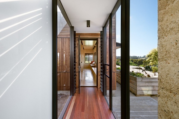
Pictured here is the bridge that links the new structure to the house. It is also the access point to the new vegetable garden, which was moved north to allow a straight corridor to connect the home to the addition.
The homeowners had originally expected the addition to be a replica of the existing house, designed in 2006, but they developed a trust in the design team that allowed the designers to experiment. The result is a pavilion that is integrated into the design of the existing home but is contrasting at the same time.
“This was a new project with its own constraints, not to mention architects a decade older,” Mihaly says.
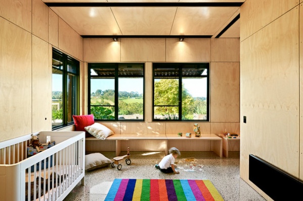
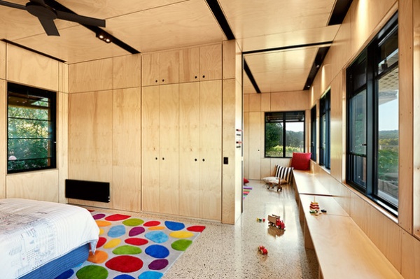
The rooms are designed to be flexible in accommodating different uses — two bedrooms now, and perhaps a bedroom and playroom in the future — as the homeowners’ grandchildren grow. The addition of a sliding wall between the two rooms also enables multiple configurations to control light and sound.
The floor throughout is polished concrete, which was driven by the desire for robustness. “The same thinking led us to line the walls and ceiling with plywood, and clad the building in timber,” Mihaly says. “These materials are durable and have natural finishes that will not require much maintenance. They will age gracefully and should absorb the mayhem of growing children with ease.”
Internal walls: BC plywood with Wattyl’s Estapol water-based clear finish, Austral Plywoods
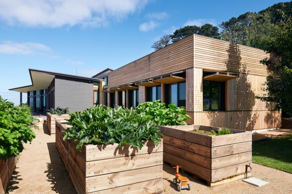
Sustainability was at the core of the design. The structure was built in conjunction with a 200 percent extension of an existing solar power system, which now has sufficient generating capacity to cover 90 percent of the clients’ residential and winemaking needs. In addition to using passive solar design techniques — exposed thermal mass, heavily insulated walls and roof, operable windows for cross ventilation and eaves over all the windows — the design team sought to further their clients’ commitment to sustainable design by researching the idea of ecological custodianship.
“We folded our insights back into our specification processes, making predominant use of plantation and native regrowth timber, and detailing our materials to heighten their durability and natural character,” Mihaly says. “We also invested ourselves in off-site manufacturing processes, in particular for the external window shutters. Entirely customized, we first designed these with millimeter accuracy on the computer, then prototyped them in close conjunction with the builder, steel fabricator, electrician and CNC router to perfect them. This was a first for us: Never before had we been so closely involved in the manufacture of our designs.”
The architects designed from scratch the steel shutters mounted to each window, because they were unable to find an affordable system that worked the way they wanted. It was a long and involved process that Mihaly says was well worth the effort. The team also went through a similar design and testing process with the electrical system.
The control point for the shutters is in the form of a playful launch control in the middle of the addition, as seen here on the side of the sliding wall that helps divide the space.
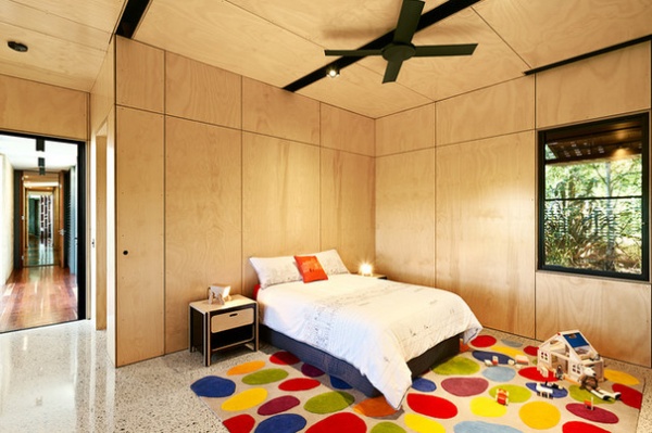
The space has various moving parts — operable shutters, sliding walls, retractable curtains — which is unexpected in such a small space, and not only creates a reconfigurable internal layout, but also adds to the sense of play.
“We like to think [the addition] is what a child might design for herself, given six years of architecture school and an adult’s resources,” Mihaly says.
Ceiling fan: Revolution, Hunter Pacific
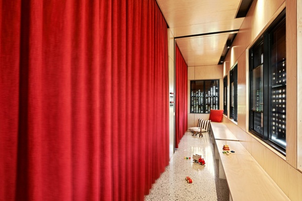
Mihaly describes the corridor as a “special and unusual place.” A retractable strawberry-colored curtain instead of a wall divides the rooms and the corridor, enabling multiple configurations and a connection to natural light from the north-facing windows.
Not just for circulation, the sliver of space is a playspace for toddlers, a reading nook for teenagers, a stage for performances, a spot for hide-and-seek and even a lookout. He adds: “It’s no accident that the curtain is red. It’s a deliberate reference to theater!”
Bronco II composite fabric curtain in Strawberry: Zepel Fabrics
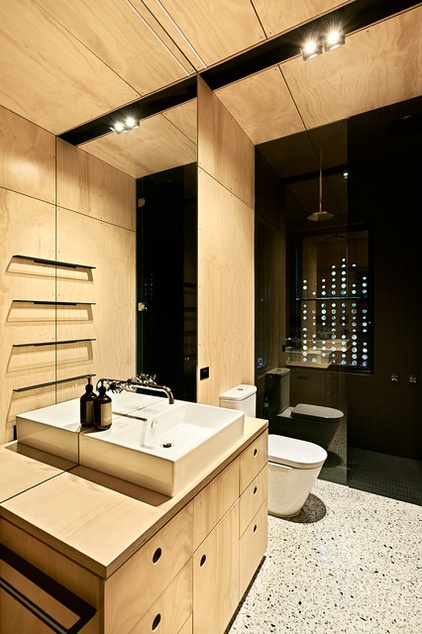
Catalano Premium 60 basin and Gas sink fixtures: Rogerseller; Ideal Standard Tonic toilet: Reece
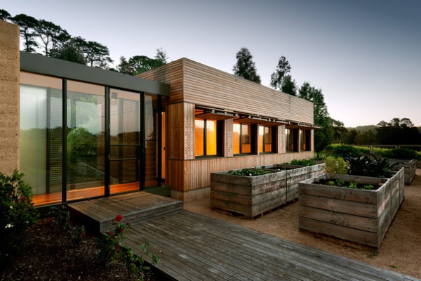
The shutters help to retain a connection to the house and landscape by opening like eyelids to let light and views in …
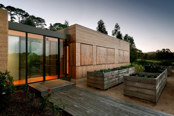
… and closing to make way for a secretive, kids-only sanctuary.
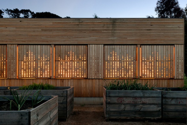
At night the building glows bewitchingly like a lantern, adding yet another dimension to the already picturesque setting.
Browse more homes by style:
Small Homes | Colorful Homes | Eclectic Homes | Modern Homes | Contemporary Homes | Midcentury Homes | Ranch Homes | Traditional Homes | Barn Homes | Townhouses | Apartments | Lofts | Vacation Homes
Related Articles Recommended


