Houzz Tour: Watch a Sliding Wall Turn a Living Space Into 5 Rooms
Gramercy Park is a small, beautiful, private, fenced-in park in Manhattan. It’s only open to residents living in the surrounding New York City neighborhood. And despite living in a crumbling, kitchenless, 390-square-foot apartment in Gramercy, this college professor wasn’t about to give up his key to the park to buy a newer, larger unit in a less-desirable neighborhood.
So he began looking at ways to make his microunit studio feel more like a one-bedroom apartment, with a real kitchen — not just the sliver of counter and sink he’d been living with — and space where he could entertain, work from home and watch TV in bed. After stumbling upon media coverage of architect Michael Chen’s “unfolding” apartment, the professor knew he had to solicit Chen’s help. 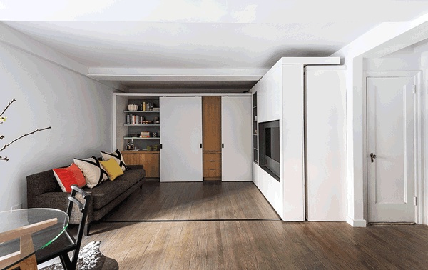
Houzz at a Glance
Location: Gramercy neighborhood of Manhattan
Who lives here: A college professor
Size: 390 square feet (36.2 square meters); 1 bathroom
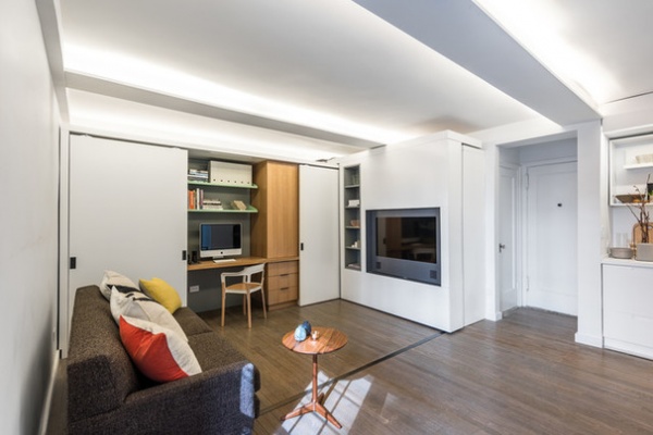
The architect responded with a custom-made storage piece with a sliding TV wall that serves multiple functions. The homeowner can slide it to one side of the living room and have open floor space for entertaining. Slide it to the other and he’s got a divider wall for a bedroom. The TV swivels so he can watch it from the sofa on one side or his bed on the other. The storage unit also has a dry bar, workstation and closet, all of which can come to life or recede into the shadows depending on where the homeowner positions the sliding wall.
The apartment is in an old building constructed in the early 20th century. Chen guesses the units were meant to be temporary. “They were designed for short-term use, never to accommodate a modern lifestyle,” he says.
The original space had peeling plaster, cracked ceilings and a barely-there kitchen niche. “It was coming apart around him and clear that it was not going to work anymore,” Chen says.
But incorporating a full-size living room, bedroom and home office was out of the question given the square footage, so Chen and fellow architect Brady Caldwell from Chen’s firm, MKCA, got to work figuring out how to integrate scaled-down spaces. The architects, along with Star Cities Design acting as general contractor, gutted the space — with the exception of the floor, which they refinished — and removed some existing partitions.
Home office. The custom storage piece takes up two walls in what’s considered the living room space. You can see the track in the floor on which the sliding wall’s casters run. The building owners prohibited Chen from hanging anything from the floor slab of the unit above, so his original idea of suspending the sliding wall cabinet was quickly thrown out.
This image shows how the apartment looks the majority of the time. The sliding TV wall is pushed against the Murphy bed on the right like a Tetris piece. The bed is up, and the closet doors are covered by the TV unit. This maximizes the open floor space and, with the doors open to the workspace, creates a working-from-home scenario.
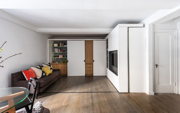
Living room and family room. Here, the work scenario disappears and the room takes on a more entertaining vibe with the dry bar area on the left exposed. Glassware sits in cabinets beneath the liquor bottles. When it’s just the homeowner, he can shut everything off and relax on the full-size sofa to watch TV.
Sofa: Room & Board
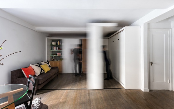
The sliding wall can be pushed manually into different positions but is also motorized, so the homeowner can flip a switch to have it move to create different living scenarios. Power cords run through the top of the unit into the top of the back wall of cabinetry to a wire management system. “It added a definite whiz-bang aspect to the project that tapped into some inner little-boy desire of the client’s,” says Chen, who custom designed the motor himself, which was then built by Trak-Kit.
The storage unit is aluminum frame on the inside, and plywood and MDF with a satin lacquer finish on the outside.
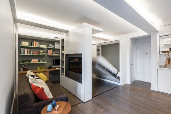
Chen felt that in such a small space, cluttering up the ceiling with visible light fixtures would have added too much visual noise. Instead, the entire top of the cabinet is a series of high-powered LED strips. Channels in the existing ceiling beams were routed out for more LED lighting. “It all throws light up at the ceiling and washes back down, creating a gentle, flattering, even light without an apparent source,” he says.
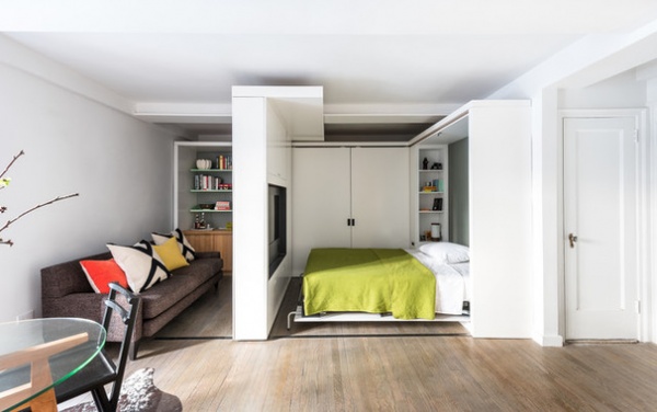
Bedroom. The TV that sits in the sliding wall rotates 180 degrees, and there are built-in speakers on either side of the sliding wall, allowing the homeowner to watch TV in bed.
The bed has an integrated nightstand with shelves for books, a lamp and an alarm clock. About the only thing Chen didn’t design custom was the mechanism for the Murphy bed, which came from Haefala. The legs at the end automatically turn 90 degrees when the bed comes down.
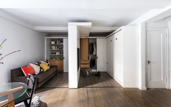
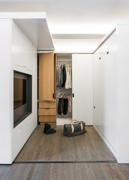
Dressing room. In this scenario there’s a separate private dressing space that’s shielded from the dining area window to the left of the living area. There’s a full-height rift-cut white oak closet with double hanging space, shelving and drawers. When it’s time for bed, the homeowner gets undressed and then brings the bed down.
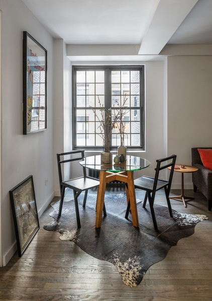
“Having a table out at all times that can seat four for meals makes a small space so much more usable and humane,” says Chen of the dining area off the living room.
This is one of only two windows in the apartment. The other is in the bathroom. The fact that it’s a north-facing window that overlooks the interior courtyard of the building led Chen to develop the hidden LED strategy mentioned earlier. “We wanted to get the apartment feeling brighter without the sensation of lights being on during the day,” he says.
Table: Room & Board; chairs: Vonnegut Kraft; rug: Meg Callahan; cocktail table: Colony
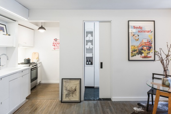
The kitchen had been tacked on and removed over the years, leaving a “tiny little scrap of kitchen,” Chen says, that included 3 feet of counter space, a sink and an undercounter refrigerator. “It was clearly impossible to cook a meal,” he says.
Everything past the door opening in the kitchen used to be a walk-in closet, which Chen removed to extend the kitchen to include a proper range and a full-size refrigerator. The lost storage got divided up into the storage unit in the living room and a bathroom linen closet, seen here through the space-saving pocket door.
Because the bathroom has the only other window in the apartment, Chen knew the homeowner would like to leave the bathroom door open. So the architect added the linen cabinet as something nicer to look at than a toilet or shower.
Art: vintage Swedish train poster
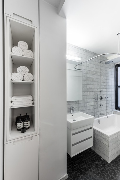
Chen also overhauled the bathroom, keeping the plumbing in place but changing all the fixtures and finishes. Honed Carrara marble tiles cover the walls. Black marble hex tiles make up the floor.
Sink: Duravit
Architect: MKCA
General contractor: Star Cities Design
Motororization, custom hardware and fabrication: Trak-Kit
Browse more homes by style:
Small Homes | Colorful Homes | Eclectic Homes | Modern Homes | Contemporary Homes | Midcentury Homes | Ranch Homes | Traditional Homes | Barn Homes | Townhouses | Apartments | Lofts | Vacation Homes


