Houzz Tour: The Science of Blending Old and New
http://decor-ideas.org 05/19/2015 04:13 Decor Ideas
The owners of this house love it now, but that was not always the case. Previously, they had lived in a nearby neighborhood in an angular midcentury modern home with sleek furniture to match. They bought this classic house because it had more space, a yard and a quieter street for their kids, who like to ride bikes and play soccer in the neighborhood. However, after moving in, they unpacked a case of buyer’s remorse. “I think they had a feeling of, ‘What did we just do?’” says interior designer Brian Dittmar. After one of the owners and Dittmar connected at a design event, he was brought onboard to help make a questionable decision the right one.
Photos by David Duncan Livingston
Houzz at a Glance
Who lives here: A couple (he’s a judge; she’s a scientist) and their 2 kids
Location: St. Francis Woods neighborhood of San Francisco
Size: 3,000 square feet (278 square meters); 4 bedrooms, 3 bathrooms
Year built: 1927
The mission developed by Dittmar (principal at Brian Dittmar Design) and the clients for the home’s lower level was straightforward: They wanted to give the traditional home a more modern spirit and warm, inviting spaces. They also wanted to use many of the pieces of furniture and art the couple already owned. “We wanted to make this once-stodgy home feel fresh and pulled together, but not overly ‘designed’ looking,” Dittmar says.
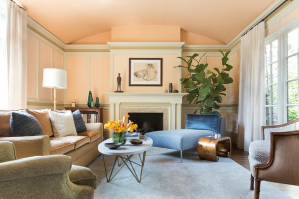
The warm and inviting portion of their mission statement manifests itself in the living room. One of the homeowners met with a woman who specializes in colors for fashion and makeup. “She said I should decorate with the colors that work for me in clothing,” says the client. “I initially thought she was crazy.”
But when she described the conversation to her designer, Dittmar thought it might be a good place to start. “My client has red hair and looks good in warm colors,” he says. “Why not paint her rooms in warm tones?”
The living room, with its barrel-vaulted ceiling, is done in skin-flattering shades of peach and accented with warm neutrals and blues. Modern pieces, such as the chaise longue, received more traditional upholsteries to make them fit in the classic home.
Wall paint: Peach Stone, Benjamin Moore; ceiling paint: Soft Salmon, Benjamin Moore; accent stripe paint: Cat’s Paw, Farrow & Ball; trim paint throughout the house: Chit Chat, C2; Lotus lamp: Barbara Barry for Visual Comfort; coffee table: Oly Studio; carpet: Mark Nelson Designs
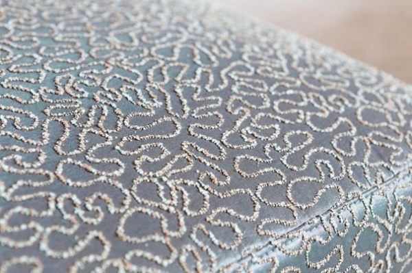
The upholstery speaks to one of the client’s passions and profession. “She’s a scientist, and she fell in love with the squiggly lines on this fabric because it reminded her of looking through a microscope,” Dittmar says.
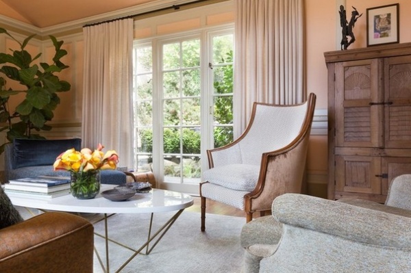
Other traditional pieces that were inherited received contemporary upholstery fabrics for a more modern look. The inherited pieces, including this curved-back chair, are from the husband’s grandparents, who had an apartment on Central Park West and a house in East Hampton. After the grandparents died, their furniture was divided among the grandchildren. In the owners’ previous (and very modern) home, the regal pieces never quite fit. Here, with their new skin, everything from the past and present lives in harmony.
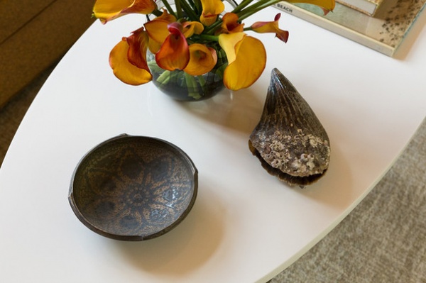
That feeling of compatibility is demonstrated on the surface of the coffee table, where a shell that was discovered and brought back from a trip to Mexico and a piece of pottery from family coexist. “There’s a lot of family history in this room,” Dittmar says.
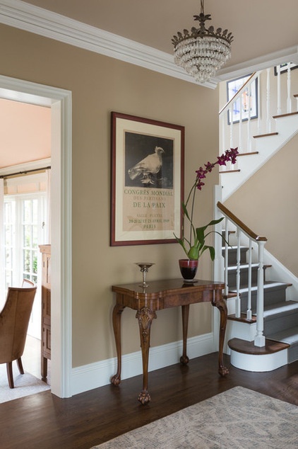
For the entry, the designer and client looked for the perfect neutral. “We wanted the brown of kraft paper or a paper bag,” says Dittmar. The evocative name of the Benjamin Moore shade they discovered says it all: Trench Coat.
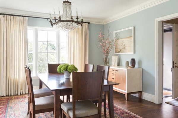
The visual temperature drops a bit in the dining room, where Dittmar selected what he calls an entrancing pale blue for a dreamy look.
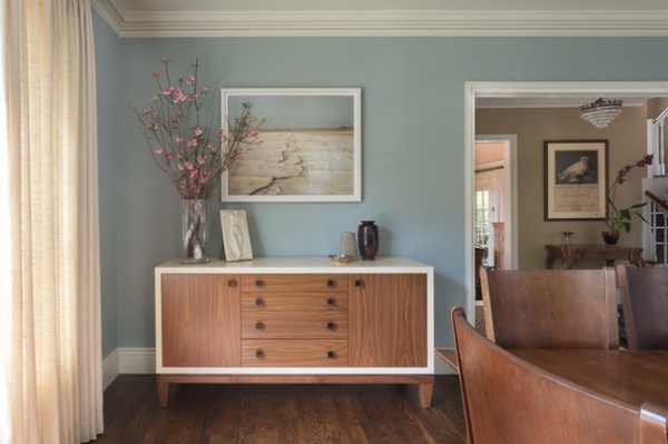
“The chandelier is original to the house, and we wanted to leave it,” Dittmar says. “But we wanted to hang some of their modern photography collection here and use the dining room table and chairs they already had.” The color, curtains and custom sideboard with natural and painted wood bridge the style gap.
Wall paint: Silver Screen, C2; photo above sideboard: Richard Misrach
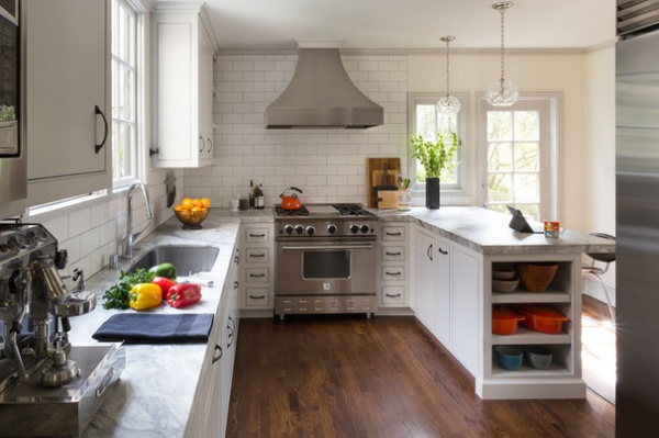
Some of the biggest changes to the house happened in the kitchen. An old elevator was taking up a lot of space and closing it off from the den (or family room) and the dining room. By removing it, Dittmar was able to reconfigure the room to make it more open to the adjacent spaces, improve the work triangle and allow the owners to have a much-desired eat-in peninsula.
Custom cabinets: Ukiah Cabinet Makers; countertop: Super White Natural Quartzite, IRG; range: BlueStar; range hood: custom, Vent-A-Hood
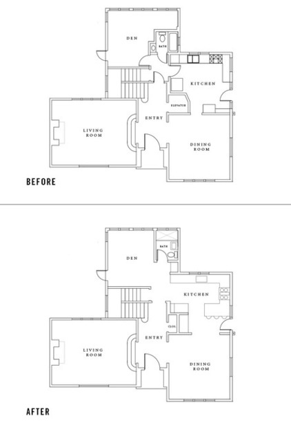
The “before” and “after” floor plans tell the story.
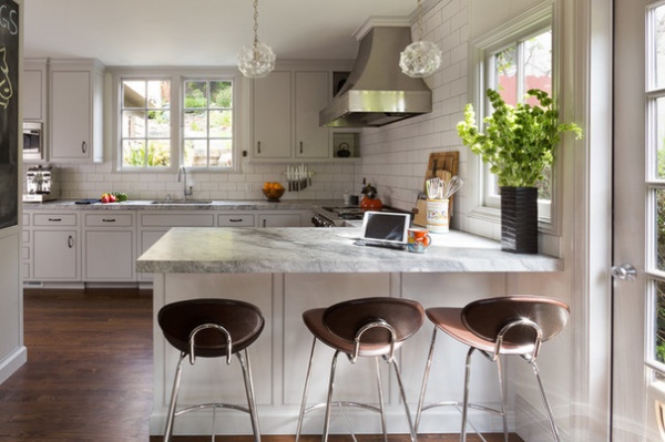
“She really wanted to have space for the kids to do their homework and for people to gather during parties,” Dittmar says. “By taking out a never-used elevator, we allowed her to have that.”
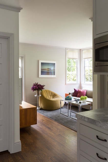
With the elevator out of the way, the connection between the kitchen and the den is much stronger.
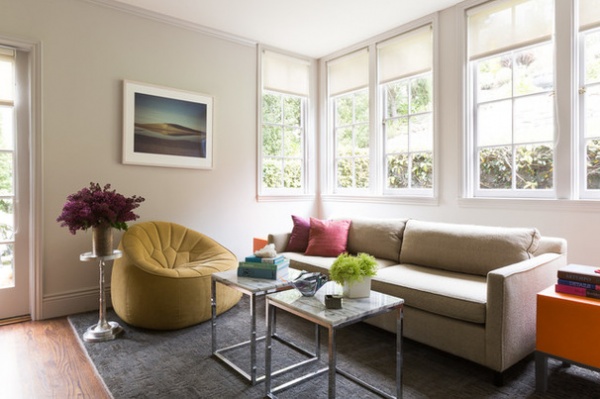
Dittmar gave the new den a more modern tone with a low sofa, a mustard-colored chair and another nature photograph by Misrach.
When it comes to the design, perhaps a bit of science makes it come together. The client says she thinks most scientists value order, and that her home is designed to be orderly but still interesting — not overly fussy. The photographs in their home remind her of her longtime love of science and the mysteries of the natural world.
Sofa: Mitchell Gold + Bob Williams; chair: Ligne Roset; coffee tables: CB2; rug: Abbey Carpet
Browse more homes by style:
Small Homes | Colorful Homes | Eclectic Homes | Modern Homes | Contemporary Homes | Midcentury Homes | Ranch Homes | Traditional Homes | Barn Homes | Townhouses | Apartments | Lofts | Vacation Homes
Related Articles Recommended


