My Houzz: Art and Fashion Inspire in a Downtown Family Home in Maryland
http://decor-ideas.org 05/17/2015 01:13 Decor Ideas
“I have a weakness for art and blazers,” Saulé Smariga says. “They absolutely elevate the look of their surroundings. A T-shirt and jeans plus a blazer actually looks like you made an effort, and a great piece of art can stand alone in a simple room and convey the appearance of a carefully thought-out decor plan. They both add an element of polish.” Saulé, co-owner of decor boutique Silk&Burlap, followed her own advice and used art and a playful, casual style to decorate her family’s 1990s suburban home in Frederick, Maryland.
Houzz at a Glance
Who lives here: Chris and Saulé Smariga; their children, Anton (age 12), Naomi (10) and Anya (7); and Luna, a 5-month-old Cavapoo puppy
Location: Frederick, Maryland
Size: 2,800 square feet (260 square meters); 4 bedrooms, 2 full bathrooms, 2 half baths
Year built: 1996
Saulé says that when she was a kid, her parents would often take her and her sister to art museums. She used to hate it, but now she says that love of art got under her skin and has had a lasting influence on her.
Today Saulé and her husband, Chris, are hoping to pass on their mutual love of art to their three kids. They have a growing art collection consisting of works by local artists, one they bought from an art student off the street in New York City and a few done by themselves or their children.
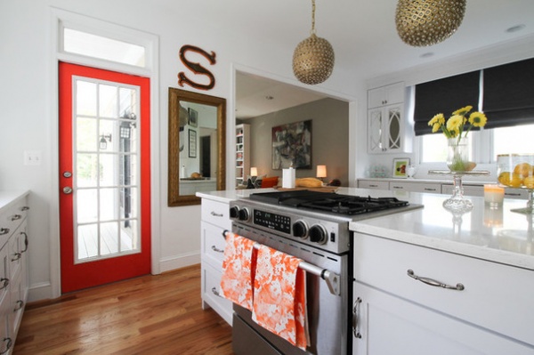
Countertops: Zodiaq engineered quartz; over-the-counter lights: Serena & Lily; door paint: Gladiola, Sherwin-Williams; orange tea towels: Silk&Burlap
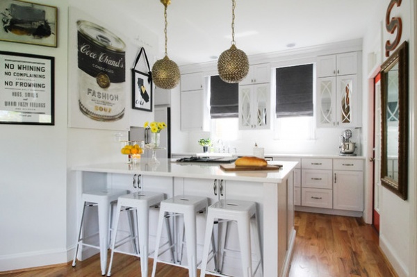
Saulé and Chris moved into their newly built home 13 years ago, before they had children. They loved the downtown location, especially as it’s close to Silk&Burlap, the boutique that Saulé co-owns with friend Angelique Hoffman. In the store and in her home, Saulé’s love for and effortless mix of art and fashion are apparent, as can be seen in the Coco Chanel– and Andy Warhol–inspired art on the wall.
The couple had always intended to move into something with a bigger yard and maybe a garage once they had kids. But now that they have three kids and a dog, they’ve realized that somewhere along the way they decided to live with the home they were in. So now their focus is on making the most of the home they have.
Bar stools and “Cali” art: Silk&Burlap; “Fashion Soup” art: Oliver Gal
“We have known for a long time that we don’t need more square footage; we just needed efficient square footage, and this house has proven that,” Saulé says. “Being able to identify even little things that make the house feel bigger and more organized helped us feel comfortable and settled in our home. The convenient location has been hard to leave, so we have been thoughtful about ways to make every inch of our house work for us, inside and out.”
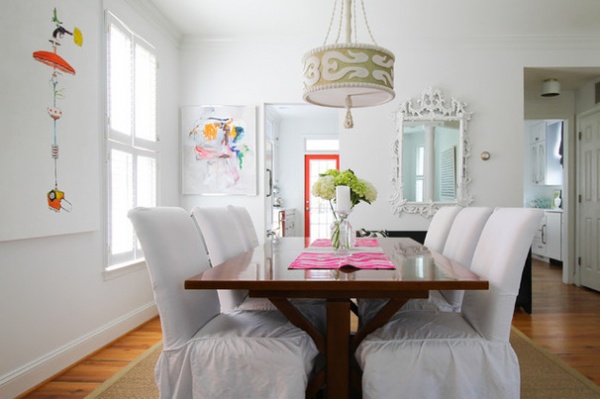
In the dining room, this philosophy meant turning the walls into a gallery to display some of the couple’s collected artworks.
Table and chairs: Pure Home; slipcovers: Simply Shabby Chic; light fixture: Shine by S.H.O.; art: “Totem Umbrella,” Doug Groupp (left) and Margaret Kennedy (right)
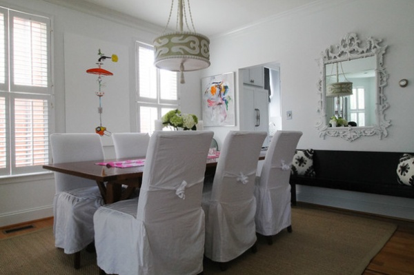
One of the most striking pieces in the home is a painting that Saulé and Chris bought from an artist off the street in New York. It’s called “Totem Umbrella” and it’s by Doug Groupp, a contemporary pop artist. Saulé says that when they bought it, it was a huge unframed canvas that would have taken up most of the dining room wall. They had it resized and mounted to fit between the windows.
Black bench: family heirloom from Chris’ parents; mirror: Silk&Burlap
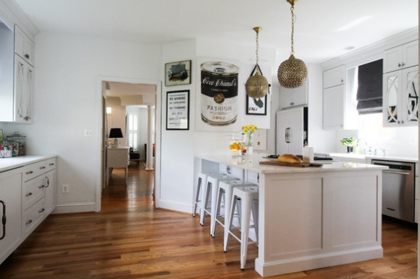
The couple recently renovated their kitchen for the second time since they’ve owned the home. “Our first kitchen was a DIY kitchen we did on a very modest budget, so it didn’t seem extravagant to revisit this project,” Saulé says.
The family loves to cook together and entertain. While they didn’t change the kitchen’s footprint, the recent changes make it feel more open and spacious for those activities as well as provide additional storage.
“We chose easier-to-care-for finishes and decided to hide the cabinet clutter with mirrored doors which reflect light, add a bit of glamour and very practically hide the varied wares stocked on the shelves inside,” Saulé says.
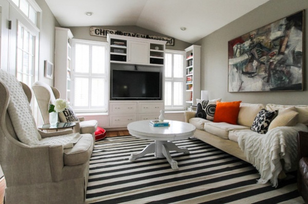
Even though adding built-ins in the family room was one of the first changes the couple made to their space, Saulé says that as soon as they did it, they still wondered why they waited so long. She says the added storage also kept them from feeling that they needed more square footage.
“The large drawers and window seats help corral the many kid toys, board games, puzzles and DVDs that accumulate over the years,” she says. “As the kids have grown, our storage needs have changed. Electronics, chargers, iPods and phones have taken over our storage drawers, but the need to hide the clutter remains.”
Painting: H.I. Gates; rug: Draper Stripe, DwellStudio; sofa: Lee Industries; coffee table: from Chris’ parents; linen chairs (vintage) and “Chesapeake Watershed” art: Silk&Burlap; black and white pillows: Silk&Burlap; orange pillows: Lulu & Georgia
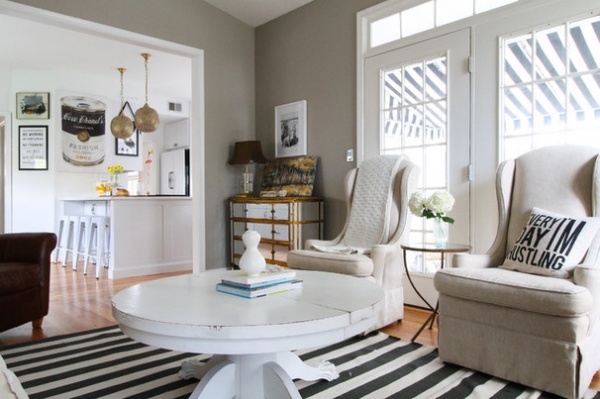
The family room, in the back of the house just off the kitchen and back deck, is one of the few rooms that isn’t painted white. The darker color on the walls gives this room a cozy feel, and the graphic black and white striped rug plays off the awning outside and gives the space a sense of cohesion and movement.
Mirrored dresser and pillow: Silk&Burlap; wall paint: Plymouth Rock, Benjamin Moore
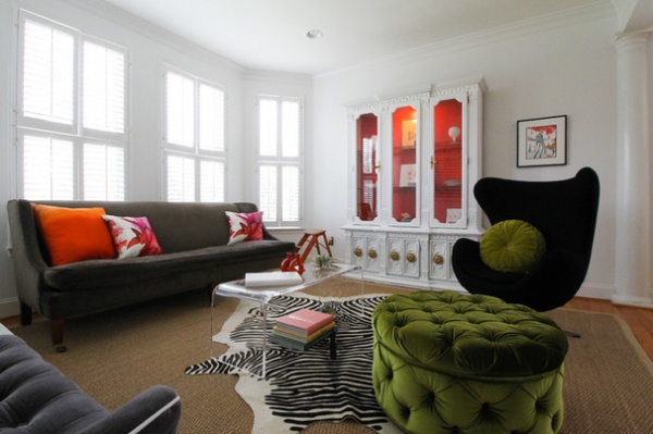
The living room, in the front of the house, greets visitors with bright colors, graphic patterns and bold furniture pieces, all set against a backdrop of crisp white walls with lots of natural light.
Sofa: Lee Industries; coffee table: Plexi-Craft; ottoman: Urban Outfitters; black chair, printed hide rug, and hutch: Silk&Burlap; rug: Natural Area Rugs
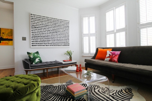
The hand-lettered canvas in the living room was a labor of love; Saulé worked on it with her son Anton. The words are the lyrics to the song “Stereo Heart” by Gym Glass Heroes. Saulé laughs and says it took her many more hours than she anticipated, spread out over years.
“I love the scale and how simple yet graphic it is,” she says. And the memory of working on it with her son makes it one of her favorite pieces in the home.
Art: Margaret Kennedy (left) and Saulé and Anton (right); pillows: Lulu & Georgia
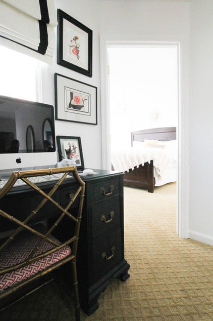
Making the most of small spaces where she can find them, like tucking a small office into the hallway outside the master bedroom, is another way Saulé has made the home work for her growing, busy family.
Chair and desk: vintage
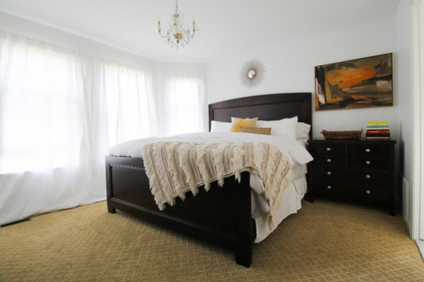
This abstract painting in the master bedroom, as well as ones in the entryway and dining room, were gifts. They are pieces the couple loves, and they have sentimental value.
Bedding: Margaret Muir; sunburst pillow: Trina Turk; nightstands: Nautica Home, Lexington
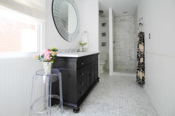
The couple recently renovated the master bathroom. The finishes are traditional, elegant and neutral, and the round, cut-glass mirror adds just the right amount of sparkle.
Vanity: Restoration Hardware; Spiegel Bubble mirror: Kare; floor: Carrara marble hexagon 2-inch tile, The Tile Shop; shower: Carrara marble subway tile, The Tile Shop
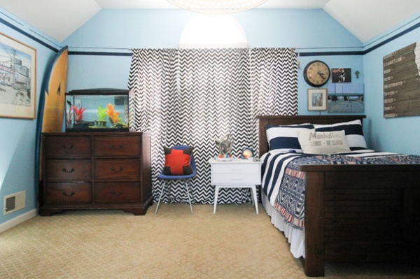
Twelve-year-old Anton’s room is on the third floor, the only room on that level. The vintage throw on the bed ties together all the textures and patterns in the room.
Curtains: homemade; duvet: Target; throw: vintage, Venus on the Half Shell; California art: Restoration Hardware; pillow with red cross: gift; plug-in clock and pillow on bed: Silk&Burlap
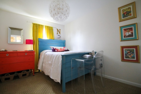
Naomi, 10, picked out this light fixture and painted her bed herself.
Bed, dresser and desk chair: Silk&Burlap; curtains and bedding: Target; light fixture: Ikea; waterfall console: Overstock
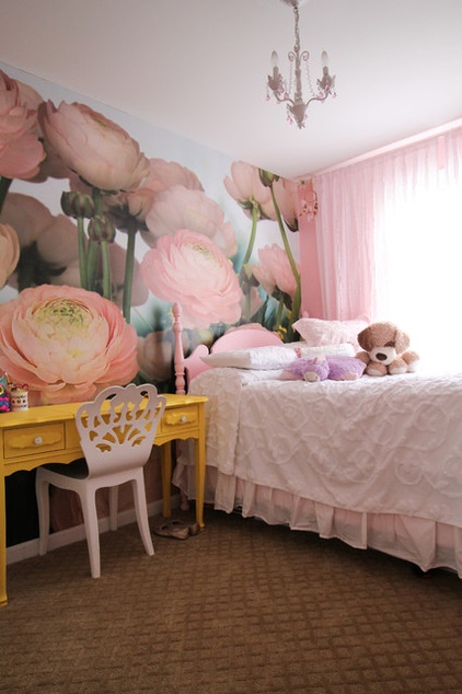
The flower wallpaper was a choice Saulé made when Anya, now 7, was little. Thanks to the oversized scale of the flowers, it has remained a perfect backdrop as the room has transitioned into a room for an older girl.
Desk, bed and bedding: Silk&Burlap; wallpaper: Sherwin-Williams; light fixture: Simply Shabby Chic
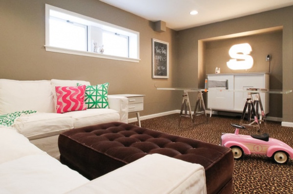
Downstairs is the rec room, where the kids can play video games or have Ping-Pong tournaments. Saulé found the vintage Plexiglas slab at a garage sale, and one of her vendors had the perfect legs for her to pair with it and create an interesting Ping-Pong table.
Sofa: Room & Board; pillows: Silk&Burlap; ottoman: Pure Home; “S” light: Carnival light (painted white), Urban Outfitters; vintage MCM chest: Renzo Rutili for Johnson Furniture
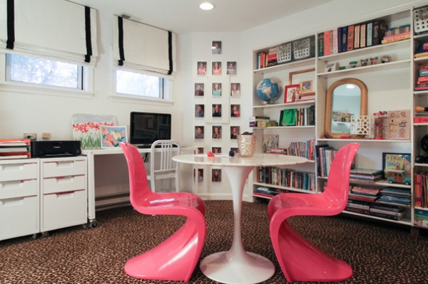
A separate room at the bottom of the stairs houses the kids’ games, books and craft supplies and is a quiet place for doing homework.
Pantone chairs and white table: Lex Mod; carpet: Call of the Wild, Shaw
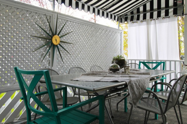
Off the kitchen and family room is a casually covered outdoor seating area. A painted trellis backdrop and curtains create shade and provide privacy for this urban setting.
Silver table and chairs: Room & Board; turquoise chairs: Target; sunburst clock: Silk&Burlap; awning: Sunbrella fabric
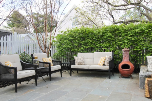
Chris and Saulé added the stone patio off the back porch, expanding their entertaining area. Saulé loves that it saves them lots of time doing yardwork on the weekends.
Patio furniture: Target
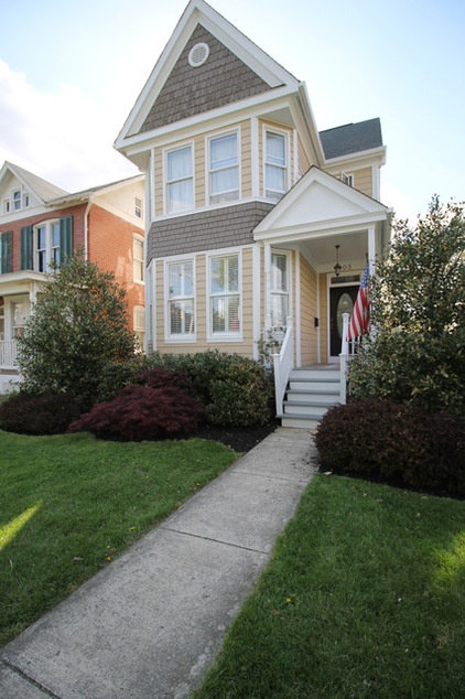
The exterior of the Smariga family home stands tall.
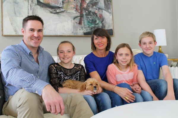
The Smariga family relax in their family room with Luna, their Cavapoo puppy, the newest member of the family.
See more photos of this home
My Houzz is a series in which we visit and photograph creative, personality-filled homes and the people who inhabit them. Share your home with us and see more projects.
Browse more homes by style:
Small Homes | Colorful Homes | Eclectic Homes | Modern Homes | Contemporary Homes | Midcentury Homes | Ranch Homes | Traditional Homes | Barn Homes | Townhouses | Apartments | Lofts | Vacation Homes
Related Articles Recommended


