Houzz Tour: A Family Home Grows in Brooklyn
In a neighborhood profile, New York magazine calls Brooklyn’s Park Slope neighborhood the “very definition of well-rounded” and deems it a comfortable home for artists, other creatives and (perhaps due to a lot of green space and good public schools) people who push strollers.
Susana Simonpietri’s clients had recently joined the ranks of the stroller set when they relocated from Chelsea in Manhattan to a recently renovated townhouse in Park Slope. But, as Simonpietri (an interior designer and the principal of Chango & Co.) points out, “newly renovated” doesn’t mean finished. “It was a lovely brownstone that had been remodeled by a developer,” she says. “It had beautiful floors but not much storage. There was a lack of built-ins and character.”
Her job was to complete a second remodel to fill in the blanks and furnish the new family home.
Photos by Ball & Albanese
Houzz at a Glance
Who lives here: A couple and their little girl
Location: Park Slope neighborhood of Brooklyn, New York
Size: 3,200 square feet (297 square meters); 4 bedrooms, 3½ bathrooms
Year built: 1901
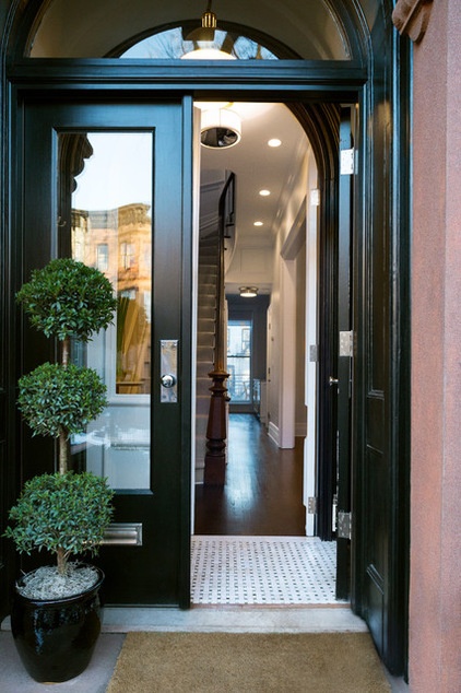
As with many brownstones around Brooklyn, the charm begins at the front door. The buildings are characterized by the reddish-brown color of their sandstone exterior. For many, the sight of that stone immediately evokes images of New York City boroughs.
This townhouse retains a traditional vestibule.
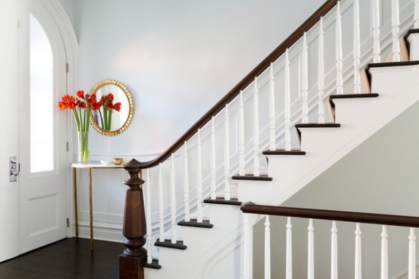
Step inside and you might think that the lovely wainscoting, the newel post and the stair rails were all original to the home. You’d be only partly correct.
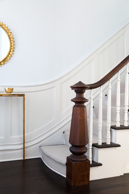
An earlier owner had eliminated most of the distinctive trim that decorated the turn-of-the-century building. The newel post and stair railings have been there since 1901, but Simonpietri added the curving wainscoting. “We’ve worked on a lot of brownstones,” says the designer. “We’ve learned a lot about the relatively simple molding that goes into them. This home had been mostly stripped of its character, but we added it back where we could.”
Working in the brownstone vernacular also has taught the Brooklyn designer a thing or two about space planning. “Brownstones are narrow, and experience has taught us a few tricks about making them seem less so,” Simonpietri says. “It’s about careful selection of colors and pulling light in from the front and back — because that’s where the windows are.”
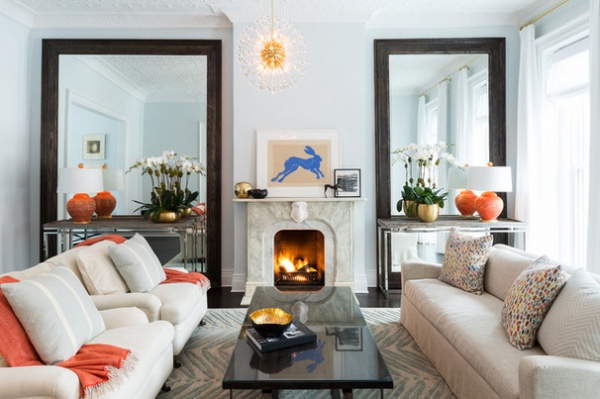
In the front living room, the designer installed two supersize mirrors on either side of the fireplace to capitalize on the large windows near the entry. The giant pieces reflect light into the space and give the illusion of being windows themselves. “They really amplify the width of the space,” says the designer.
Wall paint throughout the house: Gray Sky, Benjamin Moore; ceiling and molding paint throughout the house: Decorators White, Benjamin Moore
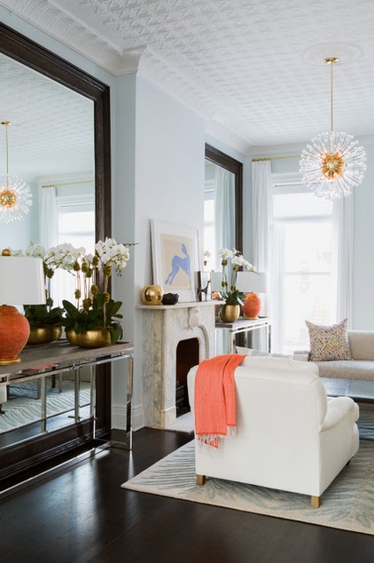
Layering narrow consoles and accessories in front of the mirrors was another strategic design move. Not only do they make the space feel more textured and rich, but they make it seem special in the evening. “When I design a room, I’m thinking about what it will look like during the day and night, summer and winter,” she says. “The lamps on the console have shades with a gold foil lining. When you turn them on at night, they cast a beautiful gold glow that’s reflected in the mirrors.”
Above the fireplace, an artwork by British artist Sophie Ryder depicting a blue rabbit is quite a bit smaller than the pair of mirrors flanking it. “Anything large would have been too much competition with the mirrors,” Simonpietri says. “Putting something there that’s a smaller scale makes it just right.”
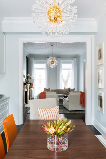
Simonpietri used the mirror trick in the adjacent dining room too.
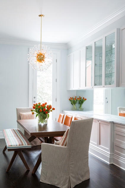
The dining room was narrow to begin with, but due to storage needs, the designer added a built-in console and cabinets along one wall. She covered the space between the two with a long expanse of mirror, instantly making the room lighter and less cramped.
The dining room table is surrounded by a bench and chairs covered with outdoor fabric. “In a family with kids, you have to be beautiful and practical,” Simonpietri says.
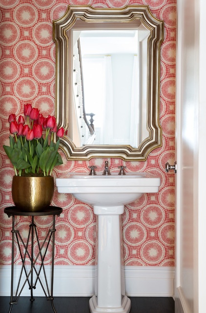
The narrow public rooms on the first floor are painted in light and reflective colors. But in the powder room, Simonpietri staged a colorful moment with a salmon-orange wallpaper. “This small room needed to make a statement and hold its own,” she says.
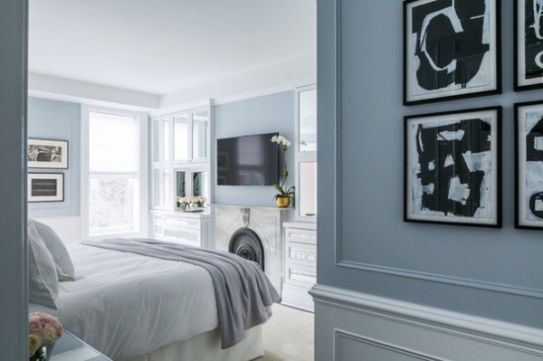
More mirrors are found in the master bedroom. The designer added built-ins on either side of the fireplace for much-needed clothing storage. Each cabinet and drawer front is inset with mirror.
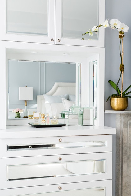
There’s not room for a dresser, so a mirrored and lit niche in one of the built-ins does the job.
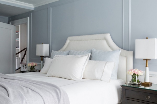
Prior to the remodel, the walls were flat expanses of drywall. The designer applied narrow moldings for a paneled effect.
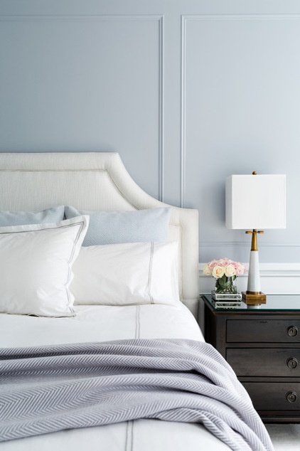
“It’s one of the tricks we play as designers,” she says. “We layer a small space with details to make it more interesting and keep the eye busy.”
The result is a room that, while on the small side, lives large.
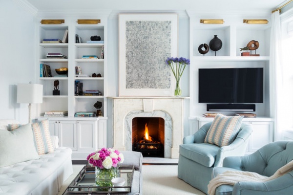
An upstairs sitting room serves as the media room. Key pieces move to allow everyone to watch the television when it comes on. The television can be pulled out and angled from the wall toward the sofa, and the blue armchairs can be swiveled to face the set. “Putting the TV to the side of the fireplace makes it so it isn’t front and center all the time,” Simonpietri says.
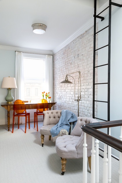
An odd space at the top of the stairs is outfitted with a table for working and chairs for reading. “This area is located near the nursery,” Simonpietri says. “It gives the parents a place to land while they are upstairs with their child. It also makes what could be a dead space dynamic.”
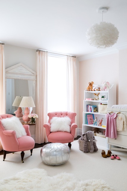
There are also places for adults to perch inside the nursery. “If we can, we add seating in a child’s room,” says the designer. “It’s a place where adults gather and play with the child.”
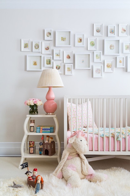
Over the crib is a collection of framed Beatrix Potter (creator of The Tales of Peter Rabbit) prints. “We did this because of their little girl’s nickname,” Simonpietri says. “They call her Bunny, because she hops around everywhere.”
And with images of Potter’s Peter Rabbit, Tom Kitten and Jemima Puddle-Duck, the character development of this townhouse is complete.
Browse more homes by style:
Small Homes | Colorful Homes | Eclectic Homes | Modern Homes | Contemporary Homes | Midcentury Homes | Ranch Homes | Traditional Homes | Barn Homes | Townhouses | Apartments | Lofts | Vacation Homes


