Kitchen of the Week: Galley Kitchen Is Long on Style
http://decor-ideas.org 05/15/2015 21:13 Decor Ideas
The restraints of a galley layout and using relatively inexpensive Ikea cabinets didn’t stop this kitchen from having an expansive feel, a luxe look and lovely French-bistro style. A strong connection to the dining room lends a more open feeling, while brass hardware dresses up the ready-made cabinetry. Oversized capiz shell globe chandeliers, a leaded glass transom, brass accents and a penny tile backsplash befit the Victorian home’s style. Most important, the kitchen is highly functional for a restaurant owner who’s also a talented home chef.
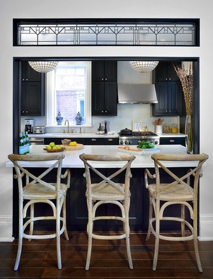
Kitchen at a Glance
Who lives here: The young family of a restaurant owner
Location: Toronto
Size: About 180 square feet (17 square meters)
The designers completed the kitchen makeover during a whole-house renovation. Previously it had just been a bare-bones kitchen, though the homeowners already had the six-burner Thermador gas range and vent hood. “The homeowner owns a restaurant and is a great home chef,” says designer Peter Brooks of BedfordBrooks Design.
This wide pass-through between the dining room and kitchen is new. A beautiful leaded glass transom marks the transition between the two spaces and enhances this large pass-through and breakfast bar. It also plays to the home’s Victorian-era vintage. Not opening the kitchen completely to the dining room also honored the historic architecture and provided a lot more cabinet and counter space.
Transom window: Stained Glass Services
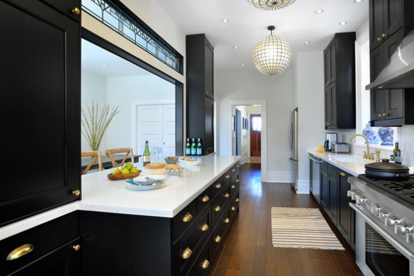
We’ll refer to this large piece on the left as the island, even though it’s not freestanding. When laying out a galley kitchen, you have to have priorities. Giving this home chef a lot of workspace on the countertops near the range was at the top of the list, so the expansive countertop on the 7½-foot-wide island was one of the most important design moves. There is also ample workspace on either side of the range. The tradeoff was recessing the bulky refrigerator at one end of the end of the room (right rear in the photo above) and the bulky food pantry at the other (left rear in the next photo). The homeowners were happy to take a few extra steps to the refrigerator in exchange for the added work area. There is deep drawer storage space on the kitchen side of the island and additional cabinet space on the dining room side.
The designers played with proportions and shapes to mitigate the long, narrow space. The oversized globe pendant lights and the cabinets and backsplash extended to the ceiling draw the eye up and distract from the narrowness of the space. Double stacking the cabinets also maximized storage capacity and gave the Ikea cabinets a more custom look.
Tip: Store items you don’t use often in high cabinets.
Capiz shell pendants,medium size: Restoration Hardware
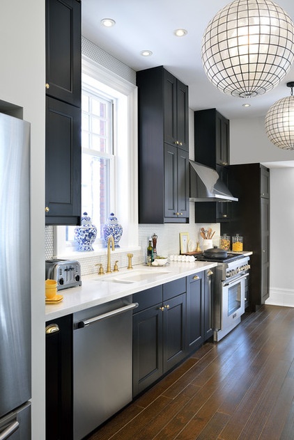
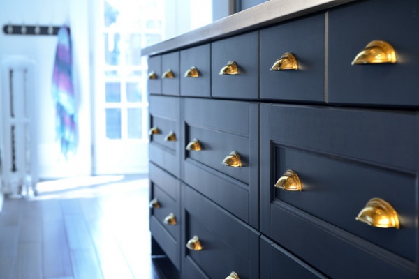
The designers also customized the Ikea cabinetry by dressing it up with stunning antique English brass hardware. “Brass is timeless and steps up the elegance on the dark black-brown cabinets,” Brooks says. In this photo you can also see the Victorian-era architectural detail of high baseboards.
Wall paint: Drum Skin 6210-11 in Cashmere finish, Sico; drawer pulls and cabinet knobs: Upper Canada Specialty Hardware; Cuisinart Classic brushed chrome toaster
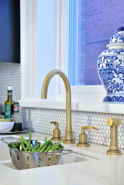
The faucets have a matte antique brass finish, which relates to the cabinet hardware without looking too matchy-matchy. The white glazed undermount sink creates a seamless look across the counter.
Mosaic penny tiles are a Victorian period detail that also carry a circular theme throughout the space. The globe lanterns and knobs also add circles, which keep the long, straight lines of the galley from overwhelming the room.
The countertops look like Bianco Venato stone but are actually much more durable quartz. Together with brass fixtures and the black and white palette, they add French bistro style.
Matte antique gooseneck faucet: Roman Bath; penny tiles: Saltillo; grout: Warm Gray, Mapei; cabinets: Ikea (discontinued, but the current Laxarby cabinets are similar)
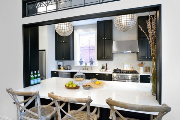
Black trim on the pass-through creates a strong graphic frame and ties it to the cabinets. This large opening to the dining room keeps the galley from feeling like a long, narrow alley.
This area is multifunctional. In addition to offering workspace, it can function as a buffet during dinner. French-bistro-style counter stools transform it into a breakfast bar or a spot where people can keep the chef company while he cooks.
Browse more Kitchens of the Week
Related Articles Recommended


