Houzz Tour: An East Coast Cottage Look in Los Angeles
http://decor-ideas.org 05/15/2015 02:13 Decor Ideas
Linda Perlman wanted an environmentally friendly house with all the trappings of a breezy East Coast summer cottage. But living in Southern California, she feared the traditional aesthetic wouldn’t fly. Architect Kirk Snyder eased her worries by replacing Perlman’s ranch-style house in Sherman Oaks with a home in the style of an Eastern Seaboard cottage, one that celebrates light, fresh air and casual living.
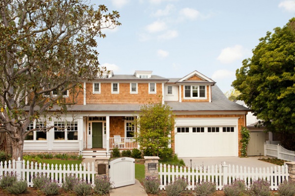
Photos by Karyn Millet
Houzz at a Glance
Who lives here: Linda Perlman, her daughters (ages 11 and 23) and her son (20)
Location: Sherman Oaks, California
Facing an unworkable layout and a small footprint, Snyder, project manager and lead designer at Tim Barber Ltd. Architecture & Design, began by tearing down the existing ranch house. Many of the materials went to organizations for repurposing, such as Habitat for Humanity. Rebuilding presented an opportunity to bring in environmentally friendly systems, which earned the home a LEED Gold rating.
The new design keeps a respectful distance from neighbors, saving much of the lot for play space, which includes a portion of the backyard, a swing set, pool cabana, Ping-Pong table, sport court and pool. And keeping in line with Perlman’s East-meets-West request, the new plan “looks traditional at first yet becomes a more open, contemporary floor plan connecting to the rear outdoor space,” Snyder says.
Roof tiles: Inspire Roofing Products
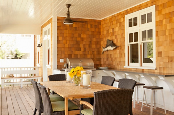
Treated cedar shingles contrast with white exterior trim, which is a composite material called Extira. With those features and faux-slate roofing tiles, the outside envelope mimics what you’d see on the East Coast but is fitter for the Southern California sun.
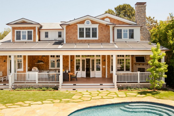
The house has water conservation systems, including greywater tanks and a rainwater cistern, as well as photovoltaic solar collection system (shown here on the rear roof) and a solar pool-heating system.
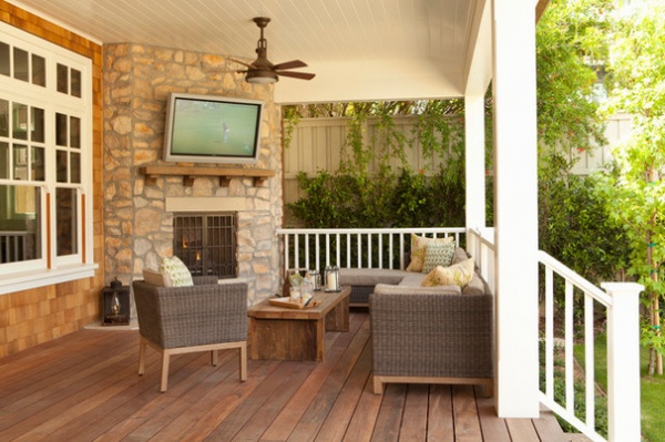
Because of the extreme summer heat in the San Fernando Valley, where the home is located, Snyder designed deep overhangs at the front and rear porches to shade many of the interior spaces. All the living spaces were also designed to have natural cross ventilation.
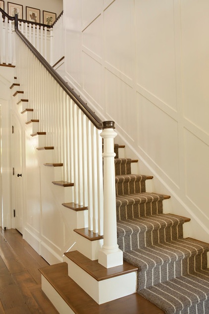
A mostly neutral palette helps highlight classical architectural details, like the newel post on the staircase and the wall paneling shown here. A zero-VOC white paint (Benjamin Moore’s Swiss Coffee) was used on all the walls and trim throughout the home. Interior designer Carla McMorran calls the paint the workhorse of the house.
Floors made of 5-inch-wide, ¾-inch-thick solid reclaimed French oak boards tie the interior spaces together and maintain consistency and flow throughout the home.
Stair runner: Brookline Stripe in Taupe/Oatmeal, Couristan
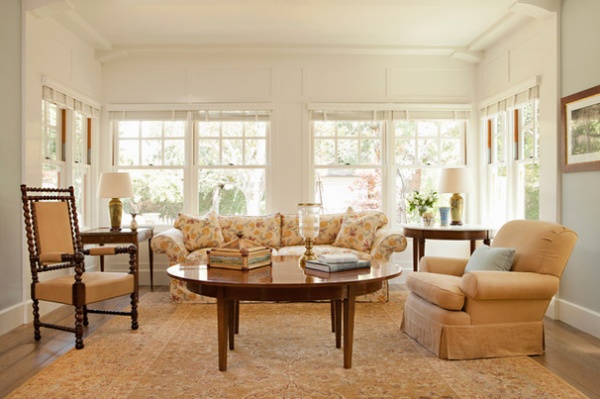
Immediately to the left of the entry, eight windows let sunshine bathe the living room. Notice the change in materials in the front third of the living room. Snyder designed architectural woodwork only in this front area versus the whole room to make the home feel built over time, as if a portion of a former front porch had been captured and incorporated into the space.
The window glides were intentionally left their natural wood color and sealed with wax instead of being painted. Snyder prefers to do this so the windows don’t stick, as they often do when painted.
McMorran used much of the furniture from the old house in the new one. “They had originally purchased very lovely pieces, and in the case of the living room, we used the furniture exactly as it was,” she says. “Many people have commented on the ‘new’ furniture. It looks new because there is so much light and life in the current living room.”
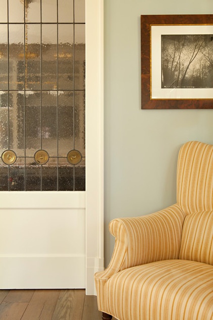
A local artisan crafted custom stained glass door inserts for the sliding doors between the living room and billiards room to facilitate the bouncing of light and color between the two spaces.
Wall paint: Gentle Gray 1626, Benjamin Moore
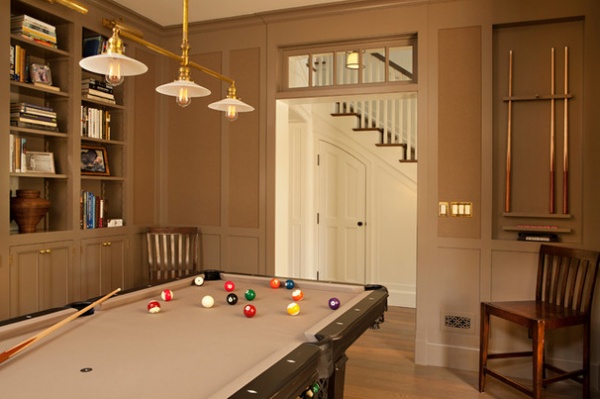
Departing from the conventional green felt table and bar-like ambience of many billiard rooms, McMorran introduced a rich, neutral taupe palette. The Edison bulb light fixture over the table has a natural brass finish that will tarnish.
Light fixture: Trinity, Schoolhouse Electric
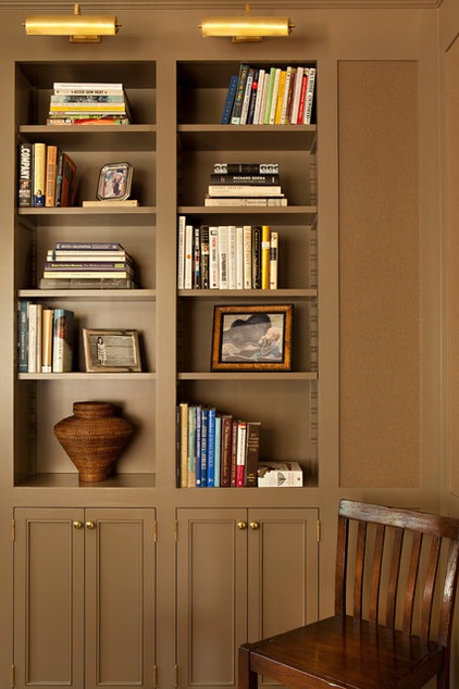
Brass finishes on the bookcase light fixtures and cabinetry pulls echo the warmth of the light fixture over the pool table.
Wall and trim paint: Fairview Taupe HC-85, Benjamin Moore; wallpaper: Sutherland Herringbone in Barley, Ralph Lauren
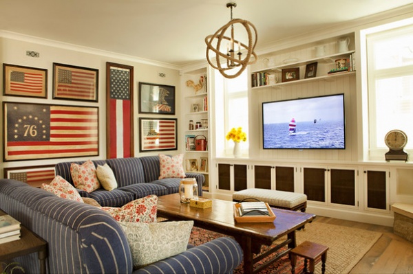
Perlman’s collection of American flags was McMorran’s source of inspiration for the design of the adjacent family room.
As in the living room, McMorran says all of the upholstered pieces in the family room are from the old house. “We took a hard look at the furniture in the old house, and I then drew up a floor plan using the pieces that we felt would make the transition to the new space. Some pieces moved as is, and others were reupholstered with the new house in mind,” she says.
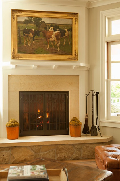
A fireplace in the corner of the family room provides a snug place to get cozy. Like the flags, the cow painting belonged to the family.
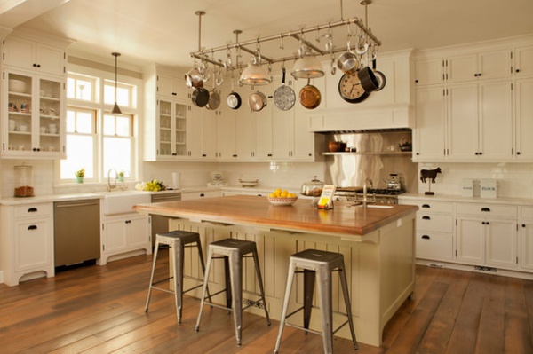
Besides the ample space, the first thing you might notice in the kitchen is the fabulous pot rack made of galvanized plumbing pipe.
Cabinet paint: Swiss Coffee OC-45; island paint: Providence Olive HC-98, both by Benjamin Moore
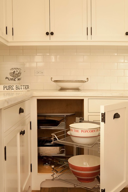
The cabinets were custom designed by Tim Barber LTD Architecture and coordinated by the builder. The perimeter countertops are Calacatta marble.
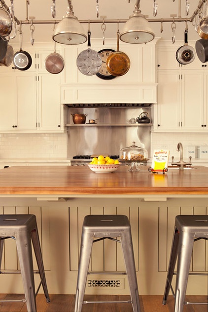
The island countertops are walnut. Notice the register cover in the base of the kitchen island. Snyder made the most of usually wasted space by hiding the HVAC ducting here and a central vacuum in the base of the perimeter cabinets.
Mid Century Studio Stools: Tolix
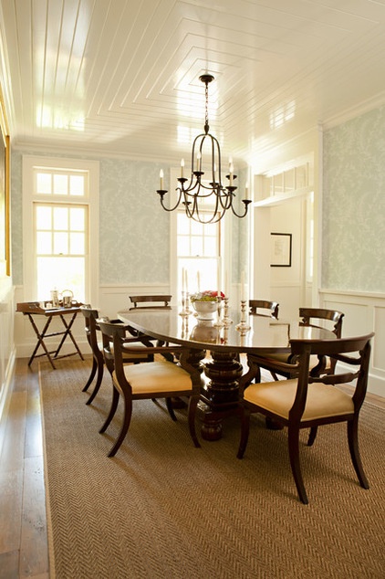
Sunshine washes across the dining room’s high-gloss ceiling, which amplifies light and gives a feeling of spaciousness. The tongue and groove planks in a concentric rectangular pattern are meant to evoke a maritime vernacular, Snyder says.
The wallpaper, by Cole & Son, is an 18th-century design taken from Colonial Williamsburg–era fabric.
Wallpaper: Ludlow in Pale Blue, Cole & Son; chandelier: Flemish medium round chandelier in Aged Iron finish, Circa Lighting
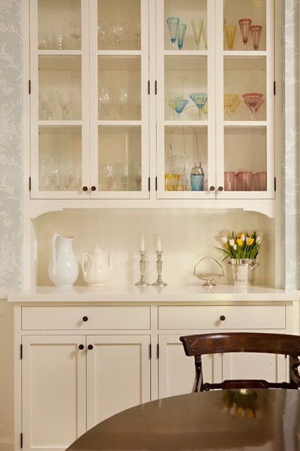
The architecture team custom designed the built-in dining room hutch.
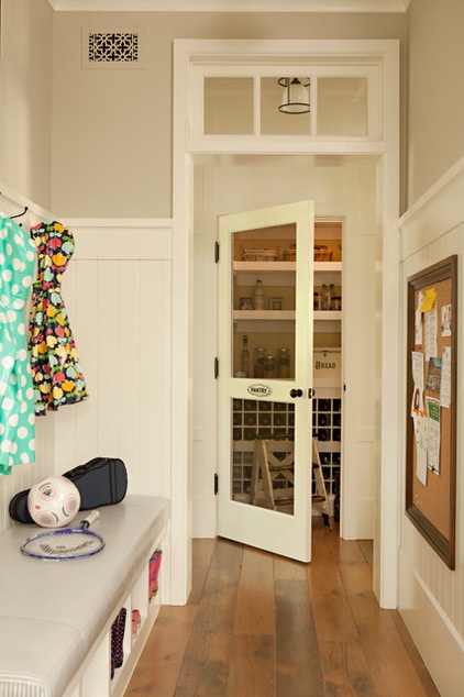
Transom windows throughout the home add a genuine sense of history while bringing light into the interior spaces. This photo was taken in the mudroom looking toward the pantry.
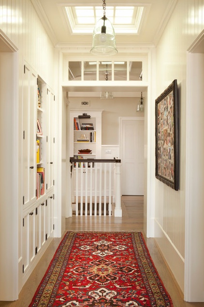
An inset bookcase lines the upstairs hallway. A skylight brings light in and serves as roof access.
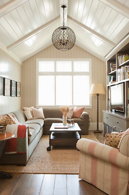
McMorran combined grays with deep reds for a comfortable, casual aesthetic in this upstairs hangout room. Four-inch vertical tongue and groove planks on the wall coordinate with the wood box beams and 6-inch horizontal tongue and groove planks on the ceiling.
All paint by Benjamin Moore: Bleeker Beige HC-80 (walls); Texas Leather AC-3 (built-in cabinet); Swiss Coffee OC-45 (trim and ceiling)
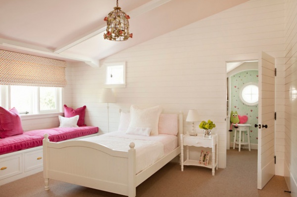
A frilly flowered birdcage light fixture from Joss & Main fueled the design of this bedroom for one of the daughters. “It was kind of a gamble, but it ended up driving the design of the whole room,” McMorran says. This bedroom, like all of the others, has very low-pile wool carpeting that helped earn LEED credits.
Ceiling paint: Fairest Pink 2092-70, Benjamin Moore; carpet: Taliesin in Saddle, Glen Eden
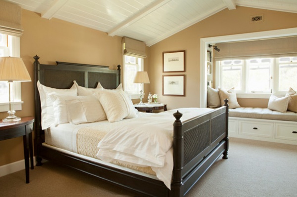
Perlman’s bedroom is neutral and serene. Located in the rear of the house, it overlooks the backyard and has a snug window niche. McMorran found the two tables used as nightstands at an antiques store in Santa Monica called Wertz Brothers.
Wellesley bed: Zinc Door; wall paint: Sherwood Tan 1054, Benjamin Moore
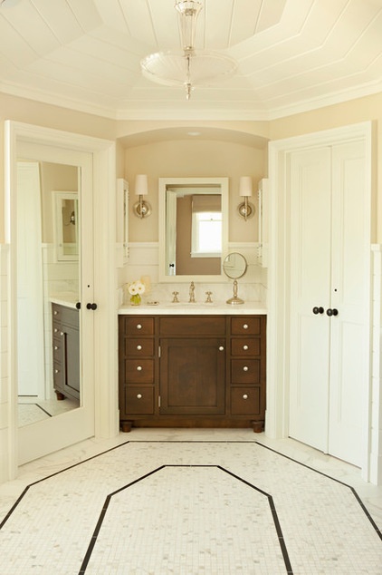
The master bath has an ample octagonal circulation area, and the closets, toilet closet, shower and tub are arranged at its periphery. Six-inch horizontal tongue and groove planks with a square groove detail make for a fetching wainscot.
On the floor, a Calacatta marble mosaic inset is defined by ¾-inch by 6-inch Absolute Black marble liners in this area and underneath the slipper tub. Six- by 12-inch Calacatta marble tiles cover the rest of the bathroom floor.
Tile: Calacatta marble and Absolute Black marble, Mission Tile West
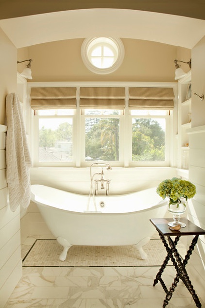
A slipper tub is perched in a perfectly dreamy spot in the master bath. Perlman brought the turned-leg side table from her previous home.
Wall paint: Cream Fleece 233, Benjamin Moore
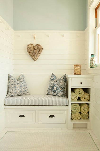
This quaint changing room finished in cool hues is outside the first-floor pool bath and is accessed from the rear porch. McMorran had the seat cushion made from oil cloth for protection. “We wanted the lightness of the ticking stripe without having to worry about kids in wet bathing suits sitting on it,” she says.
Wall paint: Mt. Rainier Gray 2129-60, Benjamin Moore
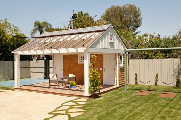
The pool house is original to the property but got a facelift during the renovation to coordinate with the new home’s exterior.
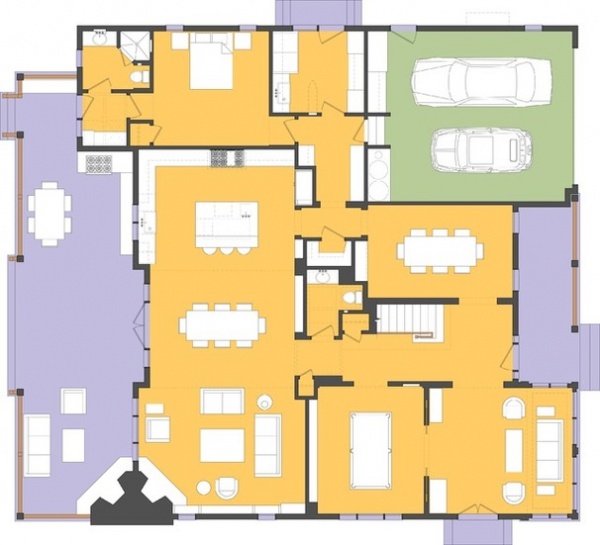
Here’s a look at the ground-floor plan. The orange colors represent indoor living space; purple signifies porch areas. The garage is shown in green.
Drawing: Sean Parmenter, Tim Barber
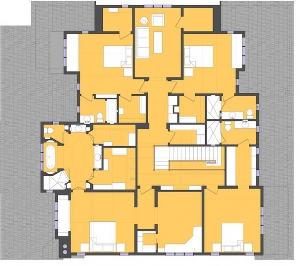
Here’s the second-floor plan.
Architecture: Tim Barber
Interior design: Carla McMorran Interiors
Builder: Stephen Bloom Construction
Engineer: Kamal Shah, Shah Engineering Group
Landscape designer: Patricia Benner Landscape Design
LEED consultant: Green Dinosaur
Browse more homes by style:
Small Homes | Colorful Homes | Eclectic Homes | Modern Homes | Contemporary Homes | Midcentury Homes | Ranch Homes | Traditional Homes | Barn Homes | Townhouses | Apartments | Lofts | Vacation Homes
Drawing: Sean Parmenter, Tim Barber
Related Articles Recommended


