Room of the Day: Midcentury Modern, Meet Craftsman
http://decor-ideas.org 05/14/2015 21:13 Decor Ideas
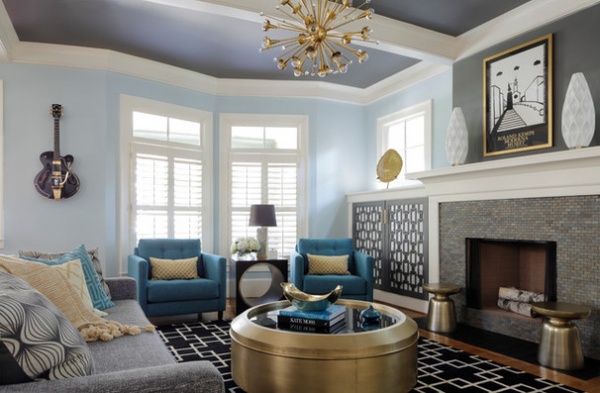
Atlanta designer Minhnuyet Hardy was asked to marry the styles of Mad Men and turn-of-the-century architects Greene and Greene in one contemporary living room. Her clients love midcentury design, but they live in a new home that was constructed to look like a traditional Craftsman. They requested that Hardy make the styles live in harmony.
Photos by Mali Azima
Room at a Glance
Who lives here: A couple (both engineers) and their 2 kids
Location: Candler Park neighborhood of Atlanta
Size: About 165 square feet (15 square meters)
Tip: To make a room feel like it’s truly yours and not something out of a showcase house, include personal items. For example, the owner’s guitar that hangs on the wall makes the room seemed collected and true to the family. (It’s more than decoration. He’s in a band and uses it frequently.)
These clients love color with brass accents, so Hardy chose blue, gray and brass hues for the room. The gray paint on the ceiling is unexpected. “I wanted the eye to go upward to the ceiling,” she says. “The gold-tone colors look great on gray, and painting the ceiling this color highlights the brass chandelier.”
In addition to introducing a midcentury style, the clients asked Hardy to help them come up with a solution for their bookshelves. The shelves flank the fireplace and are therefore part of the room’s focal point. Though the family loved having the shelves in this location, between their paperbacks, textbooks, CDs and records, the space could get crowded and untidy.
Hardy’s plan was simple: Screen the hardworking space with cabinet doors.
Armchairs: Younger Furniture
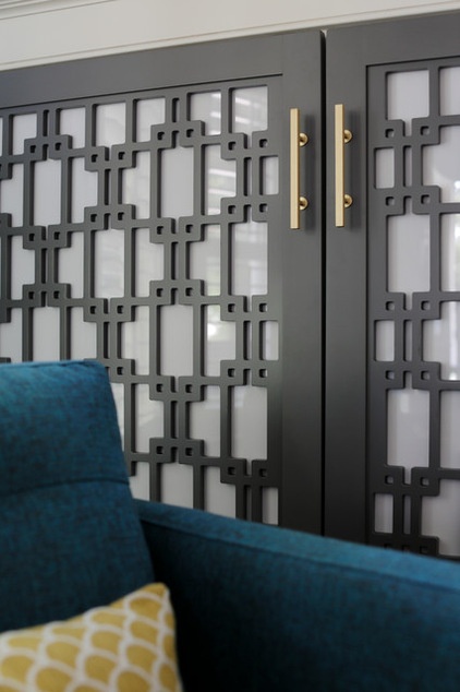
She had a mod pattern laser cut into wood panels and then backed the panels with opaque acrylic. This allows the members of the family to have all manner of items on the shelves and close at hand, while visually quieting the room.
The angular pattern is picked up in the pattern on the rug.
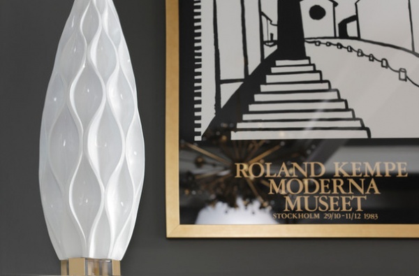
A print by Roland Kempe adds another personal touch. “The homeowner has had this for 30 years,” Hardy says. “He carried it around Europe while he was a student. Reframing it and putting it on a gray wall really makes it stand out.”
The two white vases that flank the print are one of those happy accidents that Hardy loves. She purchased the vases at Z Gallerie for $25 and the bases (actually low candleholders) at Target for $10. When she decided to use the candleholders as bases and glued them on the vases, design magic happened. “Marrying the candleholders with the vases made two interesting pieces special,” she says.
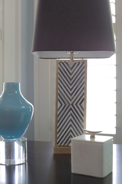
The chevron pattern on the lamp lives in concert with the other geometric patterns, thanks to its scale and colors. “If I’m going to use different patterns, I vary their size and unite them with colors,” Hardy says. In this room there’s a large pattern on the floor, a medium-size pattern on the cabinet doors and this small pattern on the lamp. All of them are done in shades of dark gray or black.
Chevron Deco table lamp: West Elm
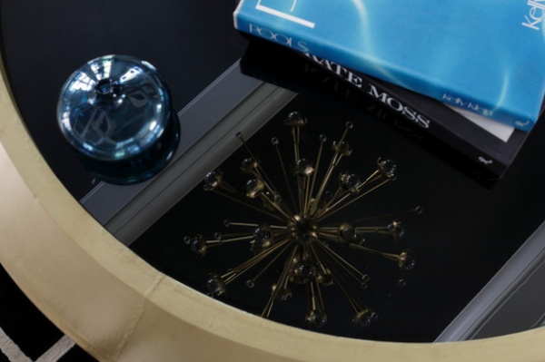
Hardy loved this coffee table done in brass and smoked glass when she saw it at High Point Market, a South Carolina trade industry furniture show. When she met these clients, she knew she’d found a home for it.
Like the other pieces in the room, it looks like it’s from the 1960s, but it was made in the present. “Vintage furniture is great, but it can be hard to find a piece that’s comfortable and the right size,” says the designer.
Coffee table: Bernhardt
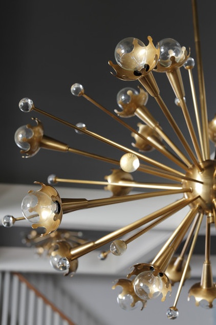
The ceiling light fixture also looks as though it could be vintage but is a contemporary piece. “The look of the light fixture sets the tone for the room,” Hardy says. She adds that when it’s switched on, the lights and the glass spheres make it an incredible illuminated piece.
The designer adds that keeping it simple, an old adage, helps decor span the design centuries. “We kept the lines simple,” she says. “Doing it that way doesn’t take away from the architecture.”
Light fixture: Jonathan Adler for Robert Abbey
See more Rooms of the Day
Related Articles Recommended


