Houzz Tour: Just the Right Touch for a Historic Renovation
http://decor-ideas.org 05/10/2015 10:55 Decor Ideas
For the top-to-bottom renovation of this protected Georgian property in Spitalfields, East London, the owner wanted to hire someone who she was confident would do the job well. Architect Chris Dyson has lived and worked in the area for some 25 years, and the owner lived two doors down from him (at her previous address) when he completed the renovation of his own home. So when she moved into this special building, she knew just who to call.
Houzz at a Glance
Who lives here: A young family
Location: Spitalfields, East London
Size: 3 bedrooms, 3 bathrooms
Architect: Chris Dyson of Chris Dyson Architects
The home had previously been a little drab, and Dyson says it was livable but antiquated in terms of services. “The client wanted to make it usable and habitable,” he says. “We wanted it to celebrate the diversity of her interests.”
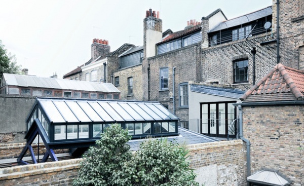
Although it was rewired and replumbed throughout and the entire interior was renovated, the most significant change was to the studio at the back of the property. Dyson cut away some of the studio structure to allow for a sunny garden space, and turned the remaining area into a glass-walled studio, which has been nicknamed “the banana barn,” as it’s home to various tropical plants.
The skylight structure covers the studio and extends to the edge of the garden space. It’s connected to the main house by a side-return extension that houses a galley kitchen, which leads into the rest of the kitchen space in the main part of the house.
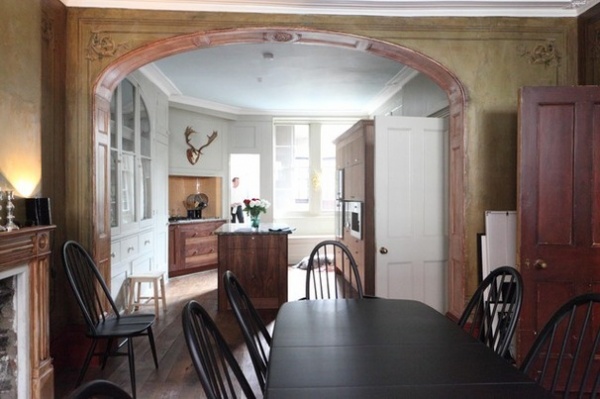
The kitchen cabinets in the main part of the house were designed to look like furniture. “We didn’t want it to read like a contemporary kitchen,” Dyson says. He custom made all of the cabinets to have the feel of pieces you’d find in any other room of the home. The rich color of the American black walnut complements the oranges and reds used in the rest of the space.
There formerly was a partition where the arch is now; Dyson opened the space up and restored the detail with the help of artist Ian Harper. The adjoining dining room had been made into “a room to remember” in the 1820s for a wedding party, and Harper helped to carefully restore some of the features of the room. “People used to do these things for special occasions. They would invest in their property rather than hire a venue,” Dyson says. An iconic Ercol dining table and chair set gives the room weight.
Walls: hand-painted in olive green oil paint by Ian Harper; orange backsplash tiles: Bisazza; dining table, chairs: Ercol
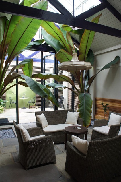
Underfloor heating makes the tropical conservatory area usable all year round. The furniture in here was the client’s own. The garden space can be seen beyond the glass doors.
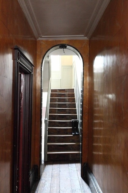
The entrance hall features a polished plaster wall, inherited from the previous owners, that imitates the staircase walls in the Sir John Soane’s Museum in Lincoln’s Inn Fields, a public square in London. The door to the left leads into the dining room and kitchen, and there is also an extensive basement, which features a spare room, a cinema room, and a wine and cheese room.
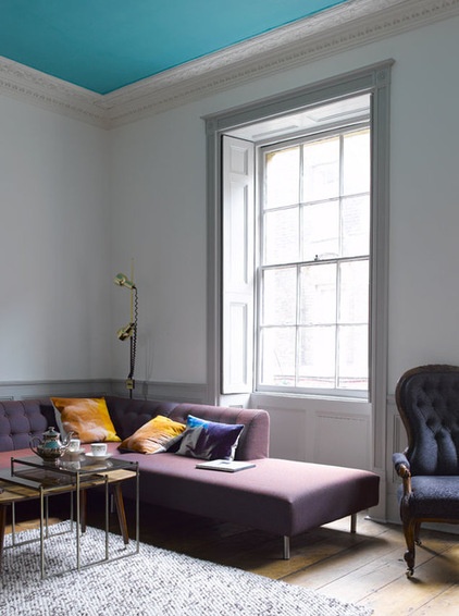
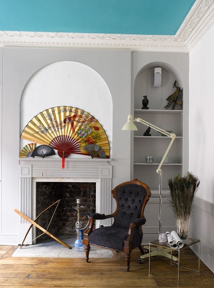
Up one flight of stairs is the drawing room, to the front of the house, with a door connecting it to a study at the back that leads out to a conservatory area with balcony. The paneling and shutters were already in place. The room was originally white, but Dyson went for light gray walls to show off the plaster details, which were restored by a local artist, and a darker gray on the paneling to add a bit of weight.
The blue ceiling is more intense in the photos than in reality, Dyson says. “We wanted a pale blue ceiling to lift it and give it the feeling of an artificial sky.”
Ceiling paint: Lulworth Blue, Farrow & Ball, mixed with white
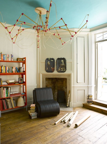
On the same floor but at the back of the home is the study area, which has a similar color scheme as the drawing room, with the addition of an unusual chandelier, one of the client’s pieces. Steps lead up into a conservatory area.
Wall paint: Slipper Satin, Farrow & Ball
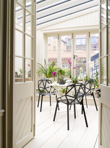
This space was once a small, dark kitchen. It had colored windows, and Dyson replaced them with glass doors that open onto a small balcony. The room is designed as a space in which to grow orchids.
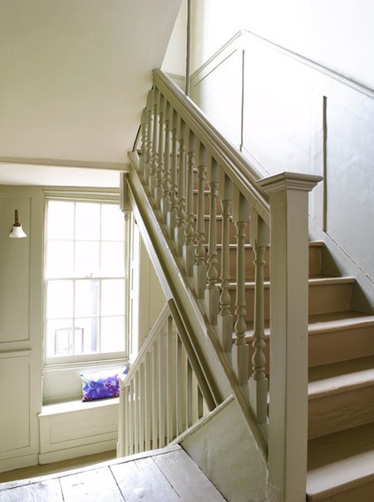
The staircase was restored to its original form and extends from the ground floor all the way up to the top floor. The pale wall color enhances the space, keeping it light and airy.
Paneling paint: Mouse’s Back, Farrow & Ball
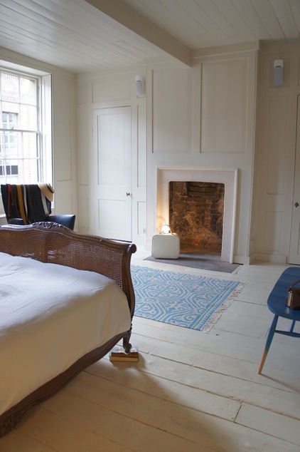
In the master bedroom, “I installed paneling around the room to create wardrobes that would house the client’s clothing,“ Dyson says. “Storage is something you don’t get an awful lot of in many of these houses, so we wanted to change that.”
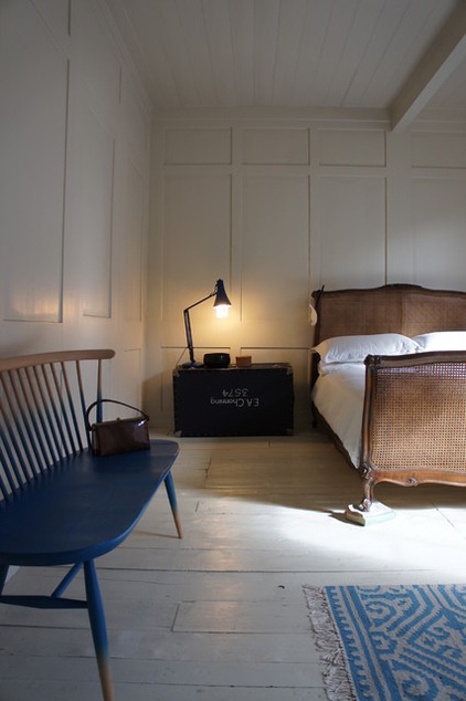
The walls, floorboards and ceiling are all painted in off-white, creating a pared-down feel that allows the detail of the paneling to be the main feature in the room. The client’s own pieces of vintage furniture give the space a real sense of history and character.
Paneling paint: Slipper Satin, Farrow & Ball
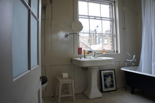
The master bath has the same paneling and wall color as the bedroom. It has a distinctively French feel, with a cast iron claw-foot bath and vintage French fittings found by the homeowner. It also has a sliding shutter over the window, which is rare.
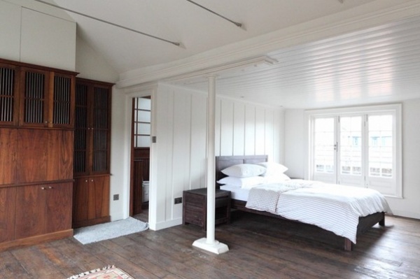
Up on the top floor is another bedroom, which would once have been a traditional weaver’s loft. The pitch of the roof goes up to the left because it would have had to accommodate a loom.
Dyson installed paneling in this room, too, although in a slightly different style. “That’s because it’s the top floor, and it would have been typical of these houses to have had a cheaper style of paneling,” Dyson says. It’s called plank and muntin, and it makes for a cheaper kind of timber wall.
Dyson designed the large walnut writing bureau. The richness and weight of the wood give the room a sense of importance and drama.
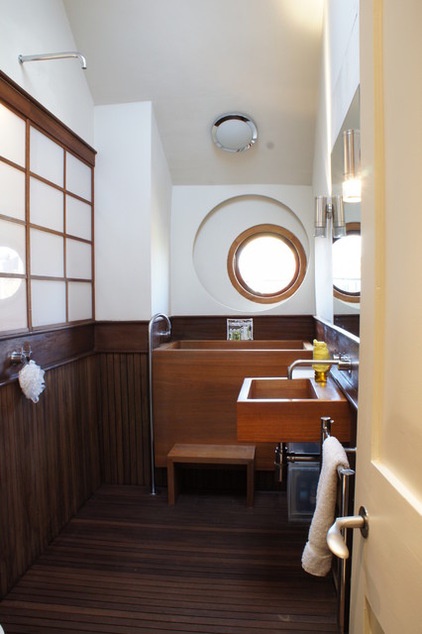
The en suite on the top floor isn’t your typical bathroom. “We wanted to create a Japanese-style space,” Dyson says. “Cedar is a great wood for Japanese baths, so we decided to use it in here for the basin, bath, floor and paneling.”
The bathtub is smaller and deeper than an ordinary one, with the idea that you dunk yourself into the deep, hot water and then step out into a cold shower. The window is a porthole made by a local cabinetmaker. “Both the client and I were enthusiastic about an interesting feature for that wall,” Dyson says.
The Japanese screen behind the shower conceals the lighting for the room, and the whole thing is watertight.
Bathtub: William Garvey; showerhead: Boffi; sink, sink fixtures: Vola
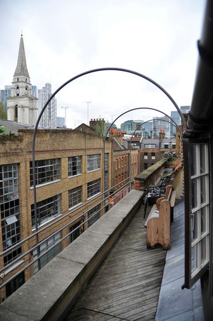
Dyson transformed the gutter area on the top floor into an additional outdoor space with great views over East London.
Browse more homes by style: Small Homes | Colorful Homes | Eclectic Homes | Modern Homes | Contemporary Homes | Midcentury Homes | Ranch Homes | Traditional Homes | Barn Homes | Townhouses | Apartments | Lofts | Vacation Homes
Related Articles Recommended


