Kitchen of the Week: A Burst Pipe Spurs a Makeover
http://decor-ideas.org 05/09/2015 02:13 Decor Ideas
Sometimes out of chaos comes calm. After an extended period away from home, this homeowner arrived to a flooded house. A pipe had burst, and water had swept through the entire house. After finding a place to live and dealing with a mountain of insurance paperwork, she made a choice to get a fresh start. “She decided that as long as she needed to replace the floors, baseboards and walls, she might as well do the kitchen–dining room remodel she had always dreamed of,” says interior designer Beth Dana. When you compare the “before” and “after” shots, it’s hard to believe it’s the same room with the same original layout.

Photos by Gaszton Gal Photography
Kitchen at a Glance
Who lives here: A woman who loves to cook
Location: Santa Barbara, California
Size: Kitchen is 130 square feet (12 square meters), 10 by 13 feet (3 by 3.9 meters); dining room is 208 square feet (19 square meters),13 by 16 feet (3.9 by 4.8 meters)
Budget: About $30,000
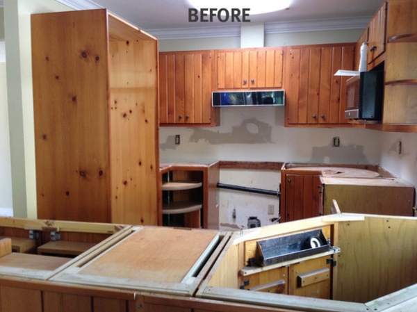
BEFORE: This photo illustrates the typical story of how “before” shots are taken. Dana rushed into the house as demolition began, snapping as quickly as she could before it was all gone. She didn’t quite make it in time to catch the old countertops.
The kitchen in the 1962 ranch house had never been updated. The room had its charms but was dark and bulky. “An extension of the peninsula made the entry to the kitchen almost claustrophobic,” Dana says. This extension was the only part of the layout she changed in the renovation.
While insurance covered the new floors and drywall damaged by the flood, the homeowner decided to make lemons out of lemonade and get her dream kitchen and dining space completed at the same time.

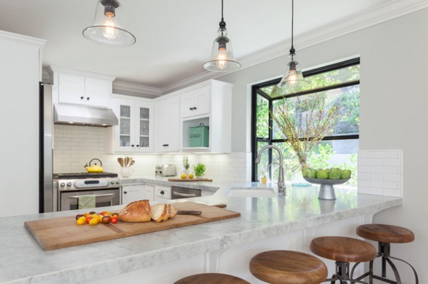
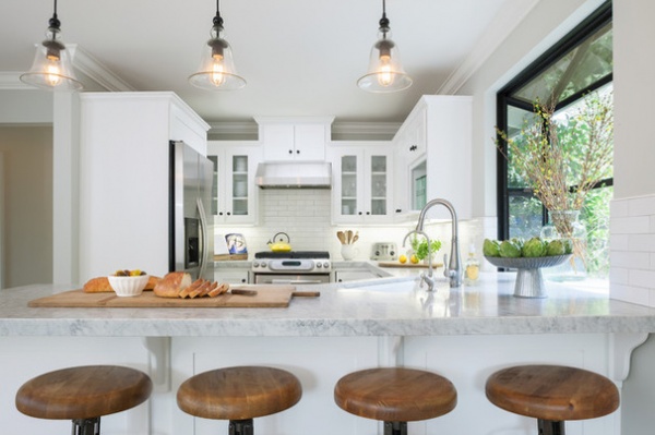
AFTER: The floors, baseboards and walls were ruined by water damage, but the cabinet boxes survived the flooding. The owner had them repainted and given new doors and hardware. This meant keeping the original layout, which functioned well for her.
Dana extended the Carrara countertops into the original greenhouse window. The window is a big asset to the room and a great spot for growing fresh herbs in the sunlight. She picked up on the black metal of the windowpanes with details like the cabinet hardware and details on the pendant lights.
Clear glass on some of the cabinet doors adds depth and lightens up the space. “You can always add color to the room here, whether you add Fiestaware or other colorful items behind the glass,” she says. “However, I would never give a client all glass-cabinet doors — it puts too much pressure on people to feel like everything has to look perfect all the time.”

Another place where the homeowner saved big was backsplash tile. She had bought the tiles years ago at a contractor’s closeout sale and stashed them in her garage, hoping for a kitchen renovation someday.
“White kitchens are timeless,” Dana says. “They create a great backdrop, and you can always add color via accessories.” She added a light gray grout for subtle contrast and depth.
Key measurements:
The edge of the Carrara marble countertops is 2 inches thick, giving it a strong presence. The countertop overhang is 11½ inches deep, providing knee space for those sitting on the stools.The subway tiles are 8 inches by 2½ inches — a little more modern than standard subway proportions.
Cabinet paint: Simply White, wall paint: Gray Owl, both by Benjamin Moore; pendant lights: Pottery Barn; hardware: Rejuvenation; stools: Cost Plus World Market; flooring: Vintage Oak, French Connection collection, Garrison Flooring

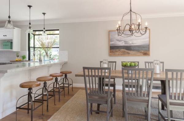
A moody seascape sets the tone in the adjacent dining area, creating a pleasing contrast to the white in the kitchen. The chairs, stools, table and iron chandelier pick up on its warm gray and brown tones. Natural light comes in through glass doors opposite the seascape wall.
The table is a custom piece that was found at Industry Home, a Santa Barbara shop. Its reclaimed industrial metal legs, as well as the legs on the bar stools, echo the dark metal accents in the kitchen. Dana chose a rug that would stand out from the wood floors. “I knew I wanted the texture of a natural-fiber rug but with added interest via pattern,” she says.
After spending so much time eating takeout while shuffling from temporary rental to temporary rental, the homeowner is cooking more than ever. “She turned the challenge of the flooding into a positive,” Dana says. “She’s happy in her bright and cheerful new kitchen.”
Table: custom made by Brothers of Industry, via Industry Home; painting: Industry Home; side chairs: Village Grigio, Crate & Barrel; Clark Two Tone Soft Jute Rug: Pottery Barn; chandelier: Cost Plus World Market
Browse more Kitchens of the Week
Related Articles Recommended


