New This Week: 3 Home Offices That Know How to Work It
http://decor-ideas.org 05/02/2015 06:13 Decor Ideas
Even if you don’t technically do your job from home, you almost certainly work there often. Whether it’s finishing up a report, firing off late-night emails, paying bills, planning a vacation, helping a child with homework or mapping out that business plan, we tend to be rather industrious at home. Couple that with the convenience technology brings to getting things done outside of normal business hours, and it’s no surprise that many remodels include home offices.
This week we searched through the photos that professional builders, architects and designers recently uploaded and found three spaces we wanted to learn more about. Here the designers dish on their plans of attack, “uh-oh” moments and more.
1. Fantastically Flexible
Designer: Alexa Kazim of Atelier 616 Interiors
Location: Holliswood, New York
Size: 10 by 11 feet (3 by 3.3 meters)
Budget: $12,000 for entire room (see below for breakdown)
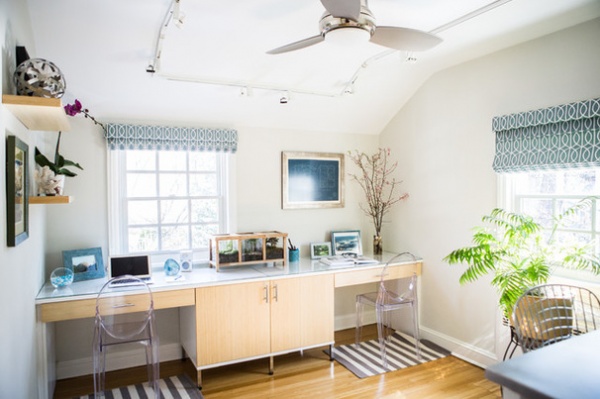
Homeowner’s request: “They longed for a space that was light, felt expansive, offered plentiful storage and multiple workstations, as well as an area to spread out papers for various projects,” says designer Alexa Kazim. “The homeowners were frustrated with the small footprint they had to work with. I first discussed with them the fact that we needed to consider custom furniture in order to achieve their functional goals. They thought that it would be cost-prohibitive, so I had to come up with ways to make it feasible.”
What goes on here: “This is for a young family that lead very hectic work lives but prioritize family life. They are young professionals in their late 30s, with an 8-year-old child. Sometimes the couple works side by side. Other times the space serves as a “mother-daughter office,” with their child doing her homework at one workstation while Mom finishes up items that were not addressed during regular business hours.”
Plan of attack: “Once they agreed to the custom desks, we explored various layouts that would allow the small space to feel expansive. I proposed several layouts, but ultimately felt that taking full advantage of one wall was the best option given the small space.”
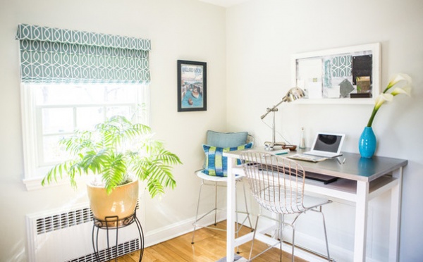
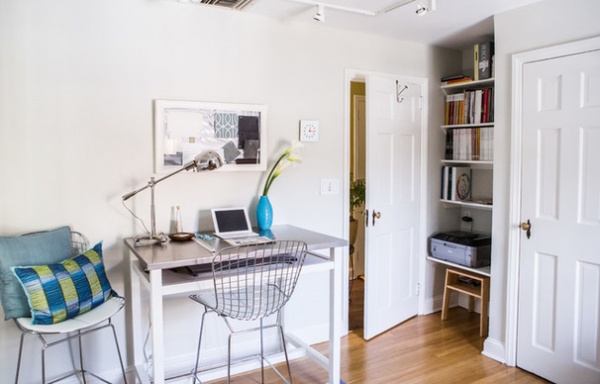
“Another desk on the other side can be pulled into the room for several people to gather around or used by one person alone when it is against the wall. I chose a counter-height table with a brushed stainless steel finish so that it offers multiple uses. All of the other furnishings, paint color and lighting were selected to follow the light feeling that the desks evoke.”
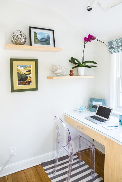
Why it works: “Now there are three completely functional workstations, and each one offers the user a different experience because of varied heights, ample storage and a unique inspirational view — window view, mood-board view or an architectural plan from 1939. The small office space is filled with light colors and airy furnishings that offer function without bulk. The use of the clear Lucite Ghost chairs and the stainless-steel wire Bertoia chairs allow the drawer fronts to be completely visible and admired.”
Designer secret: “The use of clear furniture to minimize its visual footprint, custom desks with a layout that met the design goal of keeping the room feeling expansive, window treatments that add color and pattern in a neutral-colored room, creating behind-the-door storage to add function to an otherwise “dead” corner — these are all useful design ideas for others.”
“Uh-oh” moment: “The original desk layout called for a U-shaped scheme. After taping painter’s tape on the floor and asking the homeowners to sit on chairs to see how they felt about that configuration, we learned almost immediately that the scheme left little open floor space. It left the homeowners feeling cramped at their desks and knocking their knees against the furniture.
“We revisited the layout by outlining the footprint for each one with painter’s tape, and the homeowners were able to see what layout worked best and how the dimensions had to be adjusted to be more accommodating of the varied sizes of the multiple users.”
Splurges and savings: “The homeowners wanted to use bamboo for the desk, but that was quite costly and would have used up the bulk of their budget. I suggested that we use MDF and use bamboo in a full overlay on the drawers and doors to give the face of the unit the look that they wanted at a price that was gentler on the budget. We then used inexpensive pulls on the drawers and doors but splurged on the Haefele legs to give the unit a lighter, floating look and feel without sacrificing significant space. Also having the glass top made in two separate pieces yielded a big cost savings.
“Plus, having a handyman come in for an hour and make the shelves out of maple and painting them was a big savings over having the shelves made by the custom-cabinet maker that built the custom desks and bamboo shelving.”
Take-away: “Always check the dimensions multiple times when designing custom pieces, ensure that the users are able to describe how they use the space, and do a dry run of the space with painter’s tape. You can learn where to position frequently used items so that they are within easy reach, to secure ample legroom and desk space, and how best to accommodate each of the multiple users and their varied daily tasks.”
The nitty-gritty: Window treatments: custom-made flat Roman shades with 4-inch slatted fronts designed by Atelier 616 Interiors using Robert Allen Design fabric Gate in Jade; track lighting: Lightolier; ceiling fan: Minka Aire Concept II in brushed nickel; desks: custom MDF with full bamboo overlay drawers and doors; shelves: bamboo, made by Transform; area rugs: Olin, Crate & Barrel; worktable: Belmont, Crate & Barrel; desk lamp: Ralph Lauren; Ghost chairs: Design Within Reach; wire chair: Bertoia; wall paint: Benjamin Moore Natura in matte finish, in November Rain; trim paint: Benjamin Moore Natura in satin finish, in Swiss Coffee; ceiling paint: Benjamin Moore Natura in flat finish, in Swiss Coffee; desk legs: Haefele in polished chrome; prints: Larsen-Juhl from Vacation Spots; architectural print: Larson-Juhl
Budget: “Electrical ate a big portion of the budget due to the use of Lightolier track lighting and the electrician labor, but the homeowners did not like what they called the ‘Swiss cheese’ look of recessed lighting. The custom furniture cost roughly the same as the lighting and electrical labor costs. The flooring of the room needed to be redone, and all of the walls and ceiling were painted.”
Team involved: Atelier 616 Interiors (project planning, space planning, sourcing, design concept, design installation); Transform (custom desks); behind-the-door storage: Mr. Handyman of Queens
See more photos of this room
2. Going Coastal
Designer: Marissa Cramer of Made Co Interiors
Location: Playa Vista, California
Budget: $8,000 for entire room (see below for breakdown)
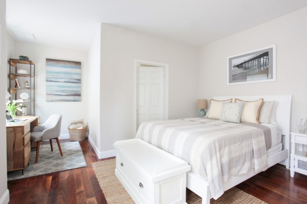
Homeowners’ request: “The homeowners are a young married couple who had a baby on the way and had just purchased their first home in Southern California,” says designer Marissa Cramer. “They wanted to achieve a relaxed coastal decor throughout the space. They requested an updated office space in the guest room that’s bright and comfortable, with some storage solutions to hide away documents, files and miscellaneous items.”
What wasn’t working: “The guest room had a home office nook with dark, bulky built-ins that were simply too heavy and dated for what the homeowner was hoping to accomplish. They wanted to inject a lighter color palette with natural wood tones, bright whites, cool blues and neutrals throughout.”
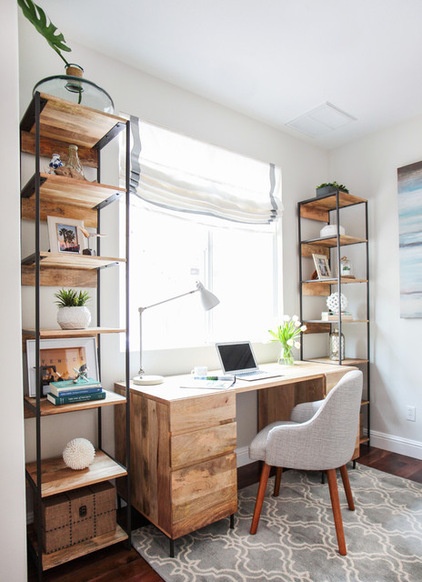
Plan of attack: “We started out by removing the built-in office unit, which immediately lightened up the feel within the space. The walls were given a clean, fresh coat of paint in a light gray palette — Benjamin Moore’s Silver Satin — and long white linen drapes layered with sheers were hung high to frame the tall double doors leading to the outdoor deck. A custom Roman shade was tailored for the window above the desk to complete the look.”
Designer secret: “By bringing in a small 4- by 6-foot area rug to the office nook, the space is defined and sets it apart from the guest bedroom while adding cozy warmth.”
Splurges and savings: “We avoided custom millwork for a new built-in office and instead brought in a mango wood storage desk and two modular bookshelves to provide additional storage and to display the homeowner’s collected art and artifacts. Also, the homeowner had a pair of shabby black nightstands and a white queen-sized bed frame. Rather than buying a new bedroom set, we gave the existing nightstands and bed frame a coat of crisp white paint to freshen them up and tie in with the new selections for the office nook.”
The nitty-gritty: Desk, shelves, task lamp and chair: West Elm; rug: Pottery Barn; Roman shade: Etsy; linen drapes and hardware: Pottery Barn; sheers: West Elm; paint: Silver Satin, Benjamin Moore
Budget: “$4,500 for furnishings in the guest room and office nook. $3,500 for AMG Contractors to remove the existing built-in desk/shelves, custom build bifolding closet, paint and install/assembly of the furnishings. The designer fee encompassed the entire home project and is not calculated in this breakdown.”
Team involved: Miguel Arcos, AMG Contractors
See more photos of this home
3. Nanny Knockout
Designer: Kathy Appel
Location: Doylestown, Pennsylvania
Size: 168 square feet (15.6 square meters)
Budget: $24,000 for entire room (see below for breakdown)
Homeowners’ request: “This space was done for the Bucks County Designer Show House & Gardens,” says designer Kathy Appel. “My vision was to do a guest bedroom craft-painting studio in a trending style, perhaps industrial or modern. This was the third floor of the house, and there were only two bedrooms on this level. The designer working on the adjoining space was creating a nursery, so the design house committee asked me if I would create a nanny’s retreat.
“This was an extra challenge to create visual cues that it was a nanny’s space while producing a design that was viable in a 21st-century home. The famous nanny Mary Poppins is an Edwardian-era character, and the popular television show Downton Abbey is from the same period in history. That became my style inspiration. I used natural linens, a Thonet-style desk chair and Edwardian furniture. I updated the space by incorporating current design trends, bohemian gypsy and industrial chic.”
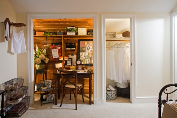
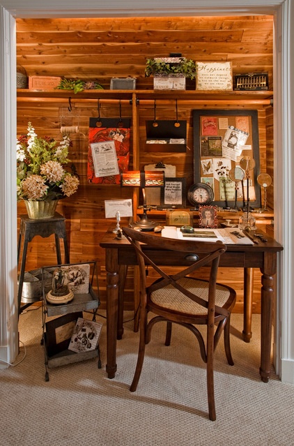
What goes on here: “This photograph focuses on the office-craft area. The desk provides a work surface for letter writing, using a laptop or tablet, or a craft area. Iron S-hooks were used to hang shelving and corkboards from the existing closet rod. Small portable tables with shelving and wire baskets were used to store supplies and display decorative accessories.”
Plan of attack: “Step 1: Deciding how the room would function. We wanted a guest bed, comfortable space for reading, place for letter writing or crafts, and a place for painting the beautiful views visible through the windows. Step 2: A space plan, laying out the room using a CAD program to determine where pieces would fit and what sizes would work. Step 3: Determining a style or mood for the space. Step 4: Selecting textiles. Step 5: Selecting a paint color that complements the space and the textiles.”
Why it works: “As you can see, we were very successful at packing multiple functions into a small room. The cedar lining in the closet already existed. Removing the doors and allowing it to show adds character and depth to the room. Colors, finishes and fabrics were all selected to create a serene and relaxing space.”
What wasn’t working: “Lighting the closet space. We used a portable desk lamp for task lighting, but we needed evenly distributed light around the entire closet interior. We used LED rope lighting in a warm color temperature and hid it around the inside frame of the closet.”
Who uses it: “The space is designed for a family with a live-in nanny. Sleeping space close to the baby’s nursery is the No. 1 priority; however, the room also needs to serve as a workspace and a sitting room for the nanny to use. When the child is older and a nanny is no longer needed, the space can be converted into a guest bedroom–home office–craft area.”
Designer secret: “The space has knee walls, angled ceilings and dormer windows. We used an off-white wall color to blend with the white ceiling. This opened the space and made the room appear larger.”
Splurges and savings: “We splurged on Ralph Lauren linens for the dust ruffle and some of the pillow shams. We saved by making the window treatments from ladies’ scarves.”
Take-away: “The No. 1 comment from guests that toured this space was, ‘I want to stay in this room.’ My take-away is that a successful room design is not a space that just looks great in a photo. The space must be physically welcoming and comfortable.”
The nitty-gritty: Desk, hanging shelf and small corkboard: Pottery Barn; desk chair: Ballard Designs; wall paint: Dollop of Cream SW7120, Sherwin-Williams; trim paint: Pure White SW7005, Sherwin-Williams; accessories and vintage items: Hearth & Hedgerow. Other items in the room — tea table and end table: Baker Furniture; fabrics: Ralph Lauren & Pindler; hand-knotted Oriental carpet: Parisa’s Decorative Rugs; daybed and chair: Oskar Huber Furniture & Design; fine art: Silverman Gallery
Budget: “As pictured, this room has a mixture of moderate-priced furnishings along with the Oriental carpet, fine art, Baker pieces and Ralph Lauren embroidered linens. The design and contractor fees, rug, paint, furniture, window treatments, lighting, bedding and all accessory items in the room cost approximately $24,000. By using all moderately priced elements or more high-end furnishings, the cost could be substantially reduced or increased.”
Team involved: Pro Painters Plus
See more photos of this space
Related Articles Recommended


