Houzz Tour: Run-Down Victorian Gets a Manhattan-Style Makeover
http://decor-ideas.org 04/30/2015 20:13 Decor Ideas
Reed Kingsley, president of furniture maker Brownstone, believed that the ramshackle Victorian he came across in the heart of San Francisco’s Pacific Heights neighborhood had potential. His real estate agent had only two recommendations: (1) buy this house, and (2) hire interior designer Ian Stallings to bring it back to life. Kingsley heeded the advice on both counts and has never looked back.
Houzz at a Glance
Location: Pacific Heights neighborhood of San Francisco
Size: 2,200 square feet (204.3 square meters); 2 bedrooms, 2 bathrooms
Designer: Ian Stallings
Kingsley wanted to create a home that was evocative of a Park Avenue brownstone with a distinct gentlemen’s club vibe. Stallings turned this vision into a reality. “I feel as if my clients are commissioning a piece of art to live in,” Stallings says. “It’s my goal to create an environment that meets all of their needs.”
A little demolition was in order. The house was stripped down to the studs and floorboards before being built back up. “Everything in this house, from the moldings to the wide-plank teak floors, is new, but the intention was to make it appear as if it had always been there,” Stallings says.
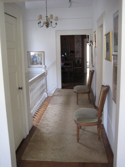
BEFORE: At the home’s entry, a flight of stairs leads to a second floor that encompasses all the living spaces. An ornate wood railing topped with a chunky newel post adorned a white hallway.
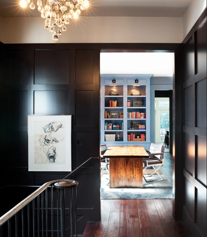
AFTER: Stallings had the main hallway widened and the doorways throughout the house raised 5 inches. He had the hallway paneled in a geometric square design and painted a custom color that Stallings describes as black aubergine. A custom brass-topped railing that swirls around at the end replaced the original. The midcentury chandelier is a vintage piece from a house in Palm Springs.
Paint: custom, Philip’s Perfect Colors
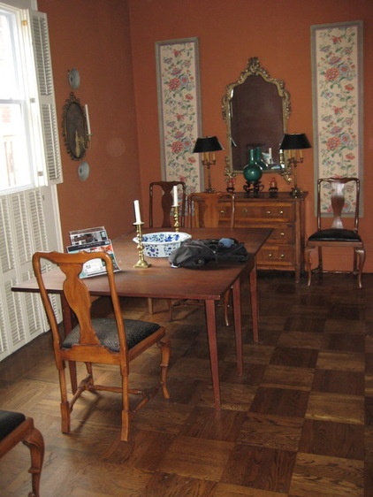
BEFORE: Burnt orange walls and parquet wood floors dominated the original dining room. The only natural source of light in the room came from a vinyl-paned window with white shutters.
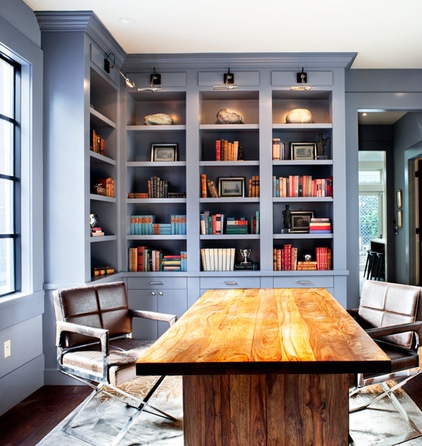
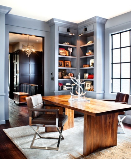
AFTER: Kingsley wanted the space to serve as an office and a dining room. He lined two walls with built-in bookshelves. Kingsley also designed a large table that functions as both a desk and, when surrounded by four modern stainless steel chairs covered in distressed brown leather, a dining table. A new wall of fire-rated steel encasement windows brings in light and adds an industrial edge. Finally, a coat of a custom-mixed paint that Stallings describes as a muddy periwinkle covers the walls.
Browse more rooms that do double duty
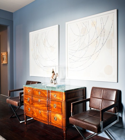
Along one wall in the office-dining room, a 19th-century commode topped with green marble rests under two large works by David King. “He’s one of my favorite artists,” Stallings says. “Everything is created from vintage paper that he cuts with an X-Acto knife and places just so with tweezers.”
Art: David King
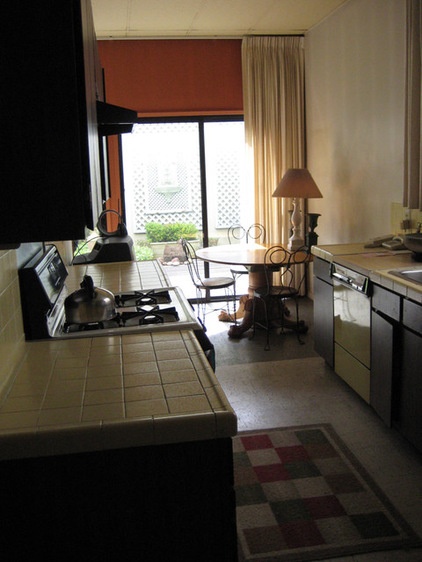
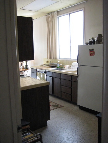
BEFORE: The original kitchen was a narrow galley with dark cabinets, outdated appliances and linoleum floors. A wall separated the kitchen from the family room.
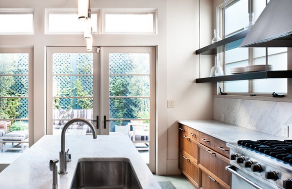
AFTER: Carrara marble covers the kitchen countertops and backsplash. All of the shelving was kept below counter level to maintain a sense of openness. Stallings designed custom metal shelves suspended in front of the kitchen windows. Electricity runs through the metal to a set of task lights underneath the bottom shelf to provide countertop lighting.
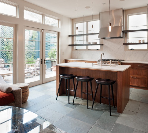
By removing the wall between the kitchen and the family room, Stallings created an open living space. Slate tile now runs directly to a patio covered in the same tile, creating a true indoor-outdoor experience.
Stools: Balboa Midnight, Brownstone
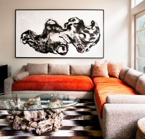
The family room is graced by a large sectional covered in orange and tweed fabric and includes a vintage driftwood coffee table topped with glass. The shape of the driftwood base complements the Topher Delaney painting hung above the sectional. “The painting is of a perfect rock,” Stallings says. “In Asian culture, some believe that if you find the perfect rock, it will bring you luck and wealth.”
Sectional: Holly Hunt; rug: Tai Ping Carpets; art: Topher Delaney
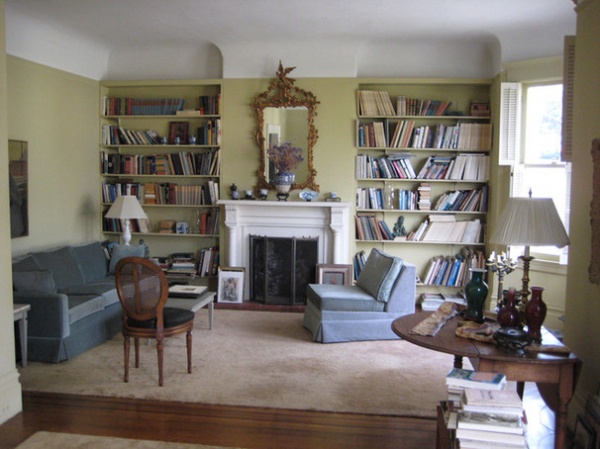
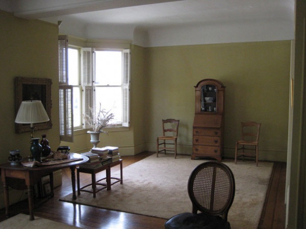
BEFORE: The original double-parlor living room had chartreuse walls, built-in bookshelves and a capped-off fireplace that posed a safety hazard. The old fireplace was meant to be decorative only, Stallings says. But at some time in the past, someone must have built a fire here, as contractors found piles of blackened insulation in the attic. The fireplace has since been converted to gas.
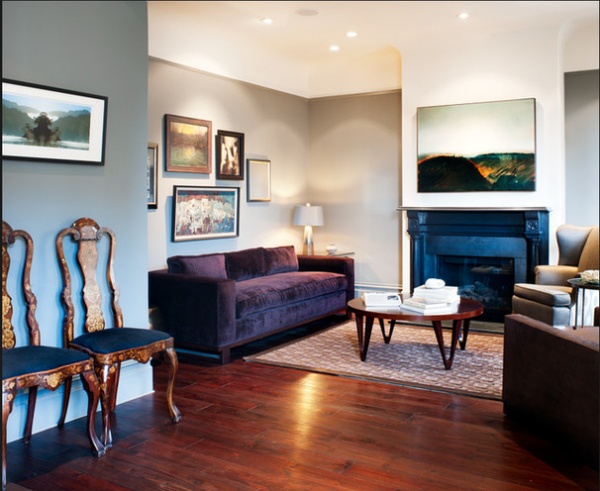
AFTER: Besides the fireplace’s being brought up to code, a black soapstone that Stallings describes as looking like “beautiful pools of miso soup” replaced the original surround. The old bookshelves were removed in favor of a less fussy appearance. The sofa is a good example of the trust and free hand that Kingsley gave to his designer. “When you suggest a purple velvet sofa to a single man, they usually wince,” Stallings says. “But throughout the home, we used many colors that might be described as feminine without diminishing the overall masculine feel.”
Rug: Stark Carpet; sofa: Holly Hunt
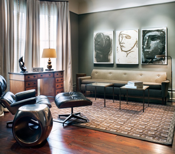
The living room’s back parlor includes a vintage Eames chair and ottoman, an antique partner’s desk and a trio of paintings above the sofa created by a family friend of Kingsley’s.
Chair: Eames; metal side table: Oly Studio; coffee tables: Robollo Home
Get the look of a gentlemen’s club at home
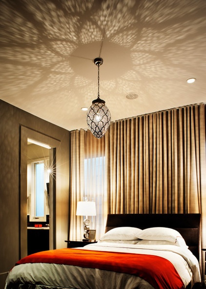
The master bedroom has two walls of windows facing each other, so Stallings installed floor-to-ceiling curtains to run the length of the wall to create a dramatic backdrop for the bed. Cut-tin Moroccan ceiling fixtures cast playful shadows along the ceiling and walls.
Orange throw: Hermès
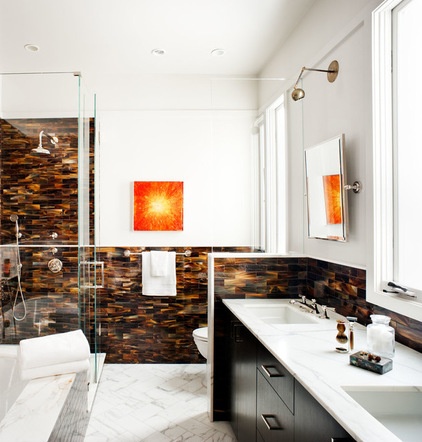
The master bathroom, which occupies a former guestroom, was inspired by the brown and orange found on a Hermès box. The tortoiseshell tiles that line the room and shower surround provide the brown from the Hermès box, while the orange comes from a piece of art made by a Bay Area artist who uses crushed glass as her medium. Sconces made from vintage barbershop chairs hang above the mirrors.
Sconces: Tradesmen
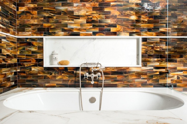
Tile: Waterworks
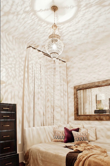
The guest bedroom was carved out of a former butler’s pantry and includes a custom daybed designed by Stallings. The sand-colored space includes pillows that provide subtle pops of color and a vintage Moroccan ceiling pendant that provides a warm glow.
Pillows and fabric: Holly Hunt
Browse more Moroccan-inspired designs
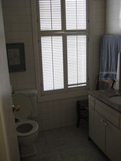
BEFORE: The original guest bathroom was a mishmash of different white tiles and in need of a facelift.
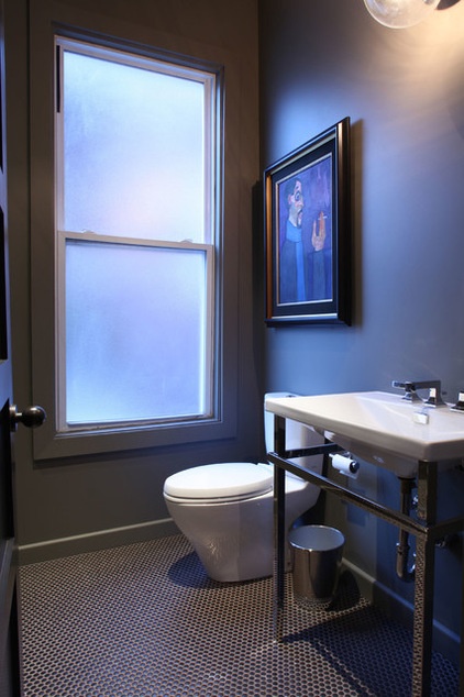
AFTER: If a Hermès box inspired the master bathroom, Stallings says that Giorgio Armani inspired the guest bathroom. The dark, moody space includes copper penny flooring, a vintage oil painting and muted gray walls.
Tile: Ann Sacks
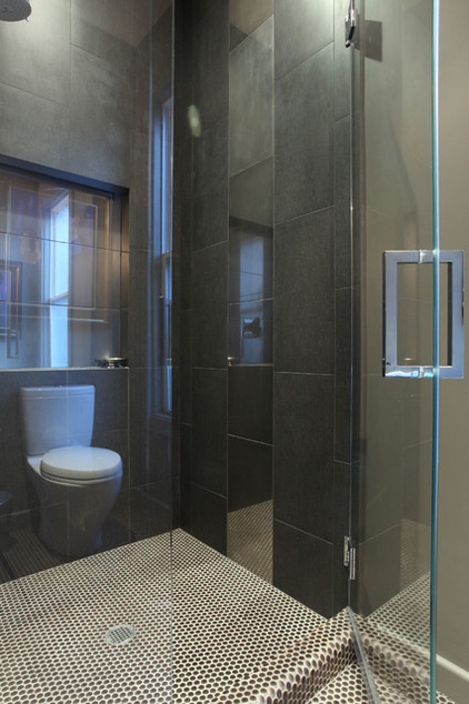
The shower surround consists of two different black tiles. The tiles in the middle row are made from a highly reflective glass. “It’s like the satin stripe that runs down the side of tuxedo pants,” Stallings says.
Browse more homes by style:
Small Homes | Colorful Homes | Eclectic Homes | Modern Homes | Contemporary Homes | Midcentury Homes | Ranch Homes | Traditional Homes | Barn Homes | Townhouses | Apartments | Lofts | Vacation Homes
Related Articles Recommended


