Houzz Tour: A Young Couple's Bright And Cheerful In-Law Suite
Jake and Lauren Hooker of Charlotte, North Carolina were thrilled when a couple from their church told them they had a one-bedroom in-law suite available for rent. While the young couple loved the apartment’s hardwood floors and nice location, they wanted to infuse their own personality into the rental and create a cozy and casual work-live space that would feel like home. Lauren, a graphic designer and blogger at Elle & Company Design, enlisted the help of designer and fellow blogger Michaela Warner.
Working with a tight budget of $3,000, smart design decisions help the space feel fresher within the limitations of a rental. The suite includes an updated kitchenette with a fun chalkboard wall, a comfortable and light living room, a simple dining area and a cozy bedroom with furniture and accessories from big-name retailers that helped keep costs under control. Now the couple have a brighter and more inviting place they can call home.
Houzz at a Glance
Who lives here: Jake and Lauren Hooker
Location: Charlotte, North Carolina
Size: About 550 square feet
Budget: $3,000
Designer: Michaela Warner
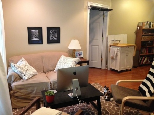
BEFORE: Jake and Lauren had furnished their small living room with existing pieces provided by their landlords, mixed with items given to them by family and friends. “I wanted to help them define their style,” says Warner, who had the couple fill out a questionnaire (with questions like “What colors do you wear a lot?") so she could use their answers to create an inspiration board. Warner also reviewed Lauren’s work as a graphic designer, and noticed she favored simple, clean lines and splashes of color.
“After” photos by Andrea Pesce Photography
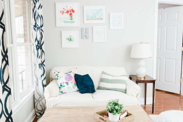
AFTER: Neutral foundation pieces mix with artwork and accessories that add a pop of color and allow the couple some flexibility. The existing sofa’s tan slipcover was replaced with a white slipcover Lauren found. Warner says since the sofa is the biggest piece of furniture in the room, they needed to lighten it up and go with a tone that would work with the once-tan, now-gray walls.
A gallery wall with colorful and fun art and prints replaces two black-and-white framed photos that previously sat above the sofa. “For a design standpoint, that wall is really big and they were missing a chance to add a pop of color there,” says Warner.
The gallery wall includes one of Lauren’s own designs, helping to personalize the unit’s main living area.
Floral pillow: Caitlin Wilson; coffee table: Cost Plus World Market; curtains: West Elm; side table: existing; table lamp: Lulu & Georgia; wall art: Minted and Elle & Co.; zinc “H” letter: Anthropologie; wall paint: Sherwin-Williams SW7029 Agreeable Gray
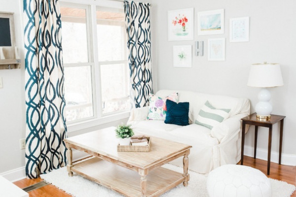
Attractive off-white curtains with a bold navy scribble add color and pattern to the space. “We wanted to do something with a vertical print on the curtains to make the room feel taller,” explains Warner, who says a good rule of thumb is to hang your curtain rod halfway between the top of your window and the ceiling line — not directly over the window if possible — to add volume to a room.
A larger coffee table in a lighter wood stain with an open shelf on the bottom provides proper proportion and a place to stash magazines and other living room essentials out of the way. “I feel like it makes the room, which was surprising to me,” Lauren says. “I love that extra storage too since my husband is in seminary school and brings home lots of books.”
The fun shag area rug was a way to add texture and some warmth to the existing wood floor.
Shag rug: Rugs USA
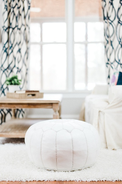
A white leather Moroccan pouf adds a touch of whimsy and provides additional seating. “Before they had two bulky chairs in there that made it feel cluttered,” Warner says.
Moroccan pouf: Lulu & Georgia
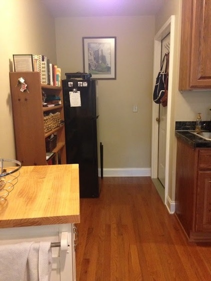
BEFORE: Prior to the makeover, the kitchen’s black refrigerator stood out like a sore thumb. Jake and Lauren had added a tall, neutral shelving unit for additional storage, but it contributed to the kitchen’s thrown-together and mismatched feel.
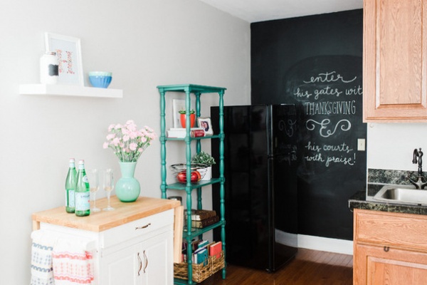
AFTER: To help the refrigerator disappear (or at least not stand out as much), Warner had the idea to use black chalkboard paint to create an accent wall. “We could have used straight black paint, but Lauren has such great handwriting and we thought it would be a fun element for them,” Warner says. “It gives them a place to write their grocery list or add some encouraging words for the week.”
A new tall teal bookshelf-storage unit was a stylish solution to control kitchen clutter, and an important addition to a small kitchen with limited counter space. “That’s one of my favorite pieces,” Lauren says. “We wanted to buy pieces we could use again when we move to our next home.”
Bookshelf: Urban Outfitters; white shelf: Target
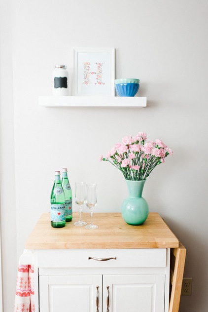
A new thick, white modern shelf above a white cart the couple received as a wedding gift provides a place for Jake and Lauren to display their favorite decorative items. The shelf, Warner notes, also helps visually balance out the heavy weight of the cart below.
Mint vase: West Elm (no longer available); latte bowls on upper shelf: Anthropologie
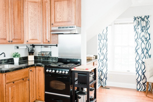
An existing black cart on wheels to the right of the kitchen’s range provides easy-access storage for a large pot, the blender and the toaster oven, as well as much-needed counter space to the right of the electric burners.
An existing hanging spice rack from Ikea keeps clutter off the counters.
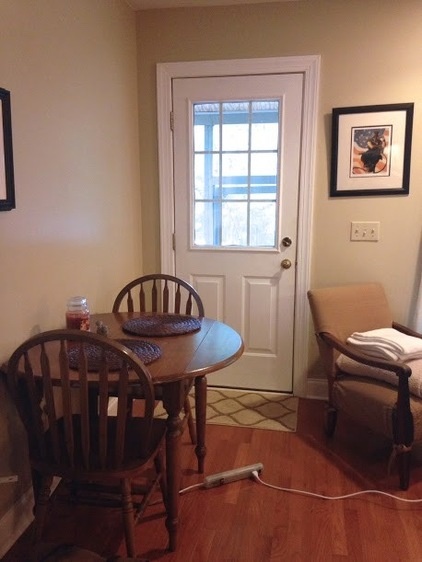
BEFORE: Located directly across from the living room sofa and by the apartment’s front door, the old dining area felt drab, with a round dark wood table and two wood chairs that lacked cushions. “My first thought was we needed something square that would be flush to the wall for more floor space,” Warner says.
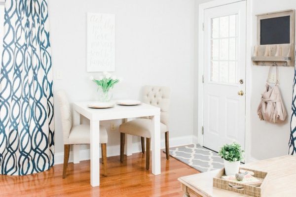
AFTER: For this tight space, an attractive but functional white square dining table with clean lines from West Elm that doubles as a work space for Jake and Lauren was the solution. A pair of neutral tufted cushioned dining chairs from Target provide comfortable seating for both dining and work time in front of the laptop.
Entry wall chalkboard: Cost Plus World Market; doormat: Target
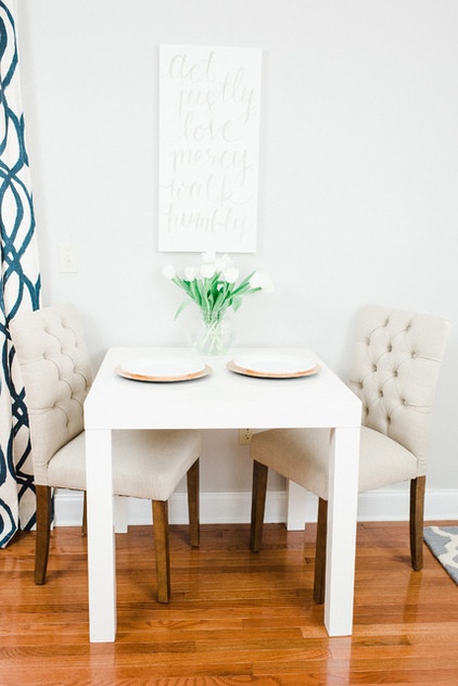
Lauren created the artwork seen above the dining table and the nearby coffee bar (located on the back side of the kitchen wall). “We looked at affordable options for artwork above the table, and I thought since I’m a graphic designer and artist it would be nice to choose one of our favorite verses,” says Lauren, who used a gold Sharpie over white canvas to create the wall art. “It was a simple solution.”
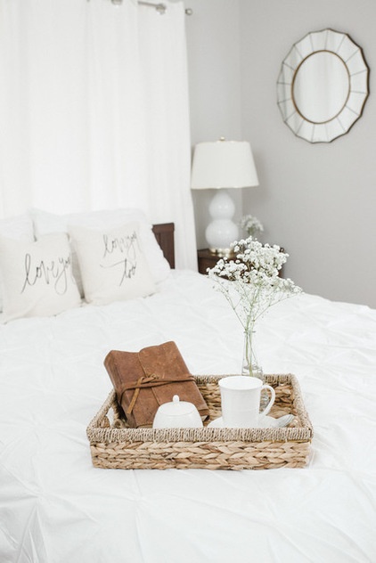
The couple’s bedroom was freshened up with the same gray paint used for the main living area and simple white bedding. The bed’s orientation was moved from an adjacent wall to the front of a sliding door that wasn’t in use. The concealed door now acts as the bed’s headboard, covered with white cotton canvas curtains from Ikea.
A round mirror was one of the reflective accessories used in the bedroom to make the smallish room feel larger. “Another one of my favorite pieces,” Lauren says. “I just love the design of that mirror and how it adds simple interest to the wall.”
Bed: existing; bedding: West Elm; decorative pillows: Parris Chic; lamp: Lulu & Georgia; tray: vintage; starburst wall mirror: Target; wall paint: Sherwin-Williams SW7029 Agreeable Gray
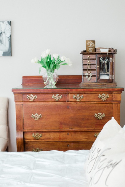
A wood dresser provided by the couple’s landlord gives Jake and Lauren a place for storing their clothes. “We have only one closet for the two of us, so the dresser has been really helpful,” Lauren says. “We tried to make use of as many preexisting pieces as possible.”
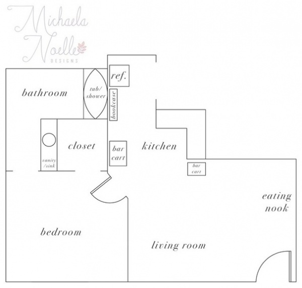
These floor plans of the suite illustrate the tight layout and need for smart design choices that would create a beautiful space that was also user-friendly.
“As a designer, I craved a place that would feel like home when we walk in the door,” Lauren says. “It’s amazing what design can do to make a space feel cozy.”
Browse more homes by style:
Small Homes | Colorful Homes | Eclectic Homes | Modern Homes | Contemporary Homes | Midcentury Homes | Ranch Homes | Traditional Homes | Barn Homes | Townhouses | Apartments | Lofts | Vacation Homes


