Houzz Tour: Wool Store-Turned-Apartment Gets a Glamorous Reboot
http://decor-ideas.org 04/26/2015 04:13 Decor Ideas
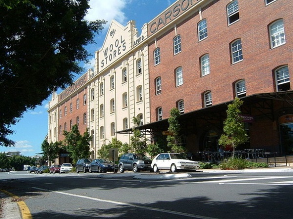
On a hot day, it’s rumored, a faint aroma of lanolin pervades New Farm’s Teneriffe Wharf precinct in Brisbane, Australia. It may linger from the 1900s, when Australia’s wealth and national identity were tied to its primary industries, particularly wool. Vast wool and grain stores sprang up along the Brisbane River. In the middle of the century, the country’s wool-led economy declined and the wool stores closed. They underwent a renaissance as apartments in the ’90s, and today many of these are being updated as the New Farm district has grown in popularity with affluent residents. Matt Riley and the Tonic Design team have revamped a penthouse apartment in the historic Winchcombe Carson wool store.
Houzz at a Glance
Who lives here: A professional couple
Location: Brisbane, Queensland, Australia
Size: 3,552 square feet (330 square meters); 3 bedrooms, 2 bathrooms and a powder room
Designer: Tonic Design, led by Matt Riley
That’s interesting: The wool stores and wharves were used as a U.S. submarine base during World War II, and General Douglas MacArthur was headquartered nearby.
The Brisbane wool stores stand as a testament to the role of the farm industry in Queensland’s past prosperity and still display the names of the then-titans of the wool industry. The earliest of these warehouses, the 1910 Winchcombe Carson wool store, designed by noted Brisbane architect Claude Chambers, has an imposing facade with recessed redbrick sections, and is embellished with Dutch gable parapets, square columns, quoin stonework and geometric pediments of Australia’s early Federation period.
A 1990s development of the wool stores as warehouse apartments retained features such as wool bale tunnels, cedar beams, brickwork and heavy hardwood doorways. The Australian heritage register sums up the wool stores’ appeal: “They provide a great sense of solidarity, security and style.”
Photo by Adz, Wikimedia Commons
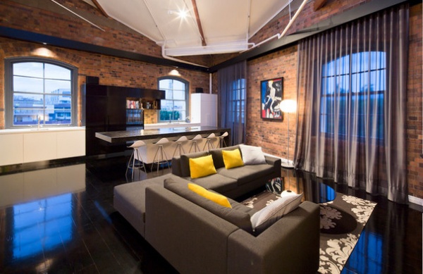
Against this significant architectural and historical background, Tonic Design, led by Matt Riley, created a design that honors the building’s past and expresses an urban industrial style relevant to today. “The client wanted to enjoy the unique architectural history of the building, with the comforts of modern living,” says Riley. “Our biggest challenge was maintaining sincerity to the existing heritage building fabric while trying to breathe a new modern style into it. This style also had to create a sense of home.”
Parking and shops comprise the street level of the building; the remaining three floors house apartments. This apartment is a corner penthouse.
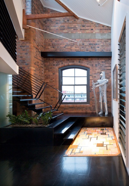
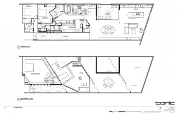
“We had many positive attributes to work with,” says Riley. “The apartment had a strong, substantial character, with beautiful cedar beams and columns, high ceiling volumes, open and interesting spaces, and an abundance of natural light. The high ceiling volume meant we could make use of a mezzanine level in what is essentially a single-level apartment, to put the master bedroom and dressing area.”
The light that floods the apartment’s living spaces from several angles comes partly from the shallow-arched multipaned double-hung windows. Keystone details in the exposed brickwork enhance their pleasing proportions.
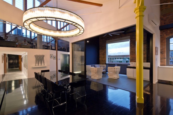
In the wool store’s heyday, the top floor was where buyers were taken to appraise the prize fleeces laid out for inspection. Because natural light, but not direct sunlight, was required for this inspection, many wool stores had distinctive east-west aligned sawtooth rooflines. The apartment takes advantage of the light and ventilation of the west-facing louvered vertical glass walls. “This roofline directs lots of light into the apartment and created some very interesting perspectives,” says Riley.
For after-dark ambience, a massive steel and glass block pendant light dominates the huge space. “It’s the biggest light we’ve ever installed,” Riley says. “It’s [8 feet] across and was originally designed for the Barcelona Olympic stadium!”
Pendant light: Estadio by Miguel Milá, Santa & Cole
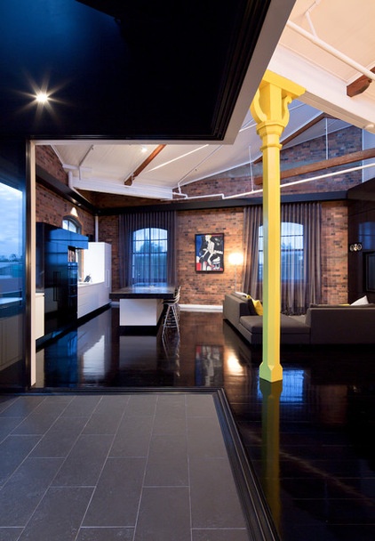
Being the “glamour” floor, the top level of each wool store showed greater interior refinement than the lower floors. In wool’s heyday, Winchcombe Carson’s showroom was considered palatial enough to host a ball in honor of the Prince of Wales in 1920, to which the cream of Brisbane society flocked. This elegant octagonal pillar with fretwork details, now in the vibrant yellow that appears throughout the apartment, is a reminder of those prosperous days.
Because of the proximity to downtown, the windows present interesting vistas of Brisbane’s city skyline. As the apartment is four stories above the street, in a fairly low-rise environment, privacy isn’t a major issue, and the windows all have gray glare-cutting sheer drapes.
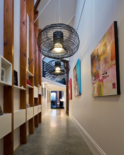
Wide double wood doors open into a long entry hallway that gives a tantalizing glimpse of what’s to come. Many of the doorways in the building were designed to slide into the brick walls, and their width was determined by the size of a wool bale.
“A priority of the owners was to have an exhibition space for their artwork,” Riley says. “The entry was once dark and narrow — we widened it and introduced more natural light and storage.” The collection is bold, colorful and modern, and has found a fitting gallery-like home in the wide entrance hall and the connecting living-dining area.
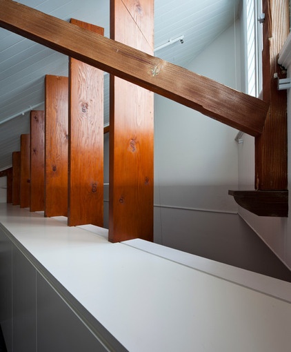
“The existing mezzanine level needed a stronger relationship with the main living area,” says Riley. “Cedar posts along the entry maintain visual connection between the two levels and are an example of how we cemented the link between old and new.”
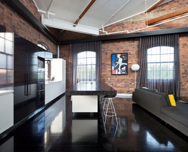
Anchoring the decor is the gleaming ebony flooring. Black stained hardwood boards were finished in Resene’s Uracryl (403), a superglossy coating used in antigraffiti applications. “The play of textures, the shine of the floor and the original exposed brick really bring the living spaces alive with the abundant natural light from the big windows and glass roof panels,” says Riley.
Floor stain: Colorwood in Pitch Black, Resene
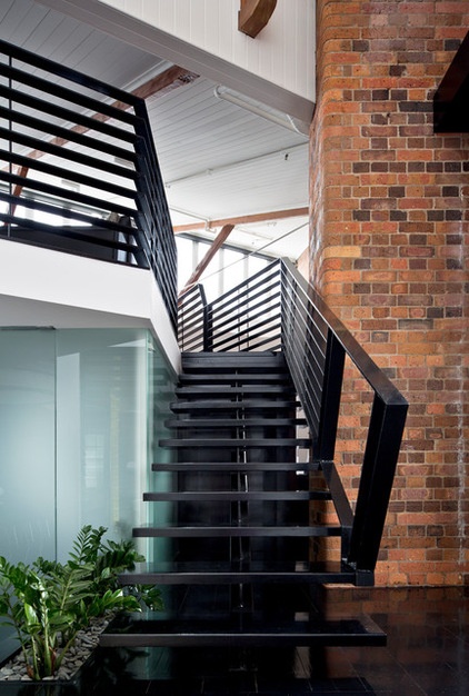
Reworking the existing stairways was central to rationalizing the layout of the apartment and to reinforcing the connections between the two levels. “We changed the function of some of the spaces and rethought the circulation paths that connected them,” says Riley.
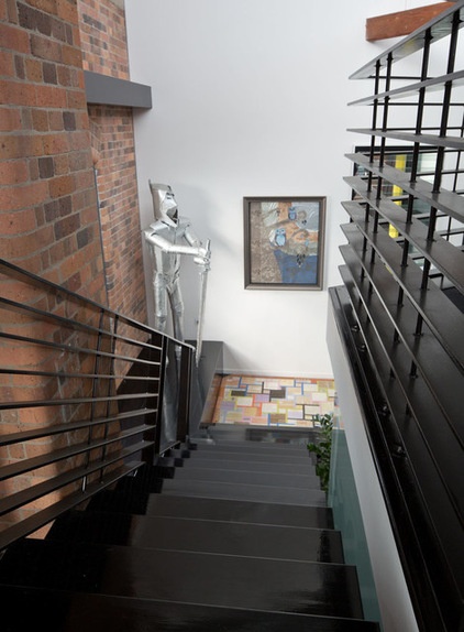
The black lacquer-like finish of the floors continues on the stairs that join the main and mezzanine levels.
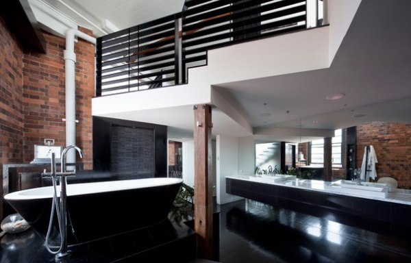
The master suite is split level, with the spacious bath and shower on the main floor. An internal staircase leads to the bedroom and sitting area on the mezzanine.
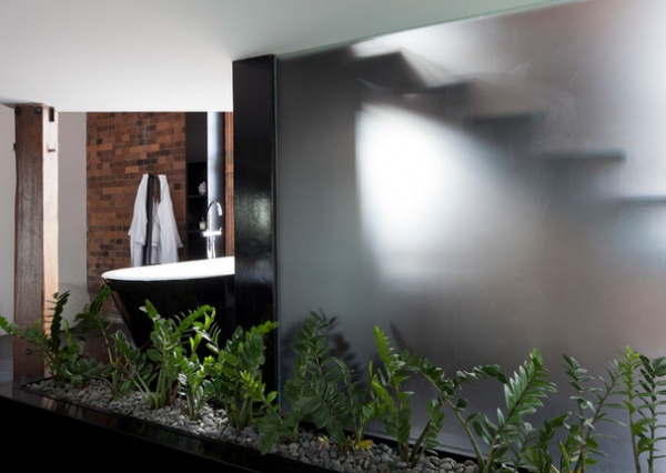
Wide expanses of translucent glass provide privacy while allowing passage of light into the luxuriously large bathroom.
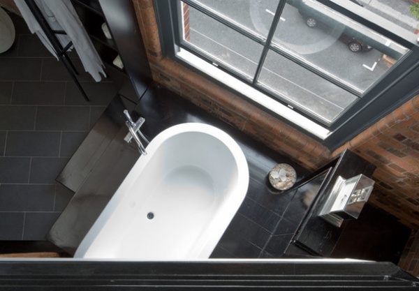
This is a bird’s-eye view of the elegant oval bathtub, seen from the mezzanine.
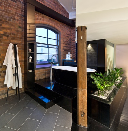
The bathroom is a study in stylish contrasts: aged, mellow and tactile elements sit alongside glossy and contemporary surfaces.
Tub: Kado Lure freestanding bath in white with black skirt, Reece; floor tiles: Black, Classic Ceramics; floor-mounted tub faucet and hand shower: Sussex Scala, Reece
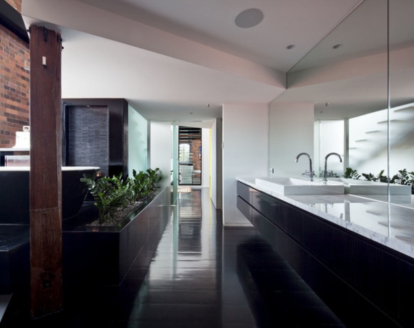
Bathroom cabinetry in glossy black wood veneer “floats” off the floor. Riley describes the sharply contemporary bathroom with its aged cedar and untouched brickwork as “exuding a sense of resort-style living not seen in most apartments.”
Vanity top: natural white Carrara marble; sink: A-line 750 Inset Basin, Parisi; cabinetry: Enviroven in Licora, New Age Veneers
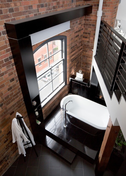
“We deliberately overscaled this L-shaped black beam over the bathroom window,” Riley says. “It was a neat way to hide the mechanism for the blind that gives the bathroom privacy, and it fits with the large-scale spaces and the strong forms of the original cedar posts and beams.”
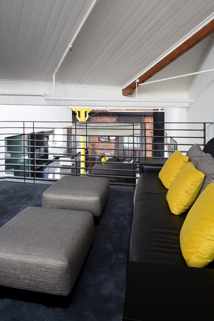
A second lounge area on the mezzanine overlooks the main living spaces. The white painted tongue and groove wood ceiling emphasizes the lofty ceilings that made it possible to fit two floors into a one-level apartment.
The interior colors are limited to black, gray and white with hits of yellow. “Splashes of vivid yellow are flickered throughout the apartment to create that spark that reflects the owners’ bright personalities,” says Riley. The juxtaposition of this contemporary palette and clean-lined modern furniture with the texture of the original exposed brick and cedar posts and beams enhances the history of the space, while giving it the freshness and personality the owners wanted.
Riley sums up what he sees as the achievement of the project: “The apartment displays the character not only of its history, but of the very stylish and artistic personalities of the owners. It’s contemporary but relaxed, low maintenance and comfortable, and still strongly connected to its past.”
Browse more homes by style:
Small Homes | Colorful Homes | Eclectic Homes | Modern Homes | Contemporary Homes | Midcentury Homes | Ranch Homes | Traditional Homes | Barn Homes | Townhouses | Apartments | Lofts | Vacation Homes
Related Articles Recommended


