New This Week: 4 Bedrooms Worth Waking Up To
http://decor-ideas.org 04/25/2015 08:13 Decor Ideas
The bedroom is where most of us spend one-third of our lives. It’s where we rest, read, surf the Internet on a lazy Saturday morning. It’s where the magic happens. Indeed, with all the important recharging that goes on in bedrooms, it make sense for them to be comfortable, personable and inviting.
So we jumped into bed with the photos that architects, designers, builders and other professionals uploaded recently and pulled four great rooms in which anyone would love to lay their head. Here, the designers share almost everything you could possibly want to know about these spaces.
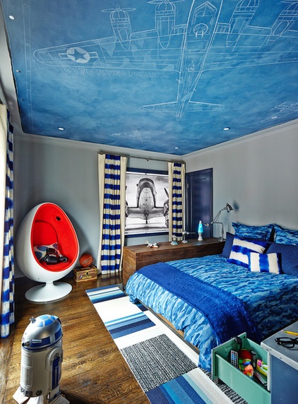
1. Boy, Oh Boy
Designer: Lisa Staprans of Staprans Design
Location: San Francisco
Homeowners’ request: “A fun and vintage airplane bedroom/bathroom for her young son that would celebrate his love for vintage airplanes and aviation history.”
Plan of attack: “The inspiration was the client’s son who loves vintage airplanes. It started with the ‘blueprint’ faux painted ceiling design. The client saw the ceiling artist’s work and we had her meet us at the house to define the look for the vintage airplanes on the ceiling and the colors. We used the ceiling colors as the point of departure for the wall and trim colors and the bathroom. Then fun dip-dye blue curtains and shades, Flor tile carpets and an orange cashmere cushion in the egg chair. ”
Why it works: “I think it worked because the theme carries throughout with the materials, colors and layout. We also selected the vanity to feel like the metal of a vintage airplane. I think the color blue and the stainless steel and the vintage airplane theme hold it together. We even did a roll-down window shade with a favorite black-and-white airplane image.”
What wasn’t working: “The challenge was keeping it fun and inspired by the aviation story without having it too busy. We kept the bathroom light with white tile and white marble so it would not feel too young.”
Designer secret: “I think the pull-down shade and the dark trim with lighter walls made the room more dramatic and masculine. But one of the biggest success elements of this room is the faux artists’ work. Her name is Shannon Geis.”
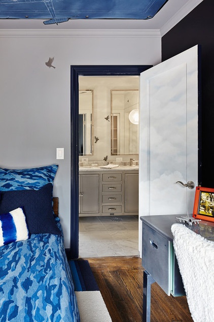
“Uh-oh” moment: “The room is small and we had a lot of items that we needed to get into the room. We were worried that it would feel crowded, but with the colors, bed configuration and ceiling, the room is very cozy and inviting and inspiring. I also think the various shades of blue give the room depth and make it feel larger. What helped to push the project forward was how excited her son was to see it unfold and come to life. He was very involved in the design decisions and selected the types of airplanes to be painted and the types of birds to put in the bathroom with the clouds and birds . the bathroom is very light and airy and grounded by the stainless steel vanity.”
Splurge and save: “We saved on the Restoration Hardware bed and vanity and Flor carpet tiles, and we splurged on the bathroom lighting from Niedhardt lighting, the artisan-painted ceiling and the hand-loomed dip-dye fabric from artists in Guatemala. We also saved on the studio line of Waterworks stone tile for the flooring in the bathroom.
The nitty-gritty: Shade: Orangepeel; bathroom flooring: Waterworks stone tile; bathroom fixtures Hans Grohe; carpet tiles: Flor; ceiling art: Shannon Geis
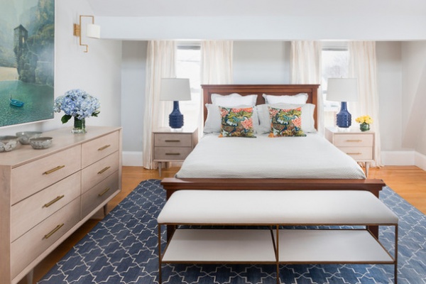
2. Transitional Treasure
Designer: Amanda Reid of Mandarina Interior Design Studio
Location: Cambridge, Massachusetts
Size: About 15 by 13½ feet
Homeowners’ request: “They wanted a calming yet bright and fresh space consisting of mainly neutrals with some colorful accents.”
Plan of attack: “First step in any design project, after dialogue with the client to discuss goals/requirements, is to conduct a survey and prepare a furniture plan. Then I begin to develop the design by searching for specific pieces (furniture, fixtures, carpet, window treatments). The bed was an existing wedding gift that the clients wanted to incorporate so that was the starting piece; all other elements including wall color are new.”
Why it works: “The client and I had decided on a largely neutral palette with accents of bolder color. The bed was existing and on the darker side so I chose lighter pieces for the new furniture items (dresser, bedside tables, bench). The base of the room is actually quite neutral; the bolder accent colors are only brought in through the carpet, lamps, artwork and pillows.
Who uses it: “A married couple in their mid-30s with a 2-year-old daughter and a boy on the way. They are both working professionals whose style preferences are contemporary yet not cold.”
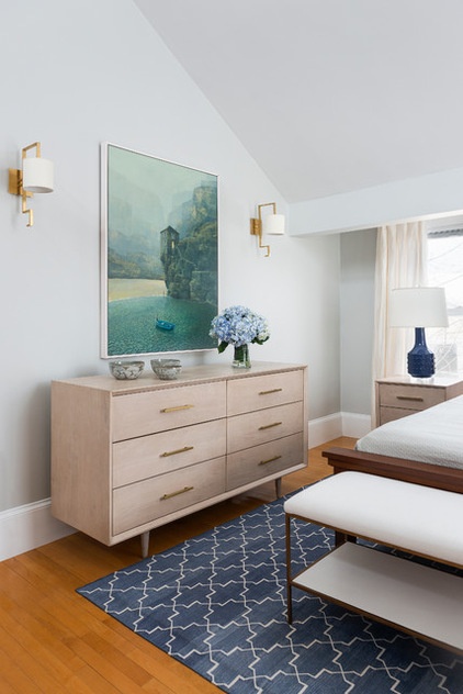
Designer secret: “We mixed furniture finishes for interest and added color in accents such as art, pillows, lamps and carpet. The major items here are actually quite neutral, but bold dashes of color create interest and pull the design together, yet can be easily changed out in the future. We also created continuity with the high vaulted ceilings by using a half-tone of wall paint for ceilings.”
Splurge and save: “We saved by using semi-custom window treatments, which are less expensive than full custom, with hardware from Restoration Hardware. The flat woven rug was less costly than hand-knotted. We splurged on quality furniture and designer fabric for pillows.”
The nitty-gritty: Dresser, bedside tables and bench: Redford House; drapery: The Merry Window; lamps: Bungalow 5; wall sconces: Visual Comfort; rug: Madeline Weinrib; pillow fabric: Schumacher; paint: Barren Plain, Benjamin Moore
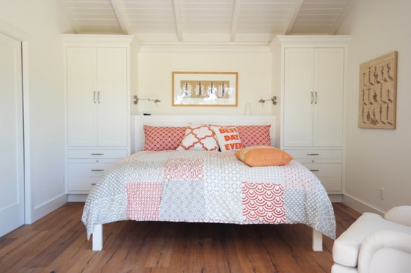
3. Built-In Beauty
Architect: Bill Willers of Marcus and Willers Architects
Location: Sonoma, California
Size: 183 square feet; 13½ by 13½ feet
Homeowners’ request: “Our clients desired a design that felt like a small second home for their visiting guests and their adult son and his family.”
Plan of attack: “This space is the bedroom in a guesthouse that by county ordinance is limited to a total of 840 square feet. So the bedroom design began with the need to limit its size and yet make it a gracious space for visiting guests. The room needed to incorporate adequate closet space for guests staying at the house but not as much as would normally be required in the bedroom of a full-time residence.
“The design evolved from these requirements, beginning with the design of the wall at the head of the bed. The two wardrobes and headboard alcove set the width of the room. The depth of the room is spacious enough to incorporate a small comfortable chair but no more.”
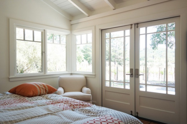
“The bedroom is placed in the overall design to provide privacy from the views of the main house and to overlook the adjacent vineyards.”
Designer secret: “The main feature is the wardrobe and headboard wall of this room. It sets the design for the room and at the same time serves all of the functional needs of the room.”
Take-away: “We enjoy making small buildings because it requires that every square inch matter. Volume in a small building is a very important feature, but it needs to remain in scale with the intimate scale of the building. Not too big, not too small, but just right.”
Team involved: Gracie Construction, Plaza Cabinetry, Level Engineers
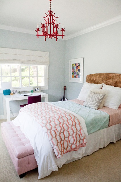
4. Go Girl!
Designer: Heather Olson of 2 Doors Down Design
Location: La Jolla, California
Size: About 135 square feet; 12 feet by 11¼ feet
Budget: Under $4,000
Plan of attack: “This was a makeover for an 11-year-old tween. The room hadn’t been updated since she was about 5 or 6 years old so she was really ready for a more mature design scheme. She had definitely outgrown the previous furniture and accessories, and we wanted to give her something that would grow with her and could last for several years. She was getting ready to start middle school, and her main priority was to purchase a desk for doing homework. Once we had selected the desk, the whole design plan started to fall into place.”
Why it works: “We were able to give our client exactly what she needed, an updated room that had all the essentials — a perfectly sized desk, a cute and comfy bed, a fun dresser (not pictured), a cozy spot for a friend to lounge (not pictured) and plenty of storage. We also added a vintage light fixture, lots of fun accessories and a couple pieces of art.”
What wasn’t working: “The most challenging aspect of this room was that it’s not very big. We had to squeeze a lot of items into a rather small space while trying not to make it seem overly crowded or too busy.”
Who uses it: “This is a bedroom for a busy tween, now teen, where she relaxes, hangs out with friends, does her homework and sleeps. The homeowners are an active family of five — three children and a husband and wife.”
Designer secret: “The majority of the furniture and fixtures in the room will stand the test of time — each piece is classic and timeless. We added lots of color through accessories and artwork. We also added a few trendy pieces that our client wanted — a Moroccan pouf, a pin-tucked duvet, a turquoise lamp — but each of those pieces will be easy and relatively inexpensive to switch out as her tastes change.”
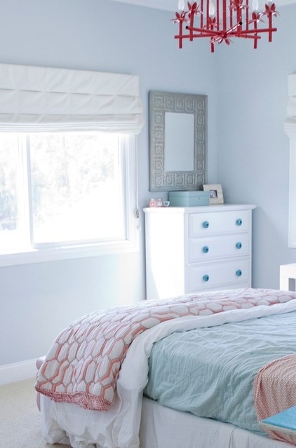
“Uh-oh” moment: “The most challenging part of the design plan was the placement of the bed. Of the four walls in the room, two have large windows and one has a wall-to-wall closet. That left only one wall on which to place the bed. The layout didn’t seem ideal at first, but we really grew to love the design scheme once we started playing around with the rest of the furniture. We did try putting the bed on one of the walls with a window but it just didn’t work. Not only did it block too much of the beautiful, natural light the room receives, it also just looked odd.”
Splurge and save: “We were definitely able to execute the design plan on a relatively modest budget, under $4,000. We repainted the existing dresser and switched out its knobs. We sprayed a vintage mirror and we repurposed an upholstered trunk the homeowners already had. By saving money in these areas, we were able to splurge on a really fun vintage light fixture that is one of the highlights of the whole room.”
Take-away: “Tweens are incredibly fun to work with. They have some really great ideas, generally know what they like and want, yet they are totally flexible and open to suggestions and direction.”
The nitty-gritty: Paint color: Blue Glow, Pratt & Lambert; window treatments: custom, Interior Window Designs; light fixture: vintage, purchased from Etceteras in La Jolla; headboard: Seagrass, honey weave, from Pottery Barn; duvet, organic cotton pintuck, white, from West Elm; blanket/quilt: Honeycomb pattern, West Elm; coverlet: quilted cotton, Pool, from Elizabeth Allen; bedskirt: tailored white, Elizabeth Allen; shams: pleated, West Elm; gray throw pillow: West Elm; fuzzy throw pillow: Target; sheets: French Ring, Pimento, from Serena & Lily; trunk: tufted pink leather, thrift store; desk: Parsons, lacquered white, West Elm; desk chair: Bernhard, red lilac, Ikea; desk lamp: ceramic, Sea Going, Target; jewelry box: lacquer, small, West Elm; artwork: Ikea print, custom framing; dresser: vintage; dresser hardware: Anthropologie; mirror: vintage
Team involved: Tim Golba (architect); Ray Bailey Construction (general contractor)
More:
14 Steps to a Perfectly Polished Bedroom
New This Week: 3 Daring Dining Rooms
Related Articles Recommended


