Kitchen of the Week: Rich Materials, Better Flow and a Garden View
Ross and Suzie Small of Yorktown, Virginia, both love spending time in their mostly perennial garden with azaleas, elephant ears and gardenias. But with only a tiny window over their kitchen sink, the couple felt cut off from their backyard. Their aging kitchen’s difficult layout with no center island also made preparing daily meals and entertaining a chore. The empty-nest couple thought a kitchen addition and a total remodel of the first floor of their four-bedroom, two-and-a-half-bath Colonial home would give them the views and space they wanted.
But kitchen designer Ebony Stephenson of Criner Remodeling could see that the couple could accomplish their goals and save money by adding a bay window bump-out that would create a better connection with their garden and a bit more floor space. Removing a wall between the kitchen and existing dining room would allow room for a new center island with seating and storage. These key design decisions plus the use of rich, natural materials — including a tumbled travertine tile backsplash, alder cabinets and an African walnut floor — have created a rustic but elegant transitional kitchen with better flow, style and views.
Kitchen at a Glance
Who lives here: Ross and Suzie Small
Location: Yorktown, Virginia
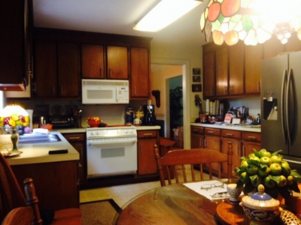
BEFORE: The existing 206-square-foot (19.1-square-meter) kitchen had mismatched appliances, laminate counters, builder’s grade maple cabinets, a worn linoleum floor and a large, looming fluorescent light above.
The dated kitchen was also closed off from the backyard and surrounding rooms, something Ross and Suzie wanted to change. “They had to go from the kitchen to the family room and then a screened porch to even get to their backyard,” Stephenson says.
“After” photos by A. Tatum Photography
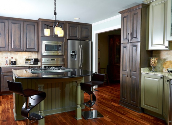
AFTER: A wall between the kitchen and the formal dining room was removed, and that space was incorporated into the kitchen. This change allowed room for a new center island with good flow on all sides. The opening shown in this photo leads to the new formal dining room — previously the living room, which was eliminated because the space was rarely used.
The updated transitional kitchen with a French country flavor has a rustic but elegant look thanks to alder cabinets with a finish that combines different tones and shades of black, brown and gray, and a ¾-inch solid prefinished African walnut floor. “They wanted it because of the variation and the color and texture of the wood, and the rich look it gave to their floor,” says Stephenson.
Cabinets: Greenfield Cabinets; brushed oil-rubbed-bronze cabinet hardware: Jeffrey Alexander, Hardware Resources; island stools: Costco
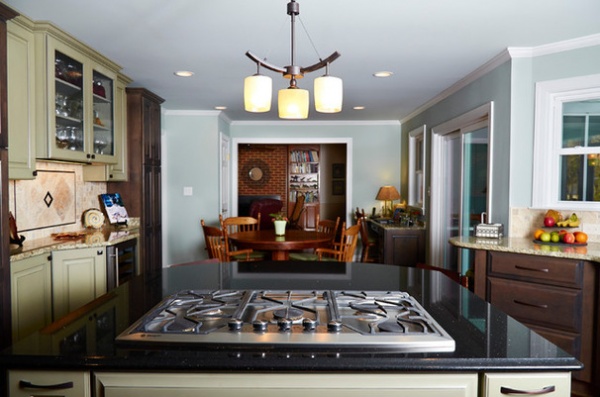
This long shot of the kitchen looks towards the family room (seen in the rear). A new desk area, located off a sliding door that leads to the new deck outside, gives Suzie a place to pay bills.
A warm gray color was chosen for the walls. “There are a lot of gray undertones in the cabinets that we wanted to bring out,” says Stephenson, who adds that they used different tones of white for the ceiling and trim to provide contrast.
A five-burner gas range at the island allows Ross and Suzie to socialize with guests or watch TV while cooking.
Paint by Sherwin-Williams: Comfort Gray SW6205 (walls), Spare White SW6203 (trim), Sea Salt SW6204 (ceiling); cooktop: Monogram Appliances; light fixture above island: Minka-Lavery Raiden 3-Light Mini Chandelier
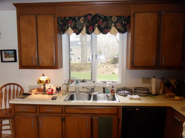
BEFORE: This photo of the existing kitchen sink window surrounded by heavy upper cabinets illustrates the limited view Ross and Suzie previously had. “We were cut off from not just the garden, but the birds and all the activity in the backyard too,” says Suzie.
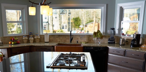
AFTER: The 2½-foot-deep bay window bump-out includes an 80-inch-wide picture window flanked by two 30-inch-wide double-hung windows that provide ventilation. “The space is incredible,” says Suzie. “It’s a small bump-out, but it makes a huge difference.”
Stephenson points out that the angle of the bay bump-out adds architectural interest to the exterior of the home, and also mimics the angle used for the new deck added outside the kitchen.
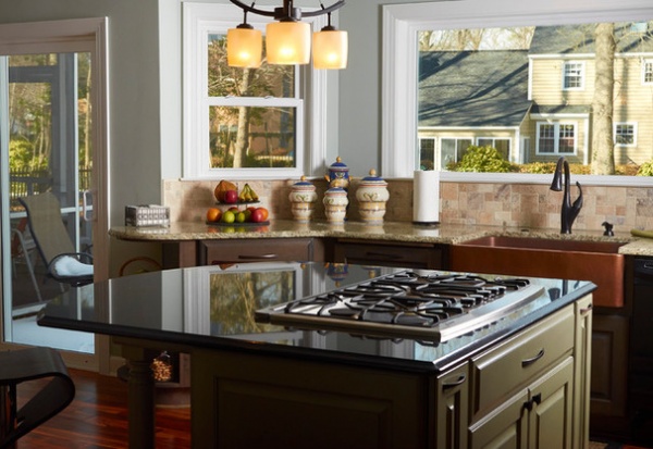
To save money, Venetian Ice granite with a standard edge treatment was chosen for the perimeter counters. A more expensive Black Galaxy granite with an ogee edge for the island top provides nice contrast and definition.
Venetian Ice and Black Galaxy granite: Richmond Marble and Granite
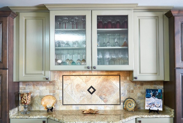
The tumbled travertine tile backsplash behind the kitchen’s wine bar has an oil-rubbed-bronze trim for an elegant and rustic look.
The back inside wall of the antique glass-front upper cabinets mimics the beadboard seen on the back of the island base. The surrounding cabinets have an amaranth green finish with a black glaze for an antique look. This lighter finish offers visual relief from the kitchen’s darker cabinets, and makes the wine bar a focal point of the room. “I just can’t look at it enough,” says Suzie. “It’s useful but also so striking. People tell me they love the soothing color combination. We wanted some contrast, and I’m really glad Ebony helped us choose that.”
Backsplash tile: ProSource of Maryland & Northern Virginia
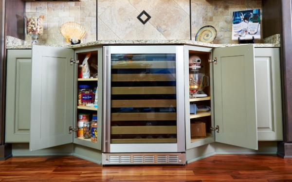
The base of the wine bar includes the wine refrigerator and two angled 13-inch-deep cabinets. The cabinet on the left in this photo holds snacks, while the cabinet on the right provides storage for the couple’s mixer and other small appliances and kitchen essentials.
Wine refrigerator: Monogram Appliances
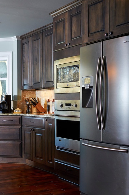
Ross and Suzie incorporated their existing stainless Samsung refrigerator into the design of the updated kitchen, and it was placed next to the kitchen’s new microwave and wall oven. Two drawers below the ovens offer storage for trays and cookie sheets.
Microwave: Profile, GE; wall oven: Monogram Appliances
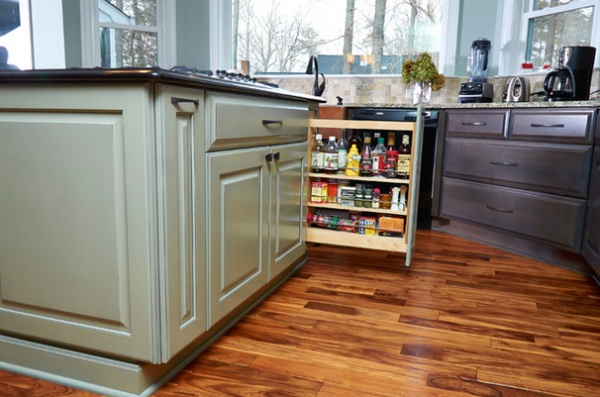
The same green color used for the wine bar was also used for the island’s base, which features pullout racks for spices and oils that are accessible on both sides of the cooktop.
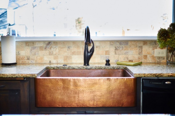
The kitchen’s attractive hammered-copper sink was the first item Suzie picked out for the kitchen, and it inspired the rustic look of the space. “I saw it in a friend’s house, and I thought it was so unique and functional,” she says. “I can get a big frying pan in there to soak without tipping.”
Farmhouse sink: Thompson Traders; Addison Single Handle Pull-Down Kitchen Faucet in Venetian Bronze: Delta Faucet
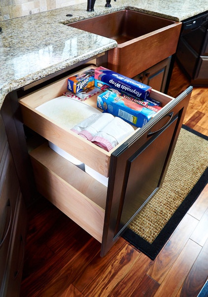
To the left of the sink, a two-tier garbage center pullout has a top drawer for plastic liners, foil and storage bags, with the garbage can and recyclables bin below.
The garbage center features an automated system that allows the homeowners to open and close the unit with a touch of the hip. A cutting board that slides out when needed was also integrated into its design.
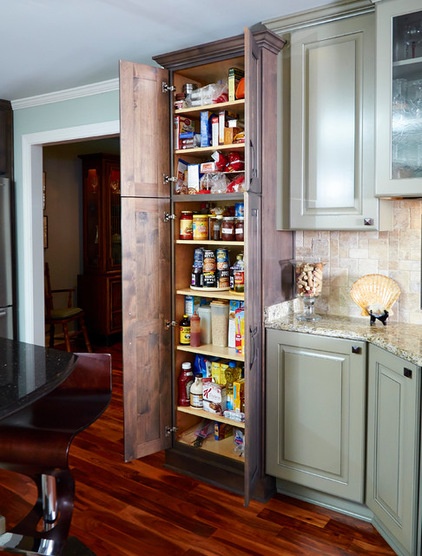
Eight shelves set at different heights create the kitchen’s user-friendly pantry cabinet. The couple saved money by going with adjustable shallow shelves instead of roll-outs. The pantry features crown and baseboard molding for a finished, furniture look.
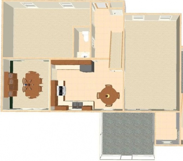
BEFORE: This floor plan illustrates how the kitchen felt cut off from both the garden and the surrounding rooms on the first level of this home.
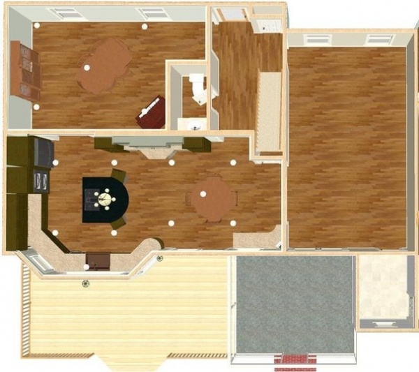
AFTER: The removal of the wall between the kitchen and old dining room, the improved layout and the addition of the bay window seen here gave the couple the views and space they wanted.
“I generally don’t want to go into any other part of the house now,” says Suzie. “I can have three different projects going on in the kitchen and not feel like I’m losing touch with what’s going on. I love it.”
Browse more Kitchens of the Week


