Room of the Day: Redesign Energizes a Ho-Hum Office and Living Space
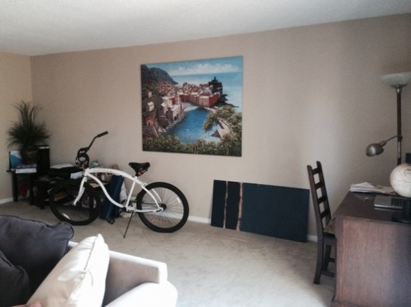
“My boyfriend and I never have fights, except over design,” says interior designer Veerta Motiani. Moving in together was an exciting time in their lives, but she was bored and uninspired by her new workspace in their living room. The room had light-colored walls, a bike and a big brown “man sectional,” as she calls it. Besides being a full-time office for her, the room is a part-time home office for him — and it’s their main living space as well. Redesigning the room for all three needs was a tall order that tested their relationship.
While he’s a whiz at putting Ikea furniture together, her strength here was culling through their belongings and placing things that made them both happy. Working together, they found a way to make the space functional and beautiful on a budget of about $5,000.
Photos by Tessa Neustadt
Room at a Glance
What happens here: This is the full-time office of interior designer Veerta Motiani; the part-time home office of her boyfriend, Dave Buck; and their shared living room
Location: Marina del Rey, California
Size: About 400 square feet (37 square meters)
BEFORE: Because the home is a rental, the couple did not want to invest in anything they would have to leave behind. “Beyond the new paint, we can take everything with us when we go,” Motiani says.
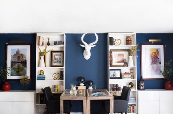
AFTER: Motiani approached the office area as a his-and-her project, with her side on the left and Buck’s on the right. Placing the desks so that they faced each other allowed her to create symmetry and a built-in look around them.
Then she filled their respective shelves with meaningful objects, books and art.
Tip: Get a built-in look from freestanding pieces with height. As renters, Motiani and Buck did not want to invest in carpentry, so they chose extended Billy bookcases from Ikea that kiss the ceiling. “Get bookcases that will extend as close to the ceiling as possible,” she says. “This makes them look built in and makes your ceilings look higher.” She also cozied the cabinets, in the same white, right up next to the shelves, adding to the built-in look.
Cabinets, bookcases: Ikea
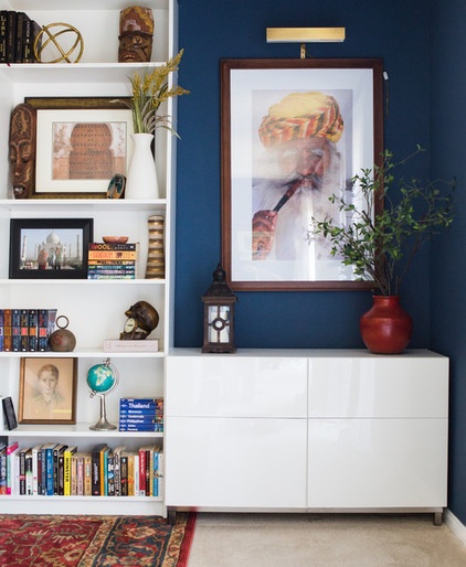
One move that made them especially happy was Motiani’s bringing out and highlighting Buck’s photography. This put two of his passions, travel and photography, in the space to inspire them both. He took the photo of this man in the colorful turban and of the Taj Mahal while traveling through India with his father. The Taj Mahal photo is on Motiani’s side, where it inspires her while she does her design work.
Of course, bringing color to the space was one of the biggest design moves the couple made. They searched far and wide for just the right navy, to complement the views of the Pacific and the sailboats just outside their windows.
Tip: Paint big sample areas, one in a spot that receives direct light and one in a spot in the shadows. Motiani and Buck painted about nine different samples before settling on Benjamin Moore’s Van Deusen Blue. The designer recommends painting as large a sample area as possible, at least 2 feet wide and 3 feet high.
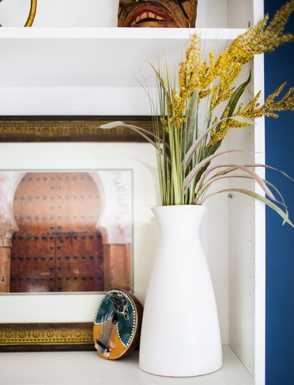
Buck often likes to focus on doors when photographing; Motiani gave this one of a Moroccan door a place of honor on the shelves. The couple picked up the little ukelele on Kauai in Hawaii.
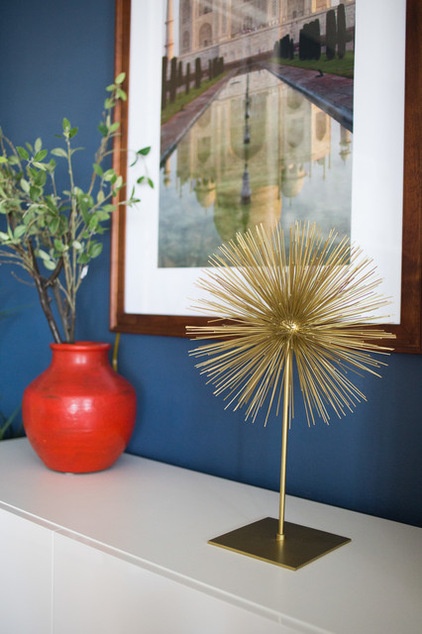
Tip: Conceal wires to make plug-ins look hardwired. “As renters, we didn’t want to invest in hiring an electrician to install anything,” Motiani says. They carefully tucked the wires from the art lamps behind the photographs and consoles, and placed the red vases from Pottery Barn to hide the spots where they were still exposed.
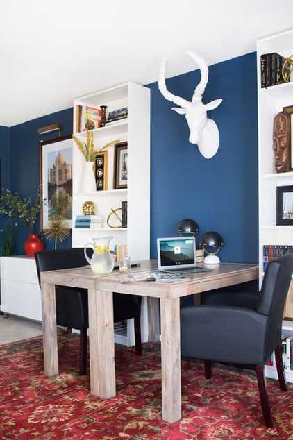
“I wanted a punch of black here, and office chairs are so ugly,” Motiani says of her choice for desk seating. “I wanted to keep them simple, comfy and a little loungey.” She scooped up these two leather armchairs at Wayfair for about $200 each. She also picked up two little midcentury modern–style desk lamps from West Elm.
Tip for renters: If the wall-to-wall carpeting you’re stuck with is bumming you out, layer an area rug right on top of it. Motiani brought lots of warm color and rich texture to the office with a rug scored at The Home Depot for $250. “I was looking at Persian and Turkish rugs for the space, but they are so expensive,” she says. “We got really lucky that Home Depot had some really beautiful options.”
Parsons Desks — Bone Inlay and Clint Mini Task Lamps: West Elm
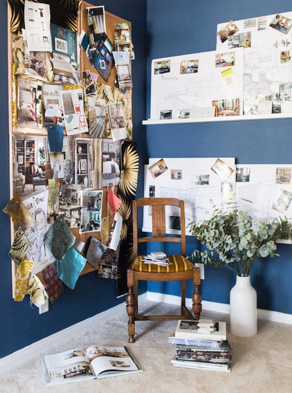
This partial wall (left) between the dining area and the office is about 5 feet wide and gave Motiani the perfect space for her mood boards. This wall is opposite the wall with the Taj Mahal photograph on it. She can turn her chair to see everything she needs to see and has easy access to her project boards. At the same time, the partial wall keeps the dining area out of sight from the living room area.
Picture rails: Ikea
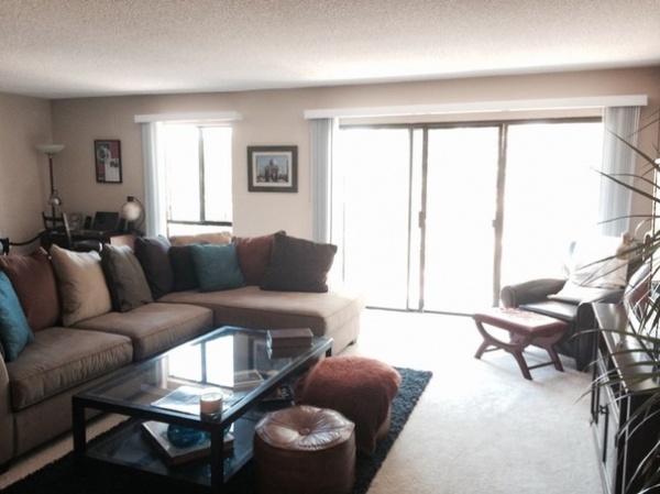
BEFORE: The living room previously was dominated by a big brown sectional sofa and an out-of-scale throw rug. The 1970s ottomans were a gift from Motiani’s mother.
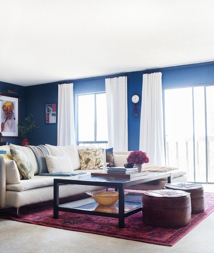
The couple found a great sofa compromise at Ikea. It has clean lines and is upholstered in a light natural linen that Motiani loves, and Buck appreciates that it’s a sectional. “We both loved his glass coffee table,” she says. They hung on to the vintage ottomans as well.
Another rug scored at The Home Depot helps define the living room seating area, adding bright color and pattern to the floor.
Tip: Make the most of window treatments. Just as she did with the bookcases, Motiani extended the rods and linen drapes up to the ceiling to exaggerate the sense of height. To give curtains a more luxe look, she also recommends using ring clips instead of sliding the fabric through the rods. Speaking of luxe, Motiani wanted 96-inch linen drapes, but the budget limited her choices. She combed the Internet until she found these at Overstock.
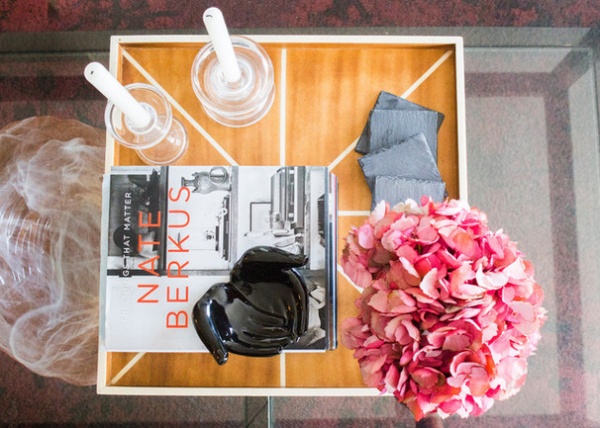
A wood tray corrals some favorite objects and books on the coffee table. Motiani is a fan of Nate Berkus’ work and says she finds his story inspiring.
Silk flowers: Rolling Greens
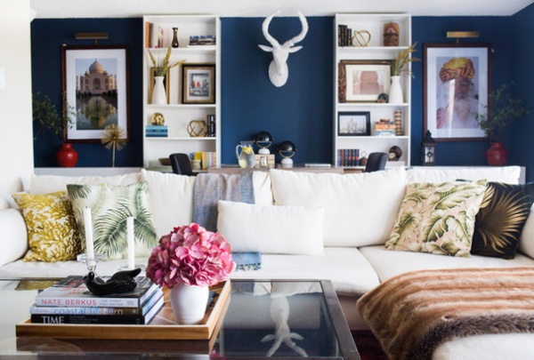
The designer repurposed Buck’s existing solid pillows to lighten the mood. “I love the iconic Beverly Hills Hotel, so I wanted to give a nod to their banana leaf wallpaper in here,” she says. She also layered on a faux-fur throw for texture.
The antelope trophy provides a focal point that draws attention from the living area to the office area up above the workspace, working well with both spaces. “We needed a pop of white, and we loved how long his antlers were,” Motiani says. “He embodies strength and sass.”
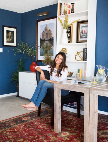
“We realized if we could get through two long trips to Ikea together in two days, our relationship could make it through just about anything,” says Motiani (seen here) with a laugh. Working with a tight budget, the designer and her handy man found compromises that resulted in a space they both love.
Browse more Rooms of the Day


