How to Design a Neutral Room That Kicks Boring to the Curb
Let’s set the record straight: Neutral does not mean boring. In fact, neutral decorating schemes can offer not only a sense of calm and serenity but also bags of personality and interest. Decorating with neutrals also offers a certain flexibility, allowing a space to be easily changed if the mood strikes. It also provides a backdrop — a blank canvas,if you like — to make little or big changes to help bring your home to life.
Don’t get me wrong; decorating with neutrals is not the easy way out. You still need to spend time planning and editing a room to get it just right. But I believe your neutral home can be interesting while also fulfilling your living needs. Follow these simple tips, and your home not only will look great but will reflect your personality and be as interesting as you are.
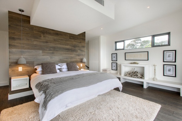
Add Tactile and Visual Texture
When planning a neutral room, always consider texture. “Texture” refers to the surface characteristics as well as the appearance of an object. Therefore, texture is not just about how something feels to be touched, but how it looks as well. Tactile texture relates to an actual feeling of a surface — rough, smooth, soft, hard — whereas visual texture is one’s perception of what the texture may feel like.
A room should be a multisensory experience through its design and decoration. It should not only look great but also beg to be touched. The room therefore needs to stimulate us both visually and in a tactile way. A cozy rug, soft wood floors and furry, soft pillows all help to make a room feel complete.
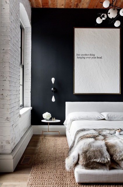
Let your personality and sense of style shine through by adding tactile accents such as faux-fur soft furnishings, leather furniture or on-trend cowhides for an up-to-the-minute look. This room oozes texture, with its fur throw, exposed brick wall and jute rug. Even the artwork begs to be touched.
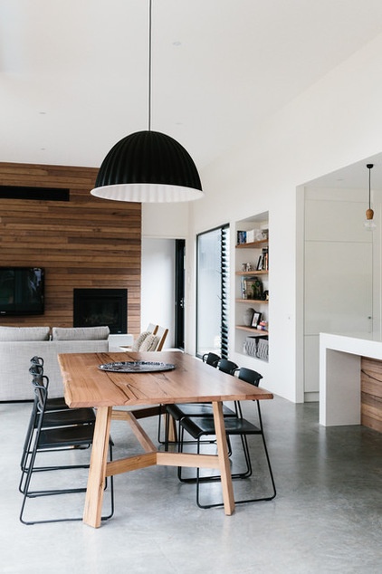
This room has a simple color palette that relies on wood to bring texture and warmth to the space. The timber brings both visual and tactile texture to the room. The timber wall and table look both warm and natural, balancing the smooth textures of the white walls and concrete floor that could otherwise have appeared cold and formal.
Tip: An easy and inexpensive way to add texture is to include a jute rug. These rugs are available in many shapes and sizes and add both tactile and visual texture.
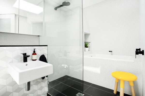
Choose One Color to Stand Out
In a true neutral color scheme, a pop of color should always be used sparingly. Consider adding a bright artwork, colored cushions or a side table. Remember to choose only one standout color and not to overdo it. This can be particularly useful when decorating children’s rooms, as their favorite colors can change frequently.
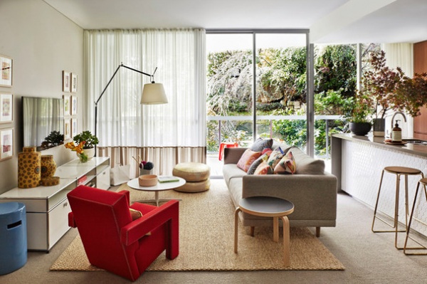
Keep the color pieces simple, so you can easily change the accent when you need a different look. In the space here, the accent piece is the red chair, while the rest of the room is simple and neutral. A chair makes a great accent piece, as it can be reupholstered in any color fabric you like, and when you are tired of the look, it can be moved to another room. Just remember that the vibrancy of colors increases against a white background, so even a little color can have a huge effect.
If you remember this, each room in your home can have its own color accent, with the neutrals anchoring the overall look.
How to Give Neutral Paint Colors a Subtle Jolt
Get in Touch With Nature
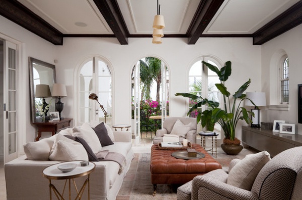
Plants can improve your mood and purify the air while adding interest, texture and color to your neutral scheme.
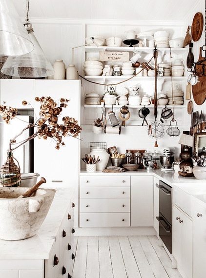
Another way to add nature to a room is by including wood. Display those wood chopping boards in the kitchen, add some natural wood shelving to your bedroom or introduce a wood coffee table in the living room. Against a neutral backdrop, natural wood furniture creates an earthy look and a relaxed vibe.
Tip: If adding the color of leafy greens is not your thing, try a bunch of twigs from the garden or some driftwood from the beach, which can also add personality to the room.
Layer for Interest and Contrast
“Layering” refers to the decorative elements you add to create interest, depth and texture.
This room has a neutral backdrop as a base. Pillows in varying shades and tones of cool and warm whites, together with shades of gray, have been layered on the sofa to create warmth and interest. The mohair pillow also adds texture.
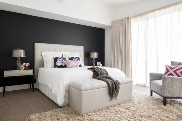
There are many examples of layering in this peaceful bedroom. Beautiful layered curtains, a rug layered on carpet and layers of color — from creamy soft furnishings to the dark wall — are tied together with a crisp white on the ceiling and trims.
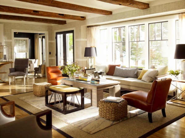
This room showcases the art of layering. Pillows in a variety of neutral shades as well as different shapes are layered on the sofa. The large sisal rug has been layered with a smaller gray and white rug, reflecting the tones used in the pillows.
Tip: When layering pillows, artwork or decorative objects, start with the largest object and continue in descending order by size. Remember to go for balance, not symmetry.
Play With Metal
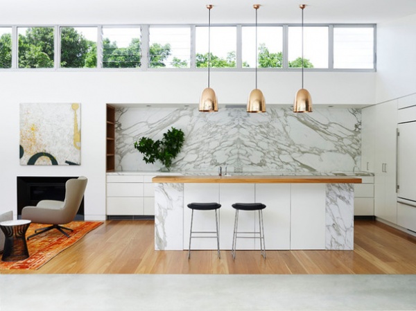
You can follow the trends — just don’t overdo it. I’m seeing a lot of gold and copper in kitchen design at the moment, and it’s spreading throughout the home. A neutral backdrop is the perfect stage on which these metallics can perform. It is important to use metallics only as accents, as they can quickly overwhelm a room, making it feel more like a nightclub than a home. Look to lighting, fixtures, handles, even utensils for metallic accents that won’t overpower the space and that you won’t get tired of.
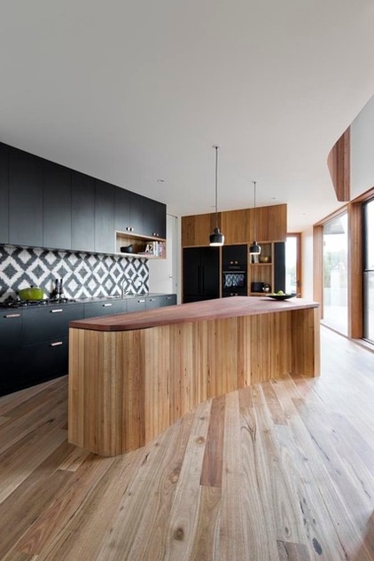
The copper handles on these kitchen cupboards are unexpected and allow the tiles and wood to take the starring roles.
Tip: Always look at a room and consider where you want your eye to be drawn. Is it an architectural element, a beautiful view or an introduced accent? That’s where to position eye-catching materials and finishes.
Make Shapes
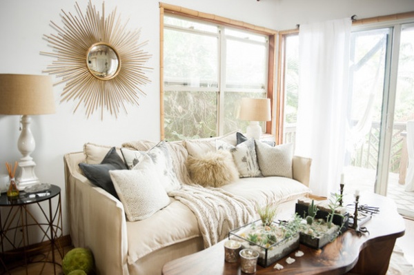
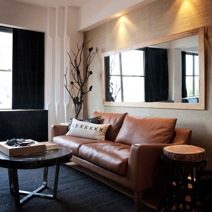
This room is a great example of how to use some of the tips outlined above to give a neutral room a wow factor. The owners have used layering, nature, texture, shades of neutrals and something unexpected.
This room is also an example of how to use my last tip: Vary your shapes. The round coffee table and side tables contrast perfectly with the rectangular mirror and sofa. Even the pillows are a combination of shapes. Varying the shapes creates interest and is visually pleasing to the eye.
The lighting has also been expertly thought out. The generous mirror not only provides an added shape, but also reflects light and space.
All of these elements combine to make this room anything but boring.
Tell us: Share your tips for a snore-free neutral space and post pictures of your neutral design schemes in the Comments.
More:
8 Great Color Palettes: Surprising Bedroom Neutrals
Best Ways to Use the Neutral Green Color of 2015


