Room of the Day: New Layout, More Light Let Master Bathroom Breathe
http://decor-ideas.org 04/21/2015 21:13 Decor Ideas
A separate toilet room can be a great thing, but not so much when your knees are hitting awkward bifold doors in a claustrophobic space. That was the case in this master bathroom, which was dark, dated and awkwardly laid out to boot. The style of the home is modern, and the homeowners were more than ready to update the bath and embrace a more minimalist style. Architect Ryan Duebber borrowed a section from the bedroom just 16 inches deep to open up the room, created strong contrast between white finishes and rich sapele wood, and flooded the room with light via a new skylight. The result is a beautifully crisp and bright, slightly larger room that feels twice the size of its former self.
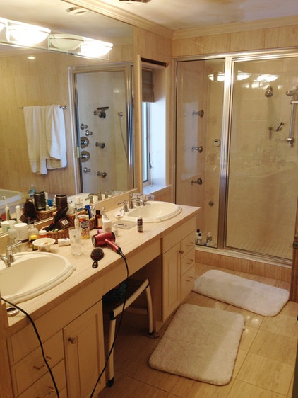
Photos by Ross Van Pelt
Room at a Glance
Who uses it: The parents, both of them doctors, of 2 children
Location: Cincinnati
Size: 132 square feet (12 square meters)
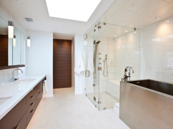
AFTER: The sapele wood accent wall marks a separate space where the toilet is. It’s in the area where the shower was in the before photo above.
With the shower moved from the back wall to the side and the dark sapele accent wall added, the room looks much deeper. The back wall provides a focal point and forces perspective. By giving the eye a place to focus, the accent wall creates the illusion of a much larger room.
Letting in more light was also important in making the space look larger. A new skylight floods the room with light and draws the eye up. White quartz countertops and white tile bounce the light around.
Floor tile: 12- by 24-inch Nordic stone
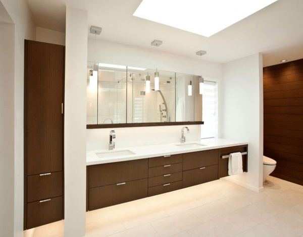
“There was a lot to think about in terms of compositional balance,” Duebber says. “The linen closet [left] and the sapele wall create a nice bookend effect on either side of the vanity.” He also paid careful attention to proportions. For example, he balanced the scale of the window on the right to the proportions of the linen closet.
The wood beneath the medicine cabinets provides a strong horizontal line that relates to the vanity. It also provides space for outlets tucked underneath as well as LED tape lights. The same lights illuminate the space underneath the vanity and linen closet. Leaving these pieces floating off the floor also made the room appear larger.
Medicine cabinets: custom
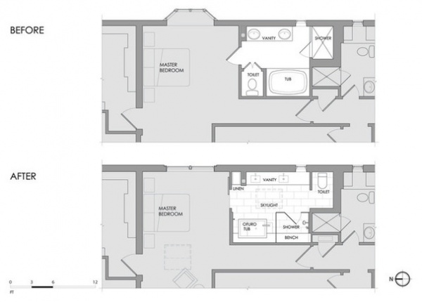
Duebber borrowed a bit of space (16 inches deep) from the bedroom to make the bathroom a little larger. If you compare the plans to the previous photo, you’ll see that the column to the right of the linen closet marks the spot where the wall between the two rooms used to be. The piece between the linen closet and the vanity now serves as a support column. Compositionally, it provides a white break between the large dark wood pieces.
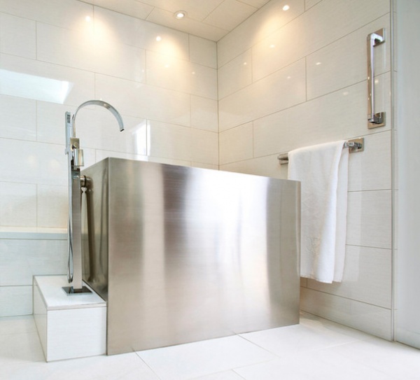
“The homeowners are modernists and wanted a much more minimalist look in here,” Duebber says. Part of this look is the Ufuro bathtub they chose. The brushed stainless steel has a sterile look these two doctors appreciate. The filler and faucets are in brushed chrome that coordinates well with the tub’s finish.
Ufuro tubs originated in Japan. They are floor-space savers, which was a big help in here. They are shorter and higher than standard tubs. You climb in, then sits on a seat inside that is about 8 inches off the bottom of the tub. The depth of the tub allows you to fill it up high. These homeowners tuck a little step stool where the towel bar is to aid them in getting into it. The towel bar and the vertical bar are both grab bars that allow them to do this safely.
One small detail worth squinting over is the vertical stainless steel strip at the right edge of this photo. Showing the thick edge of the tile at the edges was a subtle detail Duebber wanted to incorporate into the design. Since the tile edges could not be mitered, he used the metal strip instead of the typical bullnose detail. This accentuates the other steel pieces in the room, and its clean edge adds another modern touch.
Rectangular Stainless Steel Japanese-Style Soaking Tub: Amery
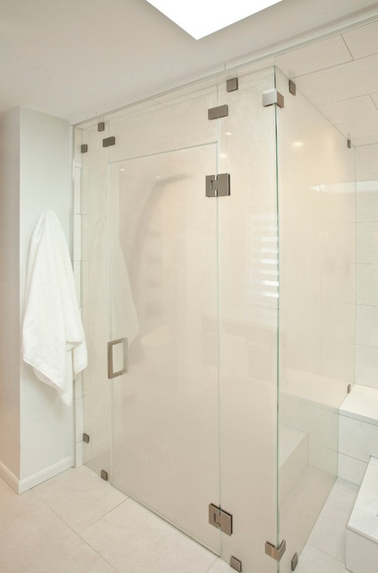
A bench continues from behind the tub into the steam shower, connecting the elements along this wall. It is tiled in 12-inch by 35-inch porcelain tiles and capped in quartz.
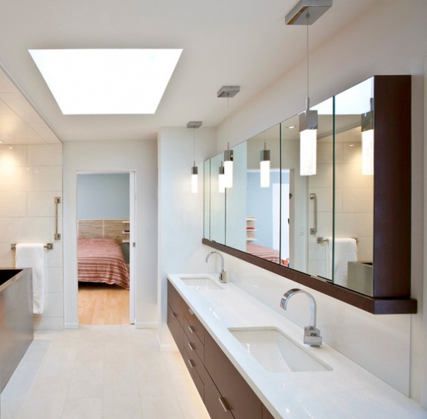
Thanks to the large medicine cabinets and carefully planned storage in the vanity, there is now a place for everything, which keeps the countertops neatly cleared off.
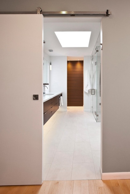
A new track door separates the bathroom from the master bedroom. This keeps a swinging door from hogging space when open. The track and hardware relate to the other steel pieces in the new bathroom.
Wood: stained sapele; wall tile: 12- by 35-inch Brunei Blanco, Porcelanosa
Browse more Rooms of the Day
Related Articles Recommended


