Color of the Week: April Sky Blue
http://decor-ideas.org 04/20/2015 22:13 Decor Ideas
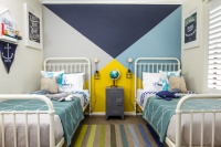
I was recently working with a client who was having trouble picking out a wall color for her young son’s bedroom. She wanted a light blue but didn’t want anything too muted or baby blue. She also didn’t want to go too gray and cold. So we worked our way through my paint fan deck to find just the right light blue — soft without going pastel, and not too gray. An additional challenge with this particular bedroom was that it doesn’t get a huge amount of natural light. We therefore needed to up the brightness a bit. If you are similarly in the market for a soft light blue that has the slightest hint of gray to it, check out these examples and how to use them in your home.
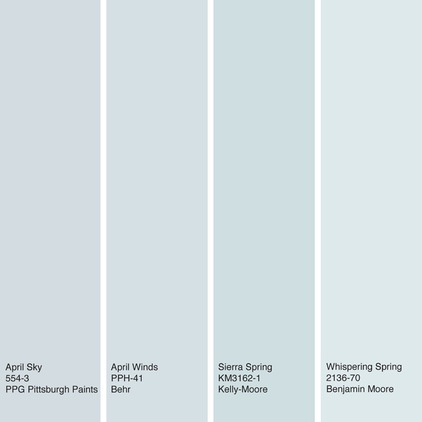
Most paint companies divide their colors into bright and muted versions of each hue. When going for a light blue, I usually head to the muted end of the paint fan deck. These are the colors that have a touch of gray or brown added to them, which knocks down the intensity of the hue. When it comes to soft blues, a touch of gray, and perhaps some green, nudges the shade toward a muted neutral that has some nice complexity. By neutralizing the blue, it allows the color to work with almost any other color you wish to bring into the space.
Shown here are some April sky blues to consider. From left to right: April Sky from PPG Pittsburgh Paints, April Winds from Behr, Sierra Spring from Kelly-Moore and Whispering Spring from Benjamin Moore.
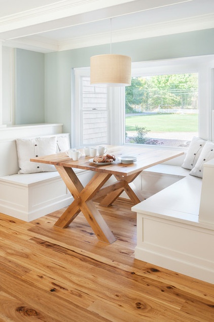
Here’s how to use our featured color in a way that creates a warm and cozy vibe. With the soft gray-blue wall color paired with plenty of warm wood tones via the table and flooring, this space is anything but chilly. In fact, the wood gets a warm boost because of how it contrasts with the cooler wall color. Plus, there’s a hint of green in this color, which also warms it up a bit and keeps it from feeling rainy-day gloomy. This is a beautiful space, perfect for enjoying that morning cup of coffee or for casual dining.
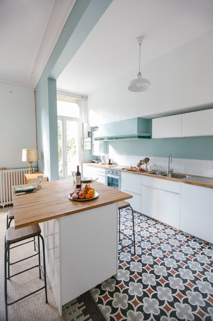
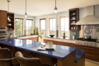
Get cooking with a soft blue in the kitchen. This example is a bit bolder than the previous blue, but it still has a sky blue quality. And there’s enough gray and green in the color that it feels like a near neutral, and not at all like a sugary pastel. As much as all-white kitchens are the rage, I encourage homeowners to think about injecting some bits of color in an otherwise white kitchen just to break it up and help call attention to interesting features.
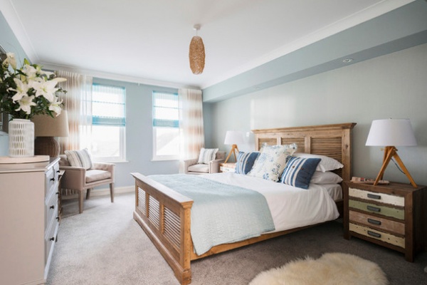
A light grayish-blue is one of my go-to colors for a bedroom. It’s soft and soothing, which helps create just the right relaxed vibe for the place where you rest your head each night. This is a fairly restrained palette, really just shades of white, orange and blue. But because there are different shades and tones of the colors, as well as varying textures, it feels perfectly pulled together.
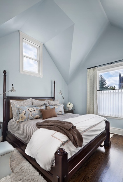
Here’s another bedroom with a cooler blue. The grayish sky blue used here gives an expansive, sleeping-under-the-sky feeling to the bedroom, especially because the color continues up onto the ceiling. Normally I like to use contrasting color to draw attention to interesting ceiling lines, but I think it was a smart decision to use the color for both the walls and ceiling in this instance. It really opens up the room, making it feel much larger than it is.
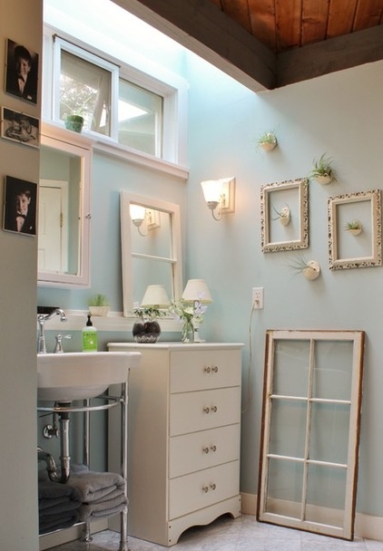
Bathrooms also wear muted cool blue tones well. This charming bathroom with its vintage vibe gets a terrific color boost from the soft blue walls. The wall color choice here was a wise one, as white walls wouldn’t allow the white decorative accessories to stand out much, but a bolder background color might distract too much from the interesting details. This color also helps a bathroom deprived of natural light feel more open and airier.
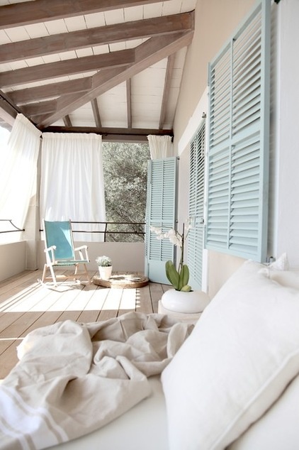
Light blue is a common porch ceiling color, especially in the southern United states, but it also looks fabulous on other areas of a porch — such as on shutters and furniture. This particular blue feels fresher and more modern than traditional sky blue. And again, it’s a great color to use with an otherwise white palette, just to add some visual interest without having to go superbold with color, if that’s just not your thing.
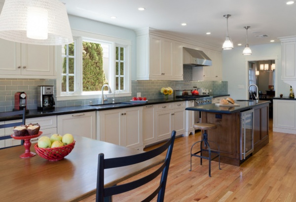
Kitchens often have a lot going on in them, material-wise. I always advise clients to select the kitchen wall color last, after every other surface — flooring, cabinetry, countertops and backsplash — has been selected. It’s so much easier to pick a coordinating wall color once these other selections are finalized. And, in this particular kitchen, I think the supersoft gray-blue wall color is a fantastic choice, as it serves as a continuation of the backsplash color, but is light enough that it doesn’t compete for attention with all of the other rich materials.
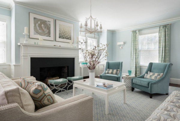
This elegant living room gets the perfect boost of color from the watery blue accents that are picked up by the slightly lighter version on the wall. This is another excellent example of using interesting color strategically to dress up an otherwise light and neutral space.
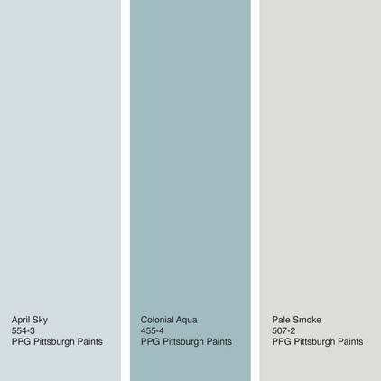
Similar to the previous example, here’s a palette that brings together our featured hue with a deeper watery blue and a soft, warm gray. For a lighter and brighter space, use April Sky or Pale Smoke as the main wall color and add accents in the deeper blue. Or, for a more dramatic space, splash some Colonial Aqua on the walls.
From left to right: April Sky, Colonial Aqua and Pale Smoke, all from PPG Pittsburgh Paints.
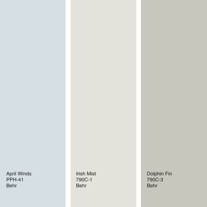
To really warm up a soft grayish-blue, mix in warmer neutrals in the taupe to brown family. Pair the palette with lots of warm wood and your room will have a cozy and inviting vibe, yet with a boost of freshness from the pale blue.
From left to right: April Winds, Irish Mist and Dolphin Fin, all from Behr.
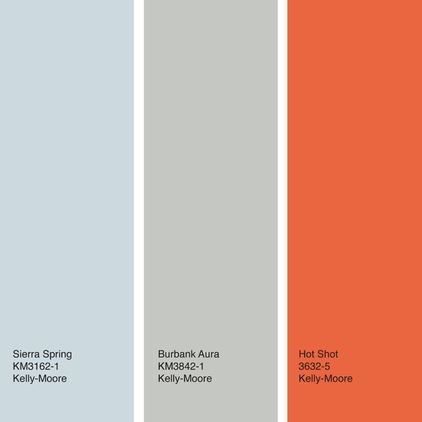
Lovers of bold colors can take advantage of the neutral qualities of a soft, silvery blue by adding a contrasting zesty hue, such as this bold red-orange. Of course, I’d recommend using the bold orange sparingly, maybe via a partial accent wall, an accent area (such as the back of a niche or open cabinet) or decorative accessories.
From left to right: Sierra Spring, Burbank Aura and Hot Shot, all from Kelly-Moore.
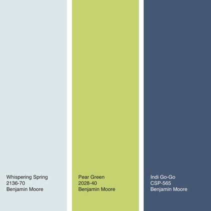
I’ve been pushing navy blue as a “new neutral” — in that it can be paired with just about any other color and is a nice departure from black, gray and brown, the usual dark neutrals. It looks fantastic with our featured blue as well as with a vivacious vegetal green. Again, think about using the bolder hues more sparingly if you want to keep the vibe airy and light. But if you want to go bold, an accent wall or two in the green or navy would be eye catching and dramatic.
From left to right: Whispering Spring, Pear Green and Indi Go-Go, all from Benjamin Moore.
Tell us: How have you used soft gray-blues in your home?
See more stories on color
Related Articles Recommended

