An Architect Shares His Go-To Materials
Just as a painter reaches for familiar brushes, mediums and colors when beginning a new work, architects have favorites we rely on to give form to our ideas. For us, products and materials comprise our personal vocabulary of design, and the way we use them is our dialect. The raw materials of building, despite their similarities, are capable of infinite architectural diversity in the hands of different individuals.
It’s a special challenge balancing the custom and the affordable, and architects have favorites for those applications too. It’s not always about selecting a less expensive material. Sometimes it’s using a more expensive one sparingly, or trading a lower installation cost for a higher material cost. Here are a few of my current favorites.
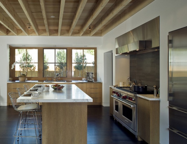
Exposed framing. Exposed framing is an authentic expression of the means of construction that lends detail to the overhead plane, provides a natural place to hide light fixtures and improves the acoustics of any space. To maximize the economy of it and define the ceiling area, I like to leave it unfinished. There’s nowhere to hide ductwork or plumbing runs with this system, so be prepared to express it (with metal ductwork, for example) or hide it via a clever design solution.
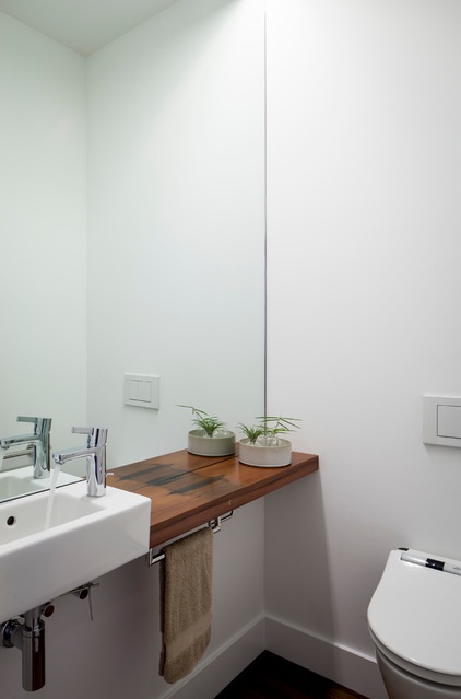
White vessel sinks. I like plumbing fixtures with minimalist, European styling because they’re versatile, playing equally well with traditional and contemporary interiors. They have a utilitarian feel that’s appropriate to their function. For me, the simpler the better. Rectangular vessels come in a range of sizes, from trough-like to deep squares. They’ll fit anywhere you need a sink. Affordable options abound from Duravit and Kohler. Boffi will probably always round out the top-of-the-line choices for me.
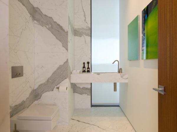
Stone slabs. While the cost is higher for slabs than for other options, there are savings to reap on the installation side. I always prefer large gestures to smaller ones, because they feel more intentional. The figure of this marble is all the adornment necessary in this minimalist bathroom.
See more on stone slabs
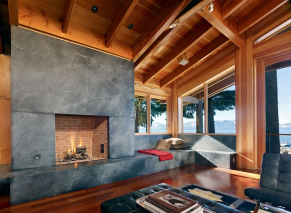
But quality marble can be prohibitively expensive. Consider substituting a more affordable soapstone or a locally sourced stone. Soapstone has a soft feel and a matte surface, and it develops a deep, natural patina with age — wearing in rather than out. Use it for counters, wall surfaces and fireplaces (even fireboxes). The price is comparable to that of granite, but it looks much more refined.
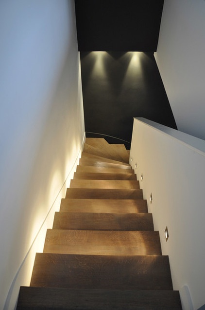
Step lights. Every good lighting scheme makes use of ambient, diffuse and accent lights. Step lights provide all three and are excellent devices for inciting movement between destinations. Step lights are unobtrusive and inexpensive, and because they’re recessed, they lend a fully customized look and feel. Opt for LED bulbs and the fixtures will consume as little as 4 watts each while directing the wattage right where it’s needed: at your feet. Two quality manufacturers I really like are WAC Lighting and Bega.
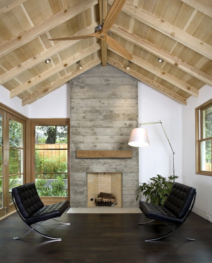
Board-formed concrete. Whenever possible I prefer to reveal the true nature of a material and the processes that created it. That’s an underlying theme of affordable adornment. The boards that formed this concrete fireplace left their mark on the face, and the pattern of knots and graining ties it to the wood used on the ceiling. By using materials for their inherent beauty, you can pocket the finishing costs or redirect them into other features of your home.
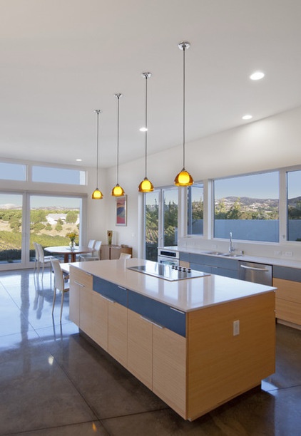
Polished concrete. The concept can be applied to floor surfaces too. Durable enough for commercial use and humble enough for the home, polished concrete has a depth and a patina of wear that builds over time that I love. It’s the perfect substrate for myriad activities and uses. It does stain, but that’s part of the life of a home, and it’s somehow easier to embrace, even expect, with concrete. It’s also an excellent thermal mass to use to collect solar energy during the day and radiate it back in the evening.
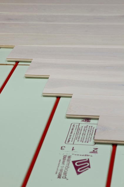
Radiant heat (low mass). While concrete floors have historically been used for radiant heat because of their high mass, it does take a great deal of energy to bring them up to temperature. Low-mass radiant floors, such as the one seen here, are an efficient alternative.
Combining the subfloor and radiant system in one structural panel and facing it with an aluminum skin distributes the heat evenly beneath the finished floor. A low-mass radiant floor comes up to temperature quickly using a lower water temperature than its high-mass or staple-up counterparts. As you’d expect, the panels are more expensive than a traditional subfloor, but the labor savings on the heating side help offset this.
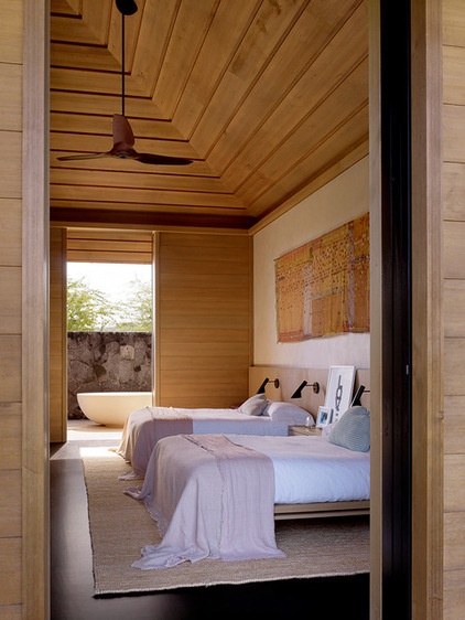
Custom-milled boards. Profiles milled into wood boarding, although expensive for large areas, can be used in select locations to achieve a custom aesthetic where it can have a meaningful effect, transforming the mundane into the unique.
The shadows lend definition to shapes, as with the tray ceiling seen here. Textural changes are an affordable means of distinguishing elements from one another when rendered in the same material. A smooth surface could be used on the walls and a textured one on the ceiling, for example. Use it to strategically break up a sea of painted drywall and lend warmth.
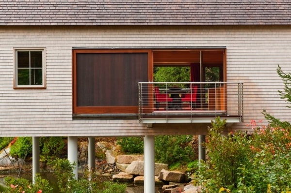
Cedar. Rot resistant, low maintenance, long lasting and weathering to a silvery gray — it’s hard to single out one characteristic that makes cedar one of my default choices for exteriors. Where I practice in Maine, eastern white cedar can be locally sourced, and the shingles are the perfect materials for blending into our rugged surroundings. Western red cedar and Alaskan yellow cedar are popular roof shingle choices for their enhanced weathering characteristics.
The initial cost of natural wood is higher than for other alternatives (plastic or HardiePanel) but the life-cycle cost of any surface that can be left to naturally weather is much lower.
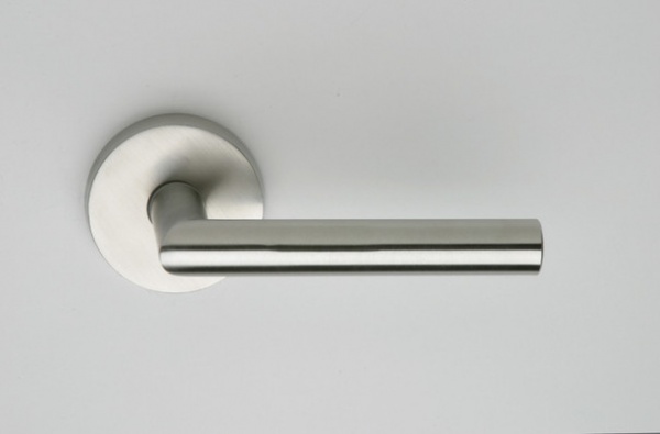
Basic lever handles. Because door hardware is subject to such heavy use, it’s a place where low quality translates disproportionately to dissatisfaction. You want a lock set that reliably latches and a handle set with some weight. The door hardware should support the other hardware decisions in the home. Keeping it simple and neutral allows for flexibility in selecting those other components. Levers are easy to use from an accessibility standpoint too. Current favorites of mine are made by Omnia, Emtek and FSB.
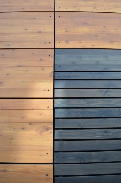
Rain screens. This is less about a material and more of a favorite detail. A rain screen wall is similar to a normal exterior wall, except instead of the siding’s being installed directly on the exterior sheathing, it’s spaced away from the sheathing by ¾ inch or so.
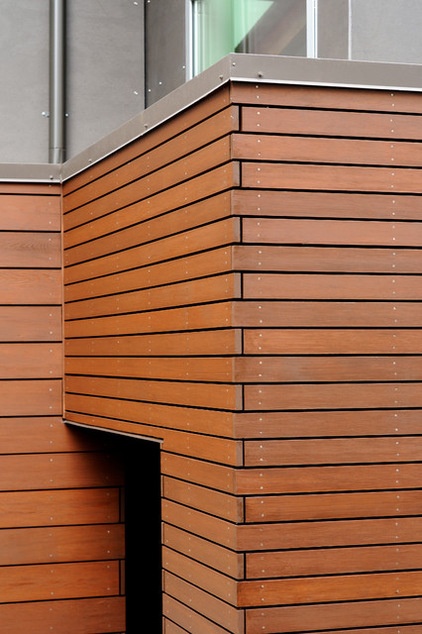
This airspace creates a slot of lower-pressure air behind the siding, providing wind-driven water a place to slow down and drop away before it hits the weather-resistive barrier on the exterior sheathing. This air gap is ventilated at the top and bottom of the wall to allow the siding to dry. This is good for both the long-term performance of the siding and the home’s exterior. This detail is again slightly expensive to install but has a lower life-cycle cost.
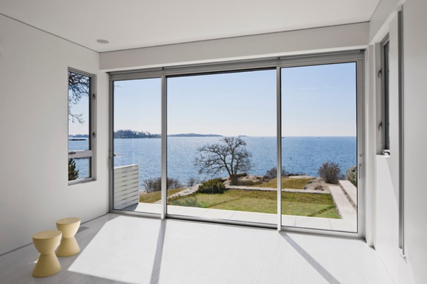
Aluminum doors. These doors are functional and utilitarian, and the slender profiles prioritize the visual connection to the outdoors rather than a bulky frame and hardware assembly. With aluminum doors, I look for “thermally broken” frames that have separate interior and exterior frames and that minimize heat transfer (and condensation) in either direction. Check out Fleetwood and Arcadia for starters.
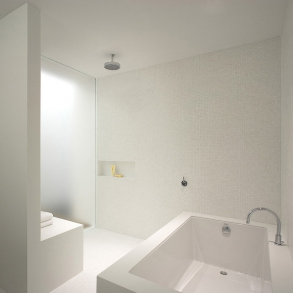
U-channels for recessed glazing. This is a simple, hidden component that makes floor-to-ceiling floating glass and cast acrylic panels possible. The U-channel is set to align flush with the adjacent finished surfaces and disappear. Begin your search by checking with a local glass shop or try C.R. Laurence online for a full range of glass attachment hardware.
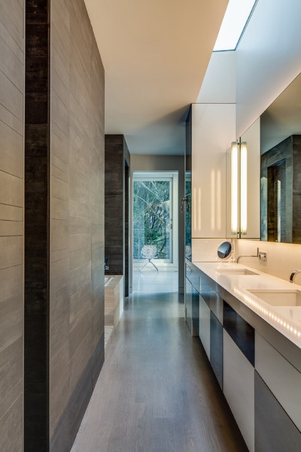
Large-format porcelain tile. I especially like large-format porcelain tiles, which offer the look and feel of natural stone at a much lower cost. They’re virtually indestructible and, unlike many natural stone products, they’re rectified, meaning they have a uniform thickness.
When the tiles have a regular depth, it allows us to use a thinset application on walls or floors, which is much less expensive than a thickset (or mudset) installation. Textured finishes vary by manufacturer but usually include honed, hammered, polished and raked. Right now I like offerings by Mosa USA and Floor Gres.
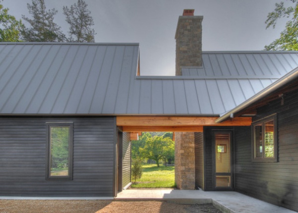
Metal roofing. Low maintenance, a crisp aesthetic and an affordable price point make this a favorite roof finish of mine. Metal roofing can be site-fabricated, where the pans are formed from metal coil stock, or it can be premanufactured and arrive onsite already formed into pans.
The preformed pans can be installed quickly and, depending on the finish, can have a warranty of up to 35 years. I like the look of natural Galvalume, a bright silver that dulls with age, and its natural patina protects the finish from corrosion. When that’s not right for the project, I select a gray Galvalume that mimics a natural metal finish. Zinc Grey is a good default choice.
Tell us: What are your go-to materials? Share your tips and photos in the Comments.
More: A Few Words on the Power of Simplicity


