New This Week: 3 Daring Dining Rooms
http://decor-ideas.org 04/18/2015 07:13 Decor Ideas
The traditional dining room may be evolving — becoming part of those ever-popular open-plan great rooms or just disappearing into the ether altogether — but every home needs a place for enjoying a good meal with family and friends.
We delved into the dining room photos that professional builders, architects and designers uploaded this week and chose three rooms that dare to make mealtimes a visual experience just as much as a culinary one. Here the designers dish on almost everything you could possibly want to know about these spaces.

1. Hollywood Head-Turner
Designer: Caitlin McCarthy of Caitlin & Caitlin Design
Location: West Hollywood, Los Angeles
Size: 10 feet by 11 feet, 3 inches (3 by 3.4 meters); 8-foot (2.4-meter) ceilings
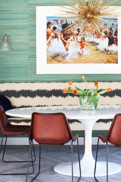
Homeowners’ request: “The client wanted the space to accommodate a lot of guests. However, the room wasn’t large enough for an oversized dining table with lots of chairs. The banquette allows for a flexible number of seats and, because the dining table is oval, extra chairs can be brought in without the seating becoming off-balance.
“Additionally, the swimming pool can be accessed from this room, so water is a factor. I was very concerned with hardwood getting damaged from all the moisture. You absolutely cannot tell, but the flooring is actually wood-like porcelain tile.”
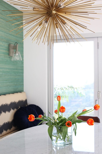
Plan of attack: “The first thing I noticed about the space was the large glass doors that completely opened up to the outdoors and revealed the home’s incredible view [see next photo]. I knew the best way to maximize this space, which has a lot of foot traffic, would be to create a banquette seating area.
“I was particularly drawn to the idea of Californian design, especially Palm Springs style, which feels casual and extravagant at the same time. I pulled in a bold pattern in the custom banquette upholstery and paired it with an aquatic overscaled grass cloth.
“An oval dining table made the most sense for the room, and I decided that a classic midcentury shape would complement the retro feel of the rest of the home. The organic brass chandelier perfectly complements the refined lines of the table and adds to the boldness of the banquette fabric. The final touch was a large-scale still from the movie Jaws, framed and centered on the back wall.”
Why it works: “The space had a natural recessed niche that was perfect for banquette seating. The previous homeowners had centered a dining table in the middle of the room, but it was cumbersome and difficult to maneuver around. I always love cozy dining anyway, so tucking the arrangement to one side was a no-brainer to me. The cutout also provided the perfect backdrop for a feature wallpaper wall. Because the client’s swimming pool is just beyond this dining room, the teal-green colored grass cloth wallpaper plays really well.”

What wasn’t working: “The space was set up like a classic dining room but was a major walkway. I knew it would be an issue, functionally, the moment I saw it. Before the design, I didn’t feel like the room had an identity at all. It was begging for a cohesive grouping to make it a unique space. The simple reconfiguring of the space suddenly gave the room a place within the home, and the high-impact colors and textures brought it to life.”
What goes on here: This space is used for intimate and casual dining.
Who uses it: “The client is a successful start-up entrepreneur. He has a fun sense of humor and loves to entertain. This space is ideal for him for eating or light snacking while enjoying his view, having friends over for home-cooked meals or as a secondary sitting area.”
Designer secret: “The framed movie still from Jaws completes the look of this room and says so much about its owner. Always bring in a personal item to your space, and extra points if it makes your guests laugh or starts a conversation.”
“Uh-oh” moment: “One huge roadblock with this space was the uneven floor as well as foundation issues beneath the floorboards. Sometimes in a project, you aren’t sure what obstacles you face until demolition starts. I was so relieved I had Chris McGraw, the contractor, to troubleshoot. He floated the floor and compensated for the unevenness with the base trim.”
The nitty-gritty: Floor tile: porcelain in Crate — Weathered Board, Stonepeak; grass cloth wallpaper: Kravet W3210, Decorators Best; dining table: Saarinen 78-inch, Knoll; banquette fabric: custom; dining chairs: Giron Brown Leather, ABC Carpet & Home; Concrete Wall Sconces: CB2; chandelier: Zanadoo 12-Light Large, Arteriors Home
Team involved: Chris McCraw of McCraw Design & Development

2. Minnesota Mix
Designer: Andrew Flesher of Andrew Flesher Interiors
Location: Minneapolis
Size: 13 feet, 9 inches (4.2 meters) wide and 17 feet, 6 inches (30.7 meters) long to the bay window
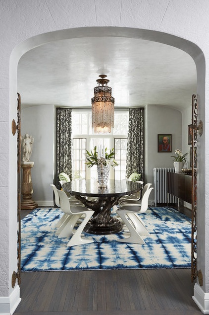
Homeowners’ request: “The challenge with this particular space was that there were three arched openings into the room, and the room was not overly large. The client also enjoys entertaining, and wanted the ability to host large gatherings in the space. We decided to do an elliptical oval-shape dining table to allow for easier movement around the table, and also used armless chairs to seat as many people as possible. The tall cabinet, hidden out of site in the photo, was custom sized so as to be not too deep, and a bit shorter, so it stopped short of the curved cove at the ceiling.”
Plan of attack: “The wall finish, which is a waxed Venetian plaster, was existing, as was the wood floor, so those surfaces became kind of a starting point in determining colors for this project and for this room specifically. Also, the chandelier was existing to the house, as were sconces in the living room and other light fixtures. The homeowner and I wanted to keep those, making them part of the design scheme.
“We started by measuring the rooms so that we could do floor plans and furniture layouts, and photographing the interiors from every angle. From that point on, the design was developed to flow through the house with things like the draperies in the dining room matching the window treatments in the adjoining living room. All of the furniture, rugs and fabrics were selected as part of that vision for the house.”
Why it works: “What was unique about this particular room was the rounded plaster cove that brings the ceiling down into the walls as one surface. Also unique were the decorative metal “gates” at the opening from the foyer into the room, and the beautiful vintage light fixture. Those items are so ornamental that they became like jewelry to the mix of contemporary with more traditional pieces. Our goal was to bring a more modern and even glamorous look to the interior of a very traditional Tudor-style house.”
Who uses it: “This is a formal dining room, so on a daily basis it is enjoyed as a beautiful space. It is also the first room you see when you come in the front door. The homeowners are a professional couple in their 40s with two teenage sons. They love to travel, ski, collect art and entertain.”
Designer secret: “I would say that choosing an elliptical shape for the tabletop was important for the size of the space and the use for larger groups. It makes a large table feel more intimate.”
“Uh-oh” moment: “We realized towards the end of this phase of the project that the chandelier was not going to be exactly centered over the table. So we convinced the clients to move it slightly so it still appeared centered in the room and more centered on the table. This meant patching the ceiling and bringing the faux finisher back to blend in the Venetian plaster — you would never know it had been moved.”
The nitty-gritty: Cipresso dining table with elliptical oval top: Michael Taylor Designs; vintage Kangaroo chairs, Historic Studio; vintage Milo Baughman credenza: 1stdibs; tie-dyed rug: Aubry Angelo; drapes: custom, Van Gilder Drapery; fabric: 174581 shantung Silhouette print in Smoke, Schumacher; chandelier, statue, pedestal: homeowner’s
Team involved: Painter and faux finisher: David St. Clair of St. Clair Designs; drapery workroom: Van Gilder Drapery

3. Canadian Cool
Designer: Nigel Parish of Splyce Design
Location: Vancouver
Size: 13 feet, 6 inches by 11 feet, 6 inches (4.1 by 3.5 meters)
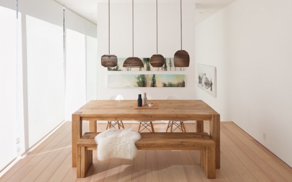
Homeowners’ request: “Our client wanted a clean, simple, light-filled space with some separation to the adjacent living space. This was achieved with modern details such as no baseboards, white walls, high ceilings and floor-to-ceiling sliding glass doors extending the length of the space.”
Plan of attack: “The space was conceived as part of the overall design for the new house. The dining space is connected to the kitchen space, and the intent was to locate these spaces on the south side of the house with access to the deck and landscape. Large sliding glass doors open up to the deck and extend the space onto the deck.”
Why it works: “The dining space here is informal and intimate, closely associated with the kitchen. The living room is located behind the art wall and is accessible from either side to promote flow and openness. All three spaces — kitchen, dining and living — share the same sliding glass door system to the south, which effectively connects the three functions.”
What goes on here: “Dining, social space, some casual work.”
Who uses it: “The space is designed for a single professional who enjoys her time at home. She enjoys the southern sun and moves along the spaces on the south side of the house as the sun moves across the house.”
Designer secret: “The wall separating the dining space and the living room is open on both sides, allowing for the spaces to flow into one another. On the dining room side, the wall became a valuable space for art, whereas on the living room side, it houses a fireplace and TV niche.”
The nitty-gritty: Pendant lights: Graypants
Team involved: Powers Construction; WHM Structural Engineers
More:
Key Measurements for Planning the Perfect Dining Room
Who Says a Dining Room Has to Be a Dining Room?
Related Articles Recommended


