Kitchen of the Week: Modern Art Inspires a Color-Blocked Look
http://decor-ideas.org 04/17/2015 21:13 Decor Ideas
Interior designer Carole Hunter knew her client appreciated modern art but was scared to show her the color scheme she’d come up with for her beach house kitchen redesign. Inspired by her client’s Calder mobile in the adjacent living room, she came up with a primary-color idea. “I find most of the time people want beige, beige, beige or white,” the designer says. After her client responded with glee, they both realized that Mondrian-esque was the way to go. After studying the way the artist’s work balances blocks of color and researching how to accomplish this on ready-made cabinet fronts, the designer created an artful kitchen that suits the home’s midcentury vintage.
Kitchen at a Glance
Who lives here: This is a couple’s summer home.
Location: Martha’s Vineyard, Massachusetts
Size: 184 square feet (17 square meters)
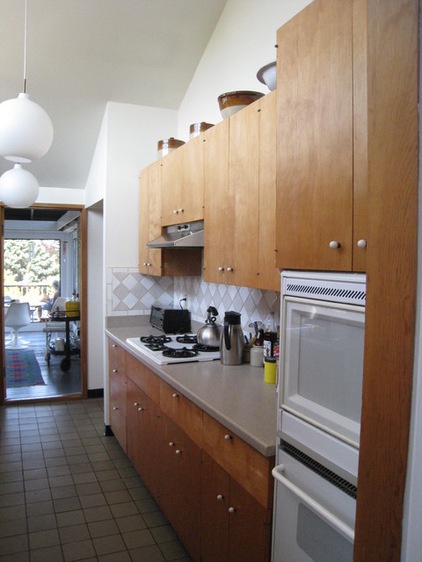
The homeowner’s late father had the midcentury modern house built in the 1960s. “He was very much of his time in terms of art and architecture,” Hunter says. When her client inherited the house, she wanted to keep her father’s vision intact while fixing some of the issues that made the kitchen unsuitable for the way she and her husband live. The kitchen was a narrow galley that was set up for staff to use, not as the heart of the family beach house. Before, there was a solid wall just out of view on the left in this photo that divided the kitchen from the living and dining space.
The Saarinan Tulip chair you see toward the back of the photo is on a screened-in porch that overlooks the water.
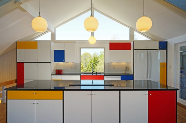
AFTER: “I didn’t make the Mondrian connection until I showed my client some sketches with my ideas for the color scheme,” Hunter says. “She is very interested in art and art history, and got very excited about using primary colors.” The two went through the client’s art books together and realized Mondrian was the way to go. Hunter studied up on his work and realized that balance was the most important element. Rather than trying to copy a particular pattern, she emulated his sense of balance when placing the blocks of color. She enlarged and moved the window over the sink to center it in the composition.
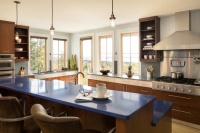
The countertops are Cambrian Black granite. “We had a custom kitchen sink made in the same material so that the countertop would appear seamless and unbroken,” Hunter says. The black induction stove and hidden vent on the island also keep the black continuous on the countertop.
The stunning pendant lights are original to the house — well, sort of. The client’s father had bought them in Italy in the 1960s, but unfortunately, two of them were accidentally broken during the renovation process. Hunter searched far and wide to find replacements. Once she realized they were Wohlert pendants by Louis Poulsen, she tracked down new ones at YLighting.
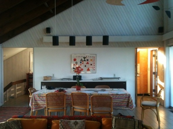
BEFORE: This is the living room before the renovation. The back wall is now gone, and the island sits in its place. You can catch a glimpse of the inspirational Calder mobile overhead at the top right.
See the existing living room and a little more of the Calder mobile from the opposite view
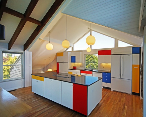
AFTER: The homeowners enjoy eating at the dining table (catch a corner of it at the lower left) and were not interested in eating at the island. They prefer to use the island as a buffet for serving food when they are entertaining.
This function helped reinforced the form of the island as a solid block. It appears to float, thanks to the black toe kicks. The island is 3 feet, 4 inches by 9 feet, 8 inches (1 meter by 2.9 meters).
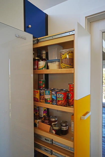
Hunter got a lot of help from Lisa Steers of Hinckley Home Center in figuring out how to color block the cabinets. “Lisa was instrumental in making this work; she helped me find Executive Cabinetry, who make very nice ready-made cabinets that offer some customization,” she says. Some of the doors have more than one color on them, which was achieved by using two panels in two different colors on the same door with a connecting plate behind them. Most of the colors are stock colors, though they did have to customize the red to get it right.
The stove, refrigerator and backsplash subway tiles are all white, which helps them become a part of the Mondrian-inspired composition.
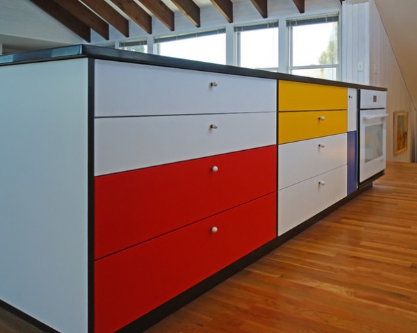
Hunter saved the small porcelain knobs from the original kitchen. The black edge banding that outlines the cabinet boxes adds to the Mondrian-esque look.
“If you’re going to paint something white, it should be for a reason, not because you are afraid to do something else,” the designer says.
More:
Read about how to work with primary colors
Browse more Kitchens of the Week
Related Articles Recommended

