Why You Should Embrace a Solid Slab Backsplash
http://decor-ideas.org 04/17/2015 03:13 Decor Ideas
A solid slab backsplash is a custom look that says luxury in a kitchen of any size. But it doesn’t require a luxurious budget. Take inspiration from this trendy yet timeless look, and give your next kitchen remodel a solid head start.
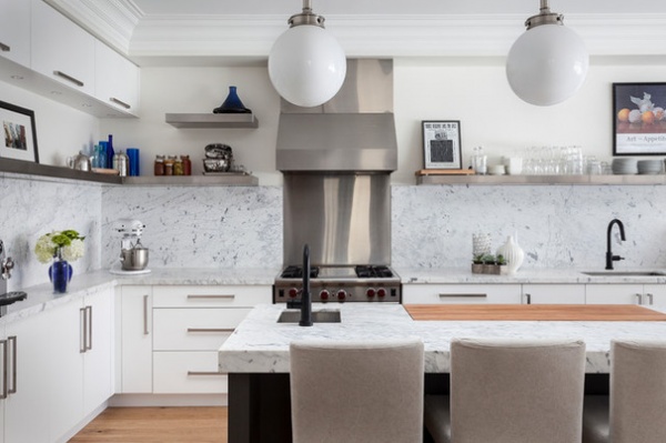
A slab backsplash is simply a backsplash made of a continuous material (or in cases like this one, a few large pieces with the occasional break for an appliance or a cabinet). The solid surface creates a different visual effect than, say, tile. When matched to the countertop, it creates an especially big, bold look.
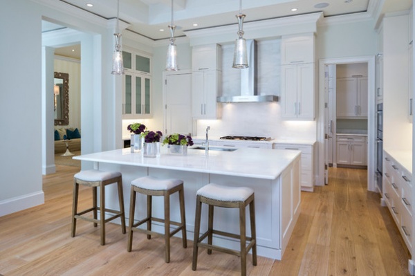
The minimalist sensibility of unbroken planes makes the slab backsplash a key ingredient in many contemporary or transitional kitchens, balancing a modern form with a timeless traditional material for the best of both worlds.
Plus, a stone treatment on the wall is naturally more eye-catching than one on the counter, as the eye gravitates to vertical surfaces first.
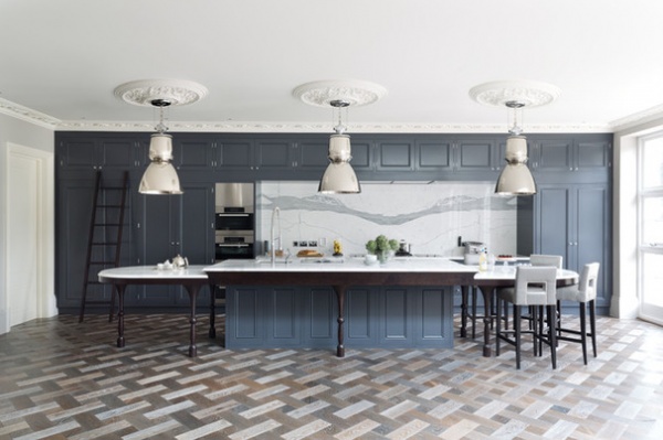
A stone with large-scale veining suits spacious kitchens perfectly, making it a natural match for open-concept kitchens where the backsplash is on full display even from a distance.
However, it can also be an achievable look for a less expansive kitchen (more on that in a moment).
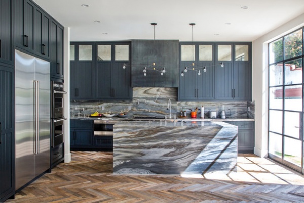
When combined with a wrapped island, the look is ultraluxe. It’s no small investment, but the unique architectural nature of the installation means it will always have classic elegance.
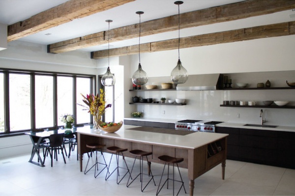
A slab backsplash does not have to be created from high-contrast stone either. An engineered material like Corian or Caesarstone also looks beautiful facing forward, especially in a more modern setting.
Layered with open shelving, it becomes the perfect backdrop for a rich but fuss-free look.
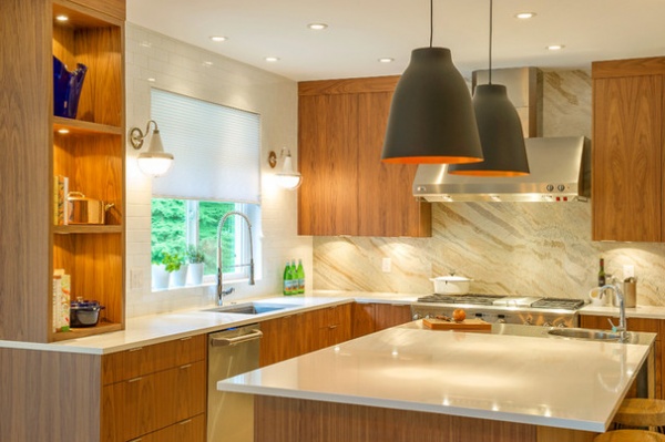
You can match the slab to the counter and island, or let it be a feature on its own paired with simpler materials for the other surfaces, even combining up to three materials for a subtly diverse look.
To play it safe, I would avoid choosing more than three materials, and for a no-fail option use a solid-colored slab for one area and simple subway tile for another to avoid clashing.
Get the Look for Less
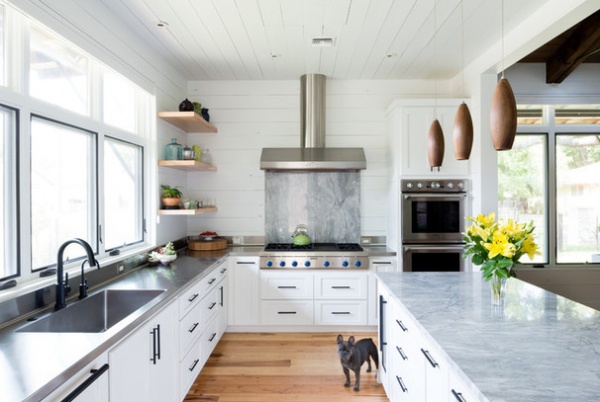
There are several budget-friendly ways to achieve this look. One is to simply clad a smaller feature area, such as the space between the range and hood. This is especially effective in a space where much of the wall is already eaten up by a window. With a pale or plain treatment for the remaining walls, the stone will dominate the statement.
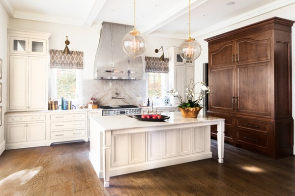
Similarly, you can use two book-matched pieces of stone (two layers sliced from the same source and flipped to make a mirror image) to create an elegant effect from smaller pieces.
If you shop around, you can likely find a stone supplier that will sell you smaller off-cut pieces at a discount; you’ll need to be flexible about the type of stone you’re seeking. This can be a great way to inspire the rest of the look — starting with a stone and working from there to choose coordinating colors and finishes.
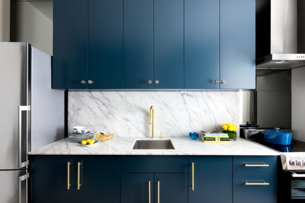
In a kitchen renovation project of my own, I needed only one slab of material to dress this galley kitchen, making the compact size an advantage in creating a big look. Because the backsplash reaches the upper cabinets, it feels like a full-impact effect, even though the actual material square footage is low. I then backed the stove and fridge niche in a subdued material (sheets of smoky gray mirror) to let the stone speak for itself.
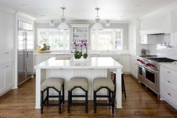
Another trend is to use a short backsplash, often just a few inches high, to give the sense that the material is traveling up the wall while protecting the wall from dings and dents where it’s needed most. In fact, you may prefer this look for its more understated nature.
You can then combine this low-lined look with a secondary tile wherever you need a little more coverage, such as behind the stove.
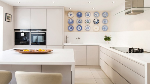
Using an engineered stone on one third to half of the wall above a countertop leaves room for a display of art, decorative plates or a stunning painting to give your kitchen a gallery-like feel that softens the functional feel.
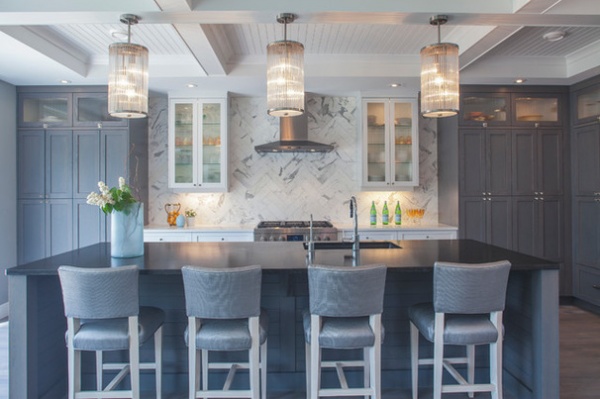
You can also create a similar effect by choosing tiles that have a chunky, high-contrast grain or color variance. When the tiles are put together in a complex pattern (like houndstooth), their geometry gives way to a sense of organic rippling that has the energy of a slab with a subtle layer of extra sophistication.
Make sure to take the treatment all the way to the ceiling for that high-impact look.
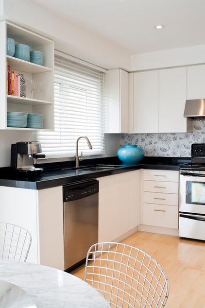
Last, take inspiration from this idea and get the look not with stone but with paper. A wallpaper backsplash creates that continuous custom look while tying the room to another space in your house (if you repeat the pattern in, say, your living room or dining nook). Just add a layer of glass on top to create that wipeable surface.
More: How to Add a Kitchen Backsplash
Related Articles Recommended


