Houzz Tour: Light Streams Into a Once-Dark London Flat
http://decor-ideas.org 04/15/2015 05:13 Decor Ideas
When designers Sebastian Camisuli and Ana Martins first saw this ground-floor flat in North London’s Kentish Town, it had what Camisuli describes as a back-to-front layout. The living room and kitchen were in the front, a bedroom was in the back, and a corridor on the side led to the garden. “It was a bad 1970s project, but the owners — who had just bought it — saw potential and got us involved,” Camisuli says.
Houzz at a Glance
Who lives here: A professional couple
What it is: A ground-floor garden flat in a converted Victorian terrace house
Location: Kentish Town, London
Size: 1 bedroom, 1 bathroom, plus a powder room
Designers: Ana Martins and Sebastian Camisuli of Martins Camisuli Architects
Part of the designers’ job was to resolve problems with the original rear addition, which didn’t work, Camisuli says.
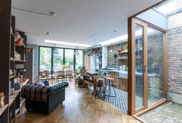
They reversed the layout, so that an open-plan kitchen, living and dining space would take up the back of the flat and make more of the “lovely long garden,” which Camisuli and Martins had noted was underused. “We wanted to bring the garden back into the house,” Camisuli says.
The designers also put a separate living room at the front of the flat and reconfigured the bathroom and bedroom, adding a walk-through closet. In creating a new courtyard in their design, they also flooded the bedroom with natural light.
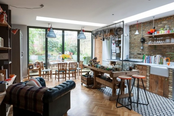
“There was very much a reuse-and-reclaim approach to the design,” Camisuli says. This was particularly so in the multifunctional space at the back of the house, where, to maintain period character, bricks in the exposed brickwork came from what had been the garden wall, supplemented with reclaimed London stock.
In the center of the kitchen area, the chunky wooden island is a reclaimed butcher’s block over which scaffolding poles have been erected to form a hanging rail for pots and pans.
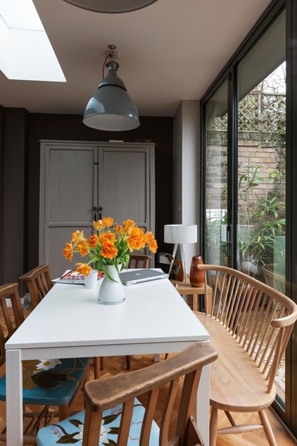
The owners had already collected a lot of the furniture and fittings themselves before the project began, having found many of the one-of-a-kind items at street markets, architectural salvage yards and salvage retailers, including Baileys Home and Retrouvius Reclamation and Design.
The gray metal pendants over the dining table were one such find, and were originally recovered from an old MGM factory. Camisuli and Martins hung them on long lengths of crimson fabric cord, allowing them to be moved around should the room be rearranged.
Wooden bench: Ercol, Barker & Stonehouse
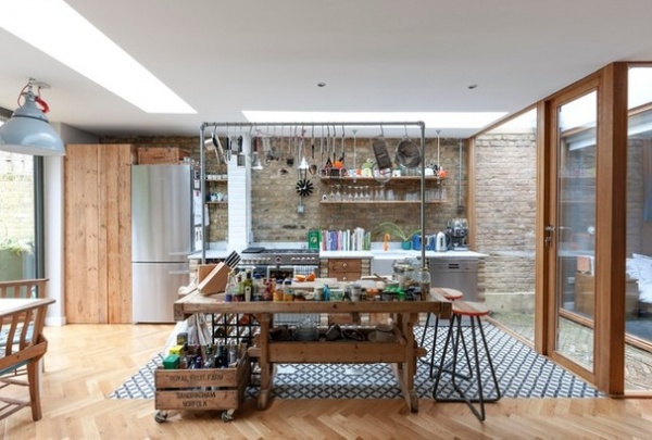
Martins and Camisuli added two skylights in the kitchen area. The one closest to the garden was cut in at the end of the exterior of the flat above. They have a sleek, unobtrusive appearance. “The skylights are formed by nice, clean incisions in the ceiling, rather than being framed,” Camisuli says.
He and Martins hid the structural steelwork added to support the new design. “There are no drop-down steels,” Camisuli says. “We worked hard to incorporate the steelwork with the joists to hide them. Exposed steelwork wasn’t the character we were trying to achieve. We were very much working with the Victorian character, and so didn’t want to go for an industrial look.”
To further enhance the period feel, rustic oak parquet flooring was arranged in a herringbone pattern, and traditional-style concrete tiles were inserted in the work area.
Parquet flooring: Havwoods; concrete tiles: Emery & Cie, Retrouvius; fridge-freezer: Bosch; extractor: Smeg
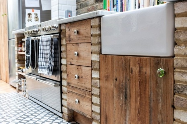
The kitchen cupboard fronts are made from reclaimed floorboards, with reclaimed bricks forming the piers. The tall cupboard next to the fridge-freezer in the previous image was also formed from secondhand flooring.
“The concrete tiles aren’t secondhand,” says Camisuli of the flooring chosen by the owner, “but they are in keeping.”
Sink: Regis, The Kitchen Sink Company, statuary marble countertop: Stone Age
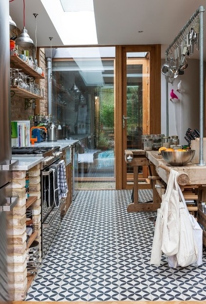
The cleverly designed new courtyard, or light well, between the kitchen and bedroom allows the latter space to enjoy natural light and air. “It also creates a division in the center of the flat,” says Camisuli of the 22-square-foot area. “You could have a skylight instead, but the exposed brickwork adds a playfulness to what the inside and outside of the flat are doing.”
Outside, there is just enough space for a little chair and table, making it a nice spot for sipping a cup of coffee or reading the papers.
Orange faucet: Vola
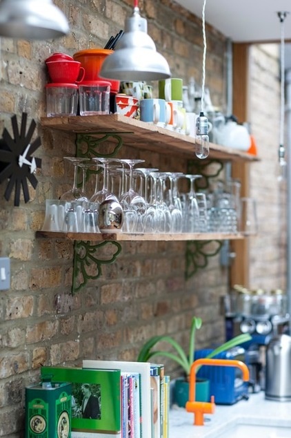
Echoing the cupboard doors, the open kitchen shelves are made of reclaimed floorboards. The decorative antique brackets were picked up by the owners at a flea market in France.
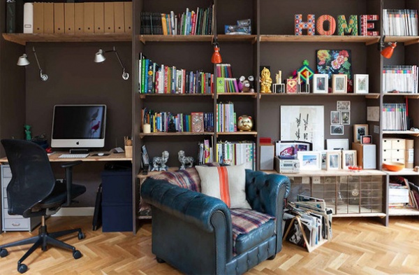
The shelving unit against the wall opposite the kitchen was made by the owners. They constructed it from painted 1-inch MDF uprights, with reclaimed floorboards forming the horizontals. The glass-front cupboard was made using a salvaged window.
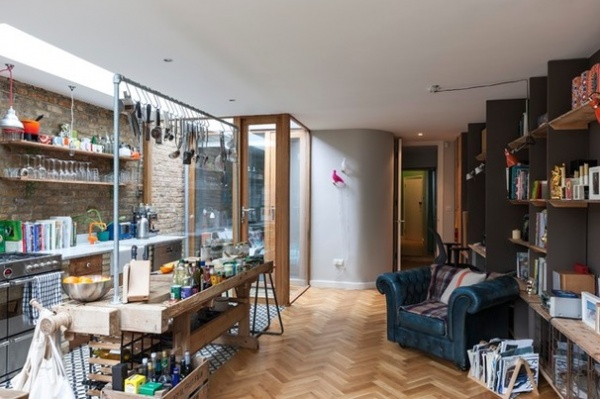
The view through to the bedroom, on the left, and to the front door, on the right, is seen from the back of the flat. The curved wall softens the transition between the living area and the bedroom, creating a softer space.
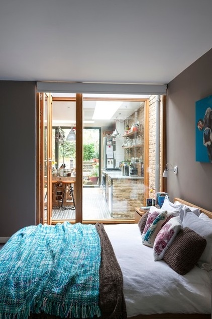
The window frame is made of oak, which gives the custom windows in both the bedroom and the kitchen a pleasing organic aesthetic. The designers arranged the clay tiles in the courtyard in a herringbone pattern to echo the oak parquet in the kitchen-living space.
Clay tiles: Vande Moortel
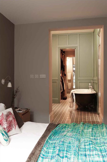
“The bedroom is quite small, in fact,” Camisuli says, “but there was no need to make it bigger, because there’s so much auxiliary space around it.”
The bathroom is doorless on the bedroom side. “The owners are a couple and were happy with that arrangement — perhaps a family would require more privacy,” Camisuli says. The toilet is separate.
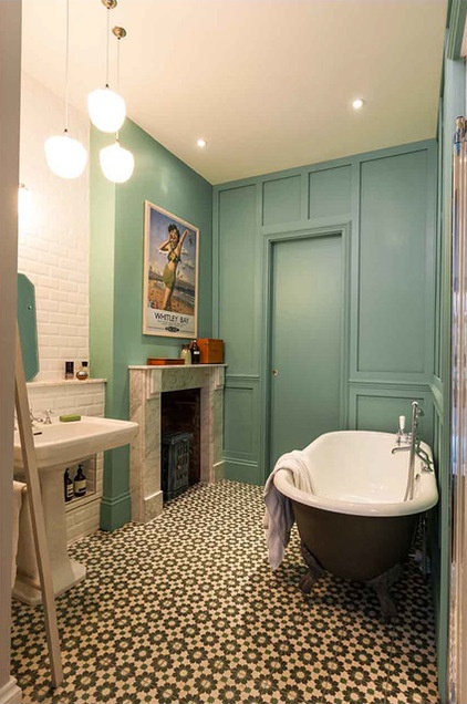
The door on the far side of the bathroom opens into a dressing room, which leads to a powder room and then the living room.
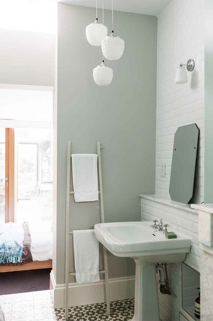
“There’s now this beautiful sequence of spaces through to the kitchen, interlinked visually right out to the garden,” Camisuli says.
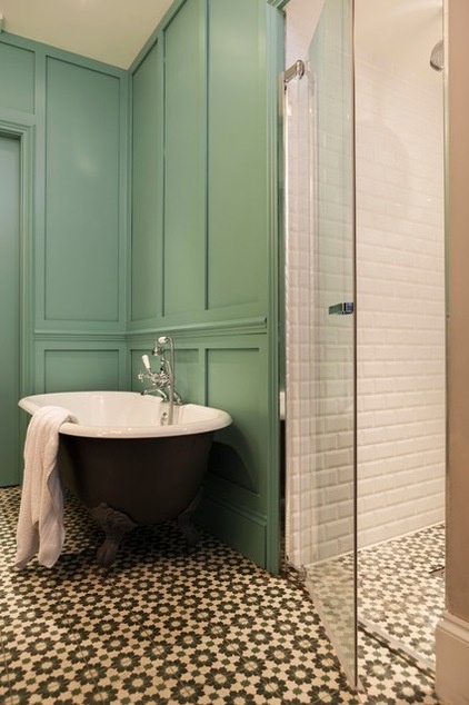
While this room was in the middle of the flat when Camisuli and Martins started work, it didn’t include the area with the fireplace. The fireplace is old but not original to the flat.
“The paneling is all new but of the era,” Camisuli says. “It’s warmer than just tiles or plasterboard. And again it gives a warm pattern that can be part of the bedroom, but also part of the bathroom.” The subway tiles in the shower and behind the sink are also repeated in the kitchen.
“The shower is a walk-in wet-room style with a level threshold,” Camisuli says. “It has a very sleek glass door, which plays with the combination of putting something that looks very traditional alongside modern finishes.”
All bathroom fittings: Aston Matthews; wall tiles: Criterion Tiles; floor tiles: Emery & Cie
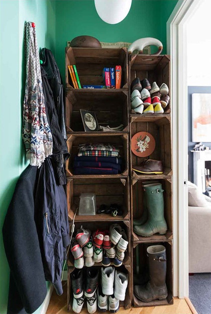
A shoe storage space, created from vintage crates, is tucked behind the door into the living room.
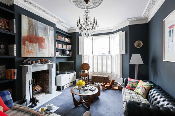
This room was originally the bedroom before Camisuli and Martins reconfigured the flat. The dark gray walls were already in place, chosen by the owner. But the molding and ceiling medallion are all new, to match what would have been there originally.
The fireplace matches the one in the bathroom, and both were bought reclaimed. Lots of work scraping paint off the marble was needed to restore them to their former glory before they were installed.
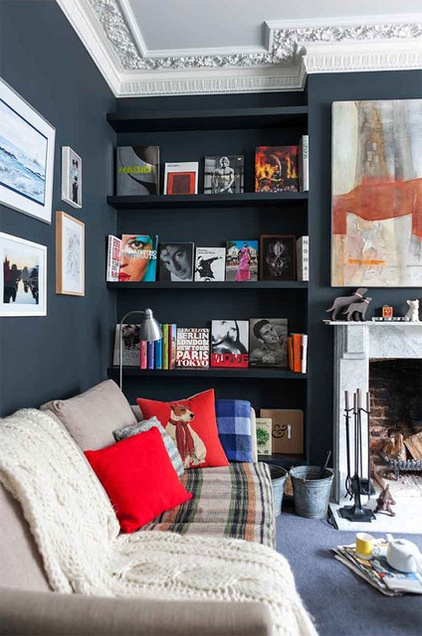
The shelving, put in by the owners, is painted the same color as the walls so it “disappears,” allowing the colorful display of coffee table books to stand out.
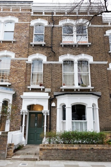
The front exterior of the ground-floor flat.
Browse more homes by style:
Small Homes | Colorful Homes | Eclectic Homes | Modern Homes | Contemporary Homes | Midcentury Homes | Ranch Homes | Traditional Homes | Barn Homes | Townhouses | Apartments | Lofts | Vacation Homes
Related Articles Recommended


