Pattern Focus: Houndstooth
http://decor-ideas.org 04/14/2015 04:13 Decor Ideas
Named after the jagged teeth of a dog, houndstooth is considered an upscale pattern with a gentlemanly air. While often associated with men’s suiting fabric, chef’s pants and Sherlock Holmes’ hat, houndstooth has found firm footing in home decor. Here are the best ways to use this classic pattern.

Houndstooth could be described as a checker pattern running a race. More dynamic than idle squares, houndstooth looks like it’s on the move. It’s a type of twill made by alternating bands of four dark and four light threads in both vertical and horizontal directions. One thread is advanced at each pass to give it its characteristic slant.
Houndstooth is a 19th-century creation hailing from the Scottish Lowlands, where it was originally worn by sheepherders. It’s also known as shepherd’s check and dogtooth.
Houndstooth jumped from the fields to upscale fashion in the early 20th century and has since been a go-to pattern. While houndstooth traditionally has a clubby, highbrow tone, it can also be fresh, bright and youthful.
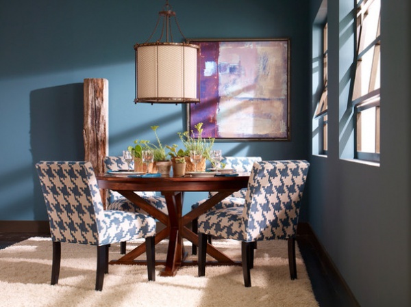
Scale variety. Just like dogs, houndstooth comes in all sizes. Patterns can range from oversized to minuscule.
When to go big. Though considered a traditional pattern, large-scale houndstooth has a more contemporary aesthetic. If the houndstooth pattern on this blue and cream dining chair upholstery was a tenth of the size, it wouldn’t have nearly the same bite.
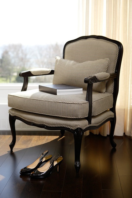
Puppytooth. Small-scale houndstooth is casually referred to as puppytooth. While there’s no dimension threshold separating the two, houndstooth at this more reserved scale is undeniably classic.
Just be aware that puppythooth may read as a mixture of the two separate colors viewed from afar. So, a black and white puppytooth might appear as gray when you’re not up close.
Some of the best ways to use houndstooth:
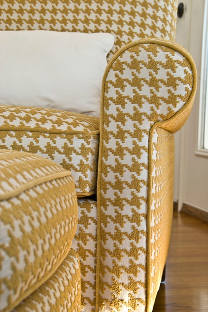
Upholstery. Anne DeCocco of DeCocco Design calls this upholstery “poppin’ houndstooth.” She says she used it because she wanted the chair to be appreciated for its clean, comfortable lines and to bring a hit of fun to the room. “Houndstooth is a masculine pattern to me — sort of menswear in tone,” she says. “I love that. It’s clean and crisp, and brings a nice shape into the space. And it never looks dated.”
Welting options. Something to think about with houndstooth upholstery is the welting. Here, DeCocco used a contrasting welt in a solid gold to show off the lines in the classic shape of the chair and coordinating ottoman. “A self-welt would have disappeared,” she says.

In this room there’s a self-welt on the two armchairs. Because a self-welt doesn’t create a high contrast, the eye isn’t as focused on the outlines of the furniture piece where the welting is located. Rather, the surface of the houndstooth fabric itself comes to the forefront. There’s no right or wrong, but some pieces lend themselves better to a self-welt and others, a contrasting welt.
Pattern size in relation to furniture components. Remember to consider the size of the houndstooth pattern in relationship to the components of your furniture piece. This example shows one full “tooth” pattern expertly centered down the slender, swooping arms. If it were larger and “falling off” the side arm, it would lose its refinement. Elegance is in the details.
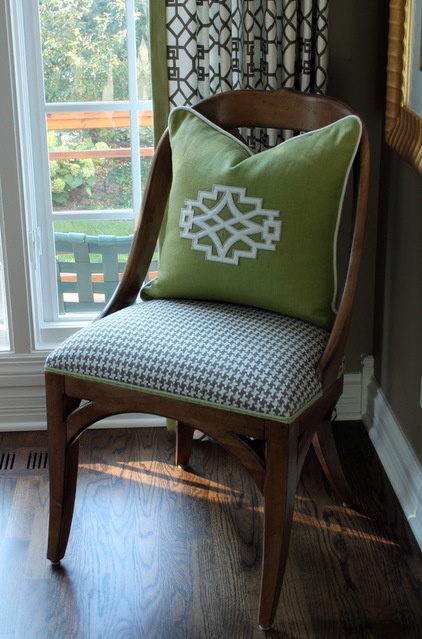
Tight and fitted. Houndstooth looks best when it’s upholstered tightly to the frame, as on this handsome side chair. Likewise, loose cushion designs should have snugly fitting covers.
Too-loose cushion covers or relaxed slipcovers will distort the houndstooth pattern in the fabric’s undulations, and can make the piece look sloppy and visually unsettling.
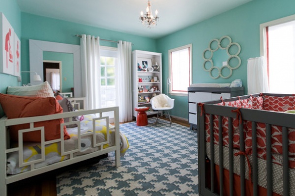
Area rugs. If you’d rather bring some focus to the floor than your furniture, houndstooth area rugs are a good choice. Most are made in a large, graphic scale. The boldness of the scale is readable, and the pattern isn’t too visually busy.
Houndstooth rugs look wonderful in modern schemes, but don’t think you need to limit their use to the living room. This houndstooth rug pulls this nursery together just fine.
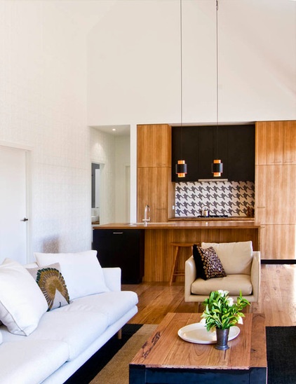
Walls, in small doses. Houndstooth on the wall should be used sparingly, or as a feature wall at most. Too much of a good thing is just that.
This kitchen features a houndstooth mosaic tile backsplash — and it’s definitely the highlight.
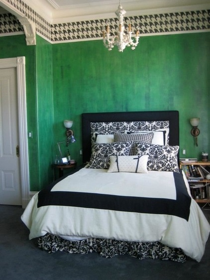
The running pattern of houndstooth also lends itself to horizontal applications. San Francisco artist Shannon Kaye did a modern take on traditional wallpaper and Victorian Lincrusta frieze designs to create this custom stenciled border. Kaye says her oversized houndstooth design challenges the large scale of the room and gives it a contemporary feel without ignoring the architectural detailing.
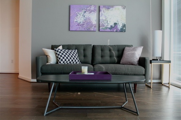
Pillows. Adding decorative accessories, like throw pillows, is an easy way to introduce a bolder pattern in your scheme without a lot of commitment. In fact, just one can do the trick!
Tell us: How have you incorporated houndstooth into your home?
More pattern stories: Toile for All | Buffalo Check
Related Articles Recommended


