Houzz Tour: A 1920s House Reinvented as a Chic Modern Family Home
http://decor-ideas.org 04/12/2015 03:13 Decor Ideas
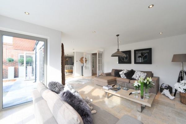
When owner Dawn Smith commissioned architect Leigh Bowen to give this grand Surrey, England, property a 21st-century makeover, it had been largely untouched since it was built in the 1920s. Smith wanted to retain the original 1920s facade but make the most of the corner property by adding on to the house in back and on the sides, and creating an airy, open-plan family space on the ground floor. Bowen says of his client: “She knew exactly what she wanted and was quite adventurous — which made my job a lot easier.”
Houzz at a Glance
Who lives here: Dawn Smith and her teenage daughters
Location: Surrey, England
Year built: 1928
Year renovated: 2013
Size: 5 bedrooms, 4 bathrooms
“Structurally, the house was in fairly good shape, but a warren of rooms downstairs needed some adjustment,” says Bowen, of 50 Degrees North Architects. “The layout made the house quite dark, so the brief was to create a lovely family home with lots of bright, open spaces.”
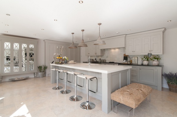
A long, double-width island with plentiful seating is the focal point of the serene, open-plan kitchen, designed for relaxed family living.
Bowen was always mindful of the budget. “We’ve created a lovely open-plan space here, but details such as the drainage are in the same place, which helped save some money,” he says.
Learn how to design a kitchen island
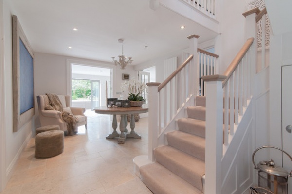
Bowen kept the original staircase in the same location. “There was no reason to move it,” he says. “By opening up the hallway, you can see straight through to the garden from the front door, so it made sense to leave the stairwell as it was. It was repainted, but otherwise it’s in its original state.”
Get tips on choosing the right stair treatment
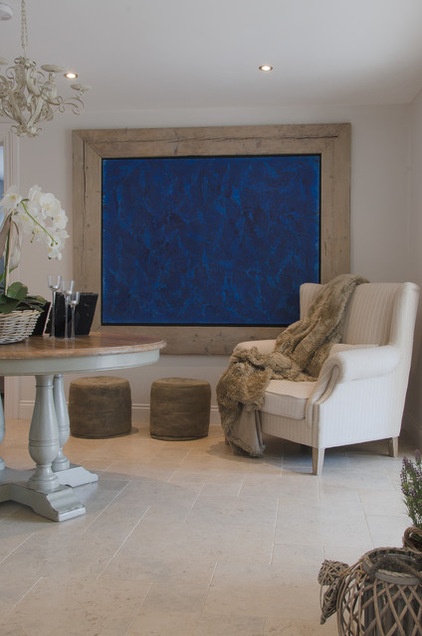
A grand entrance hall is a little old-fashioned in many ways, Bowen says, but the sense of flow achieved here has made it worthwhile. “We stole a bit of the open-plan kitchen back to create this space, but the light is wonderful, and you can access all the rooms on the ground floor from here — it’s a fantastic spot,” he says.
Chair (similar): Parker Knoll Oberon, John Lewis; chandelier (similar): Lullaby 3 Light Crystal, Endon Lighting, Wayfair
Browse more first-class foyers
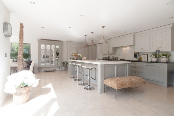
For the palette, Smith chose different shades of gray and white for a contemporary look with enduring appeal. “She used a blend of paints to get the color balance just right,” Bowen says.
With plenty of furniture from her old house to incorporate into the scheme, Smith’s pared-down palette has proved incredibly versatile. She also embraced a slightly more traditional kitchen than she was used to, for a warmer, friendlier feel.
Kitchen and tall mirrored cabinetry: Richard Baker Furniture; paint (similar): Fossil Grey, Dulux
See 15 elements of a traditional kitchen
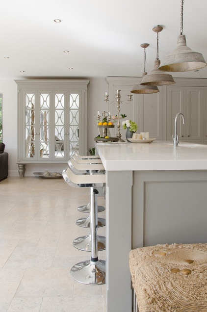
Antique pendants above the island lend a rustic feel to the kitchen, while a mirrored cabinet on the far wall adds a touch of elegance. “The mirrored cabinet is by Richard Baker,” Smith says. “He creates some really funky pieces, and it has transformed the kitchen into something very special.”
The footstool is another piece from the past. “I love the texture; it adds a lot of depth to the scheme, but it’s quite unusual,” Smith says. “It’s made from string and sacking and has pebbles in it.”
Lights (similar): Quay, Original BTC; bar stools: La Palma Lem, John Lewis
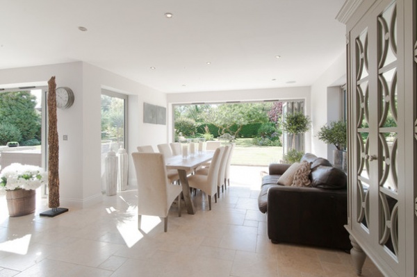
Smith wanted to include a second dining area in this corner to accommodate more formal family gatherings. “It’s a very versatile space, though,” Bowen says. “It could be used for anything.”
The antique table, which Smith brought from her previous home, has been sanded down and given a pale finish to echo the grays elsewhere in the scheme, while old dining chairs have been reupholstered for a new lease on life.
“I really enjoy reusing old bits and pieces where I can,” Smith says. “I don’t like everything to look too new, as there’s no character.”
Dining chairs (similar): Long Island, Neptune
Read more about decorating with gray
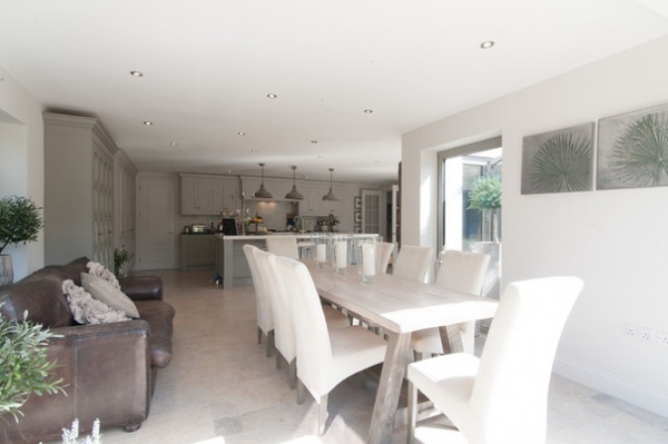
The comfy sofa is another old piece, dyed chocolate brown to enhance its antique look. “There’s a TV opposite, so we spend a lot of time in this room,” Smith says. “Above all else, it’s a very comfortable space.”
Sofa (similar): Rustic Leather 3-Seater, Old Boot Sofas
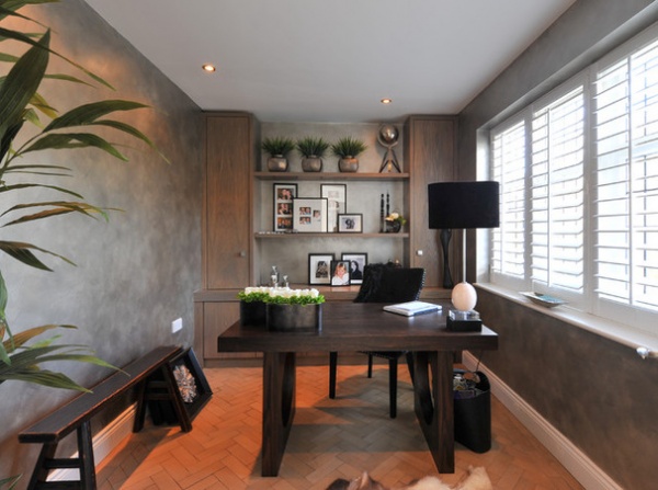
Gray walls tie the home office in with the rest of the house, although the small space has a cozier feel. Warm parquet flooring adds to the effect.
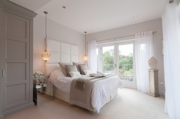
The generous master bedroom was previously very small. It was expanded to create a dual-aspect room with an elegant en suite bathroom that benefits from plentiful natural light.
As with the other rooms in her home, Smith opted for a restful gray and white scheme here, and chose a simple voile for the window treatment. “I’ve introduced internal shutters for security at the front of the house, but kept the window treatments to a minimum to let in as much sunlight as possible,” she says.
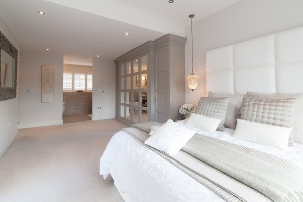
The entrance to the en suite bathroom is a simple opening, as Smith didn’t want to obscure the light filtering through from the front of the house. “It’s like a hotel suite in many ways,” Bowen says. “The loo and the shower are positioned to either side of the entrance, so there’s still a degree of privacy. It’s a very elegant solution.”
Wardrobe: custom, The English Wardrobe Company; bedding: The White Company
Be inspired by supersize headboards
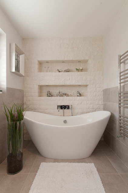
Split-face stone tiles have been used to create a textural feature wall in the bathroom. “It definitely has the wow factor, but it’s a gentle approach,” Bowen says.
Split-face stone tiles, Mandarin Stone; freestanding bath: Maderno, Bathrooms.com
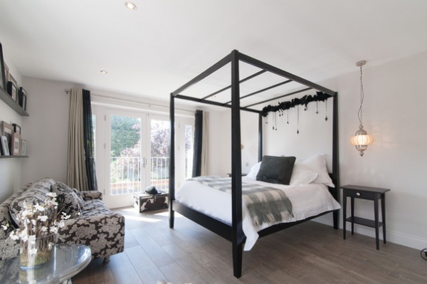
A striking four-poster bed adds a touch of drama to one of the daughters’ bedrooms, which is otherwise decorated in the home’s gray palette.
“It’s such an easy color to live with and accessorize,” Smith says. “I work a lot with flowers, so that’s how I introduce color into a scheme. It also means I can do it in a seasonal way.”
Black Brooklyn Oak 4-Poster Bed: Coach House
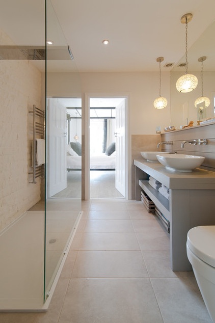
More split-face tiles create a warm mood in the guest bath. “The bathrooms aren’t huge compared to the rest of the house,” Smith says, “but we planned them well, and they make the most of the available space.”
Vanity: Bathstore
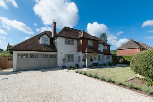
“Apart from the new extension over the garage, the features and elevation at the front of the house are as you’d expect from a property of this age,” Bowen says. A new exterior finish and new windows enhance the appearance of the property while respecting its heritage. “It actually looks as if we’ve cleaned the house, rather than updated it. It retains a very traditional feel,” Bowen says.
Building work: Building Living Space
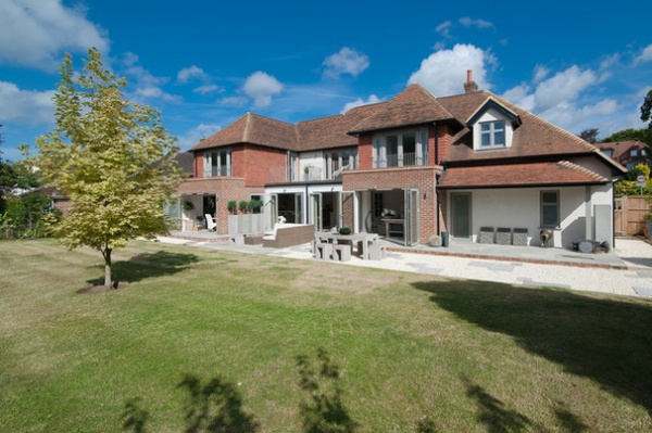
Smith had more creative freedom with the design at the rear of the house than at the front. “The ground floor is much deeper than the first floor, as we wanted to allow space to create balconies for the bedrooms,” Bowen says.
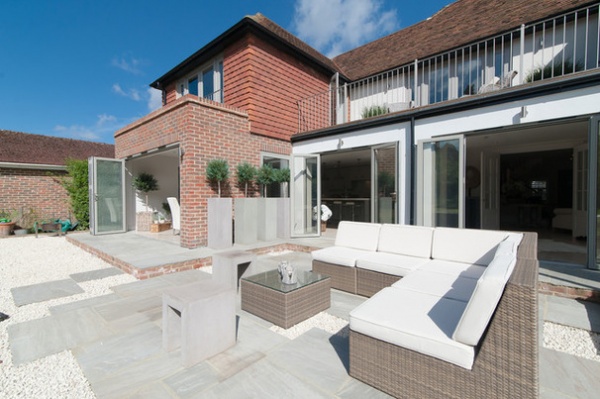
“We’ve also introduced a number of different aspects,” Bowen says, “and added interest by fitting bifold doors in all of the different rooms on the ground floor, so they all open out onto the garden.”
Browse more homes by style:
Small Homes | Colorful Homes | Eclectic Homes | Modern Homes | Contemporary Homes | Midcentury Homes | Ranch Homes | Traditional Homes | Barn Homes | Townhouses | Apartments | Lofts | Vacation Homes
Related Articles Recommended


