Design Dose: 3 Laundry Rooms We Soaked Up This Week
In some regards, the laundry room is the new bathroom. While the bulk of remodeling dollars are still funneled into kitchen and bathroom updates, laundry rooms seem to be claiming a larger portion of the budget pie than they used to. In a world where function is key to an efficient lifestyle, it’s no surprise why. Laundry rooms are workhorse spaces in our homes, getting put to use every day — and not just for washing clothes. They have become our mudrooms, craft rooms, kitchen pantries and more. With all the busywork, it’s no wonder that making them enjoyable, functional places to be in has become a popular mission.
With that in mind, we scoured the laundry room photos that professional builders, architects and designers uploaded this week and chose three that we just had to know everything about. Here the designers dish on their plans of attack, “uh-oh” moments and much more.

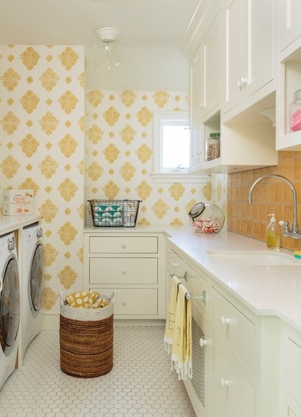
1. Bright and Happy
Designer: Alison Kandler
Location: Los Angeles
Size: Around 9 by 16 feet (2.7 by 4.8 meters)
Homeowners’ request: “Happy, fun, bright, French-Moroccan, clean and airy.”
Plan of attack: “My client wanted a happy laundry room since she spends so much time in there. We decided on the yellow tile early on and then everything else followed.”
Why it works: “It is light and bright and happy. My client also wanted a little Moroccan in the mix since her family is Moroccan, so the wallpaper was the perfect finishing touch.”
What wasn’t working: “This was brand-new construction, not a remodel, so we had the freedom to make it great.”
What goes on here: “Hours of laundry, since the homeowners have twins under the age of 3.”
Who uses it: “Michelle (wife, mother) is in this room every day. We put the laundry room right by the kids’ rooms so Michelle could get laundry done and still hang out with her twins.”
Designer secret: “Don’t be afraid of color! Especially one you really love.”
“Uh-oh” moment: “Michelle got nervous when the tile went in because it is so bright. Once the wallpaper went in and it all came together, she was ecstatic.”
The nitty-gritty: Countertops: Qortstone; yellow tile: Mission Tile West; white hex tile: porcelain (“very practical and inexpensive”); wallpaper: Pierre Frey
Team involved: Architect: Joan Swartz
See more of this home

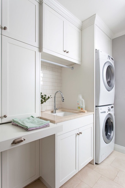
2. Classic and Multifunctional
Designer: Joanna Hartman
Location: Austin, Texas
Size: About 75 square feet (6.9 square meters); about 10 feet by 7 feet, 6 inches (3 by 2.2 meters)
What wasn’t working: “This space didn’t exist prior to this work. They did have an oddly shaped closet that fulfilled several functions: laundry, pantry and security and irrigation control room, but they would never have admitted to having a laundry room, much less one that doubled as a mudroom complete with a civilized pantry. The original complaint was that the closet was barely workable. The solution was to blow the whole closet out and start with a fresh plan.”
Plan of attack: “The clients were hoping for a laundry room with some storage, but to be able to turn the space into a light-filled laundry-mudroom with outdoor access was a feat of both careful planning and patient construction. We were working with existing appliances and the desire for both kitchen and laundry storage as well as the need for a deep laundry sink.”
Homeowners’ request: “They knew they needed and wanted this space, functionally, in their renovated home. And they wanted consistency in design, feel and materials throughout the project. I think they didn’t anticipate it becoming quite as useful (or popular) as it is, but that’s the delight in architecture.”
Why it works: “The space is essentially a wide, short hallway. Stacking the washer and dryer was the first major move. A stacked arrangement may be a sacrifice for some, but that move, singularly, allowed us to fit in the sink.”
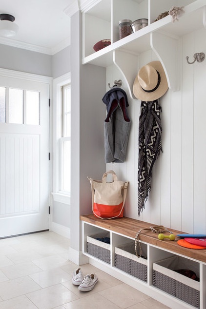
What goes on here: “This is a laundry room, kitchen pantry, a storage space and the mudroom. It serves as the clients’ everyday entryway. In a small bungalow, this space needed to serve multiple functions well.”
Who uses it: “Brittney, Sean, their two dogs and (now) newborn use this space daily.”
Designer secret: “Stacking the washer and dryer was a great step, but then adding in the deep sink meant we were still left with absolutely no countertop space. To avoid the nightmare folding scenario that is the dining room table, I channeled my grandmothers’ pullout cutting board and threw in this pullout work surface. It provides a nice surface for folding laundry but also for setting down pantry items as they are pulled from the cabinets.”

“Uh-oh” moment: “The only question mark was if we would be able to get the ceiling high enough to meet local codes in the side entry area (just outside and providing access into this mudroom). Because that side entry was tucked under the new stair, and we were adding on to the original home (where plumb and square clearly weren’t priorities), we were shoehorning this space beneath the stairway and doing our best to keep tolerances low to eke out an acceptable ceiling height. Luckily, everything worked out.”
The nitty-gritty: Wall paint: Stonington Gray HC-170 by Benjamin Moore; cabinet, trim and ceiling paint: Simply White OC-117 by Benjamin Moore; flooring: 12- by 12-inch honed Crema Marfil from Daltile; wall tile: 3- by 6-inch Rittenhouse Square in color 0100 from Daltile; wall tile detail: ½- by 8½-inch flat liner in color 0100 from the Portfolio collection by Precision H20; countertop: 3-centimeter Crema Marfil from AlphaGranite; cabinet pulls: Classic Round Knob from Pottery Barn; cup pulls: Classic 4-inch Bin Pull from Pottery Barn; mudroom hooks: Vintage Hook from Restoration Hardware; sink: Park Falls cast iron undermount in white from Kohler; faucet: Simplice single-hole faucet in polished chrome from Kohler
Team involved: Project architect: Joanna Hartman; project manager: Jay Schaefer; structural engineering: Javier Martin, P.E.; Amazonia Cabinetry; tile supplied and installed by Schroeder Carpet and Drapery; plumbing components supplied by Ferguson; countertops supplied and installed by Alpha Granite
See more of this home

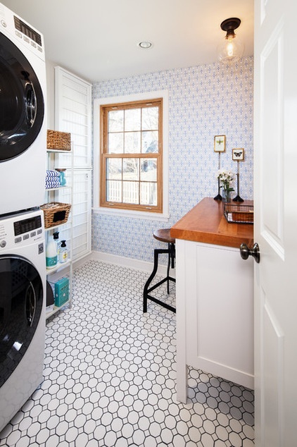
3. Vintage and Versatile
Designer: Laura Hammond
Location: Omaha, Nebraska
Size: About 7 by 7 feet (2.1 by 2.1 meters)
Plan of attack: “This laundry was an addition to the top floor of a historic house. Previously the house did not have a designated laundry room; rather the washer and dryer were housed in the basement in the storage room. All five bedrooms are on the top floor, so logistically it just made sense to have one there.”
Why it works: “This house is in a historic part of town, so we wanted to stay true to the period of this house but add the homeowners’ stamp to it. Space planning was key to this project. The desk is visible from the doorway, with the doorway being visible from one of the main areas on this level, so this area is passed by frequently by the family and guests. The desk is charming and fits with the rest of the main level, so it doesn’t feel like you are walking by a utility room where you need to keep the door closed.”
Homeowners’ request: “They wanted a window, a desk area to create a multitasking space, a way to hang laundry and to keep the vintage theme but with some fun updates. This family values minimizing their stuff, so they didn’t want a lot of closed cabinetry that would house things they didn’t use regularly. We kept things open and minimal in a visual sense.”
What goes on here: “Doing the laundry, gift wrapping, crafting, workspace.”
Who uses it: “The couple is in their 30s (both working professionals). They are intelligent and practical but have a whimsical, fun side too.”
Designer secret: “Add something unexpected. Wallpaper makes this room fun, inviting and lively, but using it on all the walls would have crossed the too-much line. Also, the homeowners wanted dark grout — we went with navy! Another unexpected feature that makes the room pop.”
“Uh-oh” moment: “We had some built-in cubbies put in next to the washer-dryer, but the homeowners did not want anything bulky, so we went with an open rack instead. Then we used the open cubbies in the pantry.”
The nitty-gritty: Wall paint: Duration Neutral Ground SW-7568 in matte from Sherwin-Williams; desk (birch base, alder top): custom made by T & T Custom Cabinets in Omaha; desk base color: Downy from Sherwin-Williams; desktop stain: Minwax in Ipswich Pine; light fixture: Schoolhouse Electric; wallpaper: Thibaut; pulls: Top Knobs; tile: Daltile; Ardex High Performance Grout; laundry hanging racks: Ballard Designs; laundry tower: Pier 1 Imports
Team involved: General contractor: Sanwick Remodeling Contractors; T & T Custom Cabinets; photography by Thomas Grady Photography
More:
8 Laundry Room Ideas to Watch for This Year
Where to Put the Laundry Room
Design Dose: 3 Living Rooms That Caught Our Eye This Week


