Kitchen of the Week: A Seattle Family Kitchen Takes Center Stage
Sometimes plans change. Just ask Julie and Paul Leonardo, who set out to remodel the cramped galley kitchen in their 1,750-square-foot 1949 postwar house with a basement in West Seattle, Washington. The couple, who share their home with son Ben, 10, and daughter Katie, 8, made a trip to the city planning department and discovered they were limited to the footprint they had and had to nix plans to bump out the kitchen. Since reconfiguring the kitchen and surrounding rooms would mean a major remodel for the home’s main level, they decided to bite the bullet and add a second story that would give them much-needed space and allow for the open floor plan with good flow they really wanted.
They put the bedrooms and bathrooms upstairs, and moved the kitchen to the center of the home’s main floor. Working with kitchen designer Paula Kennedy, they came up with a new U-shaped kitchen that gives the family an efficient and open space in which to prepare meals and entertain. Blue walls, white painted cabinets, a white subway tile backsplash, neutral gray counters and a warm hand-stained oak floor create a transitional kitchen that serves as the true command center of the home. Change can be a good thing.
Kitchen at a Glance
Who lives here: Julie and Paul Leonardo and their children, Ben and Katie
Location: West Seattle, Washington
Size: About 165 square feet (15 square meters)
Cost: Around $50,000 for labor and materials
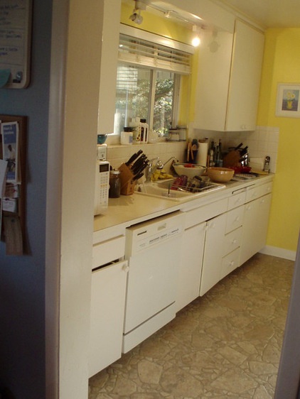
BEFORE: This photo shows the home’s old galley kitchen that awkwardly sat just off the front entry of the home. The tight space with white appliances, yellow walls and light beige vinyl flooring was suffering from a serious lack of counter space and storage. “We had to add two pantries in the basement that had us running up and down the stairs,” recalls Julie.
“After” photos by Roger Turk/Northlight Photography
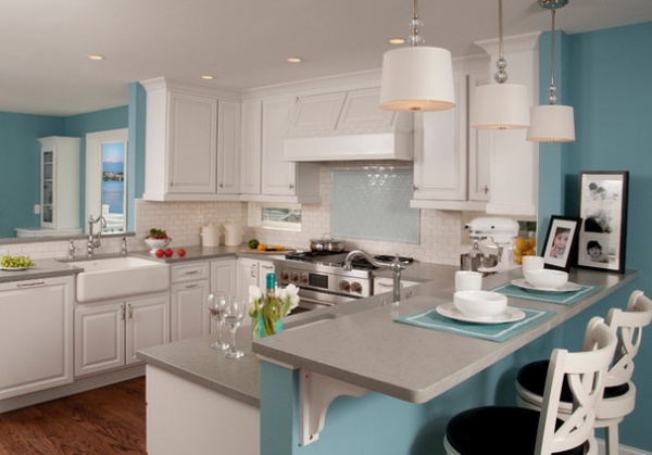
AFTER: Now located in the center of the main level with the new second story above and a refinished basement below, the open U-shaped kitchen features traditional elements mixed with sophisticated clean lines. “This center-of-attention kitchen is the perfect transition from the entry and living room in the front of the house to the dining room and deck out the back,” says designer Kennedy.
The open floor plan also makes the less-than-200-square-foot kitchen look larger than it is. Blue walls provide a colorful backdrop for the crisp white painted maple cabinets with raised panel doors and polished chrome hardware for a finished look. “It gets very gray here in Seattle, especially in the winter, and we both love color and wanted to bring it into the house,” says Julie. “It’s a cheerful blue, and we just thought it looked good with the white cabinets, really making them pop.”
The furniture-style cabinets are also user friendly, with pullouts and built-in dividers that help the family stay organized.
Two nonoperable backsplash windows are an unexpected surprise that allow natural light inside. The windows, undercabinet task lighting and decorative pendants, and a few well-placed recessed cans for general illumination, create layers of light for all the activities that take place in and around the kitchen.
Cabinets: Canyon Creek Cabinet; cabinet hardware: Chown Hardware; lighting: Lamps Plus; wall paint: Ebbtide SW 6493, Sherwin-Williams; ceiling and trim paint: Whitetail SW 7103, Sherwin-Williams
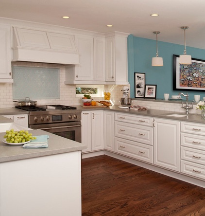
A 36-inch gas range sits at the center of the kitchen, paired with a painted maple hood with halogen lights inside. Light blue ceramic tiles create a special design and focal point behind the range. “We found lovely white subway tiles for $2 a square foot from Daltile for the backsplash to balance the $20-a-square-foot Walker Zanger tile we used for the Moroccan pattern above the range,” Kennedy says.
The couple also saved money by purchasing an appliance package from Jenn-Air, which came with a free dishwasher. The kitchen’s main farmhouse-style sink sits to the left of the range in this photo, with a separate prep sink on the right side that allows the kids to clean vegetables and help out while meals are being prepared. Polished chrome plumbing complements the cabinet hardware and respects the budget. Since the kitchen was part of a much larger renovation than originally planned, Kennedy says they worked hard to make smart choices that kept kitchen costs under control while still creating a fresh and inviting space.
Hood: Vent-A-Hood; sinks: Kohler; faucets: Brizo
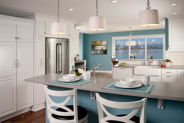
An eating bar creates definition between the kitchen and living room and gives the family a place for casual meals or snacks. The stain- and impact-resistant gray quartz counters with a matte finish from Silestone USA were chosen for their good looks and durability. “In this beautiful home with white casement and blue walls, a gray countertop was the only solution,” says Kennedy. “We needed a true neutral, but not black or white, and the gray hit the middle compromise that was just right.”
Bar stools: Florence 29-inch, Boraam Industries
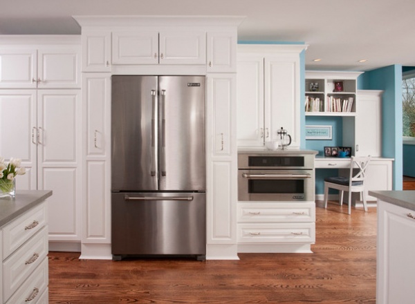
The family’s large stainless French door refrigerator sits by a built-in microwave oven with a speed-cook system, placed at a lower level to provide additional counter space, that allows the busy family to bake potatoes or make snacks quickly. “They were excited to tell me it only takes four minutes to make chocolate chip cookies,” says Kennedy.
The tall cabinet above the oven offers storage for everyday dishes. Two deep drawers below the oven store lunch boxes and plastic storage bags. Long and deep pullout pantry cabinets on each side of the refrigerator are roomy enough for more than spices. “We can keep all our canned goods and baking mixes there,” says Julie. “They’re awesome and hold a lot.”
The built-in desk seen in this photo is where the kids do homework. A separate desk off the front family-friendly mudroom entry was added for Julie so she could have her own bill-paying space. A simple and bright powder room was also added to the main floor near the kitchen.
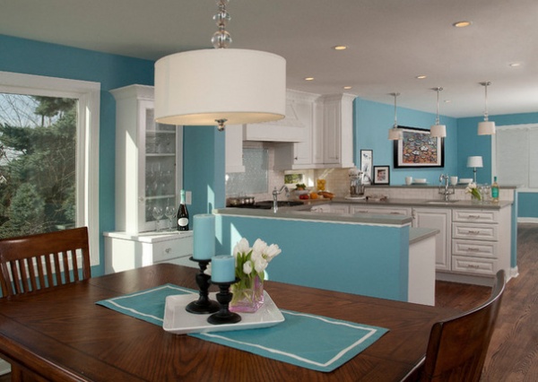
The dining area is located right off the kitchen. Built-in cabinets with glass fronts on each side of a picture window with views of the mountains, including Mount Rainier, provide storage for china and glassware, with drawers below for serving trays and tablecloths.
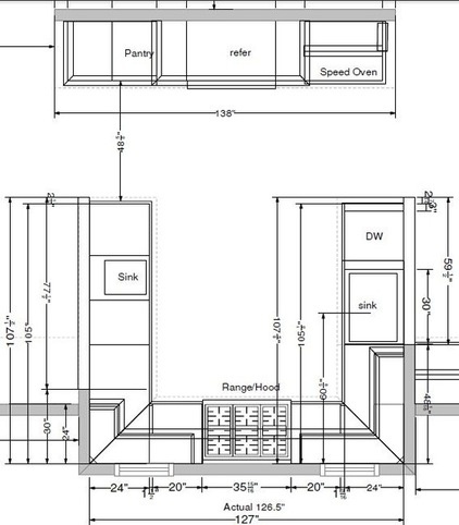
This floor plan of the well-detailed kitchen illustrates the efficiency of the space. With the bedrooms moved upstairs, the kitchen can sit prominently on the main floor of the now-2,700-square-foot home.
“Having the open kitchen is so great when we have people over,” says Julie. “It has also really allowed us to be together as a family in an easy way.”
Designer: Paula Kennedy CMKBD
General contractor: Raymond Rowland, Fishtail Construction
See more Kitchens of the Week


