Houzz Tour: Scandinavian Cool With a Comfortable Sophistication
“It’s a gorgeous, big house, although it looked like an empty barn when I first saw it,” says designer Fiona Andrews, reflecting the sentiment of this property’s owners when they moved in a few years ago, a little overwhelmed. “It’s a lot bigger than their previous home, so they needed some help with the layout and transforming it into a comfortable family home with personality.”
The mid-19th-century house is set over four floors, and the owners adopted a gradual approach to renovation, living in the property as they restored it one floor at a time over a two-year period. With the help of builder Pascal Huser, Andrews’ first task was to make a number of structural adjustments to the layout to enhance the flow between rooms, before creating a relaxed yet glamorous interior, shot through with flashes of bold color. “The owners naturally gravitate toward cream and brown interiors, which can be lovely, but this house needed some color,” Andrews says. “As the build went on, they grew in confidence, and so, much like the house, their style has evolved over time.”
Houzz at a Glance
Who lives here: A professional couple with their sons, ages 10 and 13
Location: West London
Size: 5 bedrooms, 5 bathrooms
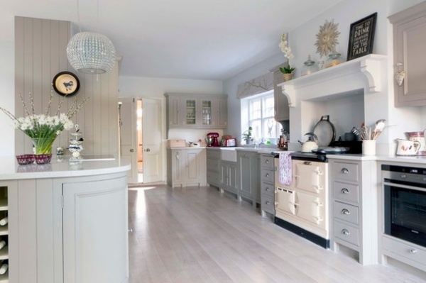
“They’re a big, warm family who love to entertain, so a convivial kitchen–dining area was essential,” Andrews says.
Hand-painted wood-paneled walls in this part of the house have been teamed with a pale gray wood floor for a restful scheme, in a masterful blend of Scandinavian cool and country-style charm. “The owners love the pale and interesting look of Scandinavian-style kitchens, so there was a push to incorporate this into the design,” says the designer. To get the look, she sanded down the existing wood floor and gave it a lime wash to lighten it and complement the pale gray cabinetry.
Kitchen: Neptune Home Fulham; wall paint (similar): French Grey, Little Greene
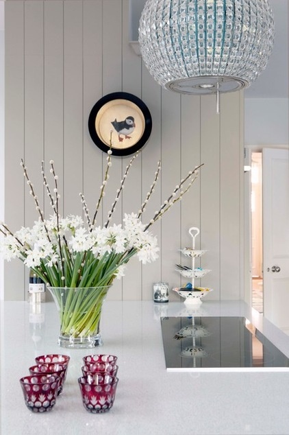
The owners wanted to keep the Aga range, but Andrews persuaded them to integrate a second cooktop into the design for ease of use. “They love to cook, so this part of the kitchen is perfect for quick family suppers,” she says. “Agas look fantastic, but they’re not always a practical choice.”
An elegant chandelier above the sleek cooktop, meanwhile, is cunningly designed to conceal an extractor fan. “It’s a lovely piece and proves that practical appliances can be beautiful as well,” says Andrews.
Elica Celestial Ceiling Mounted Decorative Hood: Angel Appliances; artwork: Will’s Art Warehouse
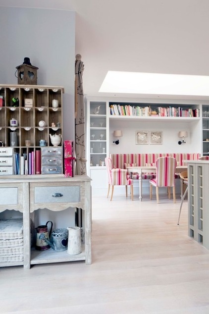
Andrews was given the task of incorporating a number of heirloom pieces — such as the console table on the left — from the family’s previous home into the design, enhancing the warmth and friendliness of the scheme.
“The cabinet works really well in this space. The rich texture of the wood echoes the grain of the flooring in this part of the house, adding depth and interest,” Andrews says.
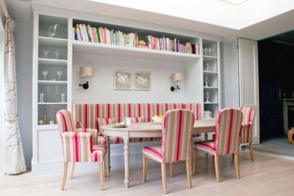
“This area was a blank slate when I first saw it, although the skylight was already there,” Andrews says.
With so much space to play with, there was a danger the room would feel too cold, so Andrews opted for colorful banquette seating to add drama to this corner of the room.
“We added the traditional-style wall unit above the seating to give a more friendly vibe,” she says. “Having books along the top makes it a really personal space, and is a lovely way to express the family’s character.”
Fabric: Arley Stripe, GP & J Baker; dining table: Karavan; bookcase: custom built by Pascal Huser
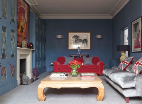
Just off the kitchen, a cozy space has been transformed into a TV room that erupts with seductive blue, raspberry and silver hues.
“It’s a naturally shady room, so we decided to embrace the darkness and add interest with texture and color,” Andrews says. “This is the room where they spend most of their time as a family, so we’ve hidden a TV among the bookcases, and we brought in a little more light with the mirrored cabinetry.”
Wall paint: Blue Blood, Paint & Paper Library; silver sofa fabric: Nakuru, Sabi Velvets, Osborne & Little
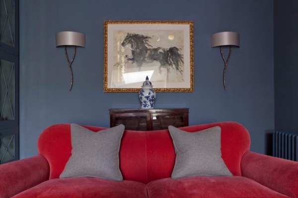
“By the time we decorated this room, the owners trusted me enough to take a few chances,” Andrews says. The sofas were reused from their old property and reupholstered in sumptuous velvet.
Yves Wall Light: Porta Romana
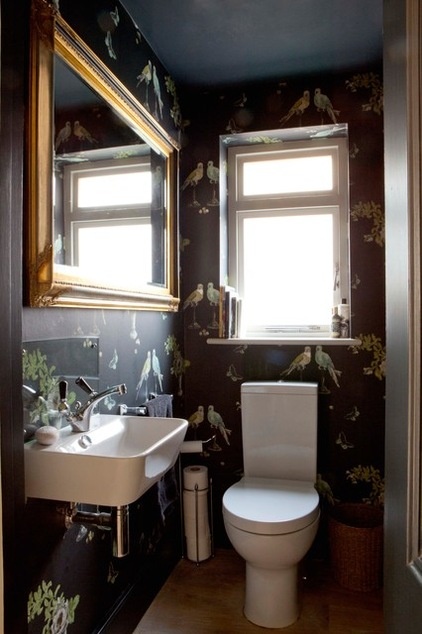
Playful parrot wallpaper in the downstairs powder room makes this tricky space sing with life.
“The client found the wallpaper and loved it, but we didn’t know where to use it at first,” Andrews says. “Eventually we settled on here — downstairs loos are a great place to be a bit more dramatic with the interior.”
Wallpaper: Perroquet, Nina Campbell; sink fixtures: Connaught Monobloc, Lefroy Brooks
Browse 10 bathroom designs that pair perfectly with Victorian homes
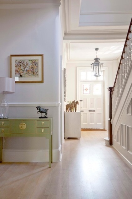
Lofty ceilings and pale flooring create a simple, elegant look in the hallway.
“We’ve continued with the Scandi theme in this part of the house, but we’ve added a touch of drama with some Oriental-style furniture. It’s a subtle look and very timeless,” Andrews says.
Light Green Lacquer Ladies Cabinet: Orchid; deco lantern: Hector Finch Lighting
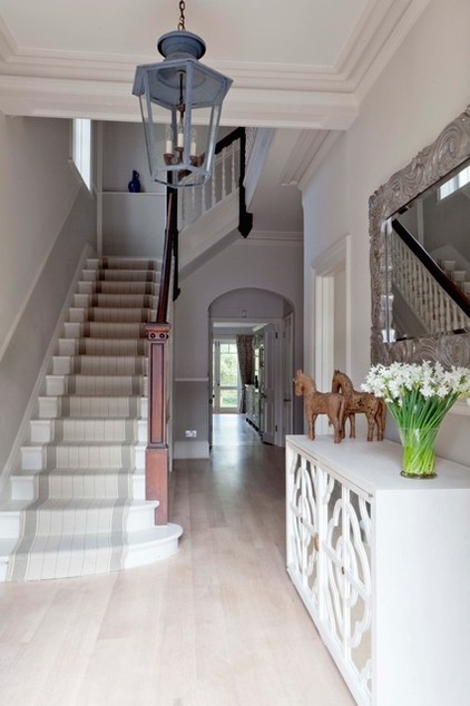
An elegant cabinet elsewhere in the entrance hall provides an elegant storage solution in an unexpected spot. “As it is for any modern family living in London, storage space is always at a premium,” Andrews says.
Anna 2-Door Low Cabinet: Julian Chichester
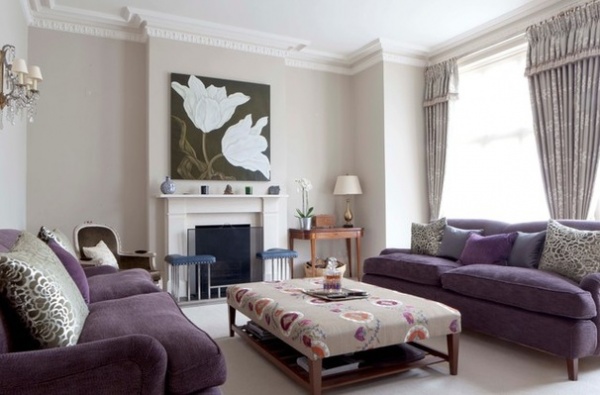
An original fireplace in the formal living room is a beautiful relic restored from the original property.
“It’s very grown-up in this part of the house,” Andrews says. “They use it quite a lot for reading the papers or a book, and for making the most of the sunshine that streams into the room during the summer. It’s next to the TV room, but it’s a much more relaxing space and not as visually challenging.”
Sofas: Redcliffe, David Seyfried
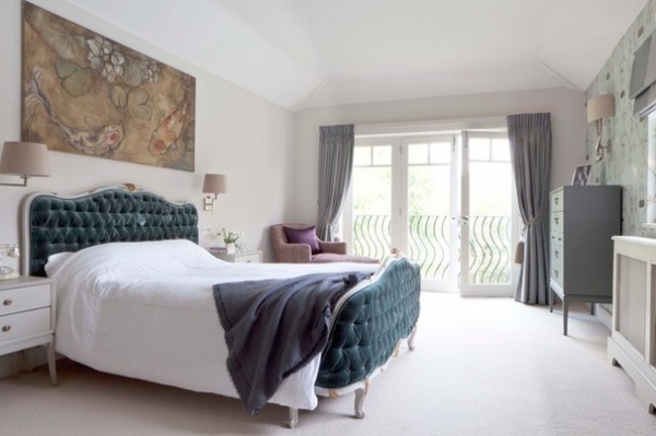
When it came to decorating the master bedroom, Andrews was asked to create a calm, comfortable, grown-up space, with just a hint of decadence.
A sumptuous antique French bed with richly textured velvet takes center stage, while soothing creamy walls and pleated curtains melt effortlessly into the background.
Antique French bed (similar): Swans of Oakham; artwork (similar): Will’s Art Warehouse
Get ideas for creating a glamorous bedroom with a movie star quality
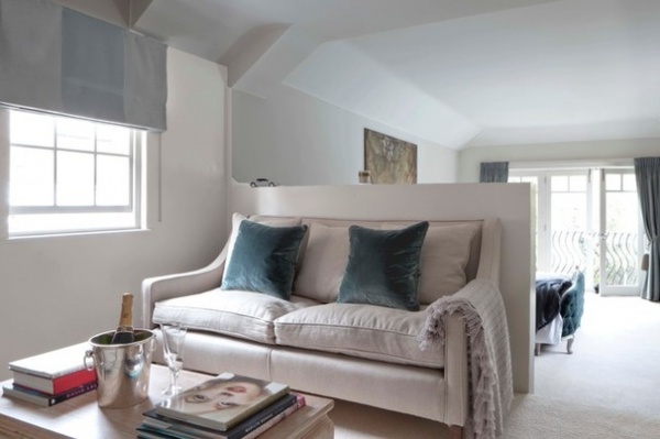
Just off the main bedroom — in what used to be the en suite bathroom — a cozy TV area with a champagne fridge provides a decadent spot where the couple can unwind away from the hustle and bustle of the rest of the house.
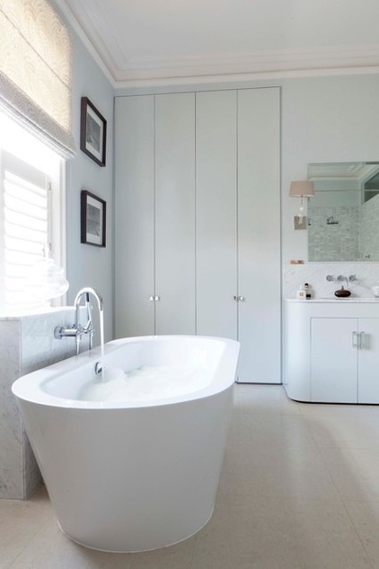
There is a distinct hotel-chic feel to the new en suite bathroom. “The owners chose marble for its clean, fresh finish in this part of the house,” Andrews says. “It’s luxurious but refreshingly bright and breezy in here.”
Tub: Philippe Starck, Duravit
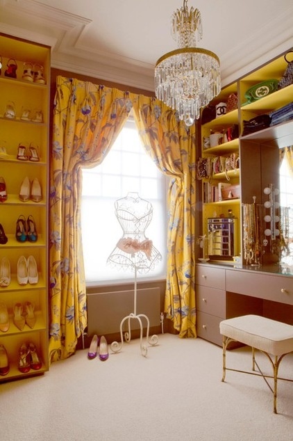
“The client fell in love with this yellow fabric, so I came up with this crazy combination of brown and yellow for the dressing room,” Andrews says. “It’s certainly a little bit over the top, but it’s important to let yourself go in certain rooms if you can.”
Curtain fabric (similar): Floratina by Lorca, Osborne & Little
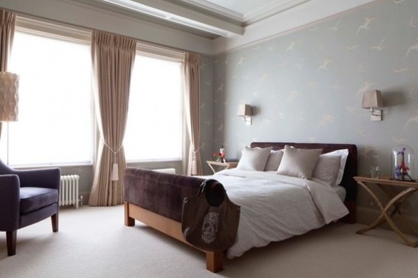
The owners reused furniture from their previous property when it came to furnishing the spare bedroom. “Again, we’ve gone for a timeless, neutral palette in here, but the Sanderson wallpaper adds a subtle hint of vintage style. It’s pretty but not overdone,” Andrews says.
Wallpaper: Swallows, Sanderson
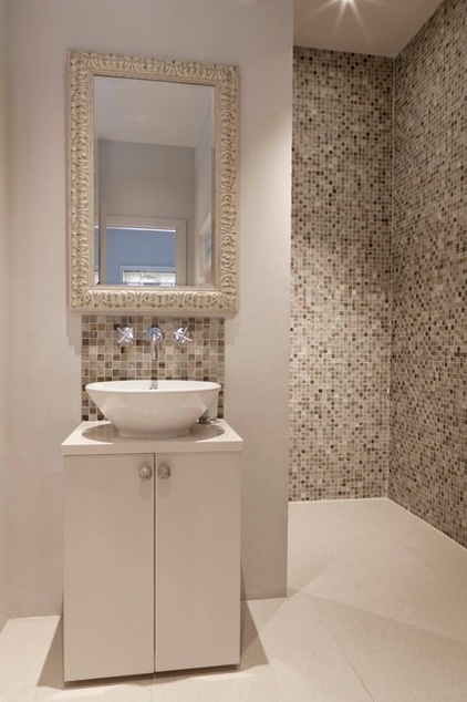
The guest bathroom is long and narrow, so Andrews positioned the shower behind the walls near the sink to make the most of the available space. “As it’s quite compact, we didn’t want to make this room too busy, so I’ve relied on texture and tone from the mosaic wall tiles,” Andrews says.
Mosaic tiles (similar): Praetorian square, Topps Tiles
Browse more homes by style:
Small Homes | Colorful Homes | Eclectic Homes | Modern Homes | Contemporary Homes | Midcentury Homes | Ranch Homes | Traditional Homes | Barn Homes | Townhouses | Apartments | Lofts | Vacation Homes


