Room of the Day: Going Less Formal in an Oceanfront Home
http://decor-ideas.org 04/06/2015 21:14 Decor Ideas
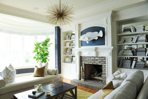
The views were breathtaking, but the interiors were no match for them. A couple bought this home perched on a cliff over British Columbia’s Eagle Harbor fully furnished, but found the heavy, dark and formal decor distracted from the beautiful surroundings. They immediately hired a design company they’d worked with before, Fox Design Studio, to revamp the whole house, giving the designers almost free reign to change everything as they saw fit. “We wanted the entire house to blend in with the surroundings, so we used neutrals — grays and blues to match the rocks on the cliffside and the ocean,” says head designer Ben Leavitt. The result is a comfortable yet crisp nod to nautical style that doesn’t go overboard.
Photos by Tracey Ayton
Room at a Glance
Who lives here: A couple
Location: West Vancouver, British Columbia, Canada
Size: 250 square feet (23 square meters)
Leavitt had completed a gut renovation of the homeowners’ animal hospital, so they felt confident leaving the project in his hands without much input. They wanted the house to be comfortable and less formal than it was with the existing decor. “She told us, ‘Just do it,’” Leavitt says. “He never came by once to check on the project until it was done, and he was super happy with it.”
Large, curved windows jut out over the cliff, with huge views out to the Pacific. “We wanted a neutral color scheme that would go with the view of the cliff rocks and the ocean,” Leavitt says.
One exemption from the free-reign rule — one of the homeowners insisted on keeping the peachy-pink marble fireplace surround, no matter what, and scoffed at the idea of replacing it with brick. “I just couldn’t,” Leavitt says. “The homeowner said there was no way he would want brick in here, but we did it anyway, and he’s glad we did.”
The original millwork fared better; the designers simply added mirror behind the shelves. “Everyone with bookshelves should do this; it makes a room look so much bigger,” he says. Adding the mirror to the backs of the bookshelves cost about $250.
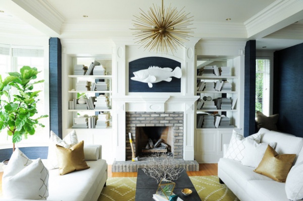
Let’s get right to the (focal) point: the large white fish above the fireplace. “We knew we wanted the room to give the impression of nautical without being overly nautical — as in, not full of seaside items like anchors and ship’s wheels,” Leavitt says. The designers chose just one overt acknowledgment of the water below — this large fish.
“We liked the idea of a taxidermy fish, but not a real one,” he says. The fish came in chrome; they painted it white to make it pop against the blue grass cloth wall covering.
Wallpaper: Blue Mountain Wallcoverings
Elements of Classic Coastal Style
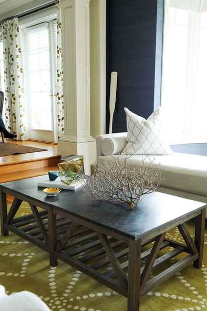
The coffee table is composed of sandstone atop a wooden base. It adds an organic touch and creates a nice tie to the brick fireplace surround. While the designers hinted at organic objects throughout the room, they gave some of them a twist. For example, the side table is shaped like a tree stump but has a warm metal finish. And of course the fish fits this description as well.
The designers also wanted to add some unexpected touches. A chartreuse rug adds a jolt of bold color on the floor, while a Sputnik chandelier surprises overhead.
Sofas: custom; Arteriors Zanadoo Antique Brass Chandelier; coffee table: PlaidFox
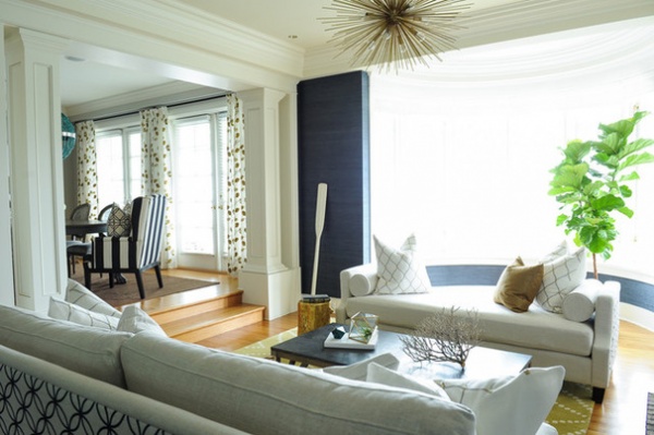
Leavitt custom designed the sofa and daybed to fit the room’s proportions. He chose a backless piece to keep the spectacular views out to the water through the curved windows open.
“Contrast works so well,” Leavitt says. “Iron or silver would not have stood out like the gold and brass touches on the pillows, side table and chandelier.” These items make the room more modern, funkier and less formal. They also brighten things up on gray Vancouver days.
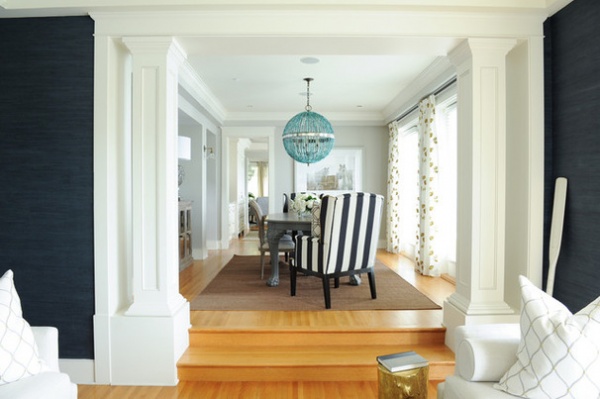
The living room is wide open to two other rooms; here you can see the view into the formal dining room, located directly across from the fireplace wall. Before, very heavy furniture and colors like burgundy darkened the room. Now ethereal curtains, side chairs with light backs and a stunning green coral and mirror chandelier lighten the space. The hand-embroidered gold and chartreuse leaf pattern on the curtains ties in with the living room.
Before, an intricate Persian rug weighed the room down. The new rug is jute. “You don’t always have to invest in an expensive rug; this one wears really well,” Leavitt says. It also adds another natural material to the palette.
Tip: According to Leavitt, the perfect can’t-fail gray is Thunder by Benjamin Moore. They diluted it by 50 percent and used it throughout the house. “If you have trouble with gray, if it’s looking too blue or purple or another color, this is the ultimate gray,” Leavitt swears. “You can darken it or dilute it to be lighter, like we did here.”
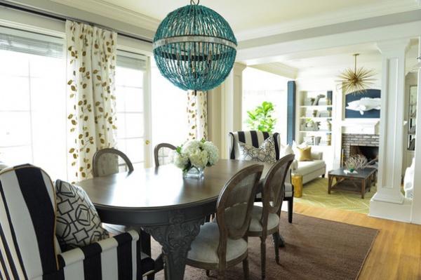
The clients decided to keep the original dining table, so the designers made it less formal by painting the base gray and staining the top.
However, they got rid of the matching dining chairs that came with it. “I don’t like when all of the chairs match,” Leavitt says. A mix lends a more causal look — he added side chairs with lighter caned backs and boldly striped host and hostess armchairs. He designed the antique mirrored-door buffet while on a trip to India and had it made there.
Side chairs: Restoration Hardware; armchairs, drapes: PlaidFox; Alberto Orb Chandelier: Currey & Company
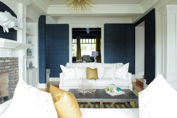
Spinning around 90 degrees, we see there is an open view into the home office.
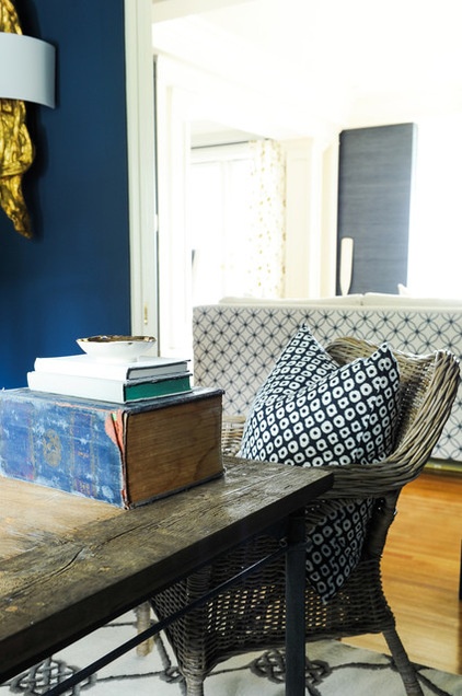
I know what you’re thinking. This is an unrealistic home office that is staged to perfection and never gets used, like one you’d see in a show house. Upon first glance, I was right there with you. However, this office gets a lot of use; it just has a big secret.
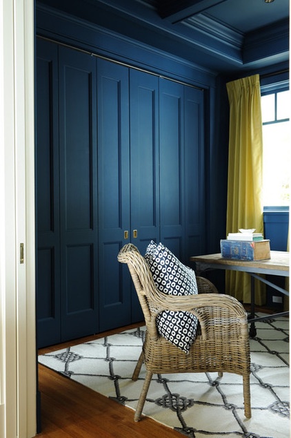
“Accordion doors hide the messy, ugly parts,” Leavitt says. They conceal piles of work, a printer and fax and the unsightly wires that go with them, files and other eyesores. When in active work mode, the homeowners open the doors, spread out and use the fully accessible workstation. When they don’t want to even think about work and just want to relax in the living room, they shut the doors and the view into this room becomes a perfectly staged, calming sight.
Not only is work out of sight, but it’s even easy to forget that these are doors. Leavitt treated them like a wall when designing the millwork, and when closed, they look more like a wall than doors.
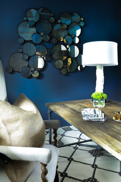
Painting every bit of the room navy, from the baseboards up the walls and across the ceiling, was an idea that hit Leavitt late in the game. Once he decided to turn the room into a little jewel box, he chose a lighter rug for contrast.
Paint: Gentleman’s Gray, Benjamin Moore; chair, desk: Restoration Hardware; wicker chair: Ikea; mirror, rug, lamp: PlaidFox
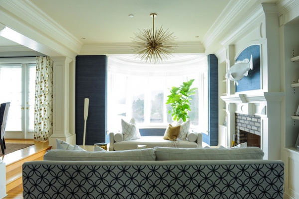
One last surprise: Leavitt chose a patterned fabric for the back of the sofa that picks up on the navy walls and can be enjoyed from the office. “Sofas are often pushed up against walls, so we don’t think about the backs,” he says. If you’re going to float your sofa, it’s a playful way to add pattern. He notes that the fabric on the back doesn’t have to be as durable as the rest of the fabric on the sofa, that this is easy to do on a custom sofa, and that it doesn’t usually add much, if anything, to the price.
See more Rooms of the Day
Related Articles Recommended


