Houzz Tour: A Boston Brownstone Is Restored to Glory and Then Some
http://decor-ideas.org 04/06/2015 03:13 Decor Ideas
Despite the fact that it looked “horrific,” interior designer Tanya Capaldo knew good bones when she saw them in this 1885 Boston brownstone. The house was dark, walls closed off rooms, surfaces were covered in orange shag carpeting and floral wallpaper, and most of the original architectural details had been ripped out. But the designer knew she could bring it back to its former glory; during the gut renovation she added key details that were appropriate to the Victorian-era architecture while putting her own eclectic spin on things. The result is a beautiful, functional home that feels like its stunning architectural details have been well preserved for the past 130 years.
Photos by Eric Roth
Houzz at a Glance
Who lives here: Interior designer Tanya Capaldo and her partner, Tom Caracciolo
Location: On the border between Back Bay and the South End in Boston
Size: 2,000 square feet (186 square meters); 2 bedrooms, 2 bathrooms
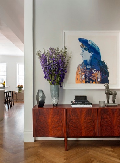
“My aesthetic has always been eclectic. I like clean lines, I like to install character and humor, and I love midcentury modern pieces and modern art,” Capaldo says. The foyer embodies all of this; Andy Warhol’s “Annie Oakley,” a faceted vase and a midcentury modern Brazilian rosewood credenza by Kofod Larsen welcome visitors.
The painstakingly installed and stained white oak floor’s herringbone pattern lets you know that this is an elegant place that honors its historic vintage.
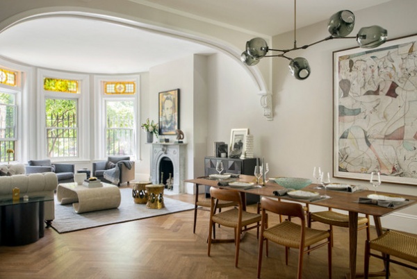
At first glance one might assume that the architectural details are original to the 1885 brownstone. In truth, only the stained glass window treatments are original. The original millwork and fireplace had been completely ripped out, and the floors underneath the orange shag carpeting had not been worth saving. Capaldo added the herringbone floors, archway, salvaged marble fireplace surround and millwork to bring the building back to its former glory.
Wall paint: Light Pewter, Benjamin Moore; artwork next to dining table: hand-colored etching, Volker Hueller
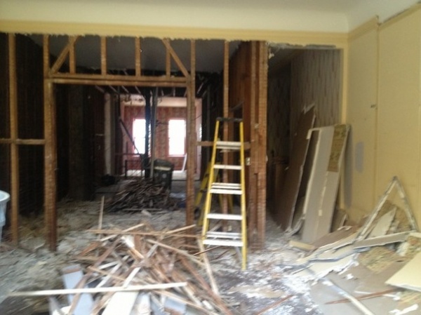
BEFORE: The couple took down this wall between the dining area and the living room. “We were drawn to this brownstone not only because it sits right between Back Bay and the South End, but also because it’s 17 feet wide. Many are only about 12 to 13 feet wide,” Capaldo says.
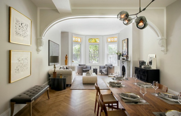
AFTER: The archway is located where the wall once stood, designed to respect the original interior architecture. Capaldo scored the corbels at the ends of the archway at an antiques store.
The designer loves to mix eras and styles, and has a particular penchant for midcentury modern. Vintage teak Niels Møller P 75 dining chairs surround a walnut dining table from Germany. A stunning Lindsey Adelman 5-globe Bubble chandelier defines the dining room space.
The artworks over the bench (left) are by Joan Miró.
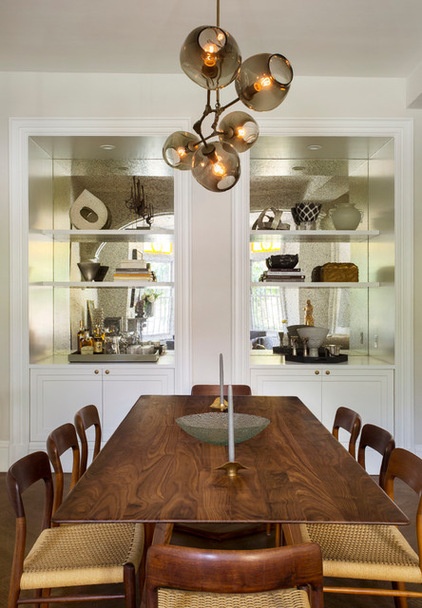
Capaldo designed these custom cabinets and shelves for serving and storage, and craftsman Paul Cusack built them. They are backed with antiqued mirror, which reflects a lot of light into the end of the room farthest from the windows.
“I use shades of gray like others use Decorators White,” the designer says. “I tied the home together with 10 to 12 different shades of gray, creams and mushroom browns and chose to use texture over pattern.”
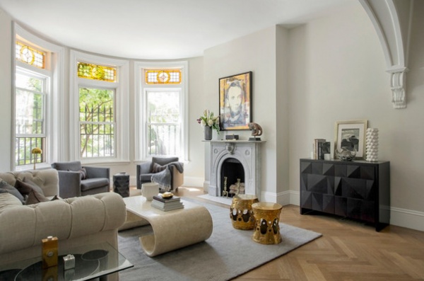
In the living room, a deep sofa and two comfortable midcentury modern Charles Pfister cube armchairs provide seating. A large vintage coffee table by Karl Springer suits the scale of the room and adds some big curves. A custom faceted cabinet and a faceted side table add more complicated geometry, while two brass stools add sculptural shapes and warm patinas. Jonathan Adler’s Georgia vase adds a dash of humor and lets guests know not to take the elegant room too seriously.
Brass stools: Jonathan Adler; sofa: Restoration Hardware; faceted cabinet: custom, Paul Cusack
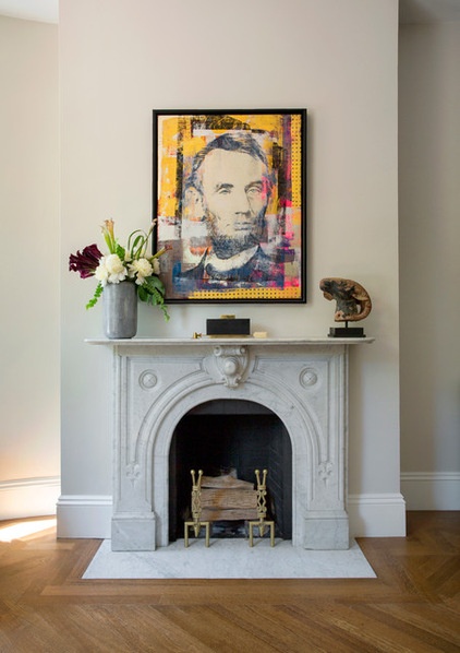
The couple found a suitable marble fireplace surround at an architectural salvage yard. An Abe Lincoln artwork by Houben R.T. finishes off the stunning focal point.
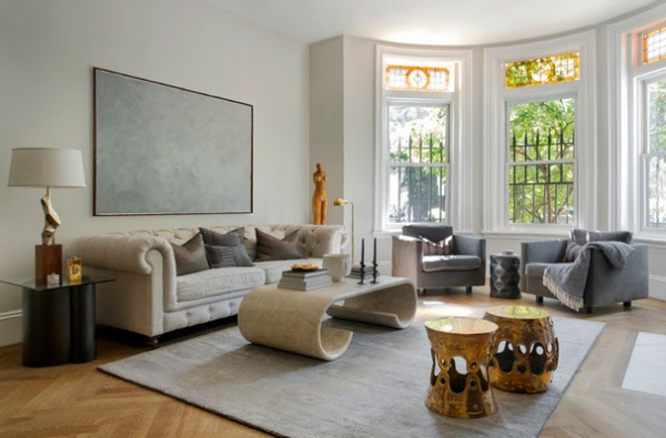
Capaldo doesn’t believe in trying to do it all at once. “I wait until I find the right things as I go along,” she says. For instance, she’s still on the hunt for a large quiet piece of art to hang over the sofa that won’t compete with Abe across the room. In the meantime, she ordered a big canvas and painted this work herself as a placeholder until the right thing comes along.
The couple’s art collecting is not limited to the two-dimensional kind. They appreciate sculptures as well, like the 1960s Italian piece to the right of the sofa. An artful midcentury modern lamp, the coffee table and the brass stools also add sculptural shapes to the room.
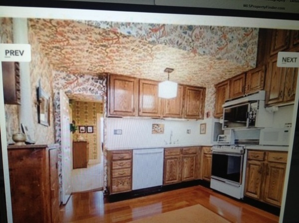
BEFORE: The kitchen’s floral wallpaper was dizzying. Capaldo had worked professionally as a restaurant expeditor for years, as well as a professional cook and caterer, so she knew exactly what she wanted out of the kitchen redesign. “I love a utilitarian kitchen, where everything you need is right at your fingertips,” she says.
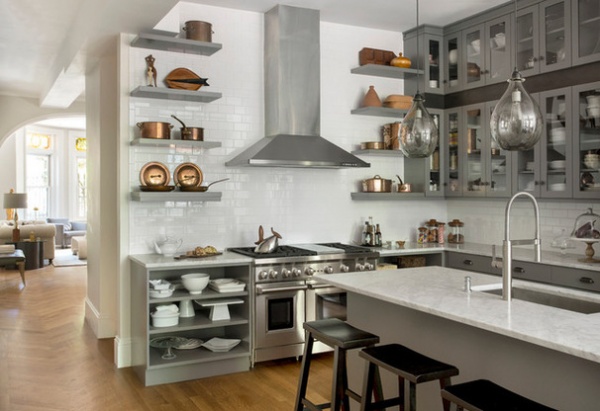
AFTER: The open shelves surrounding the range, both above and below, were inspired by kitchens she’d seen in France and Italy. The copper pot display was inspired by one French kitchen that had always stayed on her mind. Not all the items are so luxurious, however. The designer is a huge fan of stores like HomeGoods and found many of her items there as well.
The range is a 48-inch Wolfe model with a grill. While Capaldo had hoped to order a range from France, the extensive lead time meant she would not be able to cook for her 15 incoming Thanksgiving guests, and that took priority. “Fifteen people is a small group to us; we often have 30 to 35 people,” she says.
Teakettle: Frank Gehry Pito; copper pots: Mauviel
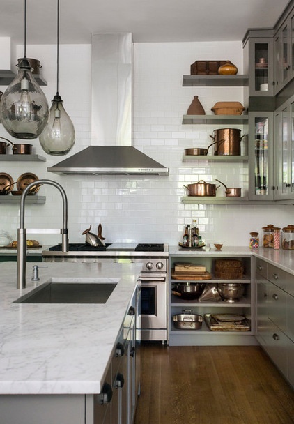
Experience in professional kitchens made the designer well aware of what can happen to much-used Carrara marble countertops, and she loves the story that wine rings, lemon juice spills and water splashes leave behind. One tip she retained from the owners of Barcelona restaurants is that a cheap and easy way to clean marble countertops is with inexpensive vodka.
As for the simple antiqued bronze hardware that blends in with the gray cabinets, “I knew there was going to be a lot of hardware, and I didn’t want it to look busy,” the designer says.
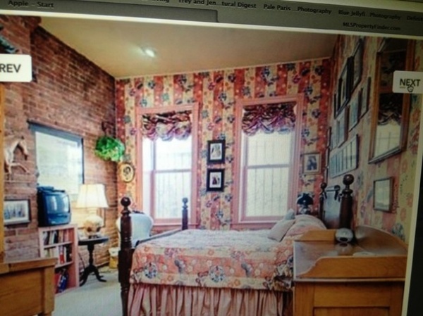
BEFORE: The family room area used to be closed off from the kitchen and served as a third bedroom. “Making this space a casual family room was a better fit for how we live,” she says. It serves the family well when Tom’s children come to visit and when they are entertaining, and the open layout lets the kitchen enjoy the natural light from the two windows.
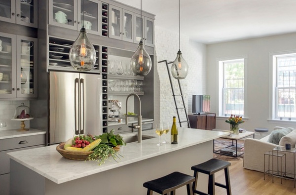
AFTER: “I also wanted the kitchen to have a relaxed feel, not uptight and stuffy,” the frequent host says. For example, a wine bar area to the left of the refrigerator is stocked with wine and wineglasses so that guests can help themselves to a refill whenever they want one.
They also can easily spread out into the comfortable family room, but Capaldo will put them to work in there. The brick wall serves as a “quote wall,” where guests are encouraged to scribble away.
To make the most of the high ceilings, the designer had another set of cabinets installed above the upper cabinets. A metal strip provides places to rest the handmade metal ladder, which has rubber stops on its ends.
Wall paint in kitchen and family room: Sea Pearl, Benjamin Moore; glass pendant lights: Cisco Lighting
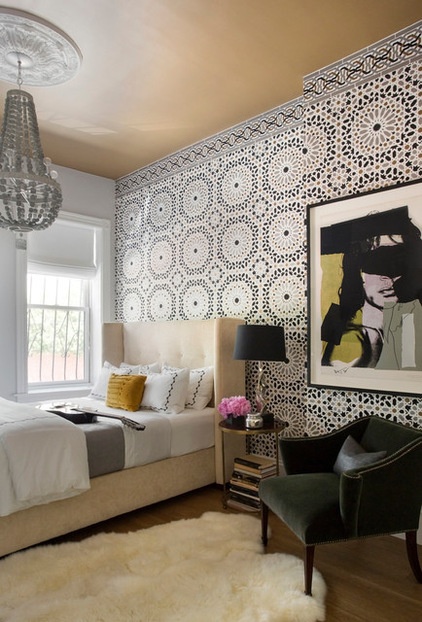
In the guest room, the designer went for a unique boutique-hotel style. A bold Moroccan graphic pattern dazzles. “The wall covering is only on one wall, so when our guests are in bed, their view is actually very calm,” Capaldo says. She picked up on the gold in the pattern with a caramel-apple color on the ceiling. The chandelier is crafted of spun wire, and she had the 1940s curvaceous chair recovered in green mohair.
“Our guests get to say they slept with Mick Jagger when they stay at our house,” Capaldo says with a laugh. The portrait of the rock ’n’ roll icon is by Andy Warhol.
Wallpaper: Schumacher; bed: Mitchell Gold + Bob WIlliams; spun wire chandelier: Arteriors
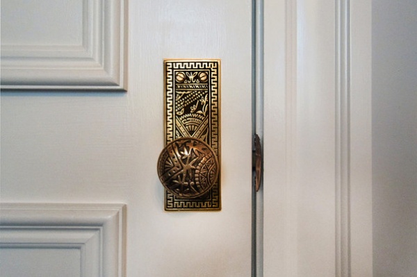
The designer paid attention to every detail. During the Victorian era, these doorknobs were originally made in Branford, Connecticut. She found a company in Charleston, South Carolina, that had bought the original molds, and she purchased bronze knobs, plates and hinges for the home.
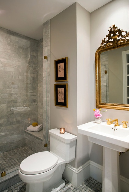
A bit of France dazzles in the guest bath, in the form of an antique French mirror. Elegant honed Carrara subway tile in the shower and a Carrara basket-weave-patterned floor add to the room’s elegance and nod to the brownstone’s historic period. This full bathroom also serves as the powder room.
Wall paint: Cornforth White, Farrow & Ball; unlacquered brass fixtures: Waterworks
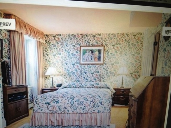
BEFORE: The master bedroom suite is located on the floor below. Traditionally, this level was not trimmed out as elegantly as the main floor; it was very traditional and floral.
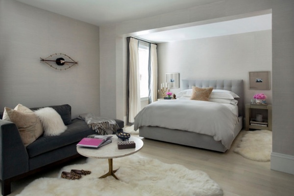
Capaldo calmed the room down with soothing gray, using a striated paint technique to create a wall finish that resembles grass cloth panels, to add subtle texture. The floors are cerused oak; she had them bleached to take out any yellow tones, then finished them with a clear white stain.
The master bedroom is set up to be a comfortable suite, with a bedroom area and a sitting area. “I love to mix high and low end,” the designer says. The bed is from Room & Board, and the silver nightstands are from West Elm. The clock is a midcentury modern icon, a George Nelson Eye Clock. Capaldo repurposed the velvet chaise from her former home.
Wall paint: Cloud White and Stonington Gray, both Benjamin Moore; bed: Room & Board; George Nelson Eye Clock: Vitra
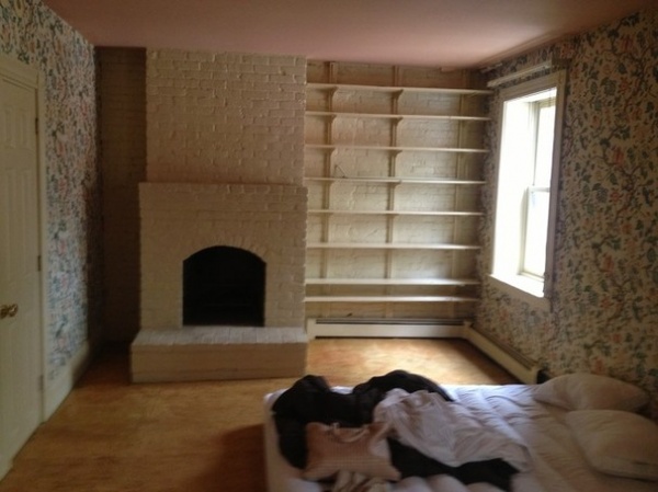
BEFORE: The master bedroom sitting area was cluttered up by unattractive shelves.
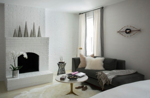
AFTER: Removing the shelves and painting the fireplace lightened things up. Full-length drapes give the window a stronger presence.
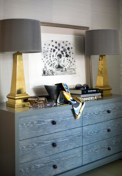
This dresser is another custom piece by Paul Cusack — it has gray cerused oak drawers wrapped in gray lacquer. The brass lamps add a warm touch and symmetry. The artwork is by Salvador Dalí.
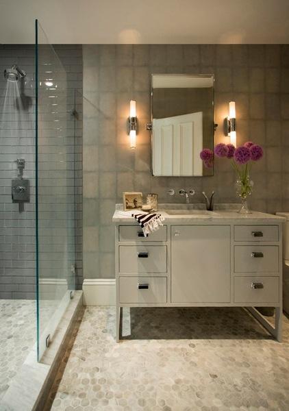
The master bedroom continues the more modern look of the suite. The vanity is a custom piece that keeps the floor underneath open. The flooring is hexagonal Carrara marble tiles. The shower has contemporary gray glass tiles. The wall covering has a shagreen look.
Sconces: Restoration Hardware
Browse more homes by style:
Small Homes | Colorful Homes | Eclectic Homes | Modern Homes| Contemporary Homes | Midcentury Homes | Ranch Homes | Traditional Homes | Barn Homes | Townhouses | Apartments | Lofts | Vacation Homes
Related Articles Recommended


