Houzz Tour: New Tower Rises From a Midcentury Ranch House
Karen Knight knew this was the house for her as soon as she walked through the front door in 2010. For Knight, who considers herself more a fan of French country style, the 1968 A.D. Stenger ranch for sale in the Westlake Hills neighborhood of Austin, Texas, wasn’t exactly what she had in mind. But the home’s efficient layout and tree-filled quarter-acre lot in one of her favorite neighborhoods proved to be a powerful selling point. Despite original dark finishes and small, compartmentalized rooms in the middle of the house, Knight put an offer on it without seeing any other properties. “I knew the potential of what we could do,” she says.
Knight hired Austin architect David Webber at the suggestion of Veronica Koltuniak, her friend and interior designer, who had seen his work throughout Austin. When she described the home to Webber, he realized he already knew it, and had even trick-or-treated there as a kid. “Having grown up in the neighborhood, I was very familiar with it and lived in a house designed by the same architect that did hers,” Webber says.
Over the next few years, the designers transformed the 1,500-square-foot ranch into a 3,000-square-foot residence to accommodate Knight and her three daughters. Updated finishes and a new A-frame tower preserve the sprit of the house but offer a thoroughly modern twist. “It was so fun to see David’s ginned-up version of a Stenger,” Koltuniak says.
Houzz at a Glance
Who lives here: Karen Knight and her 3 teenage daughters
Location: Westlake Hills neighborhood of Austin, Texas, 4 miles from downtown
Size: 3,000 square feet (279 square meters); 5 bedrooms, 4 bathrooms
Year built: Original home in 1968; addition in 2013
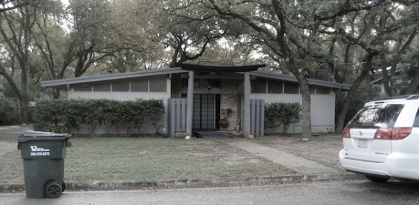
BEFORE: The original one-story exterior met at a gentle pitch at the front door, crowned by a somewhat unusual Japanese torii gate as a nod to the home’s Japanese influence. Adding to the Zen feel, you also would have crossed a water feature to reach the front door.
A.D. Stenger designed and built around 100 homes in the Austin area between the 1950s and 1990s, and like the designs of many home developers of the era, his houses featured sweeping rooflines; they were often single-story houses catering to Americans who wanted modern, affordable designs following World War II. The exteriors often used stone, pulled into the interiors, and featured clerestory windows and wood siding.
“After” photos by ArcherShot Photography except where noted
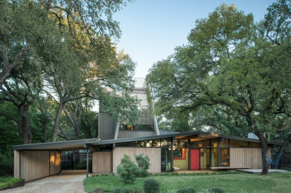
AFTER: They kept the front door in the same place but removed the covered front entry and moved the front walk off-center, breaking the symmetrical front. Webber built a new carport, and the new addition projects up from the back of the house, further enhancing the asymmetrical entry.
Knight and Webber wanted this home to be a warm, comfortable place for modern living, but they also wanted to preserve the essence of the home to pay homage to Stenger’s original design. “I wanted to do right by the house,” Knight says. They replaced the painted wood siding with stained locally sourced cedar that they then carried through the home’s interiors. “We really wanted to honor the woody materiality that was on the exterior of the original house, but we wanted to enrich it and make it more natural,” says Webber. A semitransparent Cabot stain on the exterior will keep the color pretty much as is; a low-VOC stain was used on the interior wood.
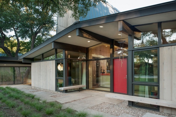
The design blends the living spaces of the house inside and outside. They left much of the house intact in terms of layout but tore down walls in the middle of the house to open it up. At the request of Knight, Webber replaced existing front sliding glass doors with floor-to-ceiling windows and added an extra window to bring more light into the house and eliminate an entrance.
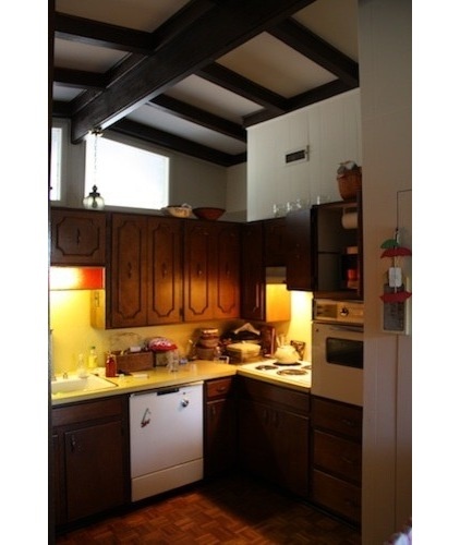
BEFORE: The original kitchen sat in the home’s center, but its tall cabinets and inward-facing layout made it somewhat closed off from the rest of the downstairs activity. Knight wanted the kitchen to function more like the home’s hub. The kitchen was also pretty dark, with parquet flooring and dark windows.
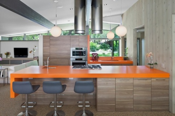
AFTER: Webber started by knocking down walls and tall cabinets to open up the kitchen to the rest of the house. Now when Knight stands at the sink, she can see the front door of the house. “I’m constantly waving at the neighbors going by,” she says. When she stands at the stove at the new peninsula, she can look out to the backyard.
New finishes have reinvigorated the kitchen. Walnut laminate cabinets contrast with and complement the cedar walls and the pebbled floors. Orange Formica countertops add color and a touch of period authenticity. (Knight coincidentally had orange laminate counters in her childhood home.) They also call attention to the kitchen as the great room’s focal point.
Throughout the first floor, inside and out, Webber installed commercial-grade Pebble Tec floors as a warmer alternative to cost-effective concrete. “They’re really sturdy,” Knight says. “It’s like you get a foot massage every time you come to my house.”
Photo by Andrea Calo
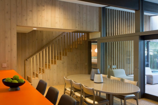
This Danish modern dining table had a dark brown stain when Koltuniak found it. She took it and the dining chairs to an auto body shop and had them painted in a shimmering shade of champagne that blends in with the warm neutrals.
For the interior finishes and decor, Koltuniak created a palette of warm neutrals with some period-appropriate color, like the orange countertops. She wanted color but didn’t want to overdo it. They were strategic about where they introduced color and brought in texture for interest, too. “I found her making our moves stronger,” says Webber.
Photo by Paul Bardagjy
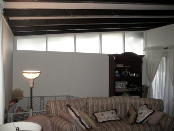
BEFORE: While the home’s details, finishes and some walls were replaced, its scale and overall configuration were efficient and a selling point for Knight. In the living room the beams were dark, the frosted glass windows obscured some of the light coming in, and the sliding glass doors provided too many access points into the house, but the room was already right where it needed to be, just off the kitchen at the front of the house.
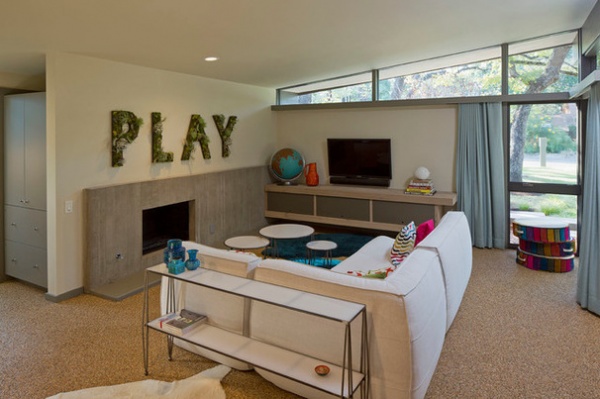
AFTER: They replaced the existing fireplace insert with a more contemporary concrete one. Simple custom furniture uses the same materials and details as many other custom pieces seen in the house. The sectional sofa is actually an indoor-outdoor piece. The air plant installation is one of Koltuniak’s most recent additions and is a reminder to Knight and anyone visiting the house what this home is about. “I wanted it to feel fun,” says Knight of her house.
Photo by Paul Bardagjy
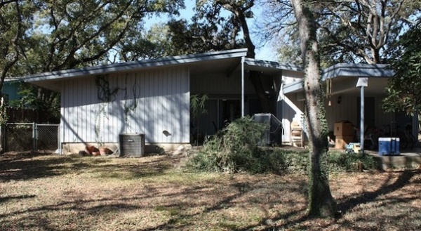
BEFORE: The view of the home’s original back side was covered in shadows. There was a small covered back patio and covered carport, but little else in terms of landscaping.
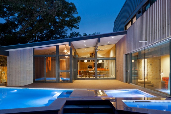
AFTER: The new rear of the house opens up much more to the backyard. Sliding glass doors on all the back rooms open up onto the patio, enhancing the indoor-outdoor relationship Knight was after. The new master bedroom on the right, which had been the original carport, opens up the back patio, and the new tower addition sits above that. The Pebble Tec flooring and cedar paneling has been carried outside from inside.
A new pool hugs the master bedroom wall on the right and frames a 12- by 12-foot patio next to the dining room. “I grew up in Michigan and never had a pool in my life,” says Knight. Local regulations forced them to pull the pool in close to the house, but with the continuous Pebble Tec flooring inside and out, once the sliding glass doors open, it’s as though Knight has an outdoor kitchen and dining room right next to the den and master bedroom. Curtains on the private rooms can close them off from public viewing.
Photo by Andrea Calo
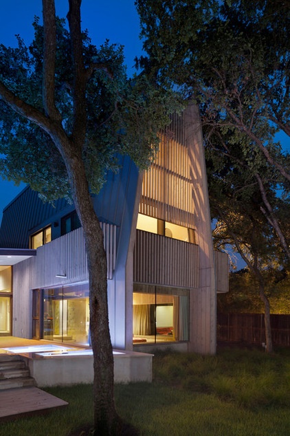
“The tower came about almost accidentally,” says Webber. They knew there would need to be an addition in order to accommodate all that the Knight wanted in the house, but local regulations about impervious surfaces and setbacks made it seem that building up would be the only option. The addition doubled the size of the house, so it was especially important for the team to consider how the addition would fit in with the scale of the house.
After struggling with how to expand a house that seemed so intrinsically a single-story structure, one designer in Webber’s firm suggested adding a boxy tower. Though Webber thought this shape wasn’t quite right, it got him thinking about the addition as a contrast, not just as a hidden complement to the house. Another Stenger house in the neighborhood had an A-frame roofline, which inspired the addition’s design. “It seemed obvious to use one of A.D. Stenger’s other prototype houses as a vertical to act as a counterpoint to this prototypical house as our horizontal,” he says.
Photo by Andrea Calo
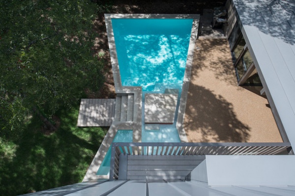
The pool’s pinched center, seen in this view from the tower, came in part from Webber’s wanting to preserve an existing backyard tree. He then decided to mirror that on the other side, creating a loosely geometric butterfly shape as a homage to Knight’s favorite wildlife creature and as a nod to the Japanese philosophy of wabi-sabi, finding beauty in the imperfect or incomplete.
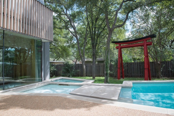
A bridge through the pool’s center frames the rescued tree and leads to another surviving original feature: the Japanese torii gate from the original entry. Painted red and with new structural supports, the Japanese accessory has found new life as a backyard sculpture.
One of the pool’s most interesting features may be one that you can’t see. Geothermal loops run underneath the pool and use the water’s constant temperature to cool or heat the house, depending on the season. Refrigerant lines create cool temperatures in the house during the summer and bring heat out of the house. In the winter the refrigerant lines work in reverse, creating warmer temperatures into the house and bringing coolness out. The constant temperature of the water does the work.
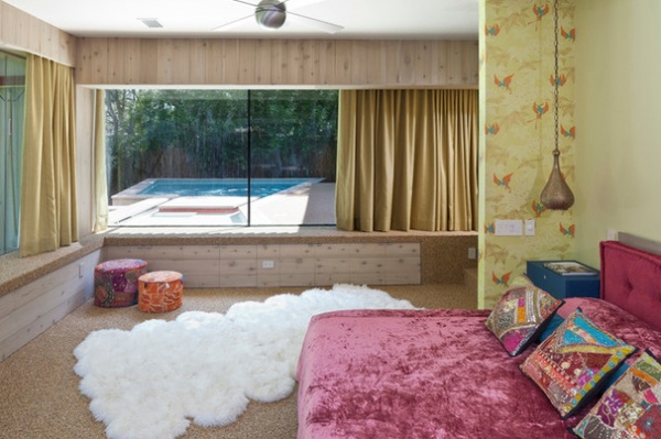
To take more advantage of the square footage and to retain the number of bedrooms Knight wanted, Webber converted the carport into Knight’s master bedroom. The carport was located at the back of the house and had been structurally reinforced for a second story. By sinking the floor down a couple of steps, Webber gave Knight a more secluded bedroom retreat while giving the ceiling a little more height and using the existing reinforced ceiling structure to build the addition onto. From her bed Knight can view the pool area that runs right up to the window; drapes custom made by Koltuniak can be closed for privacy.
The same Pebble Tec floors used throughout the house tie the bedroom in with the rest of the design, but unique touches by Koltuniak create a softened room that’s distinctly for Knight. Knight bought the pillows in India, and Koltuniak made the pink velvet bedspread from leftover upholstery pieces she bought in the garment district in downtown Los Angeles. The butterfly wallpaper is another homage to Knight’s preference for butterflies.
Photo by Andrea Calo
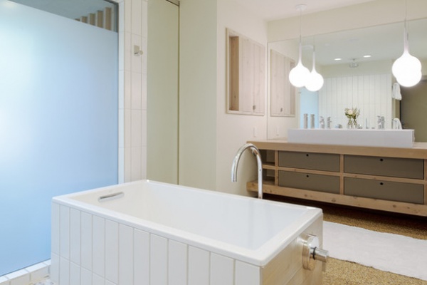
The connecting master bathroom was an original bedroom. The same red cedar siding on the house’s exterior was used for the custom vanity, and the Pebble Tec floors flow into the bathroom as well. Webber says that the Pebble Tec flooring is waterproof but also very porous and needs to be cleaned from time to time. The wood, for the most part, is left alone.
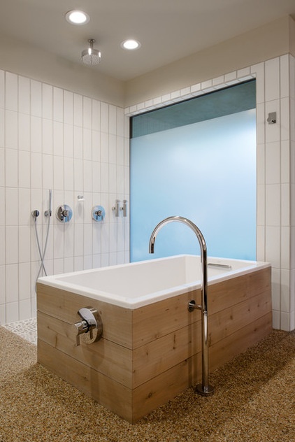
Knight had originally wanted a round Japanese soaking tub in her master bathroom, but when they inserted it into the drawings, the rounded corners kept getting in the way. Instead, they installed this rectangular soaker and positioned it to take in filtered light from the backyard. The tub frames a tiled open shower in the corner.
Water from the showers, bathroom sinks and laundry are hooked up to a greywater system that filters the water and disperses it into the landscape via drip irrigation. “It works great and was relatively low cost,” says Webber.
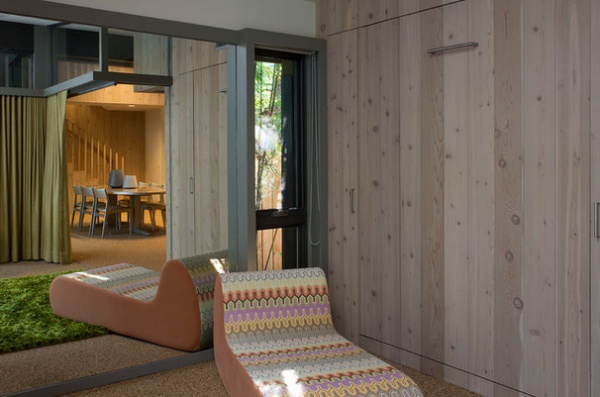
With the master bedroom now in the converted carport, Knight was free to transform the original master bedroom off the dining room into a yoga studio and lounge area. It opens up directly to the open dining area and pool but can be closed up, and a Murphy bed pops out of this cedar wall. “I was big on multiuse space,” says Knight.
Photo by Paul Bardagjy
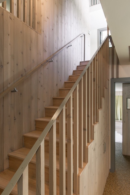
The cedar staircase off the dining room leads to the new upstairs portion of the house, where Knight’s three daughters’ bedrooms are.
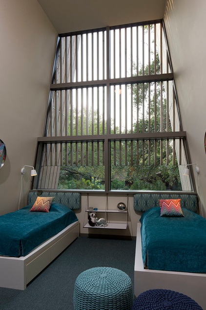
Two of Knight’s daughters share this high-ceilinged bedroom in the tower. They helped Koltuniak choose the blue and teal color palette, including the geometric Kelly Wearstler fabric for the upholstered headboards. Koltuniak painted off-the-shelf twin beds the same color as the walls and hung a custom suspension nightstand between them.
Photo by Paul Bardagjy
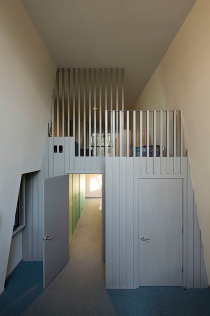
The younger girls’ shared bedroom connects to the oldest daughter’s bedroom on the tower’s other end via the bathroom. Above the bathroom, a common loft area provides the girls with a place to relax and lounge together.
Photo by Paul Bardagjy
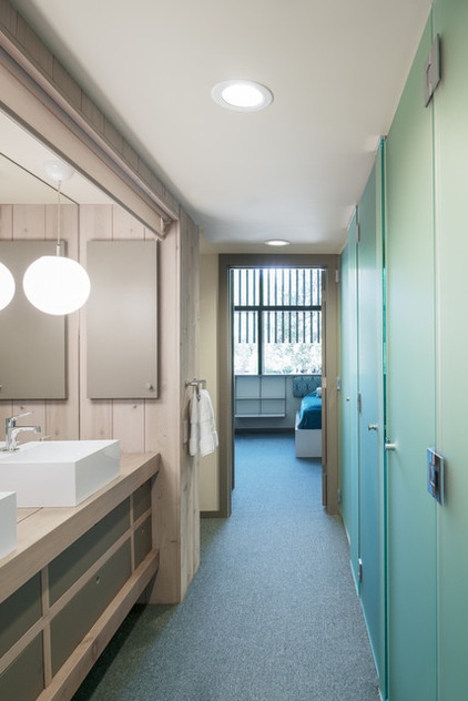
The girls’ shared bathroom has the same materials and design details as the bathrooms downstairs. The frosted glass doors conceal a toilet and shower area so that the sinks and passageway can be used at the same time.
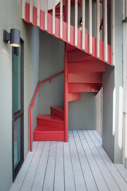
A red steel staircase winds up from a deck off the second floor to a rooftop deck above. Local welder Brandon Ariel custom fabricated the staircase to meet all local building codes.
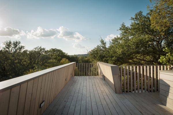
From the tower’s roof deck, Knight can gather with friends and look out over the lush surrounding treescape. In winter, when the trees are bare, the lights from downtown Austin reach the rooftop.
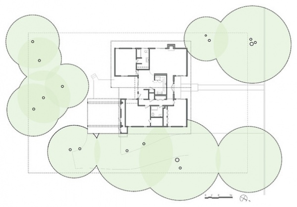
BEFORE: The first-floor plan before the remodel and addition.
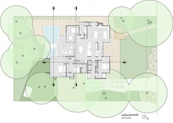
AFTER: The first-floor plan after the remodel and addition.
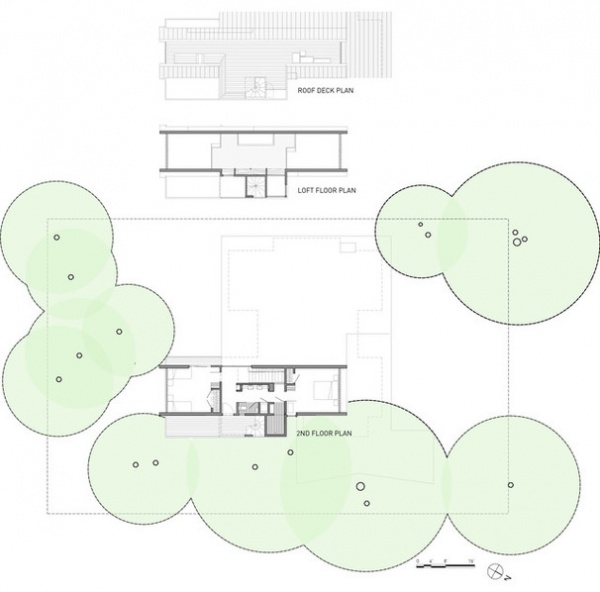
The second-floor plan after the remodel and addition.

Sections of the house.
Browse more homes by style:
Small Homes | Colorful Homes | Eclectic Homes | Modern Homes | Contemporary Homes | Midcentury Homes | Ranch Homes | Traditional Homes | Barn Homes | Townhouses | Apartments | Lofts | Vacation Homes


