Design Dose: See Why 3 Living Rooms Caught Our Eye This Week
http://decor-ideas.org 04/04/2015 01:53 Decor Ideas
The kitchen might be the hub of most homes, but when it comes time to slow down, kick back and relax, most of us head straight for the comfort of our living rooms. It’s where we put our feet up, chat with friends, turn on the TV, power up a laptop, open a book or laugh with our spouse about something our child said that day.
And just as the activities in these spaces span a broad spectrum, so too do the styles of living rooms. We took a look at the living room photos that professional builders, architects and designers uploaded in the past seven days and picked three that we just had to know everything about. Here, the designers dish on their plans of attack, “uh-oh” moments and much more.
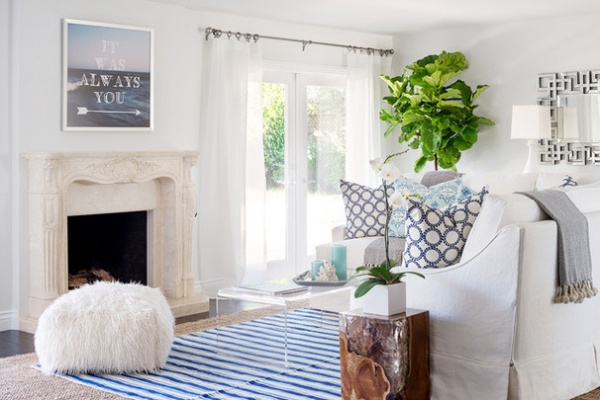
1. Bright and Beachy
Designer: Lauren Christine Henno
Location: Santa Barbara, California
Size: 200 square feet (19 square meters)
Budget: $20,000
Homeowners’ request: “The homeowners are from Arizona and wanted a beach house to vacation in with their three young girls. A place where they could come and relax with a California coastal vibe.”
Plan of attack: “When I first walked into the space, it was extremely dark and felt enclosed. My main objective was to lighten it up and create an airy appeal. I began with my color palette, choosing fabrics and tones that enhanced a breezy coastal aesthetic, with a pop of modern glam. I then chose a beautiful white paint that had a hint of gray for the walls, which were a dark khaki, and a more vibrant white paint for the baseboards and cabinets, which were a dark wood.”
Why it works: “Our color palette choice really helped the space come together. It opened the room up completely and made it more inviting. The ceilings are low, and there isn’t much natural light that brightens the space. The airy fabrics and paint choice provide an illusion that the room is larger and brighter than it truly is.”
What wasn’t working: “Being that the homeowners have three young girls, they wanted to ensure the space would be functional for the family. In order to lighten it up, we had to use a white linen that was durable and washable. We designed a fitted slipcover that can easily be removed and washed if spills are made.”
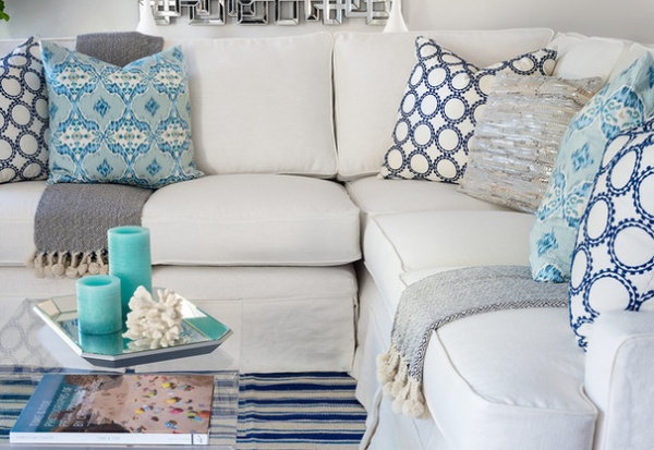
What goes on here: “The space is where the homeowners spend most of their time when visiting. To the left is a TV. We chose a sectional so that the TV, fireplace and view of the backyard could all be enjoyed when resting.”
Who uses it: “The professional couple have three young daughters. When they visit California, they enjoy their time in town and particularly love being at the beach.”
Designer secret: “Lucite! It truly makes a smaller space feel more open.The space between the sectional and fireplace was tight, so we chose a Lucite coffee table that helped with design function and scale.”
“Uh-oh” moment: “The homeowners were visiting from Arizona in August and would not be returning to California until December. I had to create a floor plan, as well as choose fabrics, furniture and paint all within a 48-hour time frame before they flew home, though with a concentrated effort it was all doable. The homeowners’ fun personalities and outgoing nature made the project something that was an enjoyable rather than stressful experience.”
The nitty-gritty: “Almost everything was custom! I designed the sofas, pillows and even the striped rug.” Pillow fabric: Fabricut; sofa throws: Serena & Lily; Mongolian pouf: West Elm; artwork: Alicia Bock Photography; sheers: Pottery Barn; curtain hardware: Restoration Hardware; side table: Cabana Home; lamps: Curry & Company
Team involved: Interior designer: Lauren Christine Henno; carpenter: Jose Sanchez; painter: Santiago Pintor
See more of this house
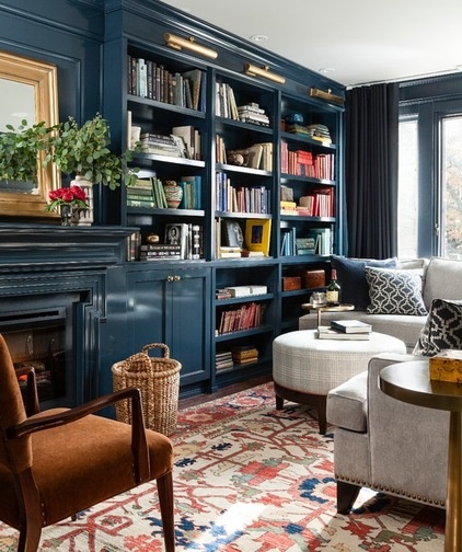
2. Bold and Brawny
Designer: Meredith Heron
Location: Toronto
Size: 10 feet by 16 feet (3 by 5 meters)
Homeowners’ request: “The homeowners wanted a sophisticated space that was both suitable for entertaining but was pet friendly and not too precious. They wanted it to be a showstopper but didn’t want to have to worry about upkeep. It needed to have character but not look dated.”
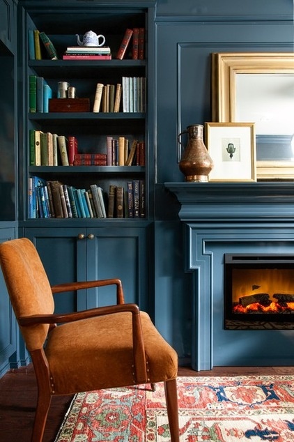
Plan of attack: “The room is very narrow and long, so we chose a rich indigo in a high-gloss lacquer for the millwork, which wraps around the space in an L. We then painted the remaining walls in the same color but in an eggshell finish. The lacquer and sheen brighten up the indigo by about 20 percent, so whenever I’m asked what the color is on the millwork, I always give the caveat that the paint chip — Benjamin Moore Lead Gray — looks nothing like the eventual color.
“Painting the room out in the dark indigo reduces contrast in the space and makes the room feel double the size. It’s cozy and perfect for media watching. The best part of this entire room, though, was being able to display the heirloom library of books that were handed down from a favorite aunt. We didn’t have to buy any accessories for this room. We just shopped the house. It gives it such character and a true personalized touch.”
Why it works: “The best part of this entire project was the fact that the clients gave us a lot of information about how they live and what the function of the space needed to be. They have two very large standard poodles who run the show, and then they left us alone to create.”
What wasn’t working: “There had been an actual wood-burning fireplace, but it protruded rather far out into the room, and beside it was a poorly located radiator. This drastically reduced how and where the furniture could be laid out. Both clients are well over 6 feet tall, and with two dogs they could barely fit in the room, let alone entertain.
“They are huge movie buffs and love to have viewing parties and Oscar parties, and this is where they wanted that to happen. We removed the old fireplace and closed it up. We replaced it with an electric fireplace. We also removed and relocated the old radiator and replaced it with a new slim-line one that allowed for the millwork and a sectional to both find a home in the room. It opened up the floor space and gave us room to put in a sectional that fits perfectly into the space and still have room for additional chairs for guests. The dark palette makes it perfect for movie watching at any time of day. We made sure to use blackout lining for the wool draperies, which doubles as sound dampening.”
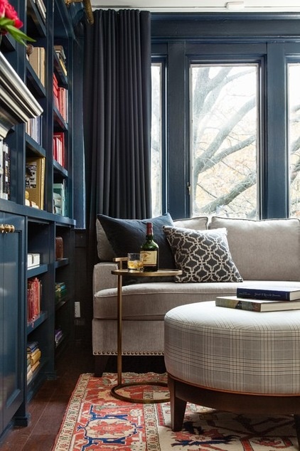
What goes on here: “This room is designed for lounging, casual entertaining, movie viewing for larger groups and the occasional sleepover.”
Who uses it: “The clients are two professionals who split their time between Toronto and Palm Springs. Avid movie buffs, they enjoy screening movies and entertain a considerable amount. Their two dogs, Miss Sugar and Sir Barkley, are their darling fur babies. The entire home has been designed with them in mind, from fabrics to carpets — even specific furniture pieces.”
Designer secret: “Choosing a bold, dark, rich color and then repeating it around the room is the secret to the success, along with the high-gloss lacquer we chose to use on the millwork. It creates an unexpected lightness to the space, which keeps it from feeling oppressively dark. The books are the splash of color that was then repeated in the rug, which came after the books were in their place.”
“Uh-oh” moment: “One of the clients has confessed that after the meeting where I proposed the high-gloss lacquer in Lead Gray, he had to work on deep-breathing exercises after he left. He thought I was nuts but decided to trust us. He continually comments on how glad he was to just go with it. Our cabinetmaker thanks us every time we see him for this project. He too thought we were nuts for asking for it. We just finished a new project with him, this time in high-gloss Oxblood lacquer, and we’re all dying over how good it turned out. High-gloss lacquer is the best!”
The nitty-gritty: Millwork: custom, designed by Meredith Heron Design; rug: one-of-a-kind Persian, Weavers Art in Toronto; chair: antique; sectional: custom by Meredith Heron Design; drapery: wool with blackout lining, Meredith Heron Design; ottoman: custom design, Meredith Heron Design; basket: Vintage Fine Objects; mirror: antique; pillows: custom, Meredith Heron Design; table lamp: Arteriors; table: Barbara Cosgrove Lamps
Team involved: Meredith Heron Design; J. Blasdale Contracting; Woodchuck Flooring
See more of this house
3. Rustic and Relaxing
Designer: Adam Kois
Location: Central New Jersey
Size: About 800 square feet (74 square meters)
Homeowners’ request: “Our clients desired a family gathering spot in the kitchen.”
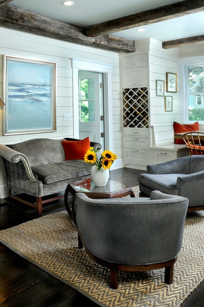
Plan of attack: “The renovation to the overall kitchen was guided by several strategic design elements, including a screened porch addition, a new bay projection for the eating area, a desk area and a mudroom addition. Once the mechanics and general functionality of the kitchen were resolved, we explored several options for the gathering space that included a fireplace, a TV lounge as well as an oversized island option. The clients came to the realization that they did not want a TV in the kitchen space, nor did they want the permanence of the large island, and the fireplace was ruled out. It was decided by all that a sitting area best met the needs of this family.”
Why it works: “There are several dominant elements to the overall kitchen layout. This solution provides an area in the kitchen for the family to gather and relax, yet it still maintains the circulation and functionality of the kitchen.”
Who uses it: “This project was designed for a family of five.”
Designer secret: “This room is dominated by the custom cabinetry. We did several things to lessen its presence: the use of side panels or ‘dummy’ panels on the millwork gave it a more furniture-like appearance. We also lined the walls with exterior shiplap siding, which acted to unify the millwork elements in the various areas of the room; and then by using subtle color and finish changes between the walls, millwork and trim, the overall mass of the ‘built-in’ millwork elements seemed to be lessened, yet still have a relationship/dialogue with each other.”
The nitty-gritty: “We used custom products and the highest-quality materials, which included reusing decorative wood beams salvaged from old barns.”
Team involved: Architecture and millwork design: wengerkois architecture + design; construction and custom millwork: AWK & Sons; color consultation: The Shady Lady; photo: Margaret Kois Photography
See more of this house
Related Articles Recommended


